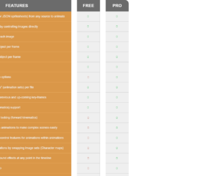
This is an example of a responsive feature comparison table, designed with CSS, HTML, and Bootstrap framework 4. The font style and the Bootstrap styles have been imported to the code with their URLs. The concept of Lists has been used with UL and LI components. UL element has been used with the child elements of LI to display the table rows, in an orderly manner. The table header title is displayed with a font-size of 25px. The header section of the table is displayed with a style set of background color as #6b6b6b none repeat scroll 0 0, font color as #fff, font-weight as 600, and text-transform as uppercase to automatically convert the text to uppercase. The table rows are given a style set of background color as #da9748 none repeat scroll 0 0, border-bottom as 2px solid #e5a253, font color as #f1f1f1, and font-size as 16px. In a hover event, the background color of the table rows gets changed to #e5a253.
Source: https://bootsnipp.com/snippets/33nxX
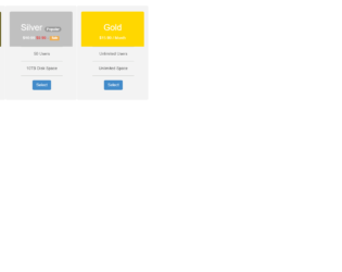
This is an example of another price card table, designed using CSS, HTML, and Bootstrap framework 4. The Bootstrap styles have been imported to the code with their URLs. The form consists of three price cards. The concept of Lists has been used with UL and LI components. UL element has been used with the child elements of LI to display the card details, in an orderly manner. The price cards are given a background color of #f3f3f3, and a box-shadow style of 0 0 12px 3px #b0b2ab. The three header sections of the price cards are given three different background colors as #665D1E, #C0C0C0, and #FFD700, whereas the font color is set as #fff. The price cards take a box-shadow style of 0 0 12px 3px #b0b2ab, in a hover event. The 'Select' button is created as a primary type button and given a font-size of 18px.
Source: https://bootsnipp.com/snippets/May9
Price Cards Table
4.3.1
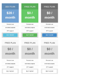
This is an example of a responsive pricing table layout, designed using CSS, HTML, and Bootstrap framework 4. The font style and Bootstrap styles have been imported to the code with their URLs. The concept of Lists has been used with UL and LI components. UL element has been used with the child elements of LI to display the card details, in an orderly manner. The form consists of 2 sets of pricing cards. All the price cards take a box-shadow style of 0px 0px 30px rgba(0,0,0, .2), in a hover event. The upper price cards are given the background colors of #EF5A5C, #73A3D4, #65C965, and #808080. The background color of the white pricing cards is set as #dfdfdf. In a hover event, the panel heading section of the white cards take a box-shadow effect of 0px 0px 30px rgba(0,0,0, .05), whereas the body section takes a text-shadow effect of 0px 2px 0px rgba(250,250,250, .9). The 'Buy Now' buttons have been created as danger, success, primary, info, and default type buttons.
Source: https://bootsnipp.com/snippets/3xB5q

This is an example of a pricing cards template with hover effects, designed using HTML, CSS, and Bootstrap framework 4. The font and Bootstrap styles have been imported to the code with their URLs. The form consists of three pricing cards. The concept of Lists has been used with UL and LI components. UL element has been used with the child elements of LI to display the card details, in an orderly manner. The body of the form is given the styles of background color as #cddc36, and font-family as 'Raleway', sans-serif. The title of the form is displayed with the styles of font-size as 36px, font-weight as 800, and font color as #3c2f17. The title of each pricing card is displayed with a font-size of 18px. The price details rows take a box-shadow effect of 0 2px 4px rgba(125,138,164,.06), and a transform effect of scale(1.05), in a hover event. The 'Buy Now' button changes its color to rgba(125,138,164,1), in a hover event.
Source: https://bootsnipp.com/snippets/5MWZa
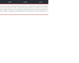
This is an example of another table layout with tabs, designed using CSS, HTML, and Bootstrap framework 4. The Bootstrap styles have been imported to the code with its URL. The form consists of four table tabs. The background color of the table is set as #272e38. The table consists of the tabs section and the tab content section. The tab content section is given a style set of background color as #fdfdfd, line-height as 25px, border as 1px solid #ddd, border-top as 5px solid #e74c3c, and border-bottom as 5px solid #e74c3c. In a hover event, the table tabs take the styles of background color as #e74c3c, font color as #fff, and transition as background 0.20s linear. The first tab of the set is made selected by default, with the areas selected value set as true, whereas the value for the other tabs is set as false.
Source: https://bootsnipp.com/snippets/exE6D
Table Layout
4.3.1
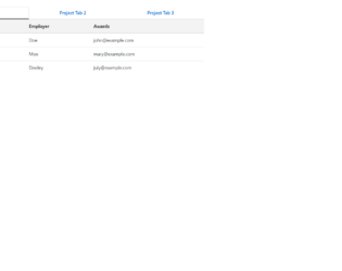
This is an example of a data table with tabs, designed using CSS, HTML, and Bootstrap framework 4. The Bootstrap styles have been I ported to the code with their URLs. The form consists of three tabs that display three tables. The tabs are given a style set of font color as #0062cc, background-color as transparent, border-color as transparent transparent #f3f3f3, border-bottom as 3px solid, font-size as 16px, and font-weight as bold. The table rows are given the styles of border as 1px solid transparent, font color as #0062cc, font-size as 16px, and font-weight as 600. The table row items have been created as links to external pages, which take an underline effect in a hover event. The table row items are displayed using the styles of color as #333, and font-weight as 600.
Source: https://bootsnipp.com/snippets/AlZ7g