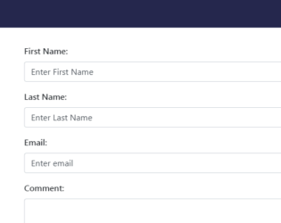
This is a responsive form and works well with most of the devices. Adding this form will give a stylish look to your website and portfolio. It is a simple yet stylish contact form which consists of "container". Contact form is placed inside the container which contains the input tags like “first name”, “lastName”, “email”, “comment” and submit button. FormGroup and FormControl are used to group the label and input area. The image is placed in a contact-info class with the margin set at the bottom. Head tag consists of bootstrap min and jquery references. CSS is defined to match the details added in the contact form. Styles like background color, padding, and height is defined. Class contact-info it needs to be set with margin. Focus on button shadow is none. This form goes well with a personal, portal and business websites.
Bootstrap contact form
4.1.1
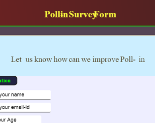
This is a Poll-in survey form, where we have created a CSS style to match the outlook for the form and javascript to transfer data using HTML “post” request. We will start by creating the container using class “container”. This is responsible for flexible behavior of the form. We will then create a form using the “Post” method of HTTPRequest and using the REST API framework. The Form is divided into field set. The first fieldset contains “Personal Information” whereas the second contains “Survey” information. Controls like text box, options, labels are used. CCS style defines the looks of each control. A keyframe is defined during submit, it defines the rules for animation code. Once the user clicks on submit, javascript is used to collect the data and post it using ajax function. Once the HttpRequest is created we call the callback functions.

This is an Bootstrap sticky contact form which will be fixed at the bottom position of the page. It will be located at footer area and when clicked will slide out to show the form. The form is floating and fixed at bottom of page, it will be displayed when the user clicks on “Send a message”. When click it provides animation and popup with all input fields to be filled out. HTML contains the “container” and fixed classes which act as a container. The entire form is placed in this container. The form contains the input, textarea and submit button. The container is using CSS style for all the classes and uses jquery 1.11 for animation. and popup of this form.
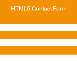
HTML5 Contact Form which has a unique design and it looks professional. It is clean and fresh modern design contact form with validation which makes your website outstanding. It’s SIMPLE and works well with HTML5 Validation. It’s styled with CSS3 and designed to fit your website. It’s easy to customize. The fields included in this form are full name, email, subject, phone, and message. All the form fields have an icon which makes sense of the input fields. You can customize it very easy as you want it to be and can add more fields into form by simply copy & paste the few lines of HTML code. Our HTML5 form comes with many impressive features. One of the features is form validation without using any JavaScript or jquery. The HTML5 form validation little restricted to browser support, and it didn’t support old browser version especially IE. But the good thing, it is a responsive contact form and looking good on all type of screen resolution.
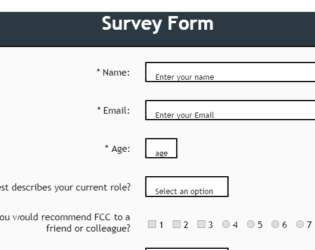
The snippet is of Survey Form. This form encloses all the data in RowTab control. The form consists of text, labels, select option, a radio button with multiple checkboxes. The CSS file mentions in the attribute, and classes for styling. Once you are done with the form, click submit. All the fields are marked as required. The width and height of different screens are defined. Each attribute has some style attached to is class. This form asks for name, email, age, role, suggestions, improvement lists.
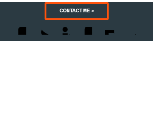
This is an awesome example of Expanding Contact Form which can be used in web pages. The contact form is been shown only when clicked on the “Contact Me” button. The complete code is placed in the tag, which uses the class like FooterSocial. To contact using social media, we have placed icons respectively. A CSS style is been applied for all the classes and controls used in this snippet. The JavaScript code gives an additional feature to slide and toggle the panel when clicked on the “Contact Me” button. Once the simple form of contact me appears, you can add the details and click on submit button. Check the input fields in the form, they are marked with the required attribute. Note the input name “client” has required attribute marked with the input pattern. The form uses HTTP “post” method to submit the details.

This is the example of tracking progress form. It basically tracks the form completion. It has a Javascript code which runs while the user completes the form. It displays the message according to the percentage of completion of the form. The HTML consists of a simple form, which wraps the progress bar and progress message. Each FormControl is wrapped by class Field. Each field is marked with required, which makes it mandatory to fill the input field. Note the Select tag with options defined for CardMonth and CardNumber. At last, we have input with the class button. CSS style format is defined from body of HTML to the button at the bottom. In JS file attribute for the progress is checked and accordingly message and progress at a progress bar is set. Once the form is completed we can submit the form using HTTP “post” method.

This is an excellent example of a Footer. Footer is an additional navigation method for websites. It holds company info, copyrights, links, buttons, etc. This snippet contains classes like FooterTop, FooterBottom, FooterTitle, FooterLogo, FooterSocial. Check out the CSS settings in tag of HTML. We will be using font awesome for icons. Footer tag of bootstrap sets the stage for footer in HTML, the contains of the footer is placed in the class “container”, it deals with responsive behavior of the page. The row is divided into 4 parts and each part contains respective info which is using its individual style sheets. Check out the table class inside the footer. Each class and tag has its own style defined. Check out the hovering style defined for the button.
Simple footer
4.3.1