Today I would like to share the design process of an ecommerce theme that I recently designed. Shopdock is an Ajax ecommerce theme where the user can quickly add/remove items to the cart with a single click. It is actually inspired by one of my sites, IconDock. The design process was quite challenging to make an Ajax shopping cart with a responsive design. I will explain why certain design directions are taken to handle the design challanges for both desktop and mobile.
Planning
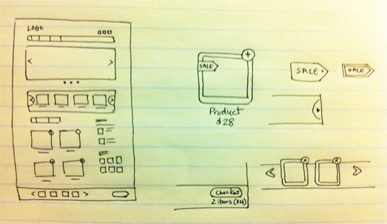
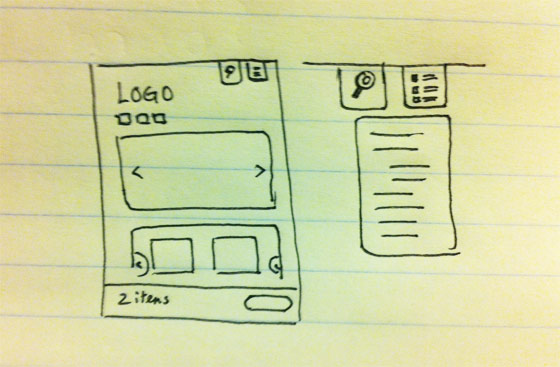
As shown in the "Responsive Design in 3 Steps" tutorial, the technical side of creating a responsive site is very easy. It is just a matter of using media queries to reset the layout elements on specific viewport width. Planning the responsive layouts is rather more important. Each layout (break point) should be planned. In other words, you should plan out the layouts for desktop, tablet and mobile. Below are the sketches I made for the Shopdock theme.
Desktop
Mobile
Mockup and Prototype
Usually I only design a mockup for the desktop version. The tablet and mobile version is done with CSS while prototyping the templates. Because there are way too many devices and different resolution, it will take too much time to test the design with each device and resolution. I find the best way to test responsive sites is by resizing the browser window. Testing on the actual devices (iPad, iPhone, etc.) usually done at the final phrase when the prototype templates are completed.
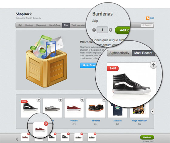
Ajax Shopping Cart
One Click to Add Products
The user can add/remove items to the dock instantly by clicking on the add/remove icon. It makes the shopping experience much faster and easier compared to the traditional shopping cart where user had to click back to the shop.

Product Lightbox
If the product has variants such as size and color options, obviously the single-click add item will not work because the user needs to choose the selection. So a lightbox window with the product options will pop for the user to pick.

However, the lightbox solution doesn’t work well on mobile due to the small screen. Instead of popping the lightbox window, it will direct the user to the product page.
Shop Dock
The dock is invisible initially or when it is empty. When an item is added, it slides up beautifully. It is in a fixed position at the bottom of the page so the user has an overview of the cart. When an item is added, the product thumbnail is placed at the beginning of the dock so the user is aware when an item is added. The number of items in the dock is updated instantly. The loader animation appears whenever the dock is processing (whether adding or removing items).

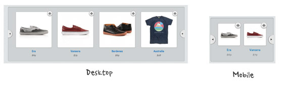
On mobile version, the product slider on the dock is hidden. But the cart total, loader animation, and the checkout button is still visible so the user knows what is in the cart.

Product Slider
On the desktop version, the product slider is set to display 4 items at the same time. But on mobile, it resets the visible item to 2 to maintain a good size of the product container.
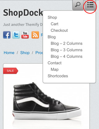
Mobile Navigation
When creating responsive design for mobile, another challange is designing the navigation menu. If the site has 3 or 4 buttons, then it is fine. But if the site has more than 6 buttons, it often ends up with a unpleasant result where the buttons stack on top of each other (like the screenshot below).

To solve that navigation layout issue, an icon/button is used to toggle the menu. The user can toggle the search form and the navigation by clicking on the icon. This approach is widely used on many mobile sites.
ExoticKnight
Inspiring!
murat
impressive and original.
Mindfree
Great jop! I love your design.
Norvik
I like your minimalistic and clean design! :)
Gary
Nick, the Ajax easy to use shopping cart integration is excellent. I’ve ‘played’ with ShopDock quite a bit and the speed and ease of use is excellent. looking forward to more ecommerce themes with this functionality :-)
Pepper Time
cool
thank you very much
The Vector Box
Great insight! very impressive.
MezoraDesign
Nice one. I like the simplicity of your design and the use of the white space as well.
william
非常漂亮,,也很简洁,适合用户操作。
hediye
good jop, very impressive.
Pawel
As stated above, very impressive and inspiring. In most of the shops when you add a product to the cart you are taken from the place you have been before, so it’s a bit of confusing.
NJ SEO
I absolutely love this design. Very user friendly.
Menj
wow!! thanks for this great idea! :)
Min
Nicely done!
Highersite
It is impressive post.I am felling glad on this article.can you more share with me.I have many ideas about it.I will come back as soon.
Thanks for more sharing…..
website development Boston
RC
Simple and great Design
Prem Poonom
Hi, You post a most important website designing article. I will be take your service recently.
Thanks
Prem Poonom
“website applications Boston”
Aaron Neville
Wow. Great insight. Also, this degrades so gracefully sans JS!
Hassan
Very Nice Done! Love it!!
Mark Roberts
Lovely slick design, only thing I would question is the ‘plus’ icons to add the items to the cart as i think intuitively this indicates an enlarged view rather than adding to the cart, maybe a cart or buy icon would work better?
ImpressionWebStudio
great chance to learn professionally website planning process
London website design
I love the theme. It works very well and is very clean.
custom icon design
Very inspirate to me. I like the article like this.
Many thanks.
Joe
Wow, I still have a long way to go before I come close to your level as a web designer. But thanks for the inspiration!
marcalow
Great design.
Melbourne web design
wow nice. did not know Ajax had such a component, (I am new to the Ajax word unfortunately), well you know what they say better late than never. Joe
Jasa Pembuatan Web
Very simple process…
I like it
yudali
nice theme. keep going
Jat
Liked it :)
Tim
Great looking theme. The only problem is the cart location. We have done A/B testing where I work and very few people are going to see that little footer popup for their cart items. They are going to wonder how to get to their cart page to checkout.
I would HIGHLY recommend placing a link in the header for the cart. Actually, making that bar slide down from the top of the page is a much better solution that will lead to higher conversions.
Just passing along what I’ve learned designing ecommerce sites.
sampada
Nicely explained!
Thanks a lot.
Angela Brown
Attractive blog. Using images are too much beautiful.
Gareth
Wow, nice work there.
Paul Weston
Thought this was a great article and one that will very useful to me in the future. I really like your thought process behind the site and the way you have planned is something I am going to take on board for when I approach projects like this one. I also really like the design of the site you have produced, it has very clean a fresh feel through the use of colour and layout for both the desktop and mobile versions.
Manual
WoW, a great and attractive work.
Tiffany outlet
Vielen Dank für diesen wunderbaren Beitrag. Bewundern Sie die Zeit und Mühe, die Sie in Ihrem Blog und detaillierte Informationen bieten.
quizzes
Beautiful work. Apple has inspired the whole world.
quizzes
I also liked the attention to detail in every element of design.
John
Ektaah, a crowd-funding platform, is launching a design contest to determine our logo and web design. The winner will receive an Apple iPad!
For more information and to find out how to win go to http://www.ektaah.com/web3o/node/68
Chien
no demo????
Think360studio
Hi everyone. I heard about Ajax but i didn’t know how to use it in ecommerce theme. I really enjoyed this article and learns lot. Thanks for sharing this article.
Craig Smith
I like the quick shopping cart experience. I have been playing with opencart and I believe they have the same ajax driven feature with their cart as well. Way better process than the traditional shopping cart website.
magazin
This does look like a great theme.
Aquaster webdesign
This is a great step in usability in webshop carts. The only thing you could think about is delete 1 item of 2 of the same. This is not possible at this moment in the webshop. Nice webdesign!
DiegoQ
Great strategy.
There is a way to decrease the page´s weight, recognizing the user screen size, using javascript; I think this should be done, because of the size of images; if u are on a mobile could be hard.
طراحی سایت
Thanks dear. usefull
Kamil - plywanie
Damn, I’m a backend programmer. I envy you for your frontend skills.
ch kwok
great… hope this theme is free …. :)
Carl Samuelsson
Great work! May I ask what your experience is with systems like Magento or Opencart?
Drupal Web Designer
This will be a great theme for the stores and it will help them sale easily and fast.
Nathan Giesbrecht
Thanks, this is helpful. I’m about to embark on a redesign of a network of e-commerce sites, with responsive design being the main reason of doing so. You’ve given me some great ideas, thanks!
Meleny Swanson
Really great to see behind the scenes; most people don’t know all the work that goes into a successful site!
Grapic Man Ricardo
Conversion optimization at its best in the real world. So many people get so involved in the science that they forget about the impact of aesthetic appeal overall. Nice work on the navigation toggle. I would have tried to do the same.
Kenzie
Shrink, Share & Get Paid!
Post your Links on Facebook, Twitter, Blogs & Websites!
Go To http://http://netfly.co/V to get paid for your posted links!
Kenzie
Shrink, Share & Get Paid!
Post your Links on Facebook, Twitter, Blogs & Websites!
Go To http://netfly.co/V to get paid for your posted links!
Rak
I just love the simplicity. Thanks for sharing.
Alquiler yates Ibiza
I have been playing with opencart and I believe they have the same ajax driven feature with their cart as well. Way better process than the traditional shopping cart website.
shauraj
can u tell me plz, how u add price filter slider in the 3rd image above….
shauraj
or atleast tell me the website link dat whr i cn find that runing shoping cart,including price filter…
thnks..:)
seo
This will be a great theme for the stores and it will help them sale easily and fast.