CSS2 allows you to specify stylesheet for specific media type such as screen or print. Now CSS3 makes it even more efficient by adding media queries. You can add expressions to media type to check for certain conditions and apply different stylesheets. For example, you can have one stylesheet for large displays and a different stylesheet specifically for mobile devices. It is quite powerful because it allows you to tailor to different resolutions and devices without changing the content. Continue on this post to read the tutorial and see some websites that make good use of media queries.
CSS3 Media Queries (demo)
Check my demo and resize your browser window to see it in action.
Max Width
The following CSS will apply if the viewing area is smaller than 600px.
@media screen and (max-width: 600px) {
  .class {
    background: #ccc;
  }
}
If you want to link to a separate stylesheet, put the following line of code in between the <head> tag.
<link rel="stylesheet" media="screen and (max-width: 600px)" href="small.css" />
Min Width
The following CSS will apply if the viewing area is greater than 900px.
@media screen and (min-width: 900px) {
  .class {
    background: #666;
  }
}
Multiple Media Queries
You can combine multiple media queries. The following code will apply if the viewing area is between 600px and 900px.
@media screen and (min-width: 600px) and (max-width: 900px) {
  .class {
    background: #333;
  }
}
Device Width
The following code will apply if the max-device-width is 480px (eg. iPhone display). Note: max-device-width means the actual resolution of the device and max-width means the viewing area resolution.
@media screen and (max-device-width: 480px) {
  .class {
    background: #000;
  }
}
For iPhone 4
The following stylesheet is specifically for iPhone 4 (credits: Thomas Maier).
<link rel="stylesheet" media="only screen and (-webkit-min-device-pixel-ratio: 2)" type="text/css" href="iphone4.css" />For iPad
You can also use media query to detect orientation (portrait or landscapse) on the iPad (credits: Cloud Four).
<link rel="stylesheet" media="all and (orientation:portrait)" href="portrait.css">
<link rel="stylesheet" media="all and (orientation:landscape)" href="landscape.css">
Media Queries for Internet Explorer
Unfortunately, media query is not supported in Internet Explorer 8 or older. You can use Javascript to hack around. Below are some solutions:
- CSS Tricks – using jQuery to detect browser size
- The Man in Blue – using Javascript (this article is written 6 years ago)
- jQuery Media Queries Plugin
Sample Sites
You need to view the following sites with a browser that supports media queries such as Firefox, Chrome, and Safari. Go to each site and see how the layout responds base on the size of your browser winow.
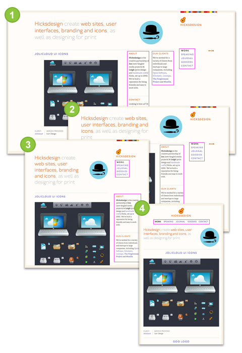
Hicksdesign
- Large size: 3 columns sidebar
- Smaller: 2 columns sidebar (the middle column drops to the left column)
- Even smaller: 1 column sidebar (the right column shift up below the logo)
- Smallest: no sidebar (logo & right column shift up and the other sidebar columns move below)
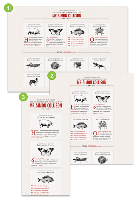
Colly
The layout switches between one column, 2 columns, and 4 columns depend on the viewing area of your browser.
A List Apart
- Large size: navigation at the top, 1 row of pictures
- Medium size: navigation on the left side, 3 columns of pictures
- Small size: navigation at the top, no background image on logo, 3 columns of pictures

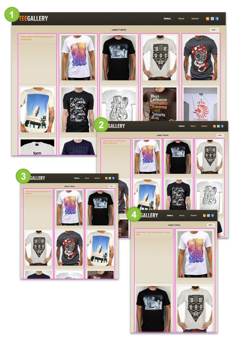
Tee Gallery
This one is very similar to previous example Colly, but the difference is the images of TeeGallery resize as the layout stretchs. The trick here is use relative percentage value instead of fixed pixel (ie. width=100%).
Conclusion
Keep in mind: having an optimized stylesheet for mobile devices doesn’t mean your site is optimized for mobile. To be truly optimized for mobile devices, your images and markups need to cut on the load size as well. Media queries are meant for design presentation, not optimization.
Chef de projet internet
Hi ! Your demo is not found :( –> https://webdesignerwall.mystagingwebsite.com/demo/media-queries/
Shaan Qazi
open the url at firefox (FF)
Brandon
CSS2??? Whoa, typo!
HTeuMeuLeu
Nice examples !
Ajay Karwal
Excellent tutorials and thanks for the tips about the iphone resolution and ipad orientation…
Martin
Using Javascripts for those effects since 2 years and pretty happy i can do it with css only now. Here our 4th magazine-issue from may done with media queries: http://www.designmadeingermany.de/magazin/4/
Joey
Nice post!
@Brandon
It’s not a typo, he’s referring to the previous CSS version, 2.
Eric
Does the orientation hook work on iPhones as well? Or just iPads?
Christopher Carlsson
Wow! Thanks alot, that really helped out a bunch!
stuart robson
7. Eric – No, the orientation hook only works on the iPad. :-(
oliver
thanks, good tips
Matthew
Awesome tips and a fantastic article.
Thank you very much for sharing.
Alojamento Web
Nice examples that you’ve got here.
It would be great if you could let anyone download it. As you did in the past.
Nick La
@Alojamento Web – To download the demo, go to File > Save Page As.
Hastimal Shah
Nice Post..
It will help me!!
Jason
Great post and another great tool to add to your CSS arsenal.
Robert Tobys
Excellent post. It will be interesting to apply to fluid HTML5/CSS3 layout on my new site launch in September.
François Royer Mireault
Well written and inspiring stuff. You make it sound simple, it gives us a bit of motivation to implement it on our sites. Thanks again.
Ryan
Eric, Stuart – It seems silly that the iPad, Safari 4 all support the orientation media query yet the IPhone doesn’t.
However, I came up with a solution to detect orientation using media queries for the iPhone check it out http://www.1stwebdesigner.com/tutorials/how-to-use-css3-orientation-media-queries/
Irene
Great Article! Thx : )
Bible Online
It’s good article for me, it’s useful some times.
Puneet Sahalot
Perfect tutorial. Will surely give it a try on my website. Thanks for sharing :)
Kaye Media
Very good article
Abraham C. C.
thanks for the article :D it’s going to be very useful in a project.
Web design portfolio
awesome stuff.
Ben
Great article. Mobile design is definitely not a cosmetic only feature anymore and with the growing market of smartphones, better start doing it by default i’d say.
Online Portfolio
Very helpful, can’t wait to utilize this. I wonder if you could target specific devices like the iphone/pad just by using CSS now…?
Micke Hasselqvist
Very well written article, thank you. I liked the examples you provided, makes it easy to follow along.
It’s just to bad that IE as usually won’t support these kind of things. I have great hopes for IE9 though, once it’s released!
Online Strategies
Great info. Media queries is a nice addition to CSS that saves us a lot of time and effort in making the website more user-friendly. The provided demo is very useful.
Waldio
Great Great Great. Your CSS tutorials are the best!
Hans Kuijpers
Very interesting tutorial. Thank you
suraZ
Hi,
Certainly I have off topic question. I can see that web designers struggling for cross browser compatibility. My question is, is CSS3 still usable for our website. We still have lots of people still using Internet Explorer 6 and other non-upgraded browser version.
I don’t think older version browsers supports CSS3. How much practical it is to design your website in CSS3?
Regards,
Webdezine Blog
crusher machine
Thanks for share.
Xaby Web Design
Helpful info there you have,this post saves me some time from searching. Thanks for your effort.
adikahorvath
nice article!
Vibe web design
Great Great Great.
Renan
Hei, I didin’t knoow about this.
Thank you a lot!
Richard Kotze
CSS 3 is pretty amazing! These media queries will certainly make life easier applying stylesheets to different browser sizes and mobile browsers. The iphone one is a good idea with the two orientations – simples. :)
Cesar Castro
That’s useful, too bad CSS3 is only on modern browsers, I have tested many CSS3 codes on older browsers and the page gets converted into a mess, I guess we would have to wait until most people upgrade their browsers.
wantfee
Thanks for sharing this. I have written it down on my notebook. IE is a mess so we have to wait for IE supporting this.
dan
see you in 2035!
NewMobileDesigner
I just went to the demo web page on my phone (Samsung Gravity, smaller than an iPhone). Unfortunately all the colored boxes were lit up at once…so something went wrong. It seems the entire web design community is struggling to find a working solution. Surely there must be a way to check the screen size on non-Apple (and thus, non-Safari) devices?
Ore grinder
Yes, with css3 and html5 ,we can imply many effect easily.
cheap balmain jacket
喜欢,订阅!
Freelancer web designer
Very Nice Article
Web tasarım izmir
thanks I will try all
zcwan
Learned
Jerky Oats
CSS 3 is going to help no end when developing websites! I wonder if IE will support this anytime soon?
great post.
Ardhy W. Nugroho
Hi,
Actually I was re-designed my blog to implement CSS3 media-queries — currently being optimized.
Thanks for the article, it gives me more implementation reference.
/dhy
GeanD
great job guys..thanks
mobiper
Now THIS is called story.now i am waiting for another
Michael Molino
Very informative and inspirational article! The same goes for the entire site. I’ve added you to my “must read weekly” right along with the likes of Alist Apart. Please keep up the good work. We budding web developers need out heroes!
bankruptcy attorney in los angeles
The codes are really great…
Loans Halifax
Thank you for this post, it really help me a lot… Thank you guys…
Sandy Wright
Great article-will definitely use some of the tips included here! Thanks!
Thomas
this css is very good and it is beautiful theme
I will take this for my websites
ospop
Very well written article, thank you. I liked the examples you provided, makes it easy to follow along.
Thomas
Nice CSS
but it not appropiate with my website
Ozon yağı
great css coding
ospop shoes shop
Great info. The provided demo is very useful.
kenny
Searh jobs
12,257,378 new jobs in the last 7 days
inpeed.com
chinese new year
Very informative and inspirational article! The same goes for the entire site. I’ve added you to my “must read weekly” right along with the likes of Alist Apart.
Mack
Very nice article, thank you.
I like the examples you provided.
videodikha.blogspot.com
paslanmaz çelik boru
ccs3 very well compenent for web browsers
Space toys
this is really cool. simple yet powerful
lyuda
I was reading something else about this on another blog. Interesting. Your position on it is diametrically contradicted to what I read earlier. I am still contemplating over the opposite points of view, but I’m tipped heavily toward yours. And no matter, that’s what is so great about modernized democracy and the marketplace of thoughts on-line.
Sensitive Designs
This is a cool thing… !!
Cogo
I’ve been using media queries on a few projects and much prefer this method than building a seperate mobile site or something running off a javascript framework like sencha.
This is the way forward..
Rob Hiffy
css 3 has some surprising quirks! Loving the new things it does though. Great blog, keep it up!
Business creation
Totally informative, Thank you for all the efforts in sharing your talents with us.
Remy Hair
This is really a big help to my page. thank you
Kansas City Web Developer
Well written, thank you
意美
you get it !
Web Design Hull
Useful article, thanks… can’t wait to start using CSS3 on a regular basis!
Tech2connect
nice post thanks for a lot sharing with us
malaysia web design
great post….thanks for sharing….
怎样减肥
Totally informative, Thank you for all the efforts in sharing your talents with us.
Melvins
Really, you have done great job. I enjoyed while reading this one and also inspired me too much. I will use this theme on my blog as well as website. I like it very much. Thanks for upgrade my knowledge.
Los Angeles Web Design
URL Send
The iPhone specific stylesheet is a great help, thanks!
Billig hjemmeside
My site looks better on Iphone – thanks to You
premier pixels
I really like your information.Thanks for sharing.
Fausto Rone
Utile article peut I mention ceci sur le mon emplacement ? Merci
accounting tracking
SDfasdfsdadasfsdfdfsfsdfsadddddddddddddddddddddddddddddd
ertretre
wow that’s great :)
whiteiphone4
Oh God you are a genius person and a good photographer i like your pics thanks.
Henry Peise
white iphone 4 is so charming and chic. As the icon of latest fashion, how can you miss it!
pandora8
Thank you for all the efforts in sharing your talents with us.
Juno Mindoes
But to really see the difference between these cameras I put together an overview containing 100% crops. It’s not fair comparing the white iPhone 4 with an 18 megapixel DSLR but it’s good to have as a reference.
clark david
Great Information and post! It is very informative and suggestible for the user of solar energy, May I think it can be beneficial in coming days…
facebook apps
nice posting and helpful info.
Uçak Bileti
css3 teknolojisini hep beğendim
Rebecca
Love the article and I’m always finding very useful stuff on your site.
One issue I have been having with media has shown up with your demo as well. I viewed the demo on a phone and both the grey and blue box highlighted along with not fitting to the screen. I’m not sure what the issues is but it’s like a lot of phones think they have a width of over 900px but just viewed at a small size. So everything is as if you have a 900px browser just seen from far away. I hope you understand what I’m talking about. Do you know why and maybe even have a solution?
Ben
Thanks for sharring importent information in this blog.It was very nice.
sanober
Nice Blog and very helpful…it’s very beautifully explained.
DMailula
Thanks for a nice article, was just about start doing the same stylesheets for my application..you rock!!!
tütüne son
Thanks for sharring importent information in this blog.It was very nice.
John McDuffie
Very handy. This will solve one of the issues I’m having on my image hosting site.
Grzesiek
Świetnie opisane, bardzo przydatne. Nie moge doczekać się kolejnych artykułów!
Fine writing, very helpful. Can not wait for the further articles!
:)
Ralph
First, i saw your demo and i don’t know, why should i use on a website. Your article help me to understand the possibility of this methode of css3. Thank you.
Ralph
erin
cool stuff
Desiree
Thank you for this. It’s going to help a lot!
Mohd Irfan
Gr8 Information Big Bro
Mohd Irfan
But tell me one thin how can i test my diffrent stylsheet any testing software r u know if so plzzz tell me
sumomax
is not easy to put on weight
Ladida Cafe
yes, I think it needs some experiments #lol
Sriramajeyam
good work.. thanks for sharing.. http://mediaqueri.es/
Aravind
Really nice stuff….thanks
dom
Hi,
I try to use the CSS @media screen and (max-width: 600px)
and @media screen and (min-width: 600px) and (max-width: 00px)
unfortunatelly the first one (max-width: 600px) Works only in the head section of the page and not on a separate stylesheet.
I wonder where the problem is!
dexx
Recent surveys, children of depressed mothers’ negative patterns of activity occurring in different brain reveals. This is for children of mothers who take more risks in the future is going to have depression.
Rinja
Thank you for this, helped a lot <3
sawebdesigns
just what im looking for thanks
Ksgr
Awesome!
iDesignWallpaper
I am learning CSS3, this is a very useful tutorial for me, thanks!
tommi
this helps a lot
thank you so much
Tuan
Can you view a website inside your website but it will automatically be smaller like the examples shown above ?
چاپ
thank you so much
Mont Blanc Pen
What is friendship?Mont Blanc PenWhy do we call a person our friend? When do we call someone a very good friend?
Mont blanc Pens
thank you so much
complex41
And then he handed you the thirty-five 45
orhanbt
This is verry good.
Tory Burch Sandals
I can wait to give it a shot ASAP after I get the pattern. Thank you for your punctuality on posting the tips which really help a lot!
mont blanc pens
a good article!
mont blanc pens
private investigator detective
R.Q. Investigations specializes in a range of investigator services. The private investigator detective offers you a high level intelligence and analysis service molded to suit your requirements and handles investigator services with personal care and diligence.
hip replacement recall
For depuy hip replacement recall information or regarding depuy hip replacement recall lawsuit , you can contact the expert New York personal injury lawyer.
wellensteyn jacken
Wellensteyn-Jacken werden getragen von qualitätsbewussten Menschen, für die Stil und Outdoor-Bekleidung keinen Gegensatz darstellt. So sind die funktionalen Jacken mittlerweile Alltag auf den Straßen deutscher und internationaler Großstädte.
Translation Services
I love the tutorials on this blog, keep up the good work.
Victoria
Hi!
Thanks for the lovely demo!
That really inspired me to keep reading.
Really great article!
Would it be to much to ask for a demo .css that one can download?
I just know there’s something I’m doing wrong cause my website I’m working on doesn’t change the when I browse it with my phone.
Thanks for all the tutorials and a Happy new year!
Andrew
Good article!
How does this work when the user changes orientation? E.g. Portrait to Landscape and vice versa? Using the “max-width:480px” I have had trouble when I go from portrait to landscape on an iPhone the page looks great in portrait but then scales when I go to landscape.
@urielink
You saved me! i understood now this stuff. :) Beautiful site!
Rajeev
Excellent tutorial, thank a lot. Worked like a charm!
Ivan Bayross
This is a superbly written tutorial. Its language is simple and easy to understand.
I thoroughly enjoyed reading and understanding its content. My drive is to create a flexible Joomla template based on the information I’ve read in this tutorial.
If you have a minute, please take a look at http://www.opensourcevarsity.com it has a ton of tutorials on opensource tools and technologies.
I wonder if you would consent to doing a Guest Post, or writing a tutorial for OSV.
Regards,
Ivan Bayross
Madhab Saha
Please tell me how to solve in IE.
dean
dont worked in Chrome either
Manie Desfosses
This specific are getting to be good yet again routines when assists you to loosen all the spinal column and likewise sleep thoroughly without the go through on the subject of kind with your once again.
Helge-Kristoffer Wang
I love the articles on site! Mostly quality articles, and that’s what makes me come back! :) Keep up the good work!
dready
Good tips! Thanks :D
resimler
The closing date is May 2012 right ?a
The SEO & Translation Agency
A very useful post as mobiles are becoming such an important source of traffic and we are currently researching how to improve the experience for our users. Thanks a lot, will be coming back!
Al Lemieux
Everything worked except for max-device-width. Can you please explain the rationale behind using max-width vs. min-width. It’s a little confusing.
Bala
Very Clear tutorial Keep up the Good work……
Thank you so much.
Bala
Very Clear tutorial Keep up the Good work……
Thank you so much.
I am very much interested to know how to use the with Phone gap..
Lallosh
Great tutorial I was wondering how some websites change their layouts according to the window size .
Webdesign Twente
Very nice examples, keep up the good work :)
Dart Supplies
Hi, the whole thing is going niсelу here and
οfcoursе еverу οnе is shaгіng facts, thаt’s really good, keep up writing.
Agustín
i see it! thank you!
muhsin
good
Gary
Thanks Nick. I was looking for a ‘min width’ solution and yours as described worked perfectly.
Florian
Nice tutorial but why I see the 4th box which should only appear on IPhones? Either Firefox or Chrome could interpret the device-width command… Or did I use it the wrong way??? Only max and min-width works for me, could you help me why?
Lindsay
Thanks Nick, this is just a great explanation, covering all bases nicely. Hugely appreciated!
Lee Goddard
Thanks for the most comprehensive and legible page on the subject! Great stuff, as always.
Gentle
really enlightened me on media query as a new guy in the field of web design…
thanks
UNICAC
GREAT!
Erneeraq Fleischer
I am trying to hide two modules, i have made custom css and put:
/* Smartphones */
@media (max-width: 480px) {
#full_left { display: none; }
#full_right { display: none; }
}
/* Smartphones to Tablets */
@media (min-width: 481px) and (max-width: 767px) {
#full_left { display: none; }
#full_right { display: none; }
}
/* Tablets */
@media (min-width: 768px) and (max-width: 959px) {
#full_left { display: none; }
#full_right { display: none; }
But they still shows in ipad/iphone…
Any idea?
Dymo Labels
hello sir
i really like your post
really nice collection
CSS3 media is best then CSS2
thanks