When applying CSS3 inset box-shadow or border-radius directly to the image element, the browser doesn’t render the CSS style perfectly. However, if the image is applied as background-image, you can add any style to it and have it rendered properly. Darcy Clarke and I put a quick tutorial together on how to use jQuery to make perfect rounded corner images dynamically. Today I’m going to revisit the topic and show you how much more you can do with the background-image CSS trick. I will show you how to use box-shadow, border-radius and transition to create various image styles.
Problem (see demo)
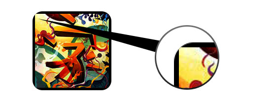
Take a look at the demo and note that there is border-radius and inset box-shadow applied in the first row of images. Firefox does render border-radius on image element, but doesn’t render the inset box-shadow. Chrome or Safari doesn’t render the border-radius and inset box-shadow at all.
Workaround
To get the border-radius and inset box-shadow working, the workaround is to apply the actual image as background-image.
Dynamic Way
To make it dynamic, you can use to jQuery to wrap the background image dynamically for every image element. The jQuery code below will wrap all images with a span tag and apply the image source as the background image (jQuery code by Darcy Clarke).
<script type="text/javascript" src="http://ajax.googleapis.com/ajax/libs/jquery/1.5/jquery.min.js"></script>
<script type="text/javascript">
$(document).ready(function(){

  $("img").load(function() {
    $(this).wrap(function(){
      return '<span class="image-wrap ' + $(this).attr('class') + '" style="position:relative; display:inline-block; background:url(' + $(this).attr('src') + ') no-repeat center center; width: ' + $(this).width() + 'px; height: ' + $(this).height() + 'px;" />';
    });
    $(this).css("opacity","0");
  });

});
</script>
Output
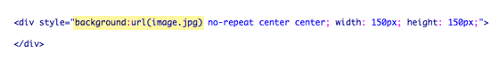
The above code will output the following HTML code:
<span class="image-wrap " style="position:relative; display:inline-block; background:url(image.jpg) no-repeat center center; width: 150px; height: 150px;">
	<img src="image.jpg" style="opacity: 0;">
</span>
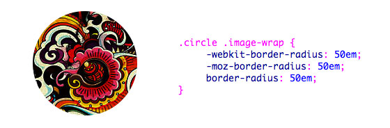
Circle Image (see demo)
Now that the image is applied as a background image, you can pretty much add any style to it. Below is a simple circle image created with border-radius. If you are not familiar with CSS3, read my tutorial on the Basics of CSS3.
CSS
.circle .image-wrap {
	-webkit-border-radius: 50em;
	-moz-border-radius: 50em;
	border-radius: 50em;
}
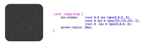
Card Style (see demo)
Below is a card-like image style created with multiple inset box-shadow values.
CSS
.card .image-wrap {
	-webkit-box-shadow: inset 0 0 1px rgba(0,0,0,.8), inset 0 2px 0 rgba(255,255,255,.5), inset 0 -1px 0 rgba(0,0,0,.4);
	-moz-box-shadow: inset 0 0 1px rgba(0,0,0,.8), inset 0 2px 0 rgba(255,255,255,.5), inset 0 -1px 0 rgba(0,0,0,.4);
	box-shadow: inset 0 0 1px rgba(0,0,0,.8), inset 0 2px 0 rgba(255,255,255,.5), inset 0 -1px 0 rgba(0,0,0,.4);

	-webkit-border-radius: 20px;
	-moz-border-radius: 20px;
	border-radius: 20px;
}
Embossed Style (see demo)
With some alterations, I can turn the card style into embossed style.
CSS
.embossed .image-wrap {
	-webkit-box-shadow: inset 0 0 2px rgba(0,0,0,.8), inset 0 2px 0 rgba(255,255,255,.5), inset 0 -7px 0 rgba(0,0,0,.6), inset 0 -9px 0 rgba(255,255,255,.3);
	-moz-box-shadow: inset 0 0 2px rgba(0,0,0,.8), inset 0 2px 0 rgba(255,255,255,.5), inset 0 -7px 0 rgba(0,0,0,.6), inset 0 -9px 0 rgba(255,255,255,.3);
	box-shadow: inset 0 0 2px rgba(0,0,0,.8), inset 0 2px 0 rgba(255,255,255,.5), inset 0 -7px 0 rgba(0,0,0,.6), inset 0 -9px 0 rgba(255,255,255,.3);

	-webkit-border-radius: 20px;
	-moz-border-radius: 20px;
	border-radius: 20px;
}
Soft Embossed Style (see demo)
This is pretty much the same as the embossed style, but I just applied 1px blur to it.
CSS
.soft-embossed .image-wrap {
	-webkit-box-shadow: inset 0 0 4px rgba(0,0,0,1), inset 0 2px 1px rgba(255,255,255,.5), inset 0 -9px 2px rgba(0,0,0,.6), inset 0 -12px 2px rgba(255,255,255,.3);
	-moz-box-shadow: inset 0 0 4px rgba(0,0,0,1), inset 0 2px 1px rgba(255,255,255,.5), inset 0 -9px 2px rgba(0,0,0,.6), inset 0 -12px 2px rgba(255,255,255,.3);
	box-shadow: inset 0 0 4px rgba(0,0,0,1), inset 0 2px 1px rgba(255,255,255,.5), inset 0 -9px 2px rgba(0,0,0,.6), inset 0 -12px 2px rgba(255,255,255,.3);

	-webkit-border-radius: 20px;
	-moz-border-radius: 20px;
	border-radius: 20px;
}
Cutout Style (see demo)
Again with just inset box-shadow, I can make it to look like a cutout effect.
CSS
.cut-out .image-wrap {
	-webkit-box-shadow: 0 1px 0 rgba(255,255,255,.2), inset 0 4px 5px rgba(0,0,0,.6), inset 0 1px 0 rgba(0,0,0,.6);
	-moz-box-shadow: 0 1px 0 rgba(255,255,255,.2), inset 0 4px 5px rgba(0,0,0,.6), inset 0 1px 0 rgba(0,0,0,.6);
	box-shadow: 0 1px 0 rgba(255,255,255,.2), inset 0 4px 5px rgba(0,0,0,.6), inset 0 1px 0 rgba(0,0,0,.6);

	-webkit-border-radius: 20px;
	-moz-border-radius: 20px;
	border-radius: 20px;
}
Morphing & Glowing (see demo)
In this example, I added transition to the image wrap element. On mouse over, it will morph from rounded corners to circle and add a glowing effect. The glowing effect is done with multiple box-shadow values.

CSS
.morphing-glowing .image-wrap {
	-webkit-transition: 1s;
	-moz-transition: 1s;
	transition: 1s;

	-webkit-border-radius: 20px;
	-moz-border-radius: 20px;
	border-radius: 20px;
}

.morphing-glowing .image-wrap:hover {
	-webkit-box-shadow: 0 0 20px rgba(255,255,255,.6), inset 0 0 20px rgba(255,255,255,1);
	-moz-box-shadow: 0 0 20px rgba(255,255,255,.6), inset 0 0 20px rgba(255,255,255,1);
	box-shadow: 0 0 20px rgba(255,255,255,.6), inset 0 0 20px rgba(255,255,255,1);

	-webkit-border-radius: 60em;
	-moz-border-radius: 60em;
	border-radius: 60em;
}
Glossy Overlay (see demo)
The glossy gradient overlay is added with the :after pseudo element in the example below.

CSS
.glossy .image-wrap {
	-webkit-box-shadow: inset 0 -1px 0 rgba(0,0,0,.5);
	-moz-box-shadow: inset 0 -1px 0 rgba(0,0,0,.5);
	box-shadow: inset 0 -1px 0 rgba(0,0,0,.5);

	-webkit-border-radius: 20px;
	-moz-border-radius: 20px;
	border-radius: 20px;
}

.glossy .image-wrap:after {
	position: absolute;
	content: ' ';
	width: 100%;
	height: 50%;
	top: 0;
	left: 0;

	-webkit-border-radius: 20px;
	-moz-border-radius: 20px;
	border-radius: 20px;

	background: -moz-linear-gradient(top, rgba(255,255,255,0.7) 0%, rgba(255,255,255,.1) 100%);
	background: -webkit-gradient(linear, left top, left bottom, color-stop(0%,rgba(255,255,255,0.7)), color-stop(100%,rgba(255,255,255,.1)));
	background: linear-gradient(top, rgba(255,255,255,0.7) 0%,rgba(255,255,255,.1) 100%);
}
Reflection (see demo)
In this example, I shifted the overlay gradient to the bottom to create a reflection.
CSS
.reflection .image-wrap:after {
	position: absolute;
	content: ' ';
	width: 100%;
	height: 30px;
	bottom: -31px;
	left: 0;

	-webkit-border-top-left-radius: 20px;
	-webkit-border-top-right-radius: 20px;
	-moz-border-radius-topleft: 20px;
	-moz-border-radius-topright: 20px;
	border-top-left-radius: 20px;
	border-top-right-radius: 20px;

	background: -moz-linear-gradient(top, rgba(0,0,0,.3) 0%, rgba(255,255,255,0) 100%);
	background: -webkit-gradient(linear, left top, left bottom, color-stop(0%,rgba(0,0,0,.3)), color-stop(100%,rgba(255,255,255,0)));
	background: linear-gradient(top, rgba(0,0,0,.3) 0%,rgba(255,255,255,0) 100%);
}

.reflection .image-wrap:hover {
	position: relative;
	top: -8px;
}
Glossy & Reflection (see demo)
In this example, I combined the :before and :after element to create a glossy image style with reflection.

CSS
.glossy-reflection .image-wrap {
	-webkit-box-shadow: inset 0 -1px 0 rgba(0,0,0,.5), inset 0 1px 0 rgba(255,255,255,.6);
	-moz-box-shadow: inset 0 -1px 0 rgba(0,0,0,.5), inset 0 1px 0 rgba(255,255,255,.6);
	box-shadow: inset 0 -1px 0 rgba(0,0,0,.5), inset 0 1px 0 rgba(255,255,255,.6);

	-webkit-transition: 1s;
	-moz-transition: 1s;
	transition: 1s;

	-webkit-border-radius: 20px;
	-moz-border-radius: 20px;
	border-radius: 20px;
}

.glossy-reflection .image-wrap:before {
	position: absolute;
	content: ' ';
	width: 100%;
	height: 50%;
	top: 0;
	left: 0;

	-webkit-border-radius: 20px;
	-moz-border-radius: 20px;
	border-radius: 20px;

	background: -moz-linear-gradient(top, rgba(255,255,255,0.7) 0%, rgba(255,255,255,.1) 100%);
	background: -webkit-gradient(linear, left top, left bottom, color-stop(0%,rgba(255,255,255,0.7)), color-stop(100%,rgba(255,255,255,.1)));
	background: linear-gradient(top, rgba(255,255,255,0.7) 0%,rgba(255,255,255,.1) 100%);
}

.glossy-reflection .image-wrap:after {
	position: absolute;
	content: ' ';
	width: 100%;
	height: 30px;
	bottom: -31px;
	left: 0;

	-webkit-border-top-left-radius: 20px;
	-webkit-border-top-right-radius: 20px;
	-moz-border-radius-topleft: 20px;
	-moz-border-radius-topright: 20px;
	border-top-left-radius: 20px;
	border-top-right-radius: 20px;

	background: -moz-linear-gradient(top, rgba(230,230,230,.3) 0%, rgba(230,230,230,0) 100%);
	background: -webkit-gradient(linear, left top, left bottom, color-stop(0%,rgba(230,230,230,.3)), color-stop(100%,rgba(230,230,230,0)));
	background: linear-gradient(top, rgba(230,230,230,.3) 0%,rgba(230,230,230,0) 100%);
}
Tape Style (see demo)
The :after is used here to create a tape like gradient on top of the image.
CSS
.tape .image-wrap {
	-webkit-box-shadow: inset 0 0 2px rgba(0,0,0,.7), inset 0 2px 0 rgba(255,255,255,.3), inset 0 -1px 0 rgba(0,0,0,.5), 0 1px 3px rgba(0,0,0,.4);
	-moz-box-shadow: inset 0 0 2px rgba(0,0,0,.7), inset 0 2px 0 rgba(255,255,255,.3), inset 0 -1px 0 rgba(0,0,0,.5), 0 1px 3px rgba(0,0,0,.4);
	box-shadow: inset 0 0 2px rgba(0,0,0,.7), inset 0 2px 0 rgba(255,255,255,.3), inset 0 -1px 0 rgba(0,0,0,.5), 0 1px 3px rgba(0,0,0,.4);
}

.tape .image-wrap:after {
	position: absolute;
	content: ' ';
	width: 60px;
	height: 25px;
	top: -10px;
	left: 50%;
	margin-left: -30px;
	border: solid 1px rgba(137,130,48,.2);

	background: -moz-linear-gradient(top, rgba(254,243,127,.6) 0%, rgba(240,224,54,.6) 100%);
	background: -webkit-gradient(linear, left top, left bottom, color-stop(0%,rgba(254,243,127,.6)), color-stop(100%,rgba(240,224,54,.6)));
	background: linear-gradient(top, rgba(254,243,127,.6) 0%,rgba(240,224,54,.6) 100%);
	-webkit-box-shadow: inset 0 1px 0 rgba(255,255,255,.3), 0 1px 0 rgba(0,0,0,.2);
}
Morphing & Tinting (see demo)
In the example below, I use the :after element to add a radial gradient on mouse over.

CSS
.morphing-tinting .image-wrap {
	position: relative;

	-webkit-transition: 1s;
	-moz-transition: 1s;
	transition: 1s;

	-webkit-border-radius: 20px;
	-moz-border-radius: 20px;
	border-radius: 20px;
}

.morphing-tinting .image-wrap:hover {
	-webkit-border-radius: 30em;
	-moz-border-radius: 30em;
	border-radius: 30em;
}

.morphing-tinting .image-wrap:after {
	position: absolute;
	content: ' ';
	width: 100%;
	height: 100%;
	top: 0;
	left: 0;

	-webkit-transition: 1s;
	-moz-transition: 1s;
	transition: 1s;

	-webkit-border-radius: 30em;
	-moz-border-radius: 30em;
	border-radius: 30em;
}
.morphing-tinting .image-wrap:hover:after  {
	background: -webkit-gradient(radial, 50% 50%, 40, 50% 50%, 80, from(rgba(0,0,0,0)), to(rgba(0,0,0,1)));
	background: -moz-radial-gradient(50% 50%, circle, rgba(0,0,0,0) 40px, rgba(0,0,0,1) 80px);
}
Feather Edge Circle (see demo)
The radial gradient can also be used as a mask to create a circle feather effect as seen in the example below.

CSS
.feather .image-wrap {
	position: relative;

	-webkit-border-radius: 30em;
	-moz-border-radius: 30em;
	border-radius: 30em;
}

.feather .image-wrap:after  {
	position: absolute;
	content: ' ';
	width: 100%;
	height: 100%;
	top: 0;
	left: 0;

	background: -webkit-gradient(radial, 50% 50%, 50, 50% 50%, 70, from(rgba(255,255,255,0)), to(rgba(255,255,255,1)));
	background: -moz-radial-gradient(50% 50%, circle, rgba(255,255,255,0) 50px, rgba(255,255,255,1) 70px);
}
Browser Capability
This trick pretty much work on any browser (eg. Chrome, Firefox and Safari) that supports border-radius, box-shadow, :before and :after. The unsupported browsers will fall back to the image without any styles.
Use Your Creativity
As you can see, you can pretty much create any image style with combination of :before and :after pseudo element. If you come up with more creative image styles, please share it in the comments.
Update: CSS3 Image Styles – Part 2
Also read CSS Image Images – Part 2.
182 Comments
Comments are closed.
Marlin Jackson
Great Post!
Thanks for sharing this…bookmarked and followed on twitter.
Joer
Nice job !
thanks
Web Design dubai
great job!!! the way you explained is very good. Let me try. thank you
David
Nick, this is a great tutorial. I thought the effects on ‘Morphing & Glowing’ were really cool. Could definitely use this to make a WP comments section more interesting.
Doug S.
I’ve done a bunch of testing and border-radius on images seems to work rather well currently without any extra finicky work. Or, at least, in my experience if their absolutely positioned it does. I haven’t done an exhaustive study and it was just WebKit (Safari/Chrome) and Firefox on the Mac. However, I would expect to find a similar behavior on Windows.
Likewise, with inset shadow if you position the image relative (or absolute, for that matter) you can use the :before pseudo-selector to create an absolutely positioned box with a width and height of 100% (goes just edge to edge of the IMG) and give that an inset shadow as well as a z-index to lift it above the image. Works the same as border radius.
Josh
Currently image elements do not support pseudo-elements, so unfortunately the second suggestion will not work.
Helle
wow … great! Thanks for sharing!!
Leon
The problem with the border radius and backgrounds can be fixed by using
http://css-tricks.com/7423-transparent-borders-with-background-clip/
Ralph
nice ones… especially the morphing and tinting demo.
Christian
So cool !
Thanks for sharing these tricks !
Pragmatic Design
Thanks. This could be very useful.
Andreas Greif
Whoa, that’s great! Thanks a lot!
Thorsten
Nice one. Thanks for sharing that!
Andy
very great css stuff… thumbs up and thanks for simple desription
Webdesign Stuttgart
Awesome! Thanks a ton for explaining the “make it a background image” fix. Can’t tell you how many hours i had wasted trying to apply some CSS3 directly to the img.
Lauren
! :D Thank you, I love it! This is just the issue I have been grappling with on my portfolio, I have tested your code and styles out and it looks darn swell. Now I am fast at work writing it in. Thanks again so much!
Ed
Very nice examples!
firdaus
working great.. thanks for sharing
Alessio Atzeni
Wow, beautiful post and very useful tips!
Daniel
I have problems with the jQuery Code.
I’m using Drupal, so i added the code and cleared Drupal cache. On the first time I load the page, die images are wrapped correctly and everything looks nice. When I hit the reload button, the images are not wrapped anymore. It seems, that Safari & Chrome (OSX) caches the images and reloading the page doesn’t trigger the jQuery .load() function. I don’t have a solution yet, but for me it is not working in all situations/browsers. I even had the problem, that jQuery assumes a width & height of 0 for these cached images, so I added if($(this).width != 0){ … } to the code. In iOS Safari and Firefox (OSX) it is working correctly.
Daniel
http://api.jquery.com/load-event/
It doesn’t work consistently nor reliably cross-browser
It doesn’t fire correctly in WebKit if the image src is set to the same src as before
It doesn’t correctly bubble up the DOM tree
Can cease to fire for images that already live in the browser’s cache
So there are known issues with the img .load() function vs. browser caching. The annoying thing is, that is works on the first page load. When a user reloads the effect is gone – that really destroys User Experience. Maybe someone finds a solution here…
Pat
You can use this plugin to trigger your load event consistently across browsers and even when the images are cached. https://github.com/desandro/imagesloaded
Daniel
Great, that module is working!
Thanks
bob marteal
Great mini-gallery of fun tricks. Thanks for putting it together.
Sonja
Awesome post!!! All the effects one might need in one ;)
YET, seems like Opera doesn’t render them properly….
I don’t see how, since it’s codded for all renderers…
:?
Edu Agni
The CSS3 is still limited for some things. Good tips, thank you ;)
Patrick
Is there a Code-Snippet similar for MooTools?
Josh
Just a heads up, Chrome and Safari do render the box-shadow, it just sits behind the image (which is as good as not rendering it at all). They both render border-radius correctly.
Jon Osmond
awesome.
hyvaa
Really Awesome!!!!! :-)
Thx-
MOB Design Group
What a sweet post, I’ll certainly be implementing these immediately and referencing this post for a long time. As always, fellow designers like myself appreciate the effort!!
Damian
Gotta give you wraps on this, some really great work. Your code will come in very handy, hope the credit I pass on will also. Cheers
JB Web Design
This is an awesome post. Loads of good CSS3 detail. Good work
Francisco Sáez
Thanks for sharing such a great work. I’ve bookmarked this post and surely I’m gonna read it serveral times in the future.
Maulik Bengali
Awesome stuff.
Krsiak Daniel
super post
ninja skills :]
John Walker
Some great examples definitely going to look at working with some of these.
SztupY
Strange to see something that works default on IE10 (maybe IE9 too, haven’t tested), but fails on Firefox/Webkit. It used to be the other way around :)
kalen
An epic post. Great tutorial. Another Wall jam.
clairence williams
Those are awesome tricks. I’ll definitely be experimenting with the ideas here.
One question: whaddya do when the user has js turned off?
Michael Elfassy
If you are using Rails, see my post below :)
zazui
Very useful.’s Too late tonight, tomorrow, according to the next case study. Thank you to share!
Michael Elfassy
Here’s the rails way of doing it for all images: https://gist.github.com/1239460
Gaurav M
Nice!! 1 on the wall.
Bobs
What about IE 9? Nothing works, couple reloads do fix the border radis but antoher reload and things are gona again. In FF & Chrome everythings works fine.
Imobiliárias Jundiaí
Wow! This is really nice! No photoshop needed to do lots os cool stuffs. Tks!
Sammy
Awesome tutorial – thanks! :D
Saeed Neamati
Great, you just covered almost every part of every effect one can apply to images using CSS3. This article worth that much that I actually bookmarked it for future reference.
I don’t know why Microsoft doesn’t get along the standard path to implement these cool stuff.
Just one note, and that is, I think Safari supports real reflections. I don’t know for sure, though.
Non-profit Websites
amazing!I wish I can do that, I wish am good as them :)
freelancehyderabad
really need full tutorials thanks :)
Natalie Dewhirst
Brilliant and helpful as always! Thanks for sharing.
Tony
So great! Thanks
Web design london - Evan Skuthorpe
Very cool! I’ve bookmarked this!
Helena Moreno
Awesome! Very interesting explanation and demos, they will be very helpful for me :)
Thanks.
Michel Reyes
I try to see the examples on ie (Internet Explorer) but all is bad, how can i get a script to see this example in ie? Thanks
Hola, he intentado ver los ejemplos en internet explorer y todo a salido fatal, no se ven como deben ser. ¿Hay algun script que permita ver los efectos en Internet Explorer?
designer
nice effect
Paul Santosh
This is really super awesome!!!!!!
Beben Koben
it’s so very very usefully…thanks a lot \m/
Brian
This is a great write-up. I’ve been working on image styling for mobile websites and I really appreciate the detail you go into here.
web site design
very nice web site design..:)
SEO Copywriting Services
WOW – Amazing TUT as normal – Very well done!
Olivier Nolbert
Great, efficient, useful…
Thanks a lot !
mybookmart
wow it’s useful nice one
Ian Feather
I combined a few of these effects on my site a while back: http://ianfeather.co.uk/ian-feather-portfolio/
I think as with everything these effects should be used sparingly. That said there are cases where they can work very nicely.
blazicke
Cool & useful!
AFI Aveyron
Very interesting and very useful soon
StarterWebsite's Design Pete
Choice, will remember and use this!
MediaCore - The Web Specialists
Awesome can’t wait to use this, css3 is pretty exciting stuff!
sara
Great tutorial, its helping me to justify the error
Ryan from Saskatoon Web Design
Very useful post thanks a bunch!
Dan Freeman
Great stuff here!
Yulia
Thank you so much for that!!! It’s exactly what I needed and you saved me hours of work!!!!
Web Design Hull
Thanks for some very handy hints
Airen
Good tutorial, so I learned a lot techniques. I really like your tutorial, I hope you can always give us such a good tutorial. I intend to put this translation into Chinese, into my blog. Well, thank you very much.
Susan
thanks for share tips :)
ucuz beyaz eşya
thanks you .
Dean
Great blog!
Techno Web Mart
css3 is pretty creative
Аквичоп
Good tutorial, its helping me.
Tiago Kall
Really cool effects! but I also loved the artwork! who’s the artist?
Md Shahnur Arefin
It’s a nice post. I would be great if you share source file with us.
David
The Embossed Style is Awesome.
Jay
Thanks for the tutorial! The more you can post about CSS3 the better!
web design
wow this is truly awesome! good job and thanks for the tutorial man :D
Geert-Jan
The ‘cut-out’ style is exactly what I’ve been looking for. Thanks a lot!
margo
Thanks for the tutorial. Nice post
Nora @Logo Design
Wow, amazing images, As a designer this is such a very useful post! thanks for these tuts!
David Mundell
Really cool that you add the CSS code to the blog
search engine marketing optimization services
OOOO!!!! Thats cool… Really like the posts. Thanks for such information.
JNsites
Awesome!! Thanks a bunch.
Web Design Malaysia
The bit on browser compatibility saved us! thanks!
getdatinfo
http://www.1hunnit.com | #1 Trusted for Webhosting SSL Certificates Reseller and MORE!!
under $2.75 Webhosting (GOOD FOR WORDPRESS!!)
วิธีทำให้ผิวขาว
Awesome tutorial. I’ll use with my next website.
nino
owh thats great very cool
i love multimedia
adumpaul
Great tutorial of CSS.Realy useful thanks.
Merlin Mason
Good work, this is pretty damn awesome!
I just tried a little test and it seems to work well (only tested in Chrome) using the HTML5 figure element, may be of interest to those who love there semantics!
Check it out – http://jsfiddle.net/MerlinMason/U6fCS/
Lenny Terenzi
Excellent!
Rilwis
Awesome! The technique is cool and so are the effects. I’ve bookmarked this page for reference.
Brian Gervais
Fantastic! Thanks for the article.
Sylvain HUCK
Very useful, thanks for this article.
John Huff
So much to digest. Is there a way to print it off the screen, with all the coding which is showing horizontal scroll bars?
TheWebSquad
WordPress Blogs have become a staple in website development and absolutely needed for content rich and ever growing sites. Theme’s and theme development is an excellent way to gain control of your WP integration.
gabestevy
great post, nice share..
Non-profit web sites
Nice one.Very informative.
oDigital901
Nice tutorial! and very important .. I will save this link for later implementation!
Ralph Almeida
great article! but do you know if google images shows images that were set in background?
adumpaul
Awesome tutorial.Thanks you for sharing!
Mike Yasieniuk
Definitely the best resource i’ve found for CSS3 image manipulation. Thanks!
Hector Cervantes
Hi, awesome tutorial, you really show what can be done with css3.
I have a question, I’m working with templates, so can’t change html, and I’m trying to apply some tinting to a JPG images, but the inner shadow does not come over the picture, any idea how to make it straight to the picture?
Thanks
ταπητοκαθαριστηρια
This is Great tutorial! I think css3 is the future.
thanks
Trey
This is great stuff; very inspirational—thank you!
I’m going to be nit-picky here, but if you want the reflection w/ mouse over example to be more realistic, the reflection should stay put while the main image rises up. Just a thought. Nice work though. Kudos.
Diana
Great design, great tips, I’ll be back!
Badrun Badranaya
very usefull technique… Thanks….
Lemon Colly
Definitely using this in my new project. Something with a sleek clean look.
Waikiki Beach
I love your DEMO section which make easy to follow. I just can’t stop coming back to your site to learn web design stuff.
Richard
This tutorial helped me in so much different projects !! you can’t imagine !
adumpaul
Nice information.Thanks for sharing.
Static Site Design
By the css code, reduce the code & time. Also get best functionality.
Tim
Wooohhooo, thanks for sharing this with us.
Helped me a lot!
verzdonis
Greetings from wonderful Greece (irony)
I tried to put it in a wordpress theme, it works perfect in firefox but it take effect (on safari and opera) only after a refresh. Does anyone know why that happens? does it have anything to do with the fact tha it it is still hosted on wamp test server?
Ahmad Awais
Awesome use of your creativity !
Using it now on my blog !
Paris cougar
looks really good and pretty easy to do! thanks!
Ταβέρνα
that was very helpfull..
thanks a lot…
ccmag
Awesome! Trick CSS Image Thank..
kuro
AMAZING !!
great tutorial gan :)
Soniz
Thanks for sharing. This is what I want to know.
webdesign köln
Great!!! The best of CSS3
John @ Start Mission
That is a very cool trick. Going to use it for mobile development since I’m building with PhoneGap, html5, css3 and js. Thanks!
Internetbureau
Thanks man! It gives a really cool effective, very inspiring.
sdfsdf
sdfsdf
Online Şarkı Dinle
olpş
Baker Designs Halifax
I love that iPhone style app image. I am going to use that somewhere in the future. BTW, great tutorial ;) Straight in my bookmarks bar!
Web Design Ventura
I used these css techniques to create a jquery Lavalamp menu with sons of suckerfish dropdown menus. They results were fabulous. Thanks for the tut!
Roman Liutikov
Hi!
Just played with box shadows and got this nice tomato :)
http://dl.dropbox.com/u/8133826/tomato.html
jackackaman
Thanks man,
Really good Idea for giving the some new… We design application and web designing services…
http://www.amarinfotech.com/web-designing.html
Craig
Awesome examples of CSS3 in action. Inspiration for doing things a bit differently from now on…
Dheeraj Bansal
It’s all about an antializing effect.
Way2Geeks
Great tutorial…Thanks for sharing…
Mr WordPress Designer Sheffield
Awesome CSS tutorial. Thumbs up!
buy season 11 gladiator
nice working, its very effective
Erik
Most awesome post ever :)
Thank you so much!!!
Portland Web Design
This is great! Thanks! I really like the design you used.
babak
how can embed this css to dynamic php code?
in code of table generator in catalog with i++
Chandru
one of the best article which ever read.. really superb.. CSS3 will be sure more than flash.. really appreciate the work
Chandru
chandru.techwalkers.com
Kimmy | Html5xcss3.com
Thank you ! Greate post for me !
isak
Great use of CSS3 tecnique. I’ll use it somewhere…
kataskeyh istoselidwn
Excellent work! keep the good work!
Innovative Web Provider
I’m gonna try all of these examples to see which one is better on my site. Thanks for this.
vimal
very good css information. thanks.
Nature HD Wallpapers
Ammar @ CSS and HTML Tricks
Very nice CSS3 Images style. Will try it out
Tường Thọ
A good tut, I liked it, thank you very much^^
Bijay Joshi
Very nice stuffs. Thanks for sharing.
akber kabir
thanks ! May god bless you !
Alim
What about enclosed divs?
I have a div which enclosed 2 divs .. I have applied the rounded corners to the parent div but the child divs don’t get enclosed (they overlap) within the borders..
Paweł P.
Nice example. Best regards!
Adana Araç Kiralama
Nice tutorial
Web maintenance Services
Star Web Maker is a best company of improve your website ranking , eCommerce, software development,Web maintenance Services, Internet Marketing, web design services and Website Development etc visit starwebmaker.com
william
OMG ! simply amazing stuff man ! i like it so much :) btw thnx for sharing :)
sam
yeah man ! totally agreed wid u :)
aieee 2012 admit card
magazin
This does look like a great theme.pr
Ritam Das
Awesome dude! I must use those features!!
Aman
Can some body please help me telling how to use the code.
I inserted the css in my stylesheet but what to do next.
Which code is to be placed and where to be placed after that.
Thiet ke logo
thanks for sharing, this article details, very useful!
gays
As the admin of this site is working, no doubt very rapidly it will be well-known, due to its quality contents.
Schmutzka
I have found, that css in form “-webkit-box-shadow: inset 0 0 2px rgba(0,0,0,.8)” (and other browser’s version) slows down Twitter Bootstrap tooltip in Opera (to see what ‘tooltip’ is see schmutzka.eu and hover some link).
Solution: use classic #FFF, instead of rgba(0,0,0,1). No transparency, but no lags as well.
Take me quite a while to discover this hidden connection :).
Schmutzka
Btw, there is a lot spam comments here.
UFC 147
I’m gone to convey my little brother, that he should also visit this weblog on regular basis to obtain updated from most recent information.
第四个李智
非常喜欢
Mitja
Thank u! You have clearness and most important img still beside.
Webdesign Blog
Da sind interessante Themen für meinen Blog dabei.
Albin Stööp
Mostly useful CSS3 stylse, thank you for showing this :)
bob
shut your mouth
Ibiza yates
I’m gone to convey my little brother, that he should also visit this weblog on regular
Oshichi
Hi & Thanks NickLa, love ♥‿♥ your css tutorials, really helps me to tweaks my blog widgets.Wondering if you’ve had any googleplus page,just to follow your blog? ✿◕‿◕✿
bob
kawaii you slut
paul
sorry – all sorted – the problems were in my implementation of jQuery – thank you very much for these insights…
Paul
Anupam
I am not able to get it working with IE9 … please help
Nagy Gergely
Yaay!!!! *__* This is fantastic! Thank you so much! >__<
Afzal
Impressive article with great information.. i prefer to work with these designs
Vivek Moyal
Great collection of CSS effects. Some of them are very useful like the tape one.