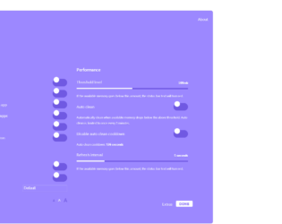
This is an example of a bootstrap settings panel with toggle feature, designed using HTML, CSS, JavaScript, and bootstrap framework 4. The icons and fonts are imported to the form with their URLs. Media queries have been used to increase the responsiveness of the form. JavaScript functions have been used to implement the toggle, radio item, and slider features. All the colors are predefined as variables. The body of the form is given a style set of font-size as 1.6rem, font-family as 'Heebo', system-UI, and text-shadow as 0px 1px 1px dark (#9c88ff). The container card is given a background color of #9c88ff, max-width of 1200px, border-radius as .8rem, and margin-bottom as 2rem. The toolbar dots are given the background colors of #EA6759, #FFCC00, and #2DCC72, and a border radius of 50%, which take a transform effect of scale(1.1), and a box-shadow effect of inset 0px 0px 3px rgba(white, .1), in a hover event. The toggle buttons are given a width of 62px, height of 32px, margin of 4px, background as dark (#9c88ff), border-radius as 999px, cursor as pointer to get the hand cursor effect, and a transform of translate (-50%), which take the background color white when they’re active.
Source: https://codepen.io/makhtar/pen/zYYQOVm
Settings Panel Toggles
4.3.1

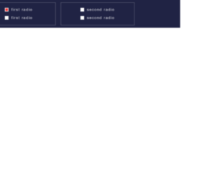
This is an example of a form with checkboxes and toggle buttons with the use of HTML, CSS, and JavaScript. JavaScript functions have been used to make the form responsive by checking the width of the screen. If the width is less than 400px, the mobile class will be added with the use of add class to apply the mobile view whereas if the width is greater than 400px, the mobile class will be removed with the use of remove class. The CSS class switch has been used for the toggle button which consists of height as 4.4rem, overflow as hidden, width as 7 rem, position as relative, display as inline-block, margin as 0, and padding as 0 whereas the switch label has the styles of width as 100%, font size as 0.5rem, and text-align as center. The CSS style class text transformation has been used with the value of uppercase to convert the text to uppercase. The hover class has been used with the style of cursor as pointer so the mouse pointer will be displayed on the toggle button on a mouse hover event. The style display has been used with the value ‘none' to hide the elements.
Source: https://codepen.io/jcgilmore2/pen/PZpmaK

This example can be used in any responsive designs as it is flexible, customizable, on/off toggle switches like regular radio buttons. It just uses the field set element which groups the related items in form, radio button which can be toggled. The styling is written using SCSS, using google fonts, and sass mixins. These mixins can be used to create the CSS code that can be reused throughout the website. They act like classes and can be included to add the properties to the classes. These are included using @include. Later the SaSS transpiler can convert it into CSS. Once you see the responsiveness of the code, the properties are switched from auto width to full width. In smaller screens, it adjusts well and is set in full width where as in larger screens it sets itself to auto width. You can use these for smaller screen applications. Source: https://codepen.io/dsenneff/pen/ZoLVZW
Responsive Toggle Switch
4.3.1