
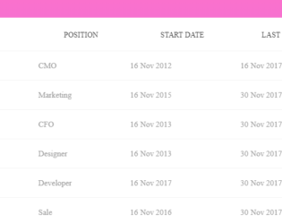
This snippet displays the complete example of Datatables of JS Library with pagination. This uses the Bootstrap 4 and Jquery 3.3, to create the table using a .table-fluid class which is responsible for the responsive nature of this table. Check out this table on various screen display, this would make the table display its responsive nature. The grid displays the 3 columns with sorting enabled in ascending and descending order. It has the search with the setting for the number of records to display be displayed in the grid. Notice the number of pages displayed according to the settings and number of records. This example uses the jquery.datatables.min.css file for styling but you can have your custom styling for each element.
With the larger data to be displayed in tabular format with multiple columns, you would require the row to be fixed. This is a simple table with the data to be displayed in row and column format. The horizontal scrollbar is added to all the tables to show the data. The purpose of this example is to show the first row is fixed. Row head is used to define the first column in the header part and the rest of the columns are displayed in the body part of the table. Scroll the data horizontally and you would see the first row is fixed at the left side of the table. CSS sheet defines the style and color to the table. JS-scroll is used to display the scroll bar. The background color, header color, and scrollbar color are in perfect sync for this table. You can use this table and tweak it to your needs.
Fixed Column Table
4.3.1
With the larger data to be displayed in tabular format you would require the column header to be fixed. This is a simple table with the data to be displayed in row and column format. The vertical scrollbar is added to all the tables to show the data. The purpose of this example is to show the headers are fixed. Scroll the data vertically and you would see the column headers fixed at the top of the table. CSS sheet defines the style and color to all the tables and headers. JS-pscroll is used to display the scroll bar. The background color, header color and scrollbar color is in perfect sync for each table. These tables can be used for tabular data format with larger dataset displayed on each page. You can use these tables and tweak it to your needs.
Fixed Header Tables
4.3.1
This is the classic example of a responsive bootstrap table, which can be used to display data with various size of the web page. You can use this table design in the sites which can be used in mobile, IPad or desktop versions. The table is wrapped under the classes which gives it a responsive behavior. The table is divided into header and body, header division contains the column names marked with class “table-header” and body division is made up of rows containing the data for the given columns. By changing the display size of the web page you can see the change in the display of each data. The data of each row is displayed with the column name on to the left side. The CCS style defines the look for each class. Media queries are defined to make the table responsive.
Responsive Table
4.3.1

This is an excellent example of highlighting of rows and columns whenever a cell is selected. Here the tables are created with different background color and various looks. The sample data for these tables are already added. Once you hover your mouse on any cell the rows and columns and a row of that particular cell get highlighted. This kind of style is suitable for the large tabular data where the header row is fixed. This kind of highlighting helps to visualize and compare the data along the selected columns and rows. The row highlight is done via CSS styling whereas for columns to get highlighted we need Jquery which adds a column when mouse over and removes a column during mouse out function. Color’s define in CSS as seen when a cell is selected. Ready to use scripts can have a special effect on your tables.
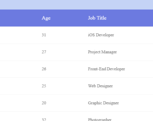
Responsive bootstrap example using HTML5 & CSS3 based which can be used as a template for your website. We have a table with example data on this template. The table is placed in wrapper having Full Name, age, job title, location as column fields. Each row is created for the data. The first row is a header row with column names followed by rows with class defined as cells and data-title defining column name. The CSS defines all the styles for the class. The table also provides highlighting the rows, when selected by the cursor. Fonts, height, padding, background are well defined to match the table and the data displayed in tabular format. CSS also defines media queries, to enable customization of content for a different presentation. For the max-width of 768pixel, the cells are displayed in block format.