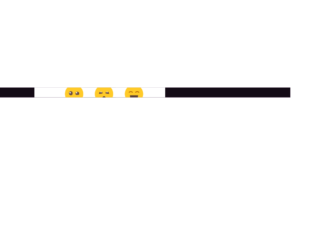
This is an example of a modal that expands to a rating form with rating emoji's, designed using HTML, CSS, and Bootstrap framework 4. The emojis are imported to the code as images with their URLs and created as radio type buttons. The body of the form is given a font style of 300 18px/1.5 'Rubik', sans-serif, and background color as #BA68C8. The rating card is given a transition value as background 0.4s ease-out. The cursor style for the rating card is set as pointer to the get the hand cursor effect in a hover event and an animation style of levitate 1s ease-in-out infinite is also given to apply the levitating effect to the emojis. The emojis are also given a transform effect of scale(1.8), to be effective on a hover event. The responsiveness and the mobile-friendliness of the form have been increased with the use of media quarries.
Source: https://bbbootstrap.com/snippets/rating-experience-modal-emojis-31937710
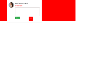
This is another example of a comment section with rating stars, designed using HTML, CSS, and Bootstrap framework 4. The profile image and font styles are imported to the code with the URLs. The rating stars are created as radio buttons. The body of the form is given the styles of display as grid, place-items as center to place the card in the center, font-family as 'Manrope', sans-serif, and background as red. The comment card is given a width as 450px, and a border-radius as 6px. The text area is given a border as 1px solid #ad9f9f. The send button is given a background color as #ff0000, which changes to #f50202, in a hover event. The rating buttons are given a cursor style as pointer to get the hand cursor effect in a hover event. The rating icons take a fill effect of #ff0000, in hover and active events.
Source: https://bbbootstrap.com/snippets/bootstrap-comment-section-form-ratings-98792632

This is an example of a comment section in a modal format, designed using HTML, CSS, and Bootstrap framework 4. The Comment section is hidden within the modal and will be shown after pressing the button on the modal. The fonts and images are imported to the code with their URLs. The body of the form is given the styles of display as grid, place-items as center to place the modal in the center of the form, font-family as 'Manrope', sans-serif, and background as #000. The model button is created as a danger type button. The rating stars are created as radio buttons. The comment section is given a border value of 1px solid #ff0000. The send message button is given the styles of font color as #fff, and background-color as #ff000. In a hover event, the background color of the button changes to #f50202. The rating icons are created to take a fill effect of #ff0000, in hover and active events.
Source: https://bbbootstrap.com/snippets/bootstrap-modal-comment-section-rating-12857455

This is an example of a rating bar with hover effects, designed using HTML, CSS, JavaScript, and Bootstrap framework 4. Media quarries have been used to increase the responsiveness of the form, and the JavaScript functions have been used to implement the rating function. The body of the form is given a background color of #000000. The background color of the rating bar is set as #fbedd9, which changes to #EDB867, in a hover event or while rating. The current rating is also indicated by the #EDB867 fill color effect. The rating bar is given the styles of display as block, width as 12px, padding as 5px 0, height as 28px, and float as left. The current rating value is indicated with the styles of font-size as 20px, line-height as 2, float as left, padding as 0 20px 0 20px, and font-weight as 400.
Source: https://bbbootstrap.com/snippets/bar-rating-1-10-97482935
Bar rating 1 to 10
4.3.1
This is an example of a star rating form, designed using HTML, CSS, and Bootstrap framework 4. The star-shaped radio icons are imported to the form with its URLs. The body of the form is given the styles of background as #F4F2F3, text-align as center, display as flex, flex-direction as column, and justify-content as center. The title of the form is given the styles of font-family as 'Fjalla One', sans-serif, and margin-bottom as 0.15rem, whereas the subtitle is given a style set of font-family as 'Cutive Mono', 'Courier New', font-size as 1rem, letter-spacing as 1px, and margin-bottom as 4rem. The cursor style for the radio buttons is set as pointer to get the hand cursor effect on a hover event. The stars are given the styles of color as transparent, and transition as color 0.2s ease-in-out to make them transparent. When checked, the radio button stars get filled with the color #d62a9d.
Source: https://codepen.io/meowwwls/pen/BzaWZg
Star Rating System
4.3.1

This is an example of a simple star rating form, designed using HTML, CSS, and Bootstrap framework 4. The icons are imported to the code with their URLs. The form is given the styles of display as flex, flex-wrap as wrap, height as 100vh, align-items as center, justify-content as center, and padding as 0 20px. The rating label has the styles of cursor as pointer to get the hand cursor effect on a hover event, width and height as 40px, background-size as 76%, and margin-top as auto. The feedback container is given the styles of max-width as 360px, background-color as #fff, width as 100%, padding as 30px, border-radius as 8px, display as flex, flex-direction as column, flex-wrap as wrap, align-items as center, and box-shadow as 0 4px 30px rgba(0,0,0,.05). The container consists of five feedback stars with five emoji’s to appear according to the rating given, which is implemented by the transform styles on the rating labels. Rating 1 has the transform style of translateY(-100px), rating 2 has the transform style of translateY(-200px), rating 3 is given a transform style of translateY(-300px), rating 4 has translateY(-400px), and rating 5 is given the transform style of translateY(-500px).
Source: https://codepen.io/knyttneve/pen/EBNqPN
Star Rating Form
4.3.1