
This is an example of a one-page navigation menu template. This can be used for floating style website as it reserves a particular space on the left sidebar. The design is such that it does not contain boundary on the homepage but for the subpages, you would see the boundaries. The menu options are just a blend to the rest of the web page as this design is possible due to the icons used for the website. The visual effects are purely due to CSS styling. These menu options can be used for creating web pages or personal blogs as the menu items are less in number. Check out the colors set for each paragraph, which gives a look of a new page. You can use this snippet for your one-page design layouts.
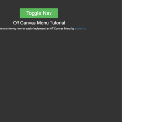
This is the best example of Off Canvas Menu. This can be used in any devices. A user would click on the icon or touch an icon to make an action that would result in the vertical navigation of menu sliding into the screen from the off canvas. This is one of the best examples of a multi-device layout pattern where web pages are designed to arrange and rearrange the page layout according to the devices used. The icon called as “Hamburg menu icon” as it resembles Hamburg. Instead of an icon, we can also use a button called “Menu”. To achieve this, we use wrapper where we are placing the off-canvas and menu to display the vertical navigation bar. To demo the action the toggle button is displayed at the center. You can place it to the sides of the screen. CSS and Javascript are used along with this pattern. Ref: "https://codepen.io/ncerminara/pen/quJpi"
Off Canvas Menu
3.1.0
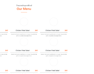
This snippet displays the stylish restaurant menus on the page. This can be easily integrated with your web page. It uses the latest features of Bootstrap 4 and jquery 3.2.The font for this style is carefully selected to match the template and enhances to make it stylish. In a container which is gives a behavior of responsiveness, we have a “section-title” which is aligned in the center. Next we have set of “single_menu_list” defined in the “menu_style1”. These set or template defines the “menu_list”, a set of image and menu header and description of each menu. These are placed equally into divided column of the row. The image border is reduced to zero during mouse hover which gives an image an elegant feature. You can use this snippet and tweak for your page to display your menu views similarly on menu card given in restaurants.
Bootstrap - 4 menu style
4.1.1

This is a classic example of the responsive navigation bar with no javascript needed. It uses clean HTML5 markup. This navigation bar is aligned to left but can be aligned to center or right. In mobile devices, the navigation bar is set on the top with the logo displayed whereas on the website it’s displayed on the left of the device. Toggling behavior can be seen by clicking on the toggle button. The dropdown is already set for some menu. The icon for each menu is set. CSS file defines responsive behavior using a media query. Navbar on the screen of width above than 767px will be displayed as block align to left, whereas for the screens below 767px the navigation bar will be displayed on the top of the page. Use this navigation bar for mobile applications to navigate to your custom links.