This is an example of a green colored sign in form with an avatar icon, designed using CSS, HTML, and Bootstrap framework 4. The avatar icon, font, and Bootstrap styles are imported to the code with the URLs. The body of the form is given the styles of font color as #4e4e4e, background color as #e2e2e2, and font-family style as 'Roboto', sans-serif. The form consists of the avatar icon, input text fields, and a 'Signin' button. The login card is given a width of 380px, background color of #fff, and a box-shadow style of 0px 2px 2px rgba(0, 0, 0, 0.3). The input text fields are given a background color of #f2f2f2, and a font-size of 16px. In the focus mode, the fields take the background color of #91d5a8, and a border color style of #e9f5ee. The login form title is displayed with a font-size of 34px. The avatar icon is given a background color of #4aba70, box-shadow style of 0px 2px 2px rgba(0, 0, 0, 0.1), height and a width of 100px, and the border –radius style as 50% to get the circle shape. The 'Signin' button is given a background color of #4aba70, which gets changed to #40aa65, in a hover event.
Source:https://www.tutorialrepublic.com/snippets/preview.php?topic=bootstrap&file=green-colored-sign-in-form-with-avatar-icon
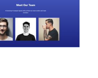
This is an example of a meet our team section template with hover effects, designed using HTML, CSS, and Bootstrap framework 4. The profile images and social media icons are imported to the code with their URLs. The background image is given the styles of background-image as linear-gradient(#3F51B5, #1A237E), color as #000, and overflow-x as hidden. The title of the form is displayed using font-weight as bold, margin-bottom as 40px, padding-top as 40px, and color as #fff. The introduction section is given a font-size as 16px. The cursor style for the profile card is set as pointer to get the hand cursor effect on hover. The opacity of the social media icons is set as 0.7, which gets changed to 1, on hover. The profile title is displayed using the styles of text-transform as uppercase to automatically convert the text to uppercase, font-size of 13px, and font-weight as bold. The profile card takes a filter layer of rgba(31, 148, 255, 0.75), in a hover event.
Source: https://bbbootstrap.com/snippets/meet-our-team-section-hover-social-icons-16498436

This is an example of a user profile with hover effects on the social media icons, designed using CSS, HTML, and Bootstrap framework 4. The concept of Lists has been used with UL and LI components. UL element has been used with the child elements of LI to display the social media icons in a single raw. The profile image is imported to the code with its URL. The profile card is given a width of 300px, height of 350px, and a cursor style as pointer to get the hand cursor effect on hover. The profile card is given an overlay filter, to be applied on a hover event, with an opacity of 1. The social media icons are given the styles of width and height as 25px, border as 1px solid #eee, padding as 20px, display as flex, justify-content as center, align-items as center, color as #fff, border-radius as 5px, and transition as all 1s. In a hover event, the icons take the styles of background as #fff, and font color as #000.
Source:https://bbbootstrap.com/snippets/bootstrap-user-profile-social-icons-animation-11258499
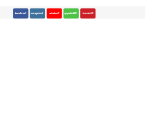
This is an example of a set of social media buttons with a 3D flipping animation, designed using HTML, CSS, and Bootstrap framework 4. Media quarries are used to increase the responsiveness of the form. The form consists of five buttons named as Facebook, Instagram, YouTube, Whatsapp, and Pinterest. The buttons are given different background colors as #3b5998, #3f729b, #ff0000, #4dc247, and #cb2027. The body of the form is given a background color as #f7f6f6. The text on the buttons is given a font-size of 20px, and a font-weight style as bold. Each card is given a transform style as rotateY(180deg) to be active on hover, which rotates the buttons by 180 degrees and creates the flipping animation. The CSS styles have been given to both the front and back sides of the buttons, separately. The buttons are given a border value as 1px solid #eee, box-shadow style as 5px 6px 6px 2px #e9ecef, and the cursor style as pointer to get the hand cursor effect in a hover event.
Source: https://bbbootstrap.com/snippets/bootstrap-social-media-icons-3d-flips-78890278