
This is an example of a testimonials template with hover effects, designed using HTML, CSS, and Bootstrap framework 4. CSS styles and images are imported to the code with the URLs. The body of the form is given a background color of #E9EAEA. The header of the form is given a font color as chocolate, and a text-align style as center. Media quarries have been used to increase the responsiveness of the form. The testimonial cards have the styles of width as 24%, height as 550px, border-radius as 10px, background-color as white, display as inline-block, margin-left as 15px, box-shadow as 5px 5px 5px gray, top as 40px, and left as 11%. In a hover event, the testimonial cards take the background color of cadetblue. The profile images are given a border-radius value as 50% to get the circle shape. The profile names are given a font-size as 20px, font-weight as bold, and font color as darkblue. The location is displayed in the font color of darkorange, whereas the content is given a font-size as 18px, and font color as darkslategrey.
Source:https://bbbootstrap.com/snippets/awesome-testimonial-template-for-your-company-51716666
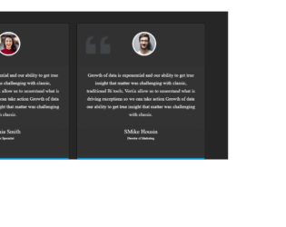
This is an example of a testimonial box with hover effects, designed using HTML, CSS, and Bootstrap framework 4. The images are imported to the code with their URLs and media quarries have been used to increase the responsiveness of the form. The body of the form is given the styles of height and width as 100%, font-family as 'Cormorant', serif, and background as #262626. The testimonial card is given the styles of box-shadow as 0px 5px 16px rgba(223, 241, 223, 0.5), transition as 0.8s, background as #333, box-sizing as border-box, and border-radius as 7px. The content of the card the styles of font-size as 20px, line-height as 33px, and color as #fff. The testimonial profile name is given a font color as #fff, and a font-weight as 500. In a hover event, the testimonial card takes a layer effect of linear-gradient(#03a9f4, #e91ee3) and gets filled with the layer color, a box-shadow effect of -5px 50px 100px rgba(223, 241, 223, 0.5), whereas the font-weight of the profile title and content section gets changed to 600.
Source: https://bbbootstrap.com/snippets/testimonial-box-hover-effect-50508276

This is an example of another testimonial web form with hover effects, designed using HTML, CSS, and Bootstrap framework 4. The profile images are imported to the code with their URLs and with a width and height given as 40, in HTML. Media quarries have been used to increase the responsiveness of the form. The body of the form is given the styles of min-height as 100vh, background-color as #eee, background-size as cover, font-family as 'Cormorant', serif, color as RGB(112, 123, 240), and a linear gradient background as (140deg, #fff, 50%, #74a0ff). The font color of the testimonial card is set as RGB(146, 154, 236), whereas the border value is defined as 1px solid. The font-size of the card content is given as 17px and the font-weight as bold. The testimonial card takes a transform effect of scale to 0.9 and changes its size to create the hover effect.
Source: https://bbbootstrap.com/snippets/testimonial-hover-animation-and-social-media-icons-36925129
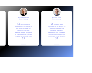
This is an example of a testimonial web form with hover effects, designed using CSS, HTML, and Bootstrap framework 4. The profile images are imported to the code with their URLs and given width and height as 40, in HTML. Media quarries are used to increase the responsiveness of the form. The body of the form is given the styles of min-height as 100vh, background-color as #eee, background-size as cover, font-family as 'Cormorant', serif, color as RGB(112, 123, 240), and a linear gradient background as linear-gradient(140deg, #fff, 50%, #74a0ff). The font-size of the card content is defined as 17px and the font-weight as bold. The font color of the testimonial card is set as RGB(146, 154, 236), and a border value is also given as 1px solid. In a hover event, the testimonial card changes its scale to 0.9 and take a transform effect to imply the hover effect.
Source: https://bbbootstrap.com/snippets/testimonial-hover-animation-and-social-media-icons-36925129
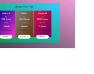
This is an example of a pricing table with hover animations, designed using HTML, CSS, and Bootstrap framework 4. The font styles are imported to the code with its URL. The form consists of three price plans on three tables. Media quarries have been used to increase the responsiveness of the form. The body of the form is given a font family of 'Roboto', sans-serif, and height as 650px. The background color of the form is set to a linear gradient color of (to top right, #353749 0%, #F7A0D9 100%). The card container is given the styles of width as 70%, height as 500px, background color as linear-gradient(to bottom left, #33ccff 0%, #009933 100%), border-radius as 10px, and box-shadow as 0 0 35px brown. The price tables are given three different linear-gradient background colors. The price cards take a transform effect of scale(1.2, 1.2), and box-shadow effect of 0 0 35px black, in a hover event to implement the animations. The cursor style for the buttons is set as pointer to get the hand cursor effect.
Source: https://bbbootstrap.com/snippets/our-pricing-table-80836256

This is an example of an image gallery layout with expanding hover effects, designed using HTML, CSS, and Bootstrap framework 4. The gallery consists of five image cards with different styles. The images are imported to the code with their URLs. The container is given the styles of width as 100vw, height as 100vh, display as flex, and box-sizing as border-box. The image card is given the styles of width as 20vw, color as #fff, text-align as center, line-height as 100vh, flex-grow as 1, background-size as cover !important, background-position as center, transition as 1s, and background-repeat as no-repeat. In a hover event, the cards take an expanding effect by changing its width to 30vw. The card title is given the styles of width as 100%, transition as 1s, and padding as 20px 25px, which changes to color as #333, and background as rgba(255, 255, 255, 0.8), in a hover event.
Source: https://www.tolmatol.com/expand-image-on-hover-flex-css-effect/