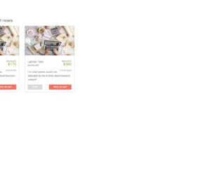
This is an example of a grid view container with images and hover effects, designed using CSS, HTML, and Bootstrap framework 4. The container consists of three cards. The images are imported to the code with their URLs. The header title of the form is displayed using a font-size of 1.6667em. The body of the form is given the styles of font as 75%/150% "Lato", Arial, Helvetica, sans-serif, background-color as #fff, and font color as #838383. The content of the cards is displayed using the styles of font-size as 1.0833em, line-height as 1.6666, and margin-bottom as 15px. The price section of each card is displayed using a font color of #7db921, a font-size of 1.6667em, and a text-transform style is given as uppercase to automatically convert the text to uppercase. The 'Book' button is given the styles of display as inline-block, background as #d9d9d9, font-size as 0.8333em, line-height as 1.8333em, and text-align as center, which takes a background color of #98ce44, in a hover event.
Source: https://bbbootstrap.com/snippets/grid-view-container-font-awesome-65969883
Grid view container
4.3.1

This is an example of a draggable grid layout with image cards, designed using HTML, CSS, JavaScript, and Bootstrap framework 4. The form consists of image cards, which can be moved and replaced. The images are imported to the code with their URLs. JavaScript sortable library has been used to implement the drag and drop feature of the form, whereas media quarries have been used to increase the responsiveness of the form. The body of the form is given a background color of #f9f9fa. The image cards are given the styles of border-radius as 5px, box-shadow as 0 1px 20px 0 rgba(69, 90, 100, 0.08), and margin-bottom as 30p. The card block is given the styles of padding as 1.25rem, and background-color as #fff. The cursor style for the mouse cursor is given as ‘move’ so that the cards would be able to be moved using the mouse cursor. The image cards are also given a box shadow as 0 0 1px 2px rgba(0, 0, 0, 0.05), 0 -2px 1px -2px rgba(0, 0, 0, 0.04), 0 0 0 -1px rgba(0, 0, 0, 0.05).
Source: https://bbbootstrap.com/snippets/draggable-grid-cards-64396890

This is a template of a product grid view card for an e-commerce website, designed using CSS, HTML, and Bootstrap framework 4. The product images are imported to the code with their URLs. The body of the form is given the styles of font-family as Roboto, -apple-system, BlinkMacSystemFont, "Segoe UI", Roboto, "Helvetica Neue", Arial, sans-serif, "Apple Color Emoji", "Segoe UI Emoji", "Segoe UI Symbol", "Noto Color Emoji", font-size as .8125rem, font-weight as 400, line-height as 1.5385, color as #333, text-align as left, and background-color as #2196F3. The product card is given the styles of background-color as #fff, border as 1px solid rgba(0, 0, 0, .125), and border-radius as .1875rem. The text is aligned to the center of the card. The card body is given the styles of flex as 1 1 auto, and padding as 1.25rem. The product name and Add to Card button is set to change their font color and background color, in a hover event.
Source:https://bbbootstrap.com/snippets/bootstrap-ecommerce-product-grid-view-card-19577966
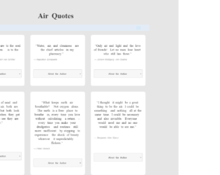
This is an example of a quote cards grid layout with the content displayed in an accordion, designed using HTML, CSS, JavaScript, and Bootstrap framework 4. The quotes are imported to the code with the URL, whereas the JavaScript functions have been used to implement the accordion expand feature. The body of the form is given the styles of background as #e6e6e6, padding as 50px 0, font-family as 'Noto Serif', serif. The quote cards can be displayed either in card layout or row layout. The quote grid is given the styles of max-width as 1000px, margin as 0 auto, font-family as 'Noto Serif', serif, theme-color-primary as #383838, and color as #414141. The quote caption has the styles of color as #414141, font-size as 40px, and font-weight as bold. The quote cards take the styles of border-radius as 10px, margin as 10px, and box-shadow as 0 4px 8px 0 rgba(0, 0, 0, 0.1), 0 6px 20px 0 rgba(0, 0, 0, 0.09), in the card layout. The accordion of the card is given the styles of position as relative, display as block, background as #f7f7f7, border-radius as .25em, cursor style as pointer to get the hand cursor effect, margin-bottom as .125em, padding as .75rem 1em, z-index as 20, border as 1px solid #cccccc, text-align as center, and font-size as 13px, which takes the background color of #ccc, in a hover event.
Source: https://codepen.io/zinggrid/pen/ZVJZEM

This is a web form with a responsive photo gallery grid, designed using CSS, HTML, and Bootstrap framework 4. The images and CSS styles have been imported to the code with their URLs, whereas the media queries are used to increase the responsiveness of the form. The number of rows and the minimum number of columns for the grid is given as 3 and 2, respectively. The background of the form is given as #262626, with the height as 100vh, and filter as drop-shadow(2px 2px 5px). The hex cell is given the styles of grid-column-end as span 2, margin as calc(-1*var(--hl)) 0, transform as scale(.95), and clip-path as polygon(50% 0, 100% 25%, 100% 75%, 50% 100%, 0 75%, 0 25%) to implement the polygon shape. The images are given a transform style of scale(calc(1 + .2*var(--hl))). In a hover event, the images in the hex cell, take a zooming effect.
Source: https://codepen.io/thebabydino/pen/PowXYpV
Hive Photo Gallery Grid
4.3.1
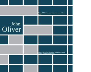
This is an example of a web form where the CSS grid is used as a mask to create a poster. It is designed using CSS, HTML, and Bootstrap framework 4. The CSS grid is displayed in 14 rows, which are defined in HTML. The background image is imported to the code with its URL. The background color of the HTML form is given as #124559, with the background-size set as 100vw. The body of the form is given a style set of font-family as 'Roboto Slab', serif, font-size as1.8vw, and color as #D3E6D9. The name of the person is displayed with the styles font-family as 'Rozha One', serif, position as relative, and font-size as 5vw. The items in the grid are left partially transparent to expose areas of the background image by changing the placement of the grid rows and columns with changing the value of grid-column-end: span and grid-row-end: span. The images and bootstrap styles are imported to the code with their URLs.
Source: https://codepen.io/andybarefoot/pen/wrXvLj