
This is a web form with a responsive photo gallery grid, designed using CSS, HTML, and Bootstrap framework 4. The images and CSS styles have been imported to the code with their URLs, whereas the media queries are used to increase the responsiveness of the form. The number of rows and the minimum number of columns for the grid is given as 3 and 2, respectively. The background of the form is given as #262626, with the height as 100vh, and filter as drop-shadow(2px 2px 5px). The hex cell is given the styles of grid-column-end as span 2, margin as calc(-1*var(--hl)) 0, transform as scale(.95), and clip-path as polygon(50% 0, 100% 25%, 100% 75%, 50% 100%, 0 75%, 0 25%) to implement the polygon shape. The images are given a transform style of scale(calc(1 + .2*var(--hl))). In a hover event, the images in the hex cell, take a zooming effect.
Source: https://codepen.io/thebabydino/pen/PowXYpV
Hive Photo Gallery Grid
4.3.1
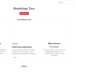
This is a template of a bootstrap tour of a web form with a navigational bar, buttons, cascading cards with social media links, and a card image gallery, designed using HTML, CSS, and JavaScript. The collapsible navigation bar is added with a dropdown list and a search bar. The bootstrap tour function is implemented using JavaScript functions. The show and hide methods of the JavaScript popover function have been used to hide and show the popup box. The images have been added to the form with their image URLs imported and the Li element of lists has been used to display the items in a list. The gallery is given an initial style set of column count as 3 (webkit-column-count: 3, moz-column-count: 3), column width as 33% (webkit-column-width: 33%, moz-column-width: 33%), transition as all 350ms ease, and animation as 1(webkit-transform: scale(1), ms-transform: scale(1)).