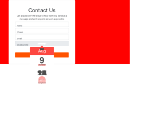
This is an example of a Contact US form with a date picker, designed using CSS, HTML, JavaScript, and Bootstrap framework 4. The functionality of the date picker is implemented using JavaScript. The font style is imported to the code using its URL. The body is given a style set of display as grid, place-items as center, font-family as 'Manrope', sans-serif, and animation style of colorchange as 50, which changes the background color of the form, from time to time. The given background colors as red, yellow, blue, and green. The information card is given the styles of width as 500px, word-wrap style as break-word to allow long words to be able to break and wrap onto the next line, background-color as #fff, border-radius as 6px, and a box-shadow style for Mozilla browsers as 0px 0px 5px 0px rgba(212, 182, 212, 1). The 'Send Message' is created as a success type button and given the styles of font color as #fff, background-color as #ff5300, and border-color as #ff5300, which changes to font color as #fff, background-color as #ff0000, and border-color as #ff0000, in a hover event. The input text fields take a border style of 0 0 0 1px RGB(255, 255, 255), in a focus event.
Source:https://webdesignerwall.com/page/3?s=contact&post_type=wdw_snippet#038;post_type=wdw_snippet
This is an example of a date-picker, designed using HTML, CSS, JavaScript, and Bootstrap framework 4. A jquery plugin has been used to implement the functionality of the date picker and the CSS properties of the form. The body of the form is given a background color as #AA00FF. The calendar button is created as a warning type button and given a color as #fff. The input date filed is given a border value of 1px solid #ed433e. In a focus event, the input date field takes a border effect of #f8c146. The jquery library has been used to scroll through the dates and months of the calendar. The min year is defined as 1970 and the range of years is defined as 10, in JavaScript. The calendar is given a fade-in animation, and the format of the date is set as m/d/y in JavaScript.
Source: https://bbbootstrap.com/snippets/datepicker-using-html-and-jquery-plugin-35354562
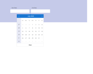
This is an example of a blue-themed date picker with date range and week number, designed using CSS, HTML, JavaScript, and Bootstrap framework 4. JavaScript methods are used to implement the functionality of the date picker. The body of the form is given a font color as #000 and background color as #C5CAE9. The input text fields are given the styles of padding as 22px 15px, border as 1px solid #CFD8DC, border-radius as 4px, box-sizing as border-box, background-color as #fff, font color as #000, font-size as 16px, and letter-spacing as 1px. In a focus event, the input fields take a border effect of 1px solid #1976D2. The calendar is given a background color as #1976D2. The date slot of the calendar takes a background color of #eee, in a hover event. The border-radius of the date slot turns to 50% to get the circle shape, in a hover event. Media quarries have been used to increase the responsiveness of the form.
Source: https://bbbootstrap.com/snippets/blue-themed-date-picker-date-range-and-week-number-61366925
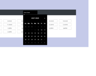
This is an example of a dark themed date and time picker, designed using CSS, HTML, JavaScript, and Bootstrap framework 4. JavaScript methods are used to implement the functionality of the date picker. The body of the form is given a background-color of #C5CAE9, and font color of #000. The information card is given a box-shadow style of 0px 4px 8px 0px #7986CB. The date input field is given the styles of padding as 10px 20px, border as 1px solid #000, border-radius as 10px, background-color as #616161, font color as #fff, font-size as 16px, letter-spacing as 1px, and width as 180px. In a focus event, the input date field takes a border style of 1px solid #512DA8. The date slot of the calendar takes a background color of #eee, in a hover event. In the active mode, the date slot takes a background color of linear-gradient(#90CAF9, #64B5F6), and font color as #000. The Month value of the calendar is displayed using a font-size of 20px, and a text-transform style of uppercase to automatically convert the text to uppercase. The cursor style for the time slots is set as pointer to get the hand cursor effect on a hover event while the background color of the time slot changes to #3D5AFE, in a focus event.
Source: https://bbbootstrap.com/snippets/dark-themed-date-and-time-picker-76906698
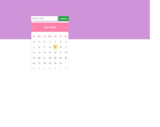
This is an example of a pink-themed custom date-picker, designed using CSS, HTML, JavaScript, and Bootstrap framework 4. The functionality of the date picker is implemented using JavaScript methods. The body of the form is given the styles of font color as #000, height as 100%, and background-color as #CE93D8. The input text fields are given a style set of padding as 10px 20px 10px 20px, border as 1px solid lightgrey, border-radius as 6px, box-sizing as border-box, background-color as #fff, font color as #2C3E50, font-size as 14px, and letter-spacing as 1px. In a focus event, the input fields take a border effect of 1px solid #512DA8. The 'Submit' button is created as a success type button. The date slots of the calendar take a background color of #eee, in a hover event. In the active mode, the date slot takes the styles of border-radius as 50% to get the circle shape, background color as linear-gradient(#90CAF9, #64B5F6), and font color as #fff. The Month value of the calendar is displayed using a font-size of 20px, and a text-transform style of uppercase to automatically convert the text to uppercase.
Source: https://bbbootstrap.com/snippets/pink-themed-custom-datepicker-93081189
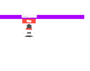
This is a template of a date picker input form with a button, designed using JavaScript, HTML, CSS, and Bootstrap framework 4. The button is created as a primary pro-type button. The dropdown function of the date-picker is created using JavaScript. The body of the form is given the styles of display as grid to arrange the information in a grid layout, background color as #F44336, and font-family as 'Manrope', sans-serif. The information card is given a background color as #fff, border-radius as 6px, and word-wrap style as break-word to allow long words to be able to break and wrap onto the next line.The input text fields have the styles of background-color as #f44336, opacity as 1, font color as #fff, and border style as 1px solid #f44336. The button is given a background and a border color of #f44336. The button changes its background color to #d8271a, in a hover event, whereas it takes the background color of #f44336, in a focus event.
Source: https://bbbootstrap.com/snippets/bootstrap-datepicker-input-form-button-18422292