
This is an example of a collapsible comment section, designed using HTML, CSS, JavaScript, and Bootstrap framework 4. JavaScript functions are used to implement the collapsible feature. The form consists of a hidden comments section, which can be revealed by clicking on the comment link. It is also given a button to add new comments. The data-target attribute with the data-toggle="collapse" method has been used in HTML to implement the collapsible function for the comment section. The user image is imported to the code with its URL. The body of the form is given a background color as #eee. The number of comments section has a cursor style as pointer to get the hand cursor effect, as well as a text-decoration as underline. The badge is given the background color as orange and font-size as 11px. The gray dot is given a style set of height and width as 7px, margin-top as 3px, background-color as #bbb, border-radius as 50% to get the circle shape and display as inline-block.
Source: https://bbbootstrap.com/snippets/bootstrap-collapsible-comment-section-fontawesome-icons-88973761

This is an example of a collapsible Like, Comment, and Share section, designed using HTML, CSS, and Bootstrap framework 4. The image is imported to the code with the URL. The data-target attribute with the data-toggle="collapse" method has been used in HTML to implement the collapsible function of the form. The body of the form is given a background color as #eee. The form is designed to reveal a comment section if the comment link is clicked, or reveal the list of social media icons if the share link is clicked. The date section is given a font-size as 11px, whereas the comment text is given a font-size of 12p. The font color of the user names is set as #007bff. The font color of the Like, Comment and Share links turn to blue, in a hover event. The cursor style for the links is set as pointer to get the hand cursor effect in a hover event. The social media icons are given background colors accordingly.
Source: https://bbbootstrap.com/snippets/bootstrap-collapsible-like-comment-and-share-section-43201372
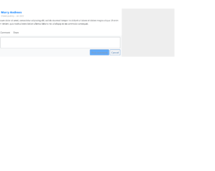
This is an example of a Like, Comment, and Share section, designed using HTML, CSS, and Bootstrap framework 4. The profile images are imported to the code with the URL, and defined as rounded-circle in HTML. The body of the form is given a background color as #eee. The dateline is given a font-size as 11px, whereas the font-size of the comment text is defined as 12px. The Like, Comment and Share texts are also given a font-size as 12px. The name title is given a background color as #007bff. The cursor style for the form is set as pointer to get the hand cursor effect in a hover event. The Like, Comment and Share text turns to blue color, in a hover event. Two primary type buttons are also included in the form to post the comment and cancel the comment.
Source: https://bbbootstrap.com/snippets/bootstrap-like-comment-share-section-comment-box-63008805
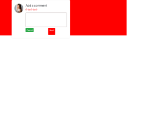
This is another example of a comment section with rating stars, designed using HTML, CSS, and Bootstrap framework 4. The profile image and font styles are imported to the code with the URLs. The rating stars are created as radio buttons. The body of the form is given the styles of display as grid, place-items as center to place the card in the center, font-family as 'Manrope', sans-serif, and background as red. The comment card is given a width as 450px, and a border-radius as 6px. The text area is given a border as 1px solid #ad9f9f. The send button is given a background color as #ff0000, which changes to #f50202, in a hover event. The rating buttons are given a cursor style as pointer to get the hand cursor effect in a hover event. The rating icons take a fill effect of #ff0000, in hover and active events.
Source: https://bbbootstrap.com/snippets/bootstrap-comment-section-form-ratings-98792632
This snippet describes how to code for the comment section of the webpage. This snippet uses the class “comment-container” and theme-light. It uses the card from Bootstrap 4 which is a flexible and extensible content container. It contains a header, footer, background colors, images or avatars. A simple card template is used with sheet and theme set to light. This card includes the avatar or image and name of the commenter. An arbitrary class dialog container is applied. The styles are applied to each class used in the snippet. Media rule is applied classes container and comments. CSS uses a few settings selectively for Mozilla or Firefox browsers.
Blog Comments
4.3.1