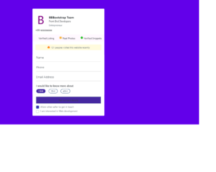
This is an example of a contact us form with custom check-boxes, designed using CSS, HTML, JavaScript, and Bootstrap framework 4. The images are imported to the code with their URLs. The title of the form is given a font style as Bold to make it highlighted. The body of the form is given a background color as #6200EA. The checkbox title is displayed using a font-size of 14px. When in checked mode, the background color of the checkboxes turns to #4527A0. JavaScript methods have been used to implement the functionality of the checkboxes and the progressing function of the progress bar. The progress bar has the styles of width as 10%, height as 15px, background-color as #4527A0, font color as white, and border-radius as 50px. The progress of the bar is indicated with the color #4527A0. The button is crated as primary type buttons. The alert message is given a background color of RGB(255, 251, 222), while the message is displayed using a font-size of 12px.
Source: https://bbbootstrap.com/snippets/contact-us-form-custom-checkboxes-72208201
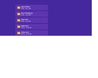
This is an example of a folder list with a checkbox and transform effect, designed using HTML, CSS, and Bootstrap framework 4. The folder icons are imported to the code by the URLs. The body of the form is given a background color as #4527A0. The list items are given a style set of margin-top as 10px, background color as #5E35B1, cursor style as pointer to get the hand cursor effect in hover, and transition as all 0.3s ease-in-out. The list items take a transform effect of scaleX(1.1) in a hover event, to change the scale of the folder items. The opacity of the checkbox is set as 0, which changes to 1 in a hover event. The checkbox is given a border style of 1px solid #10a3f9, border-radius as 3px, and background color as white, which changes to border as solid #007bff, border width as 0 2px 2px 0, and takes a transform effect of rotate(45deg), in a checked event.
Source:https://bbbootstrap.com/snippets/bootstrap-folder-list-checkbox-and-transform-effect-16091735
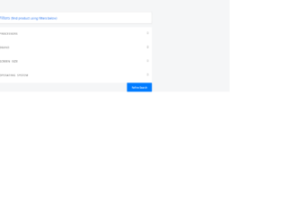
This is an example of a product filter with an accordion feature and checkboxes, designed using HTML, CSS, and Bootstrap framework 4. Media quarries have been used to increase the responsiveness of the form. The body of the form is given a background color of #f5f6f7. The panel heading is given the styles of font-family as 'Glyphicons Halflings, display as block, padding as 10px, color as #555, font-size as 11px, text-transform as uppercase to automatically convert the text to uppercase, letter-spacing as 1px, and word-spacing as 3px. The panel heading is given a transform style of rotate(180deg) to implement the collapsible effect. The checkboxes are given a height and a width of 24px, font color #fff, cursor style as pointer to get the hand cursor effect in a hover event. The checkboxes take the color of #9faab7 in a hover event, and #2874ef in a checked event. The checkbox text is given a font-family of "Font Awesome 5 Free, and a font-size of 14.66667px. The Refine search button is given a background color of #2874ef, and a font-size as 12px.
Source:https://bbbootstrap.com/snippets/refine-product-filter-sidebar-collapse-accordion-custom-checkbox-98247635
This is an example of a web form with neuomorphic checkboxes container, designed using HTML, CSS, and Bootstrap framework 4. The icons and fonts are imported to the code with their URLs. The concept of Lists has been used with UL and LI components. UL element has been used with the child elements of LI to display the icons in an orderly manner. The body of the form is given the styles of display as flex, justify-content as center, align-items as center, min-height as 100vh, and background as #ebf5fc. The checkbox icons are given a background color of #6a9bd8. The checkbox container is given the styles of width and height as 60px, background as #ebf5fc, display as flex, justify-content as center, align-items as center, box-shadow as -2px -2px 5px rgba(255, 255, 255, 1), 3px 3px 5px rgba(0, 0, 0, 0.1), and border-radius as 10px. The checkbox icons take a box-shadow effect of -2px -2px 5px rgba(255, 255, 255, 1), 3px 3px 5px rgba(0, 0, 0, 0.1), when they are in checked mode.
Source: https://codepen.io/braydoncoyer/pen/yLyrWOq
Neuomorphic Checkboxes
4.3.1
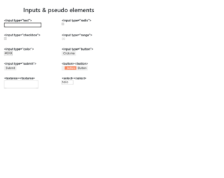
This is an example of a web form with input types and pseudo-elements, designed using HTML, CSS, and Bootstrap framework 4. The concept of Lists has been used with UL and LI components. UL element has been used with the child elements of LI to display the icons and elements in an orderly manner. There are eight types of inputs and elements displayed on the form, which are text¸ radio, checkbox, range, color, button, text area, and Select. The wrapper class is given the styles of max-width as 600px, margin as 2rem auto 1rem. The header of the form is given a text-align style as center. The list items are displayed in a grid, and the number of columns for the grid is defined as 2. The grid-gap is set as 1rem, with the font-style for the list items is set as 16px/1.4 Arial, sans-serif. An outline style of 1px solid #DDD is set for the list item box, with a padding value as .5rem.
Source: https://codepen.io/yoksel/pen/eYNmRNe
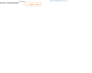
Popup-box is the best example of small talks like messengers. With the fewer amounts of code and memory, you can use this for the best performance of your application. It is the best way for simple and short talks with clients. With a click on the “open chat”, you get the entire chat box popup. The popup head contains the image at the left side where are few setting at the right. Next, are the messages in popup-messages, where you would get direct chat messages to the right and the image to the messenger to the left, a dotted border spans the entire conversation, this is well-styled in CSS along the left side. Next is the timestamp. The date and time for the next conversation are displayed at the top of the conversation. This can be modified accordingly for the usage in your applications.
Pop-up chat box
4.3.1