Creating a personalized animation can add extra creativity to your page. This is one such example where each element is to have its opacity, color, and shadow set along with animation and effect. The cursive style of font uses the tag to separate the letters, the span is set with the text-shadow for x, y, and z-axis along with different colors for each letter. The animation is set for 2s and runs forever (infinity). The keyframes set the stage for animation, each percentage set for animation contains different color, opacity and transform with the scale and rotation degree. At 100%, the text-shadow is set along with the color. This snippet also works with different screen as it minimizes the font size as per the screen size. Using this you can set your color and animation which matches your website background.
Text Style 4
4.3.1
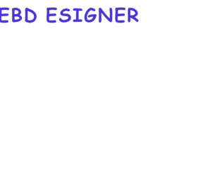
This is a flip effect for the text using CSS. The letters are separated with a tag in HTML, the CSS adds the effect along with the width, font, and animation. The cursive style of Cookie family matches this fill effect. The animation lasts for 2s and starts over again and goes forever (infinite). The effect is applied to each span element with animation-delay of 1sec each. To maintain the space between the two worlds, the 4th span (letter) is set with the margin to the right. The keyframe property set the animation and rotates each element by 1 turn. The media screen property sets the font size for different screen size. Overall the effect added is easy, with little understanding of CSS styling and animations you can have a perfect text effect for your website. Also, these animations are is not supported in Internet Explorer 9 and earlier versions.
Text Style 3
4.3.1

Text with the bouncy effects is seen on a modern website. The CSS has changed the way we see the text, with the effects, added we feel the text than just reading it. This is one of the happy bouncy effects where each letter is separated with a tag in HTML script. The CSS makes it look bold and colorful along with the bouncy effect added to it. Each element here is a bounce for 2.2sec, the delay in the bouncy effect makes each letter bounce after the scheduled time. The @keyframes settings set the actual bouncy effect with the percentage translated to the pixels. The media screen is set to display the size of font accordingly. These effects are catchy and attention seeker can be easily used in the web applications. For different browsers, the distribution of the pixels may differ and you need to test these effect on different types of browsers.
Text style 2
4.3.1

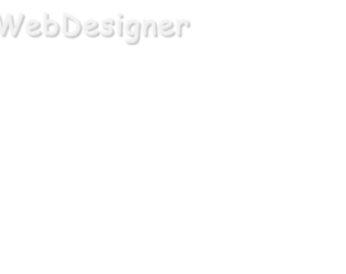
When we usually talk of communication in the web application, its usually the simple textually way along with an additional picture with it. This concept is still being followed, but with the CSS Textual Effects, there is a change in reading and viewing the text. The CSS effects make a text look attractive and help to give style to the text. This is one of the cool and stunning effects which can be added to companies name or to the text which needs attention. Each element in the HTML is separated with the this element is then styled with the font-size and text-shadow along with the animation of ease-in-out infinite alternative. The animation is also delayed by a few seconds for each letter giving a wavy effect. @keyframes sets the rule to text-shadows of each element. The snippet has media rules to set the font size according to the display screen.
Text style 1
4.3.1
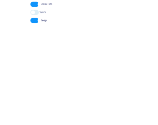
This is an example of a web form with checkboxes designed using CSS, HTML, and JavaScript. JavaScript has been used to make sure only two checkboxes of the three are selected at a time. The boxes are given the type ‘checkbox' and named as Social, Work, and Sleep. The font type is imported from Google with the URL and the label is set with the styles of font-family as "Montserrat", sans-serif, font-size as 1.2rem, cursor as a pointer to display the hand cursor, display as none to hide the elements, and margin as 1em. In an unchecked event, the styles will be as display: inline-block, border-radius: 20px, vertical-align: middle, transition: .25s .09s, position: relative, background: #deeff7, and box-shadow: 1px 2px 4px 0 rgba(#000, .4). After a checked event, the styles will change to transform: translateX(25px) and the color of the background to #1094fb and the font color to #29316b.
Source: https://codepen.io/havardob/pen/ZJJoQL

This is an excellent way to engage your audience, in case of design resource website or font designer. There are various text effects added in this snippet to which allows you to see the exact differences between them. To the left there is a drop-down option to select the effect and then you can see the effect on the text box. This will allow you to select the effects for your websites. HTML for this snippet is simple with the selector and input fields. The functionality depends on the javascript code. There are various covered like bounce, fadeIn, fadeUp, etc. which are added using the script and later the animation is added to the character. The script takes the care of all the keyboard characters and special characters which can be added in the input field along updating of the arrows. Source: https://codepen.io/andyNroses/pen/pbBWBL