
This is an example of an accordion feature with collapsible buttons, designed using CSS, HTML, and Bootstrap framework 4. The font style has been imported to the code with its URL. The JavaScript methods have been used to implement the functionality of the collapsible buttons. The form consists of four accordion panels. The panel title is displayed with the styles of display as block, font-weight as 400, font-size as 18px, line-height as 1.6, and font color as #6d7194. Each panel is given a plus icon to expand the panel, which is displayed with the styles of font-size as 45px, and background color as #03C6FE. The panel body is given a border style of 1px solid #d9d7d7. When expanded, the panel takes the background color of #03C6FE. The font color of the panel heading also changes to #fff, in the expanded mode.
Source: https://www.bootdey.com/snippets/view/accordion-collapse-buttons#html
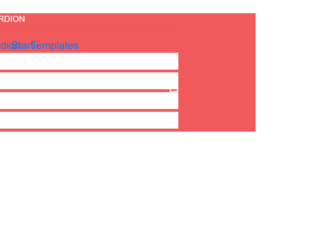
This is an example of an accordion feature, designed using CSS, HTML, and Bootstrap framework 4. The body of the form is given the styles of background color as #F15A5C, and font-family style as 'PT Sans Narrow', sans-serif. The font style has been imported to the code with its URL. The title of the form is given a text-transform style as uppercase to automatically convert the text to uppercase. The form consists of four accordion panels with hover effects. The title of each accordion panel is displayed with the styles of font color as #816d6d, display as block, font-size as 20px, background-color as #fff, and font-weight as 600, and transition as all 0.1s ease 0. The plus mark is displayed with the styles of font-family as fontawesome, text-align as center, font color as #816d6d, background-color as #fff, border as 5px solid #fff, font-size as 15px, height and width as 40px,border-radius as 50% to get the circle shape, and transition as all 0.3s ease 0s. In a hover event, the plus mark takes a transform effect as rotate(360deg), to create the rotating animation.
Source: https://www.bootdey.com/snippets/view/Bootstrap-accordion-Start-Templates#css
Accordion Template
4.3.1

This is an example of another accordion widget with the highlighted item feature, designed using CSS, HTML, JavaScript, and Bootstrap framework 4. The form consists of four accordion items. Each accordion item is given a collapsible effect to hide the non-active sections. The Bootstrap and CSS styles are imported to the code with their URLs. The card header is displayed with the styles of background color as #ececec, font-family as "Roboto", sans-serif, and box-shadow as 1px 1px 2px rgba(0,0,0,0.3). The card header turns its background color to #e0e0e0, in a hover event. The card header title is displayed using the font size of 1.3rem, and font-weight as bold. JavaScript methods have been used to create the minus icon on the accordion header, its functionality, and to highlight the selected accordion card. The background of the selected accordion header is set to change as #47b9de, in the active mode.
Source: https://www.tutorialrepublic.com/snippets/preview.php?topic=bootstrap&file=accordion-with-highlighted-item

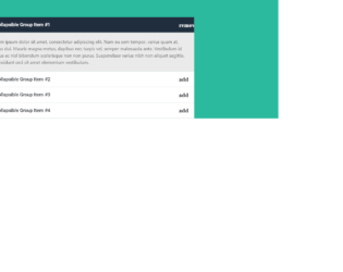
This is another example of an accordion widget for FAQ and Answers, designed using CSS, HTML, JavaScript, and Bootstrap framework 4. The form consists of four accordion items. Each accordion item is given a collapsible effect to hide the non-active sections. The font and Bootstrap styles are imported to the code with their URLs. The accordion card is given a border style of 1px solid #eceded. The card header is given a background color of #f9fafa, and a font family style as "Roboto", sans-serif. The card header changes its background color to #ecf0f0, on hover. The card header title is displayed with the styles of font-size as 1.3rem and font-weight as bold. The accordion body is given the styles of font color as #324353, text-align as justify, and border-top as 1px solid #eceded. JavaScript methods have been used to create the minus icon on the accordion header and its functionality.
Source: https://www.tutorialrepublic.com/snippets/preview.php?topic=bootstrap&file=toggle-faq-accordion
Toggle Faq Accordion
4.3.1
This is another example of an accordion widget with plus and minus icon, designed using CSS, HTML, Bootstrap framework 4, and JavaScript. The font and Bootstrap styles are imported to the code with their URLs. The form consists of four accordion items. Each accordion item is given a collapsible effect to hide the non-active sections. The background color of the form is set as #2bba9e. The accordion card header is given the styles of background color as #fff, and font-family style as "Roboto", sans-serif. The card header changes its background color to #f8f8f8, in a hover event. The header title is displayed using a font-size of 1.3rem, and a font-weight as bold. The body of the accordion item is given a background color of #eaeaea, and font color of #595959. The header of the selected accordion card takes the color #202d3c, when active. JavaScript methods are used to create the minus icon on the accordion header, its functionality and highlight the header of the selected accordion card.
Source: https://www.tutorialrepublic.com/snippets/preview.php?topic=bootstrap&file=accordion-menu-with-plus-minus-icon
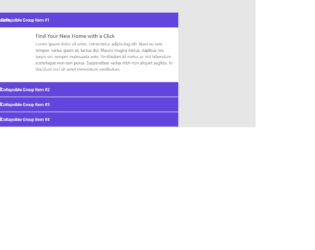
This is an example of an accordion widget, designed using HTML, CSS, JavaScript, and Bootstrap framework 4. The form consists of four accordion items. Each accordion item is given a collapsible effect to hide the non-active sections. The images, font, and Bootstrap styles are imported to the code with their URLs. The body of the form is given a background color of #e6e6e6, whereas the accordion card is given a box-shadow effect of 0 0 6px rgba(0,0,0,0.2). The accordion card header has a background color of #6245dd. The title of each accordion card header is displayed with the styles of font color as #fff, font-size as 1rem, font-weight as 500, and font-family as "Roboto", sans-serif. The accordion image is given a width of 150px. JavaScript methods are used to create the minus icon on the accordion header and its functionality.
Source: https://www.tutorialrepublic.com/snippets/preview.php?topic=bootstrap&file=elegant-accordion-widget
Elegant Accordion Widget
4.3.1