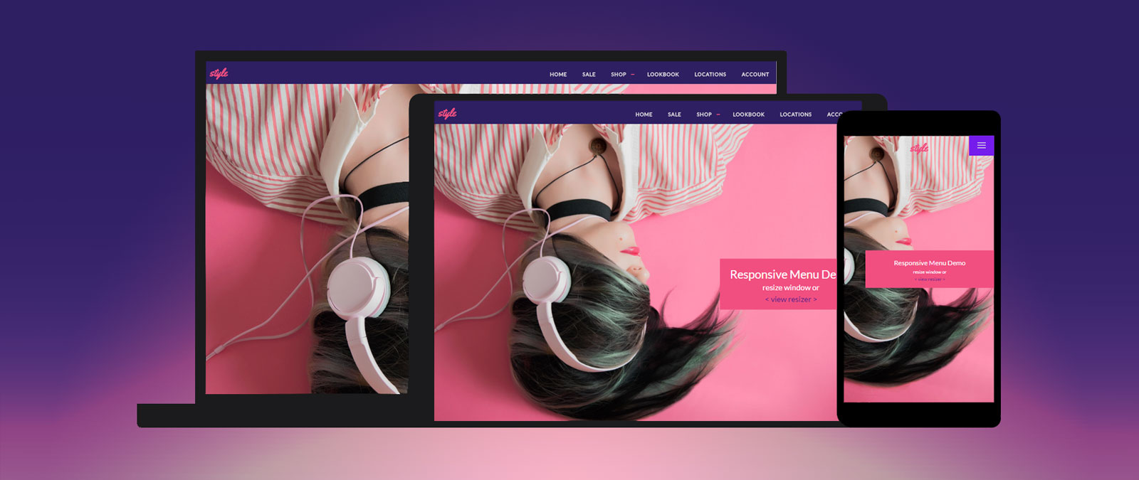
Four Elements of Truly Mobile-Friendly Responsive Menus
There are hundreds of ways to create responsive navigation, limited only by your creativity and the boundaries of what CSS can accomplish. Good responsive navigation is a little harder – ...

Easy CSS Animation Using @keyframes
CSS Transitions and transforms work beautifully for creating visual interactions based on single state changes. To have more control over what happens and when, you can use the CSS animation ...
Tutorial: Duo Layout With CSS3 Animations & Transitions (Pt. 2)
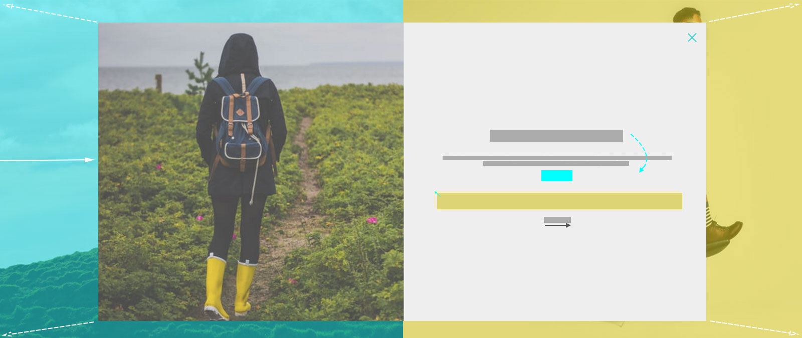
Last week I demonstrated how to build a split-screen website layout using CSS flexbox and viewport units that offers an alternative way to present a brand’s featured content. Clicking on ...
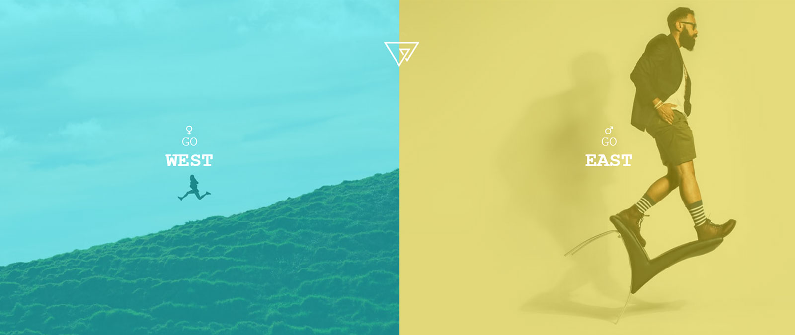
Tutorial: Trendy Splitscreen Layout With CSS3 Animations (Pt. 1)
There is no better time than the end of the year for some fresh inspiration! One of the most popular trends this year, features splitscreen layouts, lots of white space, ...
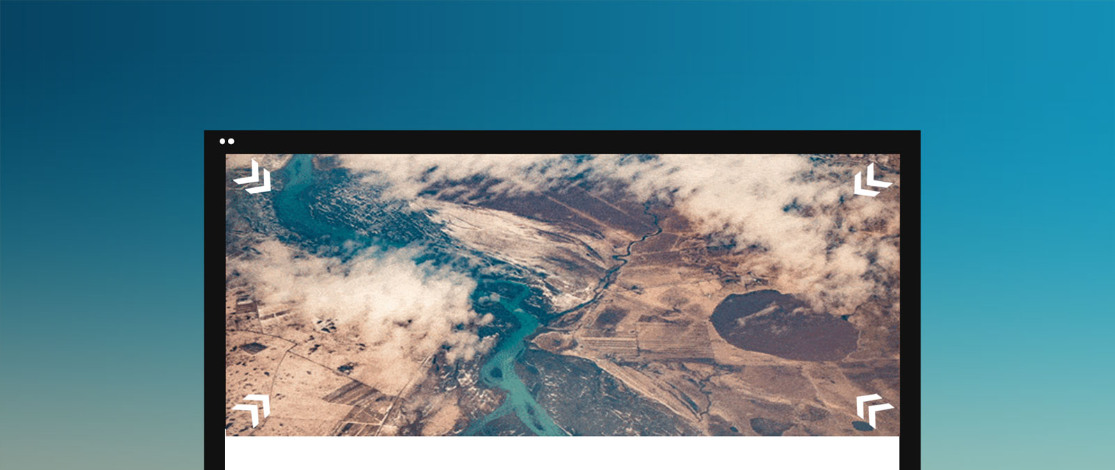
How to Zoom Hero Images on Scroll
Hero headers or hero images are one of the most frequently used and aesthetically pleasing web design trends in 2016, and will likely remain strong for a few years to ...