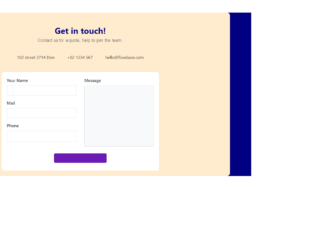
This is an example of a Contact Us form, designed using HTML, CSS, and Bootstrap framework 4. The font style is imported to the code with its URL. The body of the form is given a background color of navy blue, whereas the form container is given the background color blanchedalmond. The muted text is displayed with a font-family style as 'Ubuntu', sans-serif. The contact details tabs are given a cursor style as pointer to get the hand cursor effect on hover. The background color of the contact details tabs gets changed to #fff, in a hover event. The input text fields are given a border style of 1px solid #ddd. The fields take the border style of 2px solid RGB(105, 27, 179), and font color of RGB(105, 27, 179), in a hover event. The 'Send Message' button is given a background color of RGB(105, 27, 179), and font color of #fff. The media quarries have been used to increase the responsiveness of the form.
Source: https://bbbootstrap.com/snippets/bootstrap-contact-us-form-contact-details-66798171
This is an example of another contact us form with floating labels, designed using HTML, CSS, and Bootstrap framework 4. The font style is imported to the code using its URL. The users are given the ability to access the contact form on clicking the modal button.The body of the form has the styles of background color as linear-gradient(0deg, #fff, 50%, RGB(210, 231, 252)), and font-family as 'Rubik', sans-serif. The font size of the title has been calculated using the calc(14px + (17 - 14) * ((100vw - 360px) / (1600 - 320))) formula. The background color of the modal button is set as #52B4DB. The input text fields are given a font-size of 15px, and the opacity is set as 0.5. The font-size of the labels gets changed to 8px in the focused mode, and the font color gets changed to #04A79C to create the floating effect on labels. In a focus event, the input text fields take the effects of border as 1px solid #04A79C, and box-shadow as 2px 2px rgba(233, 226, 226, 0.8). The cursor style for the modal is set as pointer to get the hand cursor effect in the hover event.
Source: https://bbbootstrap.com/snippets/contact-us-form-floating-labels-23481684
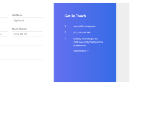
This is another example of a Contact Us form, designed using HTML, CSS, and Bootstrap framework 4. The font style is imported to the code with its URL. The body of the form is given a background color of #eee. The right side section of the form is given a linear gradient background color of linear-gradient(0deg, #376be6 0%, #6470ef 100%). The form consists of input text fields to enter first name, last name, contact details, suggestions, and the 'Submit' button. The 'Submit' button is created as a primary type button. The labels on the right side section are displayed using a font color as white. The form is linked with Google maps to get the directions, on click of the link. Media quarries have been used to increase the responsiveness of the form. The form is given a box-shadow style of 0 1rem 3rem rgba(132,138,163,0.1), to be activated on hover.
Source: https://www.bootdey.com/snippets/view/bs4-contact-form#css
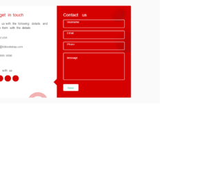
This is an example of a stylish contact us form, designed using CSS, HTML, and Bootstrap framework 4. The font style is imported to the form with its URL. The form is given a font-family style as "Poppins", sans-serif. The form is given the styles of max-width as 820px, background-color as #fff, border-radius as 4px, and box-shadow as 0 0 20px 1px rgba(0, 0, 0, 0.1). The contact information form is given a background color as #D50000. The form title is displayed using the styles of font color as #fff, font-weight as 500, font-size as 1.5rem, and line-height as 1. The input text fields are given the styles of border as 2px solid #fafafa, font color as #fff, font-weight as 500, font-size as 0.95rem, and letter-spacing as 0.5px. The 'Send' button is given the styles of background-color as #fff, border as 2px solid #fafafa, font-size as 0.95rem, font color as #1abc9c, and line-height as 1. The cursor style for the button is set as pointer to get the hand cursor effect on hover. The background color of the button turns to transparent on hover. The social media icons take a transform effect of scale(1.05), in a hover event.
Source: https://bbbootstrap.com/snippets/bootstrap-contact-us-form-floating-label-and-contact-info-71020948
This is another example of a user profile layout with timeline and overview tabs, designed using CSS, HTML, and Bootstrap framework 4. The concept of Lists has been used with UL and LI components. UL element has been used with the child elements of LI to display the information, in an orderly manner. This form allows the users to switch between the overview and edit sections of the form, with toggle tabs. The font style and images are imported to the code with their URLs. The panel heading is given a text-transform style as uppercase to automatically convert the text to uppercase. It is also given a font-family style as Arial, Helvetica, Sans-Serif. The bullet points of the bullet list are indicated with four different background colors as #d64b4b, #4dd79c, #0090d9, and #E2A917. The bullet list heading is displayed with the styles of font-weight as 700, font-size as 14px, font-size as 1.4rem, line-height as 1.4, and font color as #171717.
Source: https://www.bootdey.com/snippets/view/Profile-with-overview-and-edit#css
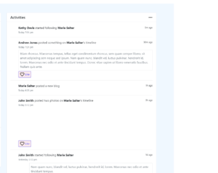
This is an example of a detailed page layout, designed using HTML, CSS, and Bootstrap framework 4. The body of the form is given a background color as #F0F8FF. The images are imported to the code with their URLs. This form provides a stylish profile layout for a user timeline. The information card is given the styles of background-color as #fff, border style as 1px solid #e5e9f2, border-radius as .2rem, and word-wrap as break-word to allow long words to be able to break and wrap onto the next line. The user image is given height and width as 128. The 'Like' button is created as a danger type button and the other buttons are created as primary buttons. The card header is given a background-color as #fff, and border-bottom as 1px solid #e5e9f2.
Source: https://www.bootdey.com/snippets/view/bs4-profile-detail-page#css
This is an example of a user profile with tabs, designed using CSS, HTML, and Bootstrap framework 4. The concept of Lists has been used with UL and LI components. UL element has been used with the child elements of LI to display the tab items, in an orderly manner. The font style and images are imported to the code with their URLs. The profile labels are displayed with a font color of #667E99. The form consists of four tabs, which opens four different forms. The first tab displays the profile information, the seconds one displays the activity feed, the third one displays the friends' section, and the fourth one displays the images. The user name is displayed with the styles of font color as #336199, background-color as #EDF3F4, and border-top as 1px solid #F7FBFF. The profile picture is given the styles of border as 1px solid #CCC, background-color as #FFF, and box-shadow as 1px 1px 1px rgba(0, 0, 0, .15).
Source: https://www.bootdey.com/snippets/view/User-Profile-with-tabs#css
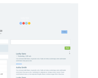
This is another example of a user profile layout, designed using HTML, CSS, and Bootstrap framework 4. The concept of Lists has been used with UL and LI components. UL element has been used with the child elements of LI to display the information, in an orderly manner. The body of the form is given a style set of font-family as 'Roboto', sans-serif, font-weight as 400, background-color as #f0f3f5, and margin-top as 40px. The user pic is given a height and a width of 100px, and a box-shadow style as 0px 3px 10px 0 rgba(0, 0, 0, 0.15). The user name is displayed with the styles of font-weight as 400, font-size as 20px, line-height as 20px, and font color as #000000. The social media buttons are created as primary, danger, info, and warning. The 'Follow' button is also created as a primary type button. The details sections are displayed with the styles of font color as #607d8b, and font-size as 13px. The user images in the friends' section, take an opacity value of 0.8, and transform style as scale(1.2), on hover.
Source: https://www.bootdey.com/snippets/view/light-user-profile#css
This is an example of a user profile layout with a dashboard, designed using HTML, CSS, and Bootstrap framework 4. The body of the form is given a background color of #f3f6f8. The images and icons are imported to the code with their URLs. The cover section is given a background color of #02c0ce. The form allows the users to view the user details, personal information, dashboard summary, inbox summary, work experience, and a project summary. The card box has the styles of border-radius as 3px, margin-bottom as 30px, background-color as #fff. The inbox items are given a border-bottom style of 1px solid #f3f6f8, to be activated on hover. The 'Reply' button is created as a success type button from HTML. The muted text is displayed using a font color of #98a6ad. The 'Orders', 'Product' 'Sold Products' summaries are displayed using a text-transform style as uppercase to automatically convert the text to uppercase.
Source: https://www.bootdey.com/snippets/view/bs4-Profile-with-dashboard#css
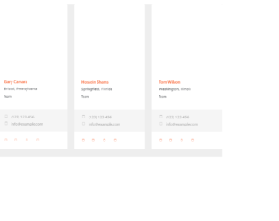
This an example of another user profile card layout, designed using CSS, HTML, and Bootstrap framework 4. The user images and font styles are imported to the code with their URLs. The concept of Lists has been used with UL and LI components. UL element has been used with the child elements of LI to display the information, in an orderly manner. The form consists of four profile cards. Each card is given a user image, user name, location, team member avatar images, contact details section, and social media icons. The body of the form is given a background color of #eee. The user name is displayed with a font color of #f96332, and a font-size of 17px. The profile card has the styles of background color as #fff, transition as .5s, border-radius as .1875rem, display as inline-block, and width as 100%. The user contact details are displayed with a font color of #9e9e9e and a font-size of 16px.
Source: https://www.bootdey.com/snippets/view/bs4-agent-cards#css
This is an example of a navbar layout with dropdown options, designed using CSS, HTML, JavaScript, and Bootstrap framework 4. The font styles are imported to the code with their URLs. JavaScript methods have been used to implement the functionality of the dropdown lists. The concept of Lists has been used with UL and LI components. UL element has been used with the child elements of LI to display the navbar items, in an orderly manner. The body of the form is given the styles of font-family as 'Open Sans', sans-serif, font-size as 1.6rem, and font-weight as 400. The form title is displayed with a font-size of 3.6rem, whereas the description is displayed with a font-size of 1.6rem. The button is created as a primary type button and given a background color of #c0ca33, which gets changed to #c0ca33, on hover. The dropdown items are set to take a font color of #c0ca33, in a hover event. Media quarries have been used to increase the responsiveness of the form.
Source: https://www.bootdey.com/snippets/view/bs4-navbar-with-dropdown-animations#js
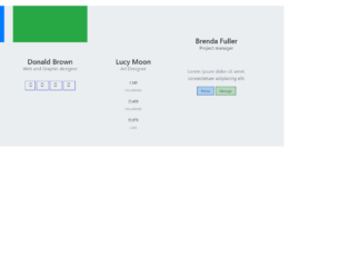
This is an example of a profile card widget, designed using CSS, HTML, and Bootstrap framework 4. The font style and user images have been imported to the code with their URLs. The card panel is given a box-shadow style of 0 2px 0 rgba(0,0,0,0.075). The body of the form is given a background color of #ebeef0. The form consists of four profile cards. The first profile card is given a background color of #5fa2dd, a font color of #fff, and two primary and success type buttons. The designation is displayed with a muted text. The second card is given a background color of #91c957, and font color of #fff. The width and size of each profile picture are set as 64px. The font-weight of each card header title is set as 600. The cursor style for all the buttons is set as pointer to get the hand cursor effect on hover.
Source: https://www.bootdey.com/snippets/view/profile-cards-widget#css