
This is a simple example of displaying the details such as prices and more information in a responsive table format with the use of HTML and CSS. The container has been implemented with the styles of margin right as auto, margin left as auto, padding left as 15px and padding right as 15px. The title of the page is designed with the use of margin as 0 and text align as center. Media queries in CSS have been used with the values of min width as 768px and min width as 992px in order to make the table responsive. The styles will be dynamically changed on the given elements based on the screen size of the user. The price column has the styles of list style as none, padding as 0, margin as 10px 1px, position as relative, display as block and float as left.
credits - https://codepen.io/thingo/pen/LkwHu
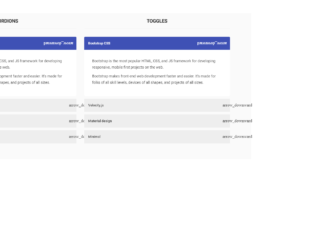
This snippet shows examples of Accordion and toggles using Velocity.js. Velocity.js is an animation engine for the UI, which works with or without JQuery. It is fast it features colour animation, transforms, loops, easings, SVG support, and scrolling. It can be used instead of Jquery and CSS. Here, the snippet deals with bootstrap 3 combined with Velocity.js v1.2. You can see the Accordion and Toggle behaviour created using bootstrap classes. The HTML is similar for both the example, take a look at the CSS and JQuery. Jquery uses the Velocity for creating the animation effect for fading the panels once clicked to see the accordion and toggling behaviour. The animations are smoothly done. This would be used in websites with large content. You can use this code with your personal tweak to blend with your page.
https://codepen.io/tofanelli/pen/waadRY

Chuyên mục MyALo
3.3.0
Comments are closed

This is an example of vertical responsive sidebar navigation, which can be used for mobiles or other devices. This is fully responsive and space saving sidebar navigation for any project. It is decorated button with primary and large settings. It button behavior is set with toggling property. The navigation is set to be a sidebar using sidebar-nav class this gives the navigation bar an ability to be placed at one side of the site. The navbar can have its brand name set by side-bar class. CSS file defines the effects and style for this navbar. Check out the properties set for each class and the wrapper which wrappers the navbar. The mouse hover effect is set in CSS with its color changing effect. The javascript adds the effect of toggling the navbar. This navbar is perfect for its responsive behavior. Use this and tweak it to your requirement.

This is an Bootstrap sticky contact form which will be fixed at the bottom position of the page. It will be located at footer area and when clicked will slide out to show the form. The form is floating and fixed at bottom of page, it will be displayed when the user clicks on “Send a message”. When click it provides animation and popup with all input fields to be filled out. HTML contains the “container” and fixed classes which act as a container. The entire form is placed in this container. The form contains the input, textarea and submit button. The container is using CSS style for all the classes and uses jquery 1.11 for animation. and popup of this form.