
Mega menus are a new trend. These are drop-down triggered when an event is triggered by hovering over a link mentioned in the menu. This is used to show all options under the particular menu. This is used on e-commerce site where all the available options are listed under a particular category. To add mega menu we are using “mega-dropdown menu”, to the menu item which will display the items under its list. To separate the content we are using the tab classes like “tab-content” and “tab-pane”. Define the tab-pane with particular ID’s. Define the nav tab’s as toggleable with links to the tab-pane of mega-menu items. Check out the CSS for hovering and styling. As mega menus are dropdowns using hovering events, you must be careful to add this on the selected menu items. Use this for your e-commerce website by listing your items and images.
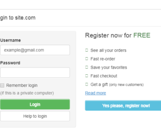
This is an example of adding Login Form in Modal. Bootstrap contains a Modal component, They are Modals are built with HTML, CSS, and JavaScript. They’re positioned over everything else in the document and remove scroll from the so that modal content scrolls instead. Clicking on the modal “backdrop” will automatically close the modal. Bootstrap only supports one modal window at a time. Nested modals aren’t supported as we believe them to be poor user experiences. Whenever possible, place your modal HTML in a top-level position to avoid potential interference from other elements. You’ll likely run into issues when nesting a .modal within another fixed element. ModelContent is divided into modelHeader, modal-body, and ModalFooter. ModalBody contains the form and registration details whereas the ModalHeader contains header details. Form and registration details are added in two columns in a row. This does not use the modal footer.
Login Form In Modal
3.2.0