This is another example of a bootstrap footer template with hover effects, designed using HTML, CSS, and Bootstrap framework 4. The icons and images are imported to the code with their URLs. The concept of Lists has been used with UL and LI components. UL element has been used with the child elements of LI to display the details in an orderly manner. The footer form is given the styles of background color as #222, font color as #aaa, and padding-top as 10px. The header titles are given a style set of color as #0894d1, letter-spacing as 1px, and margin as 30px 0 20px. The social media icons have the styles of float as left, margin-right as 3px, opacity as 0.7, border-radius as 50% to get the circle shape, and transition as all 0.3s ease-in-out. The icons take an opacity value of 1, in a hover event. The footer copyright section is given a background color as #333, and a font-size as 15px. The font color of the copyright span section is set as #0894d1.
Source: https://codepen.io/Alioos_90/pen/VPbzpy
Bootstrap footer
4.3.1

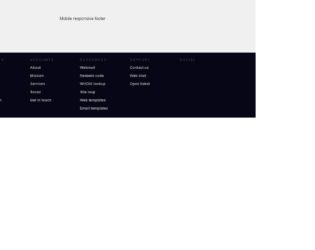
This is another example of a mobile responsive bootstrap footer template with hover effects, designed using HTML, CSS, and Bootstrap framework 4. The icons are imported to the code with their URLs. The concept of Lists has been used with UL and LI components. UL element has been used with the child elements of LI to display the details in an orderly manner. Media queries have been used to increase the responsiveness of the form. The footer is divided into five sections as Footer top, Footer left, Footer right, Footer middle, and Footer bottom. The footer right section has the styles of font-family as Montserrat, font-size as 16px, and color as rgba(0, 0, 0, 0.5). The list items have the styles of color as rgba(0, 0, 0, 0.5), line-height as 1.6, and font-weight as 500, whereas the contact numbers are given the styles of font-size as 22px, and color as rgba(0, 0, 0, 1). The list items take the color of rgba(54, 204, 142, 1), in a hover event. The email signup button is given the styles of font-family as Montserrat, font-size as 16px, height as 50px, width as 30%, background-color as #36cc8e, font color as #fff, border-radius as 50px to get the circle shape and text-transform style as uppercase to convert the text to uppercase.
Source: https://codepen.io/Tony_Codes/pen/pVJqqY
Bootstrap Footer AV Test
4.3.1
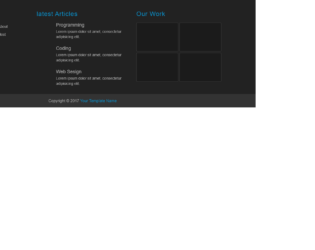
This is another example of a bootstrap footer template with hover effects, designed using HTML, CSS, and Bootstrap framework 4. The icons and images are imported to the code with their URLs. The concept of Lists has been used with UL and LI components. UL element has been used with the child elements of LI to display the details in an orderly manner. The background color of the footer is set as #f5f5f5. The "Stay in Touch" content is given a font-size of 20px, with the font color as #333. The social media icons take the color red in a hover event. The "Latest events" items are also given the same color and turn to red, in a hover event, whereas the subtitle is given a font color of #969696. The gallery items have the styles of float as left, margin as 0 3% 2% 0, width as 31%, position as relative, and margin as 0 0 1%.
Source: https://codepen.io/shamim539/pen/ZBQzYw
bootstrap footer example
4.3.1

This is an example of a bootstrap footer template with hover effects, designed using HTML, CSS, and Bootstrap framework 4. The icons are imported to the code with their URLs. The concept of Lists has been used with UL and LI components. UL element has been used with the child elements of LI to display the details in an orderly manner. Media queries have been used to increase the responsiveness of the form. The body of the form is given the styles of box-sizing as border-box, and font-family as "Lato", sans-serif. The footer is divided into three sections as Footer main, Footer social, and Footer legal and given styles. The background color of the main section is set as #555, with the font color set as #eee. The title of the list items has the styles of color as #fff, font-family as "Merriweather", serif, font-size as 1.375rem, and padding-bottom as 0.625rem. The list items take an underline effect in a hover event. The Footer legal section is given a background color of #333, and padding as 0.9375rem 1.875rem.
Source: https://codepen.io/Caseguy/pen/gObBmGd
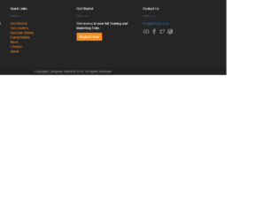
This is an example of a bootstrap footer template with hover animations, designed using HTML, CSS, and Bootstrap framework 4. The icons are imported to the code with their URLs. The concept of Lists has been used with UL and LI components. UL element has been used with the child elements of LI to display the details in an orderly manner. The main footer section is given a background color of #252525, whereas the copyrights footer section given the background color #222. The "Register Now" button has the background color of #ff8d1e, which turns to #4b92dc, with a transition value of all 250ms ease-in-out 0s, in a hover event. The social media icons also take the background color of #ff8d1e, in a hover event. The quick links items are given a font color of #ff8d1e, which changes to #4b92dc, in a hover event.
Source: https://codepen.io/digitalavinash/pen/VjGGgp
Footer made in bootstrap
4.3.1
This is an example of a mobile responsive bootstrap footer template with hover animations, designed using HTML, CSS, and Bootstrap framework 4. The icons are imported to the code with their URLs. The concept of Lists has been used with UL and LI components. UL element has been used with the child elements of LI to display the details in an orderly manner. Media queries have been used to increase the responsiveness of the form. The body of the form is given the styles of font-family as Arial, Helvetica, Sans-serif, and background-color as #070617. The footer section is given a background color of #070617. The footer column headers are given the styles of font-family as inherit, font-size as 12px, line-height as 17px, padding as 20px 0px 5px 0px, color as rgba(255,255,255,0.2), font-weight as normal, text-transform as uppercase to convert the text to uppercase automatically, and letter-spacing as 0.250em. The column list items have the styles of color as #999999, font-size as 14px, cursor as pointer to get the hand cursor effect, and transition as .2s, which changes its color to #ffffff, in a hover event.
Source: https://codepen.io/jakeduncan/pen/rJZJMM
Mobile Responsive Footer
4.3.1

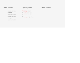
This is an example of a bootstrap footer template with hover animations and sub-navigation, designed using HTML, CSS, and Bootstrap framework 4. The concept of Lists has been used with UL and LI components. UL element has been used with the child elements of LI to display the details in an orderly manner. The footer is given a font color as white. The list items are given a font color of #bfffff, which changes to white, in a hover event. The background color of the footer bottom is set to #3d6277 color with padding of 2em. The footer step is given a background color as #2d4958. The sub-navigation section has the styles of color as white, and font-weight as bold. The sub-navigation items have the styles of padding as 1rem 1rem, color as white, and font-weight as bold, which take the styles of border-top as 5px solid orange, background as white, and color as black when they're active.
Source: https://codepen.io/gcharles/pen/oxpwyL
This is an example of a bootstrap footer template with hover animations, designed using HTML, CSS, and Bootstrap framework 4. The icons are imported to the code with their URLs. The concept of Lists has been used with UL and LI components. UL element has been used with the child elements of LI to display the details in an orderly manner. Media queries have been used to increase the responsiveness of the form. The site footer section has the styles of background-color as #26272b, padding as 45px 0 20px, font-size as 15px, line-height as 24px, and color as #737373. The site footer section has a font-size of 16px, and text-transform style as uppercase to automatically convert the text to uppercase. The list items are given a font color of #737373, which changes to #3366cc, in a hover event. The social media icons take different background colors such as Facebook as #3b5998, Twitter as #00aced, Linkedin as #007bb6, and dribble as #ea4c89.
Source: https://codepen.io/scanfcode/pen/MEZPNd
Footer Template
4.3.1