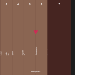
This is an accordion layout with hover effects and animations, designed using HTML, CSS, and Bootstrap framework 4. The fonts are imported to the code with its URL, whereas media quarries are used to increase the responsiveness of the form. The background of the form is given the color of #1c1c1c. The accordion is given the styles of background as #8A6552, color as #FFFFFF, font-family as 'Sunflower', sans-serif, and padding-bottom as 2rem. The accordion is given six similar child items and a different last item. The accordion items have the styles of padding as 1rem 2rem, margin as 0 auto, and max-width as 30rem, whereas the last item has the styles of background as #462521, text-align as center, and border-radius as .5rem. The title of each item is given the font-size as 1.5rem. The heart icon has the styles of color as #CA2E55, font-size as 3rem, and transition as all .3s cubic-bezier(.8,.16,.42,.89). The child elements take a transform effect of scaleX(2) translateX(-1px) in a hover event, whereas the heart icon in the last child takes the font-size of 6rem, and transform of scale(2). The title of the first six child elements also takes a transform effect of scaleX(.5) translateX(-50%), in a hover event.
Source: https://codepen.io/sfi0zy/pen/KeMZEb
CSS Accordion
4.3.1
This is another example of a simple, flat accordion, designed using HTML, CSS, and JavaScript. The fonts and icons are imported to the code with their URLs, whereas the JavaScript functions have been used to implement the accordion expand feature. The font-family for the form is defined as "JF Flat Regular". The colors and fonts are predefined as variables, which are $Mahogany : #620808, $AppleBlossom : #a53f3f, $GoldenSand : #f4ce74, $EggWhite : #ffe9c1, $OrangeRoughy : #d5441c, and $mainfont : "JF Flat Regular". The body of the form is given a background style of #f6704b. The accordion is given the styles of margin as 50px auto, width as 380px, background as #ccc, and cursor as pointer to get the hand cursor effect. The title of the accordion items is given the styles of height as 100%, padding-left as 50px, font-family as $mainfont, font-size as 20px, and font-weight as 400. Each accordion item is given a different background color and a font color as type(1)- background: $Mahogany, color: $GoldenSand, type(2)- background: $AppleBlossom, color: $EggWhite, type(3)- background: $GoldenSand, color: $Mahogany, type(4)- background: $EggWhite, color: $OrangeRoughy, and last-of-type- background: $OrangeRoughy, color: $EggWhite.
Source: https://codepen.io/SoufianeAbid/pen/eZVzBL
Flat accordion
4.3.1
This is an example of a responsive accordion with zoom-in effect, designed using HTML, and CSS, and Bootstrap framework 4.The body of the form is given the styles of min-height as 100vh, background as #000, font-family as sans-serif, display as flex, justify-content as center, and align-items as center. The container of the accordion items is given the styles of display as flex, justify-content as center, align-items as center, margin as 10vmin, overflow as hidden, and transform as skew(5deg). The image card has the styles of all 1s ease-in-out and height as 75vmin. The image is given a filter of grayscale (100%), whereas the image card head is given the styles of color as black, background as rgba(255, 30, 173, 0.75), padding as 0.5em, transform as rotate(-90deg), transition as all 0.5s ease-in-out, and font-size as 1em. In a hover event, the grayscale filter over the image turns to 0, whereas the font-size becomes 2em, and the image takes a transform effect of rotate(0deg) skew(-5deg).
Source: https://codepen.io/bbx/pen/Jxoqdg
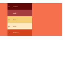
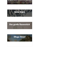
This is another example of an accordion layout, designed using HTML, CSS, JavaScript, and Bootstrap framework 4. JavaScript functions have been used to implement the accordion expanding functions. The concept of Lists has been used with UL and LI components. UL element has been used with the child elements of LI to display the accordion items in an orderly manner. The body of the form is given the styles of font-family as Helvetica, arial, sans-serif, background-color as #000, height as 100%, and a linear gradient background as linear-gradient(to bottom, #020111 10%,#3a3a52 100%). The accordion is given a max-width of 500px. The title of the accordion is given the styles of font-family as 'industry', sans-serif, font-weight as 300, color as #fff, text-transform as uppercase to automatically convert the text to uppercase and font-size as 1.125em. The accordion has four child elements each of which are given individual titles. The accordion child element titles are given the styles of font-family as 'industry', sans-serif, font-weight as 300, and font-size as 1em.
Source: https://codepen.io/aderaaij/pen/QybEQo

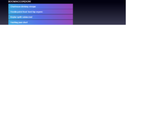
This is an example of a full-width accordion slider, designed using HTML, CSS, JavaScript, and Bootstrap framework 4. JavaScript functions have been used to implement the accordion functions. The fonts and background images are imported to the code with their URLs. The font family style for the form is given as 'Open Sans', sans-serif. The accordion is given four items, which are given different background colors as darken(rgba(240,81,81,0.65), 20%), darken(rgba(33,124,193,0.80), 23%), rgba(238,183,6,0.6), and darken(rgba(0,172,139,0.7), 10%). The accordion items are given the styles of position as absolute, display as block, width as 100%, height as 100%, a border style as 2px solid #FFF, and cursor style as pointer to get the hand cursor effect. The items change their width to 110px, in a hover event. The banner title has the styles of text-transform as uppercase to automatically convert the text to uppercase, and font color as #FFF. The accordion items change the value of their Left positions when they are selected to adjust according to the frame.
Source: https://codepen.io/EzeRangel/pen/yvsjC

This is an example of a web form accordion menu, designed using HTML, CSS, JavaScript, and Bootstrap framework 4. The JavaScript library JQuery has been used to implement the accordion expand functions. The concept of Lists has been used with UL and LI components. UL element has been used with the child elements of LI to display the child elements of the accordion in an orderly manner. The body of the form is given a style set of height as 100%, font-size as 20px, min-width as calc(300px + 1.5rem), line-height as 1.5, background-color as #333, font-family as "HelveticaNeue-Light", "Helvetica Neue Light", "Helvetica Neue", Helvetica, Arial, "Lucida Grande", sans-serif, and color as rgba(255, 255, 255, .5). The title of the form is given the styles of font-weight as 700, font-size as 1.6rem, and color as white. The accordion child elements are given an opacity of 100ms ease-in-out, which changes to .5, in a hover event. The plus mark is given a font size of .6rem, and a transform style of translateY(-50%), which changes its icons to minus when it is expanded. The accordion items are set to reveal a sub-menu when they are expanded.
Source: https://codepen.io/jamestalmond/pen/BpqrWo

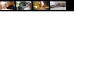
This is another example of an accordion with image cards, designed using CSS, HTML, and Bootstrap framework 4. The images are imported to the code with their URLs, whereas the concept of Lists has been used with UL and LI components. UL element has been used with the child elements of LI to display the child elements of the accordion in an orderly manner. Media queries are also used to increase the responsiveness of the form. The accordion is given four child elements with four different background images. The body of the form is given a background color as #444. The credits section is given the styles of color as #222, background-color as #f8dc3d, font-family as "Segoe UI", "Ubuntu", monospace,
font-weight as 500, padding as 2px 10px, and border-radius as 4px.The accordion child elements are given a width of 16.666%, and an opacity of 0.4, which changes to width as 50%, and opacity as 1, in a hover event.
Source: https://codepen.io/emoreno911/pen/dOveoY
This is another example of an accordion layout with 3D paper folding effect, designed using HTML, CSS, JavaScript, and Bootstrap framework 4. The images are imported to the code with their URLs, whereas JavaScript functions have been used to implement the paper folding effect. The body of the form is given the styles of background-color as #202B2E, display as flex, justify-content as center, align-items as center, height as 100vh, and font-family as 'IM Fell French Canon'. The background color of the Details section is set as White. A transform-style for the accordion is given as preserve-3d to help get the 3D effects. The cursor style for the image card is given as pointer to get the hand cursor effect. The image card displays the card title with a border-bottom style as 2px solid #D8303D, and changes the opacity to 1, in a hover effect. The card title is given a transition of all .4s ease-in-out, whereas the card details section is given the styles of color as white, font-style as italic, padding-top as 10px, font-weight as 400, and transition as all .5s ease-in-out .2s.
Source: https://codepen.io/paweltar/pen/EyVrmm