Screen resolution nowsaday ranges from 320px (iPhone) to 2560px (large monitor) or even higher. Users no longer just browse the web with desktop computers. Users now use mobile phones, small notebooks, tablet devices such as iPad or Playbook to access the web. So the traditional fixed width design doesn’t work any more. Web design needs to be adaptive. The layout needs to be automatically adjusted to fit all display resolution and devices. This tutorial will show you how to create a cross-browser responsive design with HTML5 & CSS3 media queries.
See It in Action First
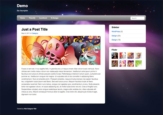
Before you start, check the final demo to see how it looks like. Resize your browser to see how the layout automatically flows based on the width of the viewport (browser viewing area).
More Examples
If you want to see more examples, check out the following WordPress themes that I designed with media queries: Tisa, Elemin, Suco, iTheme2, Funki, Minblr, and Wumblr.
Overview
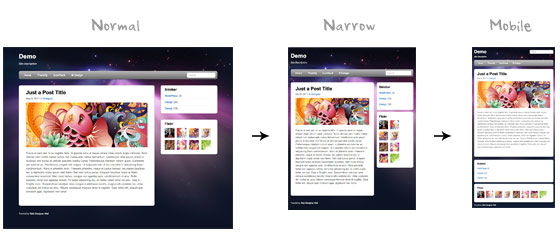
The page’s container has a width of 980px which is optimized for any resolution wider than 1024px. Media query is used to check if the viewport is narrower than 980px, then the layout will turn to fluid width instead of fixed width. If the viewport is narrower than 650px, it expands the content container and sidebar to fullwidth to form a single column layout.
HTML Code
I’m not going to go through the details of the HTML code. Below is the main structure of the layout. I have a "pagewrap" container that wraps the "header", "content", "sidebar", and "footer" together.
<div id="pagewrap">

	<header id="header">

		<hgroup>
			<h1 id="site-logo">Demo</h1>
			<h2 id="site-description">Site Description</h2>
		</hgroup>

		<nav>
			<ul id="main-nav">
				<li><a href="#">Home</a></li>
			</ul>
		</nav>

		<form id="searchform">
			<input type="search">
		</form>

	</header>

	<div id="content">

		<article class="post">
			blog post
		</article>

	</div>

	<aside id="sidebar">

		<section class="widget">
			 widget
		</section>

	</aside>

	<footer id="footer">
		footer
	</footer>

</div>
HTML5.js
Note that I use HTML5 markup in my demo. Internet Explorer prior than version 9 doesn’t support the new elements introduced in HTML5 such as <header>, <article>, <footer>, <figure>, etc. Including the html5.js Javscript file in the HTML document will enable IE to acknowledge the new elements.
<!--[if lt IE 9]>
	<script src="http://html5shim.googlecode.com/svn/trunk/html5.js"></script>
<![endif]-->
CSS
Reset HTML5 Elements to Block
The following CSS will reset the HTML5 elements (article, aside, figure, header, footer, etc.) to block element.
article, aside, details, figcaption, figure, footer, header, hgroup, menu, nav, section {
    display: block;
}
Main Structure CSS
Again, I’m not going to get into the details. The main "pagewrap" container is 980px wide. Header has a fixed height 160px. The "content" container is 600px wide floated left. The "sidebar" content is 280px wide floated right.
#pagewrap {
	width: 980px;
	margin: 0 auto;
}

#header {
	height: 160px;
}

#content {
	width: 600px;
	float: left;
}

#sidebar {
	width: 280px;
	float: right;
}

#footer {
	clear: both;
}
Step 1 Demo
Here is the design demo. Note that the media queries haven’t been implemented yet. Resize the browser window and you should see that the layout is not scalable.
CSS3 Media Query Stuffs
Now here comes the fun part — media queries.
Include Media Queries Javascript
Internet Explorer 8 or older versions doesn’t support CSS3 media queries. You can enable it by adding the css3-mediaqueries.js Javascript file.
<!--[if lt IE 9]>
	<script src="http://css3-mediaqueries-js.googlecode.com/svn/trunk/css3-mediaqueries.js"></script>
<![endif]-->
Include Media Queries CSS
Create a new stylesheet for the media queries. Check out my previous tutorial to see how media queries work.
<link href="media-queries.css" rel="stylesheet" type="text/css">
Viewport Smaller Than 980px (Fluid Layout)
For viewport narrower than 980px, the following rules will apply:
- pagewrap = reset width to 95%
- content = reset width to 60%
- sidebar = reset width to 30%
Tips: use percentage (%) value to make the containers fluid.
@media screen and (max-width: 980px) {

	#pagewrap {
		width: 95%;
	}

	#content {
		width: 60%;
		padding: 3% 4%;
	}

	#sidebar {
		width: 30%;
	}
	#sidebar .widget {
		padding: 8% 7%;
		margin-bottom: 10px;
	}

}
Viewport Smaller Than 650px (One-Column Layout)
Next I have another set of CSS for viewport narrower than 650px:
- header = reset height to auto
- searchform = re-position the searchform to 5px top
- main-nav = reset the position to static
- site-logo = reset the position to static
- site-description = reset the position to static
- content = reset the width to auto (this will make the container to expand fullwidth) and get rid of the float
- sidebar = reset width to 100% and get rid of the float
@media screen and (max-width: 650px) {

	#header {
		height: auto;
	}

	#searchform {
		position: absolute;
		top: 5px;
		right: 0;
	}

	#main-nav {
		position: static;
	}

	#site-logo {
		margin: 15px 100px 5px 0;
		position: static;
	}

	#site-description {
		margin: 0 0 15px;
		position: static;
	}

	#content {
		width: auto;
		float: none;
		margin: 20px 0;
	}

	#sidebar {
		width: 100%;
		float: none;
		margin: 0;
	}

}
Viewport Smaller Than 480px
The following CSS will apply if the viewport is narrower than 480px which is the width of the iPhone screen in landscape orientation.
- html = disable text size adjustment. By default, iPhone enlarges the text size so it reads more comfortably. You can disable the text size adjustment by adding
-webkit-text-size-adjust: none; - main-nav = reset the font size to 90%
@media screen and (max-width: 480px) {

	html {
		-webkit-text-size-adjust: none;
	}

	#main-nav a {
		font-size: 90%;
		padding: 10px 8px;
	}

}
Flexible Images
To make the images flexible, simply add max-width:100% and height:auto. Image max-width:100% and height:auto works in IE7, but not in IE8 (yes, another weird IE bug). To fix this, you need to add width:auto\9 for IE8.
img {
	max-width: 100%;
	height: auto;
	width: auto\9; /* ie8 */
}
Flexible Embedded Videos
To make the embedded videos flexible, use the same trick as mentioned above. For unknown reason, max-width:100% (for embed element) doesn’t work in Safari. The work around is to use width:100% instead.
.video embed,
.video object,
.video iframe {
	width: 100%;
	height: auto;
}
Initial Scale Meta Tag (iPhone)
By default, iPhone Safari shrinks HTML pages to fit into the iPhone screen. The following meta tag tells iPhone Safari to use the width of the device as the width of the viewport and disable the initial scale.
<meta name="viewport" content="width=device-width; initial-scale=1.0">
Final Demo
View the final demo and resize your browser window to see the media queries in action. Don’t forget to check the demo with the iPhone, iPad, Blackberry (newer versions), and Android phones to see the mobile version.
Summaries
- Media Queries Javascript Fallback:
css3-mediaqueries.js is required to enable media queries for browsers that don’t support media queries.<!--[if lt IE 9]> <script src="http://css3-mediaqueries-js.googlecode.com/svn/trunk/css3-mediaqueries.js"></script> <![endif]--> - CSS Media Queries:
The trick for creating an adaptive design is to use CSS to override the layout structure based on the viewport width.@media screen and (max-width: 560px) { #content { width: auto; float: none; } #sidebar { width: 100%; float: none; } } - Flexible Images:
Use max-width:100% and height:auto to make the images flexible.img { max-width: 100%; height: auto; width: auto\9; /* ie8 */ } - Flexible Embedded Videos:
Use width:100% and height:auto to make the embedded videos flexible..video embed, .video object, .video iframe { width: 100%; height: auto; } - Webkit Text Size Adjust:
Use -webkit-text-size-adjust:none to disable text size adjust on the iPhone.html { -webkit-text-size-adjust: none; } - Reset iPhone Viewport & Initial Scale:
The following meta tag resets the viewport and inital scale on the iPhone:<meta name="viewport" content="width=device-width; initial-scale=1.0">
Updates
245 Comments
Comments are closed.
David Nemes
Wow very good article! ty
gBaniya
quality stuff…
which bit of the code keeps the images sharp all the time? Love to try this very soon..
thanks for sharing.. :)
Shaza Chua
Wow! This is great! Thank you for sharing this! I really really need this for my upcoming project.
Benjamin Reid
Really nice explanation – something we should all be doing now.
Three
rem very good
CHEWX
GBaniya, There is no code to keep the image sharp, it just resizes to 100%, if you want to keep the image sharp you have two or three versions of the picture and then swap them depending on viewport.. the downside to media queries. That is why image heavy websites tend not to use media queries.
gBaniya
Thanks very much for your reply. It helps. :)
Catalin Red
Lovely article and thanks for sharing! I enjoyed the “Media Queries Javascript” fallback part.
curtismchale
While media queries certainly work they’re not the best option for detecting mobile devices. Since a mobile device sits on a constrained pipe (slow) already having to download all the CSS for the regular site, then the CSS for it’s screensize is certainly slow. With this method you also end up downloading the full size images then they get scaled down. Basic web optimization says we serve the image size we need not larger images that are scaled down.
Server side detection of mobile devices is a much better option since you can then only serve the code specific to the device in question. Then if you want to query for specific landscape/portrait orientation go for it. You’d only serve the image sizes required by the device as well.
Media queries are great but only if they’re used properly by an informed developer.
gBaniya
Thank you so much for the elaboration. I’ve got slightly better understanding on the media queries. Now, I’m going to go google about it and get myself more well informed. :)
Kind Regards,
G.
Joe Lambert
Using services such as http://tinysrc.net/ can help optimise assets for mobile sites whilst still using media queries.
Nick La
Thanks for the link. Didn’t even know about it.
Kent
Another option would be http://stuffandnonsense.co.uk/projects/320andup/ wouldn’t it?
Jon Glick
Besides the point that curtismchale made above, I always thought that media queries should be used based on when the screen gets larger. The mobile/basic version of the site is the default so that if the browser doesn’t understand media queries (besides IE, mostly a mobile issue) it gets the most basic version. Then, browsers that *get* media queries would have larger layouts available. Same techniques, different philosophy i guess.
Anyway, thanks for the concise write-up. I hadn’t seen “-webkit-text-size-adjust: none;” before!
curtismchale
I’ve never thought about it that way but it’s not a bad idea. We could safely assume that larger screens are on faster connections where the extra downloads aren’t as big a concern. Sure it could be tethered to a mobile device but we’re still probably safe with the assumption.
Jumping off that assumption I think we’re probably pretty okay using media queries only to get screensizes.
Nick La
Interesting.. I’ve got to try this idea.
Marcy
Thanks for the how-to! I especially appreciate knowing how you resize images for IE. And I love the way your nav menu jumps from the side to the top for this site on smaller screens. It’s really well done!
G
This is a great tut. Thank you for going into it.
Casey
Perfect tutorial! Ive been using alot of these techniques already, but I really found it useful seeing your comments on every line, explaining how and why they are used!
Sam
The Less CSS Framework is trying to do very similar things:
http://lessframework.com/
curtismchale
The LESS framework requires JS now though. JS is a blocker for downloads. We’re already sitting on a constrained pipe so I’d think we’d want to remove as much ‘required’ stuff as possible for the site to function properly.
I like the LESS framework way more when it was a rendered CSS library. All the benefits of variables and mixins without the JS requirements to bog it down.
Dmoney
Can someone tell me the difference between, say, css3-media-queries.js, adapt.js, and respond.js ?
Min
I needed this! Thanks Nickla!
joe
Why reinvent the wheel? As somebody said there is already css framework solutions like less framework and also less+
http://www.angrycreative.se/projekt/less-framework/
DED
Writing your own code is not reinventing the wheel. Reinventing the wheel in the context you describe would be if someone rewrote the LESS framework. The techniques here let you control how the code will work and gives you greater freedom than relying on another person’s solution. They also easy to implement and get you to think in more adaptive terms than you might otherwise. The LESS framework is a nice solution, but it shouldn’t be something that one must have to do what is discussed in the tutorial.
Sebastian
thanks for this helpful tutorial… again!
Jose Antonio Corachán
Great tutoria, specially the flexible images tip. You have save my day with that trick!!!
Also the idea os separate CSS for the Media Queries is quite nice. I will implement some of your ideas on my current work.
Thanks!!!
FlowerMountain
Nice article, however I’d use Andy Clarke’s awesome ‘320 and up’ template combined with Paul Irish’s HTML5 Boilerplate.
http://stuffandnonsense.co.uk/projects/320andup/
curtismchale
Great, why is the important part which you didnt’ mention.
Nicolas Gallagher
Using -webkit-text-size-adjust:100% is “safer” – http://www.456bereastreet.com/archive/201011/beware_of_-webkit-text-size-adjustnone/
An alternative to css3-mediaqueries.js is respond.js – https://github.com/scottjehl/Respond . It acts as a min/max-width MQs polyfill and is only ~1K
Warren
Thanks for this tutorial. Like others have stated, there are numerous ways of rendering a website in order to adapt to each screen size, but the important thing here is that we learn different ways to do it. No matter which method we think is best one, there will always be an scenario on which we will need to adapt to. And all these mentioned methods will help us to do it.
HTML Codes Dude
Awesome stuff. But I don’t understand why you would need the css3-mediaqueries.js? I don’t know any mobile or tablet you would be targeting that would be using IE? So why have the extra overhead?
Nick La
The point of the media queries is not just for mobile. The purpose of media queries is to build an adaptive design that works on all browsers and screens.
dmonty
Thank you again for this tutorial .. I’ve been meaning to do this but didn’t know how to go about it .. This is gonna help me a lot..
Damian
one for the memory banks thanks
Djurica Bogosavljev
Great Tutorial, just what I need for redesign of my Porfolio web site! Will help me a lot. Thanks Nick for sharing this!
Vladimir Krasko
This is handy and similar to 978 grid switching. There is an issue with using the js files to render HTML5 and CSS3 in IE. There seems to be an issue when using both of those files together. Some of the elements don’t render (specifically the navigation). However using just the HTML5shiv.js file, the markup is rendered correctly. So there is an issue with how the CSS3 Media queres and HTML5shiv files work together, but this is an issue with the development with those libraries. Just giving a heads up of the problem.
Aditya
WOW…amazing.. :D
Peter Schreiner
You’re the best dude!
Krsiak Daniel
Thanks Nick,
great stuff to learn and master in time.
Best regards
Daniel
slate tiles
very informative post thanks for sharing, extra ordinary and unique news
Maybray Digital
Ah, this is great stuff. Thank you and keep up the good work.
web sesign dubai
very useful website
Paul
Usefull as always. Thank’s
Best Regards
Pawel
Johan
Recommend http://bit.ly/engageinteractive which shows how to detect the orientation of a mobile site, in real time, as well
tmjunk
very nice “like”.
i had a problem with ie (of course).
compatibility view was on.
to bypass it i added
mabe there is something smarter that i dont know.
Christian
Amazing and helpful tutorial. I’m looking foward to trying this out on a personal project I’m going to work on.
Thanks!
GreenBot
thanks for this, very helpful
Claudio
This tutorial helped me with a website I am designing, thanks a lot!
Sudo
It’s very nice! thank for share.
Manifo
You are a big man! Thanks for this (as always great) stuff
ChesterJulie
Nice to see CSS3 put to use! I agree with you that sites need to be far more adaptive nowadays. This tutorial will no doubt help a lot of people to experiment with their site! Thanks for sharing, I’ve bookmarked it :)
Ben
Brilliant – this has been a massive help, thanks so much!
Grace Graphic Designer
Very useful – thank you so much! :)
ivan90112
Thanks for sharing :) very helpful tutorial.
albert_shpringer
Hi there…Thanks for the post. Despite I am not a coder, I got a job on designing in Phortoshop for WordPress cms. But I can not publish the files. There is no specific option in Photoshop, so I am desperate. Anyone had this problem and solved successfully? Share your experience))
emma_zuckerman
Hi! I convert psd to wordpress right from PS plugin, called Divine Elemente. If there is no coding experience, this might be good choice:
elemente.divine-project (dot) com
Website Design,
Photoshop is very useful to create a rich set of web application thanks for your valuable information about the webdesign.
Albany Web Design
Great tutorial here. Designing for mobile is super important right now, and will continue to be, but having a separate mobile only site can be a real pain. Thanks for the great advice on scalability, nice versatile solution.
Virtual Private Server and Vps Hosting service-hostv.net
It’s very nice! thank for share.
Brade
Very nice tips, and helpful for me as I redesign my own site. Only problem is that when I tilt your website to landscape mode in iPhone, it grows beyond the width of the screen–when I rotate it back to portrait, it looks correct again. The same thing is happening with my dev site. So there must be one final piece that’s missing here :/
Simplebits (for example) adapts properly when changing from portrait to landscape, so I’m trying to figure out what he’s doing differently…
Brade
Mmmkay, I think I found the difference. Instead of this meta tag:
Simplebits uses this:
I tried it, and it fixed the problem.
Brade
Well your comment box doesn’t like HTML tags I guess, but just check the simplebits source and you’ll see the difference in the meta viewport tag.
Diane Kennedy
As always a brilliant tutorial. I’ve been struggling with this, so I can get the best bang for my clients’ buck and this illustrates it beautifully. I’m still figuring out how to explain the additional CSS coding costs to my client’s though? I mean, some clients ask “what’s a browser” when I ask which browser they are viewing with, and technology is changing so rapidly that they just don’t really understand what they are paying for.
patrick
I tested couple of browser, this technique is working fine with major browser, but not for chrome. I use chrome 11.
Audee Velasco
I have also just redesigned my website into a responsive web design http://www.adooylabs.com. With all the css code for each media queries page width will make your css file size quite large. But, I think it’s worth it.
http://lessframework.com/ is a grid framework for responsive web design, it helps a little bit.
https://github.com/filamentgroup/Responsive-Images#readme – is also a nice tool to sold the overhead issue for mobile browser. In a way, mobile browsers don’t have to download the images intended for the larger screen, they’ll get the optimize images instead.
Frontline Plus
Your source code is very detailed.
Linda
Awesome tutorial! Really nice work, and easy for designers and developers to follow! There should be no excuses not to start using adaptive design. Now, how to explain this to clients…LOL.
Scott
Great tutorial. Does the reset iPhone viewport & initial scale meta tag handle the iPhone retina display?
Peter Ohlsson
Hi, I think the “rotate a iphone”-problem comes with that you increase the width, there for you have to add a code for the screen resolution 480px (and for max-min)
/* iphone portrait */
@media screen and (min-width: 320px) and (max-width: 320px) {
body {
margin: 1px;
}
}
/* iphone landscape */
@media screen and (min-width: 480px) and (max-width: 480px){
body {
margin-left: 2px;
}
}
/* retina! */
@media screen and (-webkit-min-device-pixel-ratio: 2) {
body {
margin-left: 3px;
}
Peter Ohlsson
@scott
You can make a css-tag for the different pixel ratio of the iphones.
Then add this script to change to meta-tags:
if( window.devicePixelRatio >= 2 ){
document.writeln(”);
}else{
document.writeln(”);
}
SupamaN
Demo & download is very simple for me.I like this post,thank you.
Carmen
Hi Emma and guys! I admit it is definitely good choice. Besides, what I have found http://www.elemente.divine-project .com does not require much funds, neither intellectual, nor money…Simple
Gaurav Mishra
Worked awesome! After resizing the screens.
Something Sublime
Really nice work, and easy for designers and developers to follow! There should be no excuses not to start using adaptive design. Thanks
Imobiliária Sorocaba
Great article! We have to make a cross-plataform web nowadays.
Sapatos Femininos
Really great tips, Nick! Adaptive design is my goal now. Tks!
Freelance Designer
Great article, the hardest part is adjusting the design for different browsers.. Awesome tutorial helps, look great on iphone.
alex
Thanks! Looks perfect on iPad! Also great article +!
mox
Great. Nice looking on iPhone!
Vale
Very good tutorial! The -webkit-text-size-adjust: none; property solved my problems with crazy text resizment on iOS devices which was driving me nuts!
Sajjad
exactly what i was looking for. great info
Açıköğretim
çok güzel bilgiler teşekkürler ben siteme yani http://www.nettebilgi.com adlı siteme ekliyorum herzaman
Vanessa
Thanks a lot. Now I found what I wanted. I´m going to put in practice your tutorial when I get home. :) Bye
Harr R
Thank you for the great tutorial and the excellent demo. This provides a great baseline for producing interesting sites that adapt to different media.
HLR
footworks
Clean and nice layout. I was amaze the way it was design perfect for mobile very clean….
Aquecedor Solar para Piscinas
It looks very nice on iphone! great tips, btw. tks!
css splash
Cool. good looking on Android phone too… Css Splash – Web design inspiration gallery
Edmonton Web Design
Great demo. I’d be interested in learning more about the js you’re using for the older IE versions.
Murilo
Very cool tutorial! Congratulations! Let’s keep in touch.
London Car Rental
Nice collection of portfolios. It is important to remember how long paper actually lasts :) Good stuff to keep around.
web tasarım izmir
nice review ,and awesome article thanks for the post, I found this blog just yet but I am adding you to my bookmarks
Steven Crader
This is an awesome article. As a new website designer, I have been struggling with this stuff. I will be using this method from now on.
Thanks Again
Steven – @stevencrader.
latest hindi songs
awesome article thanks for the post..i was surfing for this thanks for giving me such great stuff
SEO Website Design
I’m not gonna kid you. This info on mobile website design is gonna take some time to absorb. But thanks for posting it and explaining in detail.
Your willingness and patience in sharing your knowledge is quite refreshing.
Eric
Idk, i think mobile design is all over the place.
Cass Toyne - web design tauranga
certianly takes a bit to understand the mobile sides of things, might have to read again :) Nice writeup tho
Keith
forgive my ignorance, but what is the significance of the 650px width? i know its one-column, but it seems a bit arbitrary.
el
Great article and demo. Only problem is, and I’m not positive on this, the iPhone initial-scale=1.0 line locks that in, true. But it also locks it in only on the initial view mode you start viewing the build in. ie – if you open this page on your iPhone in portrait mode, looks great. But flip over to landscape mode and nothing scales properly. The page is too wide, and elements scale up making them too large.
Great starting point though.
Pilot
Nice tutorial, thanks :)
I checked out the demo with Firefox on my PC and on my Nokia E63 with default S60 browser, Opera mini/Opera mobile. Nokia’s default browser shows unscaled full page as on desktop, Opera mini showed scaled version but page is little wider than phone’s screen and Opera Mobile shows the page properly scaled.
So do the trick in most device browsers.
How to make page compatible with those mobile browsers which doesn’t support media query like Nokia’s default browser?
AmiShael
Thank you very much! This article helps me understand a lot of things around mobile web. Thank you! :)
Lucas del Río
This is simply great! It’s not easy but you made it pretty clear how to work every case in particular. Never seen any post like this one being so clear about adaptive structures… thanks for shearing this, I’m going to take the time to work with this and for sure share my results =) Thanks once again
Hira Kumar Maharjan
It is helpful article for my personal projecst. thanks a lot.
Adam Weso
Hi I have a question. I’m playing around with the this demo and when i open the page on an ipad landscape it’s fine – rotate to portrait it’s fine but when I rotate back to landscape it goes back to full size? Is this an iPad thing or a media queries thing and what’s the fix?
Thanks and this is an awesome demo!
Adam
ReikoSarah
“I love your blog. I really like the “wall graphics”. I also have a “wall graphics” support website at http://www.wall-graphic.net/”
Web Designer
Really very useful article. Some great information when considering all platforms – thanks again!
j_hatfield
Great article, I found this one for keeping your design of a mobile site simple.
http://www.back40design.com/news/m.blog/22/mobile-website-designers-need-to-do-less
Icondice
Very Great article!
It is very help full for my next webdesign project.
Thank you
Oral ÜNAL
This is really an amazing technique.. I’m going to try to adapt it to my website
Marcel
Video still seems to be super unreliable. When trying out both iframe and object, there are issues in addressing height in my project.
Javed Saifi
Wow! This is simply great and Excellent resource. This article helps me understand a lot of things around mobile web. Thank you! :)
Vconde
please, is it possible to use a flexible slideshow (some kind of script), instead of flexible images? it would be so nice of you to help me. thank you.
Peter Schreiner
I have to thank you again for this! It’s changed my whole approach to designing websites. SALUTE!
Rob
Great Post.
I will use your techniques in my next web-project.
So much better than having to maintain a separate layout for the mobile site.
web design
i’ve got lots of ideas here. thank you! i do have my site also for web designing. kindly visit!!
cape coral web design
Really love your post, very helpful. Great ideas and very informative. I have learned a lot of things. Keep sharing your thoughts! :)
Daquan Wright
Just kick ass, once I get my next layout up, I’ll be back!
Yordan
I love CSS3 and HTML5.
Web Designer France
Very nice! The document flow works great, even down at 245px wide, it still reads very well. Nicely done.
koyinlay
hello.
your site is very good job.
mybookmart
this site is so nice i like this
Ash Connell
When changing the phone to landscape, the layout doesn’t stick to the size of the viewport. To fix this, change the meta tag from:
to
Have fun!
Ash Connell
….i cant enter code into a comment? :-P
What i mean is add maximum-scale=1.0 to the meta tag
Binu Xavier
thanks for your help.. i really enjoy the css learning through this website… thanks for your help.. binu xavier
harmus
Hi,
aside is for article related content, not for generic sidebars and widgets covering the whole site content. see html5 specs. thanks.
Web Design Cairns
In view of the cut-throat competition in the cyberspace, many small as well as large business concerns feel the necessity to best represent them on the Internet and print media. They look for an expert web and graphic design firm that can satisfy their specific needs and boost their online presence. A successful website is generally bundled with attention-getting layouts, essential functionality, best possible user-friendliness and creative brand image. There are many Cairns web design firms that ensure the presence of all aforesaid attributes in their web works.
Katie
SPAM !!
moncler discount store
Thanks for sharing a wonderful post.
José
Hi everyone.
At first time, thanks for this great post.
In my web i have inserted diferents google maps. The problem is that the images inside them like scale controls and street view icon doesn´t show correctly. How can i resolve it.
Thanks in advance.
Ruby Barrera
Tnx for the html codes used for designing
Daniel
This is fantastic, can’t wait to get started on my next freelance project so I can build with it! thank you for the great tutorial :)
Noel
I not only bookmarked this tutorial, I added it to my bookmark menu bar!
Peter Flynn
What is the CSS3/HTML5 way to get two banner images aligned top left and top right so that they expand and contract to fill the same % horizontal space all the time regardless of browser and screen size? Clearly the traditional table or div and img % width settings won’t work.
Albi
Thank you for the explanation and example. friendly
Rahul
Awesome! Nicely explained. Just bookmarked the tut and downloaded the example. Thanks a lot.
Ashish
Wow,
I like the tutorial explained here. I was trying CSS3 Media Queries from last few months and was stacking with various problems.
I found many solutions here and best part of it this is explained with HTML5, that’s really nice.
Thanks for these all….
Name
Doesn’t work in IE – tested with IE Tester and IE 7.0 on my computer :(
Amy
Will the custom CSS upgrade in WordPress.com recognize the @media tag?
Ron
can you recommend a nice fluid 100% width design idea? hard to find any design example anywhere (besides large image background websites) that have a nice left menu all the way on the left..
Rob
Terrific tutorial. Thanks for sharing.
prab
really nice tutorial..this is really exactly what i need..thank you so much..
vi54
Nice example, however, on my ipad 2, running the latest safari browser.
It all starts good, but when you rotate to portrait mode and go back to landscape, the layout is too wide. in otherwords, the sidebar does not show.
There is something wrong with the scaling I assume. As when i refresh the layout is smaller than when I rotate the screen.
Any idea how to fix that?
thanks
Martin
A month late but if anyone is reading this comment and looking for the answer: https://webdesignerwall.mystagingwebsite.com/tutorials/iphone-safari-viewport-scaling-bug
Really great article by the way! as always
webdevelopergeeks
Thanks for the nice tutorial. I hope can build the same responsive theme taking something out of this.
Andrew Kelley
Why isn’t it working on my brand new blackberry 990.
Beta.somvio.com is a responsive theme which works on my blackberry but https://webdesignerwall.mystagingwebsite.com/demo/adaptive-design/demo-step1.html doesn’t work… What did you do differently?
Loughlin
That url links to the first step in the tutorial that does not contain any @media calls.
look at the finished demo to see it work.
led lenser h14r
Fantastic and thougher tutorial. Thanks for sharing it.
Loughlin
As always with this site, all I can say is props to you sir for yet another insightful breakdown of important CSS/design concepts
Arthur
For god’s sake, man: this is good stuff!
Lxweb Solutions
Hi,
Thanks for such a wonderful tricks. Here i have a question and forgive me if Im making no sense in my words :)
For the responsive designs, do I only need to first create a general design as we do normally from PSD to XHTML and thn use the above additions/tricks to make it working?
Thanks,
Jason
aynex
… and print….
Web Design Staffordshire
Just come to this page from your Responsive Design in 3 Steps and both were worth the read. I appreciate how clearly this has been written and it provides a useful basis in understand the basics of responsive design. Thank you.
Dan Avery
I’m curious as to why you’re not using modernizr which has respond.js built in. Modernizr also allows IE to read html5 correctly.
Phil Wareham
Some good reasons I can see:
respond.js has just been stripped out of the Modernizr builder (citing performance concerns): https://github.com/Modernizr/Modernizr/issues/348
Also, because these 2 scripts (the shiv and media query support) are loaded as IE conditionals, they will not add unnecessary extra filesize to the page load on modern browsers (since they will skip past those links).
That’s assuming you don’t need the extra tests that Modernizr can provide, of course.
sovit
when i study it. i only want to say from bottom of my heart thanks a lot guys. u guys rocks. free html/css helps me a lot to learn a responsibe design from scratch. I’m lovin in it. keep sharing. once again thnks a lot….
UK Web Designer
WOW!! – I am late to the responsive design party and this is the first tutorial I found on Google – so glad I did – it’s an excellent and clear introduction for me. I intend to use and adapt this for one of my sites in the next week or so. Thank you.
Carlo C
I am creating some wordpress theme and your tutorial helps me.
Tristan Bowersox
The one thing that I need that wasn’t covered is how to either make certain elements disappear or replace them with others (such as replacing a nav menu with a dropdown list).
Fantastic tutorial otherwise!
Joseph Buarao
very detailed this is what I’m looking for.. I’m tasked to create a responsive layout and I think this is solution.. thank you so much mate.. :)
mobile websitemobile website builder
I have read several just right stuff here. Certainly value bookmarking for revisiting. I wonder how a lot effort you put to create this sort of magnificent informative web site.
Joe
This is an absolutely great guide to responsive design… really, really useful and easy to use! Thanks!
Rory
Have to say Nick – this is a beautiful comments design you have here ;)
Print Direct Mail
You’ve got great insights about printing and mailing, keep up the good work!
Paul
Just viewed demo on an ipad which looks OK until I change orientation from Portrait to landscape. When I do it goes off screen (layout too wide for device). However, it doesn’t happen when I visit the site in landscape orientation. I think you need a javascript function to reset it. Hope this helps
Chad Buie
OMG seriously….this is worse than a virus spreading by thought.
Rob
What is worse than a virus?
Resposive webdesign?
It’s a true blessing my friend!
Rob
Helge-Kristoffer Wang
You afraid of learning new stuff, Chad? Responsive web design is a great functionality, and I can not understand how you could come with such a statement.
Of course, there are con’s & pro’s with responsive design – which means you’ll have to decide weither its useful for the project. A good web design doesn’t contain more than needed, or less. So to contain a good web design trough out every device; I would say responsive design can be VERY useful.
Dallas Web Designer
Very useful information as usually. I always end up on your site when I am trouble shooting something. I am always grateful for your tips.
Jarek
Great stuff. Thank you very much.
We’re just redesigning our website this way.
Adam
The “html.js” is not working in I.E 8 browser.
Your script is “
”
I wish instead of calling the script from a web link it would be safe if we had a folder with us and call the .js through this folder !
Adam
Your demo is working online but, I downloaded the zip file, then unzipped it and double clicked “final.html”, here it is not working !
vbraz
i cant make it work in ie8 to
vbraz
i can not make it work in ie8 to
David
Hi!
I have a question… If my page is visited by some resolution, could be 1280×1024, the browser loads the content made for the other screen resoutions (1024×720 – 144×900 -1366×768 etc ?? the thing is that my website loads different size images depending of the screen resolution, and would be bad thing if loads everything… thank you
LuAnn
Thanks for this! Can’t wait to try it out on a site redesign.
Carl Smart
Thanks for this, great tutorial -:)
Chad Buie
Finally, I found an answer for the re-sizing. I think someone should start a permanent website or blog that addresses this! I would certainly donate to this cause. If there is a site, please tell me so I can bookmark; excuse my ignorance.
Nia Dush
Our Government is operating so far outside of its design parameters that this type of discussion becomes futile. IMO the place to begin is eliminating tax which would force massive reductions in power and programs, bringing the govt. more in line with the founders structure. Only then can a discussion vis-a-vis federal and state govts. become worthwhile.
Graham
Fantastic tutorial, was directed here for the pre-IE 9 media query hack. Very helpful, thanks a lot!
TK
Using your article, I have made my site responsive, but on an Android device it shows the larger (940px and up) version by default, not the one I specified in the media queries for devices under 460px. How can I accommodate for this in my responsive site design or is it a mobile-device-specific issue?
isco abento
Nc……Graphics!
Edson
Media queries and all Responsive design stuff is simple to understand indeed, but the ‘mobile first’ concept (not discussed here) is really hard to understand, at least for me. Is there a way to start applying it for us ‘desktop first’ front-end devs?
Yousaf
Great article and a good starting point for anyone getting into modern web design.
Life insurance for Diabetics
Great guide… thanks for sharing!! :)
krishna
very very useful……
David Radovanovic
Great tutorial. Easy to understand with “just the facts”. One issue that I have: since WordPress automatically adds height and width attributes to src tag, would it be helpful to use a function, JavaScript or alike to remove the size attributes? I have several methods if you’d like?
Stein
Thanks for another great tutorial! Times are evolving and web designers need to keep up, that’s a fact. However, I do feel that the more we adjust our website designs to display properly on different screens and devices is limiting our creative ability. Designers need to create designs that fit all, so it’s almost becoming a necessity to stick to the standard header-content-sidebar-footer layout, making it hard for creative, alternative designs to survive and I think that’s just too bad.
Quang
The demo is working well. Thanks for sharing great tutorial.
AthenBkk
The demo didn’t work correctly when changing from portrait to landscape on an iPad (1) It was fine when changed back to portrait
Andrea
Thank! ;)
Tu Nguyen
Great article. Clear and easy to follow even to a none web developer like me. Now I’m trying to convert my blog to responsive design.
David
Great article! I’m hoping to really go at my first responsive design in the next few weeks. It will be a full on WordPress website with all the trimmings… jumping in at the deep end but very excited!
Colin Crawford
It’s built into the Twenty Eleven Theme and works quite well on an Android mobile phone. You can also see the results by resizing the browser window.
emad mohamed
Dear its really really a great example it helped me alot
but i have just one inquiry how can i make the bakground color white
the point is i am using a middle background that is not stretched and i want to change the darkblue background to be white but i cannot get it from css ?
coder-design
Great tutorial, easy to understand. Thanks for sharing.
Bernardo
Great tutorial htanks! but your sample templates didnt work on my Samsung android nor iphone 4, they just look full size… while other sites do well. like: perfectlyplannedoccasions.co.uk… any suggestion
Kalyan
If only there was an article writeen on a step by step instructions on how to upload it aand where to upload it, it would have been wonderful. I presume all these articles are written for guys who are tech savvy and folks like us just get lost. I have been tryinf for the last one month to get a responsive theme work but I am afraid I have reached no where :(
Colin Crawford
Great article and easy to follow, managed to get a demo up and running. I wanted to try and implement it in WordPress and then found an article about the latest theme and it is already built in with the Twenty Eleven theme.
Fery Ardiant
thanks for the awesome step by step tutorial…
HostCreat
Gracias broder, thanks bro !
truyen
Excellent, first time learning responsive and it doesn’t take me that long with this clear tutorial. Thanks
Question:
Regarding image, You mentioned we should use
img {
	max-width: 100%;
	height: auto;
	width: auto\9; /* ie8 */
}
that works but what if the img is part of the css background, say
#footer {
background: url(“../images/footer.png”) no-repeat scroll -90px top #2B803F;
}
How can we make the image in this case become responsive?
truyen
Oh, by the way, to have the above work on iOS especially on iPhone, I have to include this in the tag
Hope that help to save somebody time.
truyen
for some reason, on an IPAD, if you rotate it, the responsive doesn’t work?
Any clue? Thanks
truyen
I think I fix it by change this
meta content=”width=device-width, initial-scale=1.0″ name=”viewport”
to this
meta name=”viewport” content=”width=device-width, initial-scale=1, maximum-scale=1, minimum-scale=1, user-scalable=no”
AE
Very useful tutorial! Thank you for explaining it! Keep up with this good work.
Thanks, AE
Swamy Giduturi
I want download this demo website, Can you add the download ZIP files please.
SwamyG
Vinit
Browser : ie8 and ie7
It works fine on your hosted demo. But its not working when i opened local file after downloading your demo.
Even i tried my own responsive code, it doesn’t working called up on locally? I that the reason? I need to try hosting somewhere else?
Then only it works fine?
Please respond
Thanks for the great article Nick :)
Kiwi
I think the problem with IE7/8 not working locally is with the css3-mediaqueries js file. I read that the code inside it uses an XMLHTTP request which only works on a web server. Same issue with respond.js.
See here under Support and Caveats
Cheers.
DRKrunk
Seriously? Really? You want the author to try to diagnose (and fix) your problems – for free no doubt ? Please Respond – YUH.
CUSTOM ICON DESIGN
I think this article is great. I had read carefully and test in my pc. it works great and I think I can code the responsive web. the key note is media query in my opinion.
Alani Parker
Thank you for another great article, it really helped me understand responsive design and it’s actually easier than I thought. :)
ALIREZA
Tnx dude !!!
it was great !!!!!!!!!!!!!!!!!
Web design jobs
Thank you for the great share.I’m sure lots of people will benefit to this share.Please keep me updated of any new information that you will have.
Husien Adel
Great tutorial ;) thanks for it
Steve Dimmick
Great informative tutorial – thanks Nick!
This is a perfect find as I have 3 projects starting and need to get up to speed with responsive design and css media queries fast. I will be using the new Canvas theme (v5) from Woo Themes.
Thanks again!
Steve
Bucur
veri veri good job,bravo.
bellalutz
thank you very much for this great tutorial! i was having a lot of problems with my web and i will start from the beginning with your tutorial!
Marcus
Great tut. but is not working on my IE 8 copy the final doc and place it on my server compair it with your demo source and see now differents between them. I know it must be on my end but don’t see where. work ok in Firefox, safari, etc.
Maheswaran Manoharan
Thank you very much for this great tutorial! It really helped me understand responsive design and it’s actually good to learn.
Meredith
This is the best tutorial I have found so far on responsive design. It is simple and straight forward. Very easy to understand! I would highly recommend this to anyone looking to expand their knowledge base. Thanks!!!
igneta
thanks you veryy much.
Jonathan Clark
This is a great tutorial! Finally we don’t have to create 3 separate apps for cross-platform compatibility!
Anna
Thank you for this good tutorial.
Sajana
This is really very informative tutorial. Thank you so much
Ggt
Thanks. Thanks. Thanks.
Ibiza yates
This is a perfect find as I have 3 projects starting and need to get up to speed with responsive design and css media queries fast. I will be using the new Canvas theme (v5) from Woo Themes.
ddsign
I have one stylesheet with all my css styles, also de media queries are in this stylesheet. If I use the JS file to fix media queries in IE7 and IE8, do I have to make two stylesheet (one for the media styles)?
Stephanie
Thank-you for an amazing tutorial. When I started searching for guides on fluid layouts I honestly didn’t think I would find one that does exactly what I want and is this easy to understand.
kapil
Thanks…………. its very nice….
Thanh Binh
Thanks so much. It’s really helpful for me
Purushotham
Hi
nice tutorial
how to resize the div’s if the screen width is more than 980px.
Ganesh Kumar
Hi
I want to use the CSS idea of flexible images. If I copy the CSS code, will there be any copy right issue?
Thanks,
Ganesh
bruno
Hi
Really thanks for the tutorial, it’s so clear, perfect.
I”ve got a question : if I had responsive design to only one div in the design, will that div move and the others stay the same ?
Thanks
Ed
Another excellent, plug-and-play tutorial. I plan to use (or borrow from) it in my responsive designs.
Bert Schipperijn
Great overvieuw, many thanks from our team here !
Vipin Raj
Hi ,
The tut seems to be very helpfull for me as a beginner of responsive web designing.
it is so simple and clear tut…….thnx and hoping more about…..
Yogender
I love this tutorials. its helps me alots.
john
very useful tutorial, Very well explained.
Great job.. Thumbs up..:)
BossLady
Totally just saved my butt! Using a Woo theme and everything in a gallery or portfolio was doing just fine, but in a page or post, not so much. The images were distorted on mobile devices. Guess what the client viewed her shiny new site on… yeah. An iPhone. Woo’s response? Resize every image by hand in the editor. Not only did it make the photos look ridiculous, it is completely unreasonable and unfeasible because I’m not going to ask my client to go back through 300 pictures and resize them like that or to resize every time she uploads a new one. I needed a global solution, not a case-by-case hack. This totally did the job. I thank you from the bottom of my cranky heart!
Krishan Govind
This tutorial is really cool and clear! Thanks! :]
Aamir Shahzad
How to run media quires for IE8-7???
Justin Y.
Good tutorial, it would great to update it and include the new viewport sizes like i5 etc. I still use these tricks to do this day, thanks again for the info.
Pressure Washers
This is awesome post,with all the important points and coding. I really liked this post as this is the age of responsive design and this post is going to help us a lot.
Thanks.
Pressure Washers
Drew
I’m finding it extremely frustrating using responsive design as what works and looks fine with Firefox developer tools and some online testing viewers I’ve found absolutely do not work on the actual devices. How are people suppose to work like this?
Rudresh R
Hi Iam Rudresh,From India ,
nice tutor to implement,
how to do responsive ….if screen width is above 980px;???