Split-Screen Layout With Modern CSS: Hover Panels and an Animated Dialog
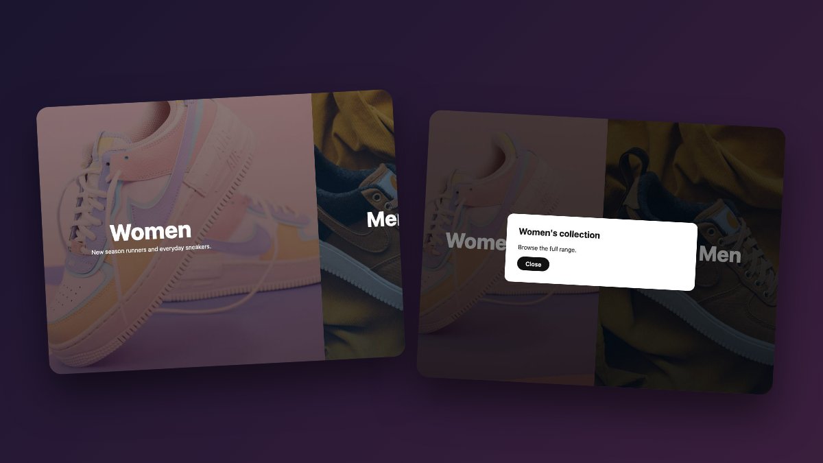
A split-screen layout divides the first screen into two big choices, and today you can build the whole thing, including the hover expansion and the modal reveal, with plain HTML and CSS plus a few lines of JavaScript. This tutorial builds a two-panel landing page for a fictional shoe brand using flexbox, :has(), the native <dialog> element and @starting-style. There is no jQuery and no animation library.
The 2016 version of this tutorial used flexbox, 3D transforms, Animate.css and a jQuery click handler. Each of those jobs now has a built-in replacement, and the result is shorter, more accessible and works without a script for the layout and hover parts.

What you are building
- Two full-height panels that share the screen equally.
- On hover or keyboard focus, the active panel grows and reveals a short line of text.
- Activating a panel opens a modal panel (a native dialog) with an entrance animation.
- On phones, the panels stack vertically and the text is always visible.
Step 1: Use real buttons for the panels
Each side is an action: it opens a collection. That makes a <button> the right element, which gives you keyboard focus and Enter/Space activation for free. If each side navigated to a separate page instead, use an <a href> the same way. Buttons may only contain phrasing content, so use <span> elements, not headings, inside them.
<main class="split">
  <button class="panel" type="button" data-open="womens">
    <span class="copy">
      <span class="title">Women</span>
      <span class="blurb">New season runners and everyday sneakers.</span>
    </span>
  </button>
  <button class="panel" type="button" data-open="mens">
    <span class="copy">
      <span class="title">Men</span>
      <span class="blurb">Trail shoes, court classics and boots.</span>
    </span>
  </button>
</main>
Step 2: Lay out the split with flexbox
Flexbox is all you need for two equal columns. Give both panels flex: 1 1 0 so they share the width, and use min-block-size: 100svh so the layout fills the screen even when mobile browser toolbars appear and disappear. The small viewport unit (svh) is the safe choice here; plain 100vh can be taller than the visible area on phones. If flexbox is new to you, read Master CSS Flexbox in 5 Simple Steps first.
.split {
  display: flex;
  min-block-size: 100svh;
}

.panel {
  position: relative;
  flex: 1 1 0;
  display: grid;
  place-items: center;
  border: 0;
  padding: 2rem;
  color: inherit;
  font: inherit;
  cursor: pointer;
  background:
    linear-gradient(oklch(0.2 0.05 var(--hue) / 0.55),
                    oklch(0.2 0.05 var(--hue) / 0.75)),
    var(--bg) center / cover;
  transition: flex-grow 0.6s cubic-bezier(0.2, 0.7, 0.2, 1);
}

.panel:nth-child(1) { --hue: 20;  --bg: url(img/women.jpg); }
.panel:nth-child(2) { --hue: 250; --bg: url(img/men.jpg); }
The demo sets each panel’s photo through the --bg custom property, so swapping an image is a one-line change per panel. Use your own optimised photography, ideally AVIF or WebP, and keep each file small because both panels load at once. The dark overlay gradient on top keeps white text readable; check the contrast of your own images rather than assuming it. The oklch() colours let you tint the overlay by changing a single hue number.
Step 3: Grow the hovered panel with :has()
The old demo only revealed content on hover. The modern trick is to resize the siblings too, and that needs a parent selector: :has(). When any panel is hovered or focused, the container reacts, shrinking the others and growing the active one. flex-grow is a number, so it transitions smoothly.
.copy { text-align: center; max-inline-size: 22rem; }

.copy .title {
  display: block;
  font-weight: 800;
  font-size: clamp(2rem, 5vw, 3.5rem);
  margin-block-end: 0.5rem;
  transition: scale 0.6s cubic-bezier(0.2, 0.7, 0.2, 1);
}

.copy .blurb {
  display: block;
  opacity: 0;
  translate: 0 0.75rem;
  transition: opacity 0.4s, translate 0.4s cubic-bezier(0.2, 0.7, 0.2, 1);
}

.panel:is(:hover, :focus-visible) .blurb { opacity: 1; translate: 0; }
.panel:focus-visible { outline: 3px solid #fff; outline-offset: -10px; }

@media (hover: hover) and (min-width: 700px) {
  .split:has(.panel:is(:hover, :focus-visible)) .panel { flex-grow: 0.6; }
  .split:has(.panel:is(:hover, :focus-visible)) .panel:is(:hover, :focus-visible) { flex-grow: 1.6; }
  .panel:is(:hover, :focus-visible) .title { scale: 1.1; }
}

@media (max-width: 699px) {
  .split { flex-direction: column; }
  .copy .blurb { opacity: 1; translate: 0; }
}
A few details matter here:
- Individual transform properties.
scaleandtranslatereplace thescale3d()/translate3d()hacks used to force GPU layers. Browsers composite these transitions without any hint. :focus-visiblebeside:hover. Keyboard users get the same expansion and a visible outline, which the original never offered.- The
(hover: hover)guard. Touch screens have no real hover, so the resize effect only applies to devices that can hover. Touch users still see the blurb because the mobile rule shows it always. :has()support. It has been Baseline widely available since December 2023, so no fallback is required. Anchor it to a specific container like.split, neverbody, to keep style recalculation cheap.
Step 4: Replace the overlay and Animate.css with a dialog
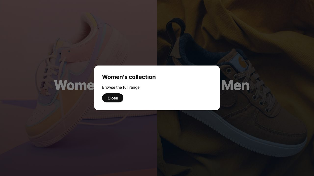
The old tutorial created absolutely positioned div overlays, toggled display: none, and used Animate.css plus jQuery to run a zoomIn animation. The native <dialog> element replaces all of it. Opened with showModal(), it lands in the top layer, traps focus, closes on Escape, restores focus to the opener, and dims the page with a ::backdrop. For another use of the same pattern, see the contact modal snippet.
<dialog id="womens" aria-labelledby="t1">
  <h2 id="t1">Women's collection</h2>
  <p>Browse the full range.</p>
  <form method="dialog"><button>Close</button></form>
</dialog>
The method="dialog" form closes the dialog with no JavaScript. The only script you need opens it:
document.querySelectorAll('[data-open]').forEach((button) => {
  button.addEventListener('click', () => {
    document.getElementById(button.dataset.open).showModal();
  });
});
Step 5: Animate the dialog in and out
A closed dialog is display: none, which historically could not be animated. Two features fix that. @starting-style defines where a transition begins when an element first renders (Baseline since August 2024). transition-behavior: allow-discrete lets display and overlay flip at the end of the transition instead of instantly, so the exit animation is visible. Support differs between the two: @starting-style and allow-discrete are Baseline, while the overlay property is not (it has limited availability and shipped in Chromium first). That is harmless. A browser without @starting-style simply shows the dialog without the entrance animation, and one without overlay skips the exit animation but still opens and closes the dialog correctly. The transition shorthand sets it implicitly when you name those properties with allow-discrete.
dialog {
  inline-size: min(90vw, 32rem);
  padding: 2rem;
  border: 0;
  border-radius: 1rem;
  opacity: 1;
  scale: 1;
  transition:
    opacity 0.35s,
    scale 0.35s cubic-bezier(0.2, 0.7, 0.2, 1),
    overlay 0.35s allow-discrete,
    display 0.35s allow-discrete;
}

dialog button {
  font: inherit;
  font-weight: 600;
  padding: 0.6rem 1.4rem;
  border: 0;
  border-radius: 999px;
  background: #111;
  color: #fff;
  cursor: pointer;
}
dialog button:is(:hover, :focus-visible) { background: oklch(0.55 0.2 20); }
dialog button:focus-visible { outline: 3px solid oklch(0.55 0.2 20); outline-offset: 3px; }

dialog:not([open]) { opacity: 0; scale: 0.92; }

@starting-style {
  dialog[open] { opacity: 0; scale: 0.92; }
}

dialog::backdrop {
  background: rgb(0 0 0 / 0.5);
  transition:
    background-color 0.35s,
    overlay 0.35s allow-discrete,
    display 0.35s allow-discrete;
}
dialog:not([open])::backdrop { background: transparent; }

@starting-style {
  dialog[open]::backdrop { background: transparent; }
}
Place each @starting-style block after the rule it modifies. Both have equal specificity, so source order decides which wins. The starting values apply only on entry; on exit the element transitions to the closed state defined by dialog:not([open]).
Respect reduced motion
Growing panels and zooming dialogs are exactly the kind of movement some people want off. Add one block that collapses the durations rather than removing the state changes, so everything still works:
@media (prefers-reduced-motion: reduce) {
  *, ::backdrop { transition-duration: 0.01ms !important; }
}
Old technique, new equivalent
| 2016 approach | Today |
|---|---|
width: 100vw; height: 100vh wrapper |
min-block-size: 100svh on a flex container |
scale3d() / translate3d() |
Individual scale and translate properties |
| Hover only | :hover plus :focus-visible, with (hover: hover) guard |
div overlay, display: none, .open class |
Native <dialog> and showModal() |
Animate.css zoomIn + jQuery animationend cleanup |
@starting-style with allow-discrete |
| Font Awesome icon in the panel | Inline SVG, or none |
Using it with real content
A modal that says “Browse the full range” is only a placeholder. For a real shop, the simplest upgrade is to drop the dialog and make each panel a plain link to its category page. Change <button> to <a href="/women/">, keep the same classes, and the layout and hover behaviour work unchanged. Keep the dialog when the choice should open something in place, such as a size picker, a sign-up form or a quick preview.
If you want the transition between the landing page and a destination page to feel continuous, look at View Transitions. Same-document transitions are Baseline, and cross-document transitions for ordinary links are a progressive enhancement, so the plain-link version above can gain a smooth page change with a small amount of CSS.
Where to take it next
Try the hover and entrance ideas from Easy CSS Animation With Transition & Transforms. If you prefer grid for the page structure, The Simpler CSS Grid covers the basics. For the hero itself, How to Zoom Hero Images on Scroll pairs well with this layout.
FAQ
Should I use CSS Grid instead of flexbox for the split?
Either works for static halves. Flexbox is used here because flex-grow transitions reliably between values, which gives the hover expansion without extra tricks.
Why not animate the panels with JavaScript?
You would need listeners for hover, focus and blur, plus cleanup. CSS does it declaratively, respects media queries, and keeps working if the script fails.
Does the dialog work on touch devices?
Yes. The click handler fires on tap, and the dialog behaves the same. Only the hover resize is skipped, by design.


