At FITC Toronto in May of this year, Shawn Pucknell, FITC’s director approached James White to develop the creative for the following year’s event, FITC Toronto 2012. “I’ve spoken at FITC twice so far and being a huge fan of the event and the entire crew behind it, I jumped at the opportunity to work with my friends,” said White. With creative freedom to develop the bits and pieces needed to promote and showcase at the event next year, James started looking at everything including the FITC identity which, at the time, he had no idea would be used. Here we go…
Creative Brief
“Those bums didn’t even give me one. Ha! I’m kidding. I’ve attended and spoke at several FITC events over the last 3 years so I’m quite familiar with what they do, how they do it, and what their overall vision entails,” said White. Through conversation, Shawn was able to express his vision of how events carry out, so to James, “experience WAS the creative brief.”
Getting Started
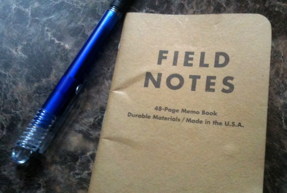
When James begun the creative process, the thought burning in his head was "What is the FITC identity I would like to see? What would set it apart from other events out there?" James wanted something clean, fun, inviting, cool and highly usable on different printed items and merchandise. “BUT, my biggest priority was making this thing FUN,” said White. His first idea was making something in a "semi-script" that had a nice flow from letter to letter without being a straight-up script font. This was a challenge since James has rarely developed anything close to a script before. So, out came the Field Notes. Time to start sketching…
Drafting and Development
Since James had a general idea in his head of what the logo might look like, he dove into drawing up some letters. “I tried a few different approaches with how letters might connect and flow into one another, a few different capitals and swooshes, and it wasn’t long before I arrived at the forth sketch which had the vibe I was looking for,” said White. “I didn’t want a "font," nor did I want a manipulated font; I wanted the new FITC identity to be built from the ground up – from nothing.”
Okay Illustrator, Let’s Do This
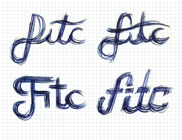
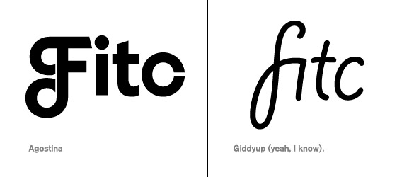
Before James dove into building the letters, he did a bit of typeface research in order to understand a bit better how letters connect, and how they flow one to the other. “As I said, this was kind of new territory for me so having a look before I started definitely helped in the long run,” said White. Above are a few examples. “Yes, that’s Giddyup. It helped. No heckling.”
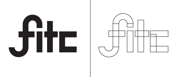
Keeping other typefaces close by for reference, James started building the FITC identity. “I knew how I wanted that F to look pretty early on, but everything else was a total crapshoot,” said White. “I always begin by using some simple shapes like circles and rectangles in order to build the letters.” Keeping those shapes separate from each other allowed James to slide them around and duplicate them while keeping width consistency. Not rocket-surgery, but it sure helps when building the silhouette so you can visualize something onscreen. He built the letters completely upright, knowing that down the road he’d be skewing them a bit to add movement.
After a while of noodling around with the letters, James found they started to take the form he wanted. “I’m not going to lie, that C gave me all kinds of problems but eventually landed on a form I liked,” said White. So he threw on some FITC Red, rounded some of the corners to soften things up and added the skew. But he felt things still looked too loose, or ill-aligned, or whatever. “I had a long, hard look at the form and made some notes of little tweaks I needed to do – bolts that needed tightening,” said White.
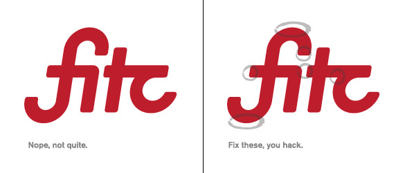
After messing with every Bezier point in the logo design, James finally managed to bang it into shape. “It had that flow I was chasing, letters joined up nicely, it was readable, and was scripty without being a script,” said White. “My favorite part is actually that tiny space between the T and the C. Details, man.”

But the logo wasn’t there, just yet. To give Shawn and the team a few different options, James threw the word mark into a solid circle. Even though it was an afterthought, it happened to really jive. “Bit of a secret: for whatever reason I’ve always wanted to design a logo that resided inside a circle but never did. Or I tried and it always looked like trash. This one happened completely by accident at the last minute. Always leave yourself open to that happy accident, man. You never know,” said White.
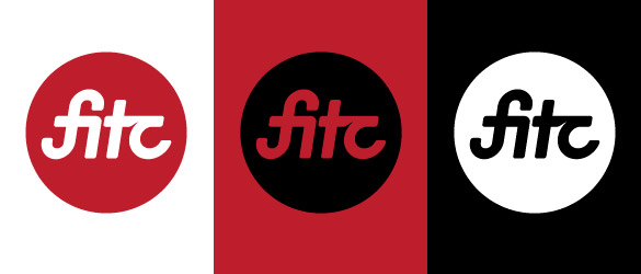
Above is the final FITC circle logo in red, black and white. “This logo process was a series of mishaps, accidents and a whole lot of playing around and having fun. I’m happy with it, the team is happy with it, and I can’t wait to see this thing land onstage at the next event I attend,” said White. “I’m super proud to have been able to help out my friends who have done so much for the global creative community.”
Simon Conlin
\m/ this whole article rocks
Marcus Williamson
I like the hustle of this process. Stellar as always Mr. White
Lex
Beauty!
Mauro
Hi there, nice process of the logo, may i suggest you the final logo, i think that have some visual tension point wich i indicate in this image:
http://www.maurocarrasco.com.ar/images/fitclogo_fig6.png
I’ts a nice logo, so clean.
Thanks for share
Lee
Very nice, although it looks a little like it says ‘Fitz’ at a glance.
jondemon
I love the design from scratch, your logo reminds me once when I tried to do a “f” like that, but I noticed that possibly could have a weird interpretation. http://i46.servimg.com/u/f46/12/66/76/72/fitc11.jpg
Mauro
Believe me, in that case the people who see the logo has to have a big imagination.
Pants
That’s quite a stretch, do you know how many symbols could be twisted into a swastika with some imagination? You can start with the Swiss flag and the Red Cross.
kartofelek
Yep. Your post is proff for that desing logo is not simple task. Everybody scream thats they can create good logo for 1$, but they dont understand how many work good design require.
Sevano
its a crooked cross on the frist letters? he has not though about that …….
Bharat KV
Love the whole process. Designing logos are always a fun process.
But I feel the Logo might also be read as “HTC”. The “f” “i” connect misleads slightly. Probably a closed user group testing might help you.
Mike
Designing logos and customizing fonts has always been a challenge for me. This article will definitely help future projects.
Mike Evan
The hole process to design logo for fitc looks really simple and fun but once you have tried it on your own you understand how difficult it could be even if you try to create a brand for your own company
Kathy Edwards
I like it – but would also put that same bit of tiny white space between the F and i – to repeat and define.
Renzo
I always find doing a logo from type being difficult. I see this was a successful story, really well done.
SEO Copywriting Services
Great post James, Thanks for sharing!
David
I would love it, if you make a white dot above i, inside f.
Please try that version.
Nora @Logo Design
I like logo design most! n i am logo designer, this logo is really very nice design by him. he is really a very talented person!
Calçados Opananken Sorocaba
I love the process you used, but I think that is missing the dot on the “I”, so it will not looks like “HTC” as some people said before. Thanks for sharing!
Gaurav M
A designer always search for depth in logo. So in T & C, details man ;)
Mark
Fun design! Great article! It is always fun and insightful to get a glance at a persons creative process!
Kevin Airgid
nice work!!!
Tejacharu
Hi,
I am really satisfied with your blog. Getting valuable information to me .
thankyou
tejacharu
Web Design Watford
Great Stuff! The black circle with red background does it for me.
Patrick
Never expected that, such a simple text logo can be so impressive. 2 colors logo also cost effective for printing purpose.
graphic design automaton
I don’t think it can be made any better this is how everyone of my designs gets laid out before bringing it to the laptop.
belden baglamali
Great Stuff! The black circle with red background does it for me
nod
the kerning is a nightmare
jamila
Nice work, it almost looks like it could be another language.
Mahmoud Shehata
Nice story, I had the same story with another logo for CB&I company …. I was looking for inspiration everywhere and i found it in the pictures of some bridges.
gupta
Nice work, it almost looks like it could be another language.
thanks
childvomiting.com
tre2215
Good stuff and well thought out, thanks for sharing. I really like the expression and the knowledge. I’m gonna try it as well, thanks….Cheers mate !!
tre
buy arena carry
nice stuff its amazing to work on it.
DRIKS
The bottom of the F has a awkward curve on the right side. But nice redesign overall!
Evan
Cool idea but… One of the best and famous color match wold be: white, red and black. Those 3 colors together will rock the logo.:)
papp
the first 2 letters remind me of a swastika (upper left part is missing)
Jason
Move along people, don’t feed the trolls.
Anjali
Awesome stuff and nicely done. Really inspired me. I am also making an effort to provide some cool stuff for bloggers and web designers on my blog at Blogger Widgets.
Web Designer Sydney
Awesome! That “tiny space between the T and the C” is aesthetically pleasant and gives the logo it’s unique look!
Solitaire
the field notes look superb!
Damian
Been so long since I’ve taken to a notepad to base a design. I kinda miss it……matter of fact I’m off to get a new field book.
terrence
i see an infinity symbol! this event i hope will go on forever… fitc was an awesome idea, the new iteration of the event should garner more attention… makes me wonder what joshua davis is up to these days… hmmmmm
Imobiliária em Sorocaba
Nice creative process!
Simon
As a matter of interest, how long in days or hours did this process take?
Web Designing UK
Gr8 stuff.. I gave up field notes a while ago…time to go shopping again!!
umesh ramidi
Awesome and amazing to work with it thank you very much
Logoswish
Simple. Clean. Professional work. Thank you for sharing it.
Taito
Excellent work! I have some troubles in the connection from “t” to “c”, but it is a really interesant job! congrats!
Taito
sorry, interesting job!!!
Web Designing Company Gurgaon
elegant work , very nice
Jennifer
Awesome the trick on the T, “hand”! Love it!
Ibiza yates
Excellent work! Thanks
Website Design Lover
Before go to design logo, at very first to create sketch of the logo on the rough paper or basic design of logo with the help of any of the graphic editing software is the best option because these both options will help to take decision of improvement on different places of the logo.
thiet ke logo
It takes a lot to impress me when it comes to writing quality articles. This article has impressed me with good writing I can appreciate….
seo
Awesome and amazing to work with it thank you very much
Afzal
You have introduce variety of logos which all are awsm :)
Great work..
keep it up..