Long ago I wrote a tutorial on how to make decorative image galleries using an extra <span> tag. It requires jQuery to append the span tag which isn’t quite user friendly. Today I’m going to share a better method without using Javascript. The same result can be achieved by using :before or :after pseudo element. The :before element is one of the commonly under used elements, but it is quite useful for adding additional elements or content. Learn it now and start using it.
HTML
Below is a sample image gallery markup in a <ul> list.
<ul class="gallery clip">
	<li>
		<img src="https://149842035.v2.pressablecdn.com/wp-content/uploads/2012/09/sample-1.jpg" alt="image">
	</li>
	<li>
		<img src="https://149842035.v2.pressablecdn.com/wp-content/uploads/2012/09/sample-2.jpg" alt="image">
	</li>
	<li>
		<img src="https://149842035.v2.pressablecdn.com/wp-content/uploads/2012/09/sample-1.jpg" alt="image">
	</li>
</ul>
CSS
Below is the base style for the .gallery. The key property you have to add is relative position on the .gallery a element.
.gallery {
	margin: 0 0 25px;
	text-align: center;
}
.gallery li {
	display: inline-block;
	margin: 5px;
	list-style: none;
}
.gallery a {
	position: relative;
	display: inline-block;
}
:before element
Now I’m going to specify a 30 x 60px container with the paper clip background image to the a:before element. Note that I leave the content property empty in the CSS rule. Without the empty content property, the container will not appear.
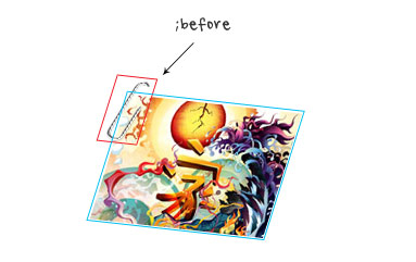
.clip a:before {
	position: absolute;
	content: ' ';
	top: -5px;
	left: -4px;
	width: 30px;
	height: 60px;
	background: url(https://149842035.v2.pressablecdn.com/wp-content/uploads/2012/09/paper-clip.png) no-repeat;
}
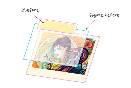
Art Frame
You can use this trick to add any overlay graphic element on top. In this example, I just replaced the background image to an art frame graphic and adjusted the dimension and position.
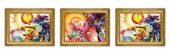
.frame a:before {
	position: absolute;
	content: ' ';
	top: -22px;
	left: -23px;
	width: 216px;
	height: 166px;
	background: url(https://149842035.v2.pressablecdn.com/wp-content/uploads/2012/09/frame.png) no-repeat;
}
HTML5 Gallery
Let’s create a more advanced gallery using HTML5 markups. In the example below, I have a <figure> tag wrapped around the image and a <figcaption> for image caption.
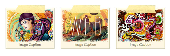
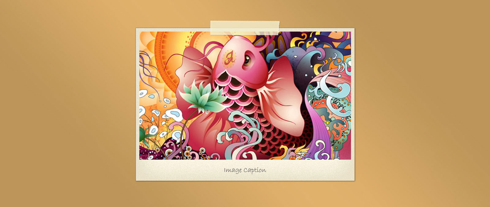
<ul class="gallery tape">
	<li>
		<figure>
			<img src="https://149842035.v2.pressablecdn.com/wp-content/uploads/2012/09/sample-4.jpg" alt="image">
			<figcaption>Image Caption</figcaption>
		</figure>
	</li>
	<li>
		<figure>
			<img src="https://149842035.v2.pressablecdn.com/wp-content/uploads/2012/09/sample-5.jpg" alt="image">
			<figcaption>Image Caption</figcaption>
		</figure>
	</li>
	<li>
		<figure> <img src="https://149842035.v2.pressablecdn.com/wp-content/uploads/2012/09/sample-6.jpg" alt="image">
			<figcaption>Image Caption</figcaption>
		</figure>
	</li>
</ul>
CSS
In the CSS, I added two :before elements: one on the <figure> element and another one on the <li> element. The overlay.png (mask image) is applied to the figure:before element and the tape graphic is applied on the a:before element.
.tape li {
	width: 170px;
	padding: 5px;
	margin: 15px 10px;
	border: solid 1px #cac09f;
	background: #fdf8e4;
	text-align: center;
	box-shadow: inset 0 1px rgba(255,255,255,.8), 0 1px 2px rgba(0,0,0,.2);
}
.tape figure {
	position: relative;
	margin: 0;
}
.tape a:before {
	position: absolute;
	content: ' ';
	top: 0;
	left: 0;
	width: 100%;
	height: 100%;
	background: url(https://149842035.v2.pressablecdn.com/wp-content/uploads/2012/09/overlay.png) no-repeat;
}
.tape figcaption {
	font: 100%/120% Handlee, Arial, Helvetica, sans-serif;
	color: #787568;
}
.tape a:before {
	position: absolute;
	z-index: 2;
	content: ' ';
	top: -12px;
	left: 50%;
	width: 115px;
	height: 32px;
	margin-left: -57px;
	background: url(https://149842035.v2.pressablecdn.com/wp-content/uploads/2012/09/tape.png) no-repeat;
}
CSS3 Transform
In this gallery, I added a cork pattern background on the gallery and use transform property to rotate the images.
.transform {
	background: url(https://149842035.v2.pressablecdn.com/wp-content/uploads/2012/09/cork-bg.png);
	padding: 25px;
	border-radius: 10px;
	box-shadow: inset 0 1px 5px rgba(0,0,0,.4);
}
.transform li {
	border: none;
}
Nth-of-Type
To make the image rotation look randomized and more natural, I applied a different rotation angle using nth-of-type.
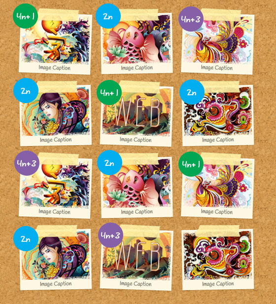
.transform li:nth-of-type(4n+1) {
	-webkit-transform: rotate(2deg);
}
.transform li:nth-of-type(2n) {
	-webkit-transform: rotate(-1deg);
}
.transform li:nth-of-type(4n+3) {
	-webkit-transform: rotate(2deg);
}
Update:
I’ve updated the gallery demo and CSS so now the images are linked. Now the :before element is added to the tag.
Alexander
Looks great,
but why didn’t you use
.transform li:nth-of-type(2n+1) {
-webkit-transform: rotate(2deg);
}
.transform li:nth-of-type(2n) {
-webkit-transform: rotate(-1deg);
}
instead of
.transform li:nth-of-type(4n+1) {
-webkit-transform: rotate(2deg);
}
.transform li:nth-of-type(2n) {
-webkit-transform: rotate(-1deg);
}
.transform li:nth-of-type(4n+3) {
-webkit-transform: rotate(2deg);
}
?
Thanks for your awesome posts!
Alexander
glow
Maybe the initial idea was to give a different angle to 4n+3 so it look more random ?
something like :
.transform li:nth-of-type(4n+1) {
-webkit-transform: rotate(2deg);
}
.transform li:nth-of-type(2n) {
-webkit-transform: rotate(-1deg);
}
.transform li:nth-of-type(4n+3) {
-webkit-transform: rotate(1deg);
}
Boothy
You’ll add a ‘what’ pattern?
Mike Malott
Haha I caught that too but a great tutorial nonetheless.
Nick La
Thanks. It is fixed now.
Web Design in Pune
one with tape looks great.. It will give very natural look to the gallery..
Thanks for sharing..
Petr Jirasek
Really, it looks great! Thanks for sharing.
AbstractAlgorithm
Nice. :before is really cool.
Nice pattern. ^_^
Furiant
I’d argue that the most valid (if not the most common) reason *not* to use :before is that it doesn’t inject any actual HTML.
For instance, you could place a paragraph asserting that labels with asterisks indicate required input, and then use :before to append the asterisk to labels with a ‘.required’ class.
The asterisk shows up visually, but if you view the source it’s not there (so a screen reader would have no idea that the field was required).
That point actually works in favor of this technique, however. Great post.
Nick La
In this case, the :before element is used for decorative reason. It doesn’t affect the usability at all.
Furiant
That was my point: why it’s underutilized, and how it works in favor of this technique. Again, great job.
Jonny
Wouldn’t javascript statistically have a greater reach than this?
CeeVee
In the examples using the tag… why isn’t the text selectable?
AbstractAlgorithm
Works in Opera, it doesn’t work in FF, dunno for Chrome.
Peter Mumford
Sweet looking, but are can these thumbnails be linked to larger versions? The demos are not linked. I find that if you overlay something on top of a thumbnail, you can’t get to the link. And an un-linkable TGP isn’t very useful.
Nick La
Certainly, the images can be linked. I’ve updated the demo and tutorial to reflect this. Now the :before element is added to the <a> tag.
Milan
awesome post…thanx for the post :)
Dan Bakan
Very well written, Nick. Using the nth-child selector to vary the rotation really helps to achieve this random look. I’d suggest to also use three different tape images to take it even further ;)
Web dizajn
For me this is perfect…i dont make bear from fly.
Website Designer Cardiff
This will be useful for when i finally get around to filling out the profile section of my site!
Many thanks.
Alex.
Alquiler yates Ibiza
For instance, you could place a paragraph asserting that labels with asterisks indicate required input, and then use :before to append the asterisk to labels with a ‘.required’ class.
The asterisk shows up visually, but if you view the source it’s not there (so a screen reader would have no idea that the field was required).
Debbs Hosting
I’m not into CSS much because I can’t memorize all of the right codes to use. But I’m trying to learn it as long as I have some codes to copy from by my side. The gallery is very attractive, by the way. Do I have to create a child theme to be able to tweak the CSS code of my theme for this one?
desenvolvimento de sites
An incredible result.
Tim
The demo doesn’t do anything. It just links to the Themify site.
Tim
Still not fixed. I’d really like to see what this gallery does.
Alquiler yates Ibiza
he asterisk shows up visually, but if you view the source it’s not there (so a screen reader would have no idea that the field was required).
Web Designing
Very nice post thanks for sharing this incredible post.
Thank You very much.
CiNiTriQs
Great tutorial, nice screenshots and examples/demo’s. As usual, be proud of this one because we all like it ;).
Zion
Very nice this will be very useful ! Thanks for sharing
Thanos
I have created some tools for web developers that apply styles of this kind to images. My experience says that in order to create styles and effects like that, you need 3 things: a) CSS3, b) Javascript (jQuery) and c) decorative/assistant images.
The best case would be to use only CSS3 but at the moment the usage of the other two is necessary if you want to create impressive styles.
Theo
I can still remember part one. The first thing that came to my mind was to ad transform:scale(1.02); on hover. Great tutorial!
Mohit Seth
This is a good article and I have been using :before and :after a lot in my design. The only concern using it that it is compatible IE8+ so you need to have some fallback if you have IE7 users.
Jeroem Douthit
It is a very nice gallery for me! As a web designer, I want a gallery like that..
blitz
The only bit that doesn’t make sense, is why you’ve used masking tape and not pins to stick pictures to a cork board! ;-)
Good little demo.
joomla websites
Nice.The information you shared is very helpful for designers i am also a designers & your information will help me a lot.
Thanks once again.
Mark Wong
Cool tips, Thanks for sharing!
ajit
wow , nice tips for web designig..
thanks for sharing..
Wordpress installations
Choice, I really like the sticky tape idea. Thanks for sharing!
geraldine
This is a wonderful tutorial. I hope to incorporate this on my blog!
Donald
I remember the original tutorial and have been using it. Thanks for the updated and improved method. I love the designs on your site. Kind regards Don
Benefits of paid Web Design Vs Do it Yourself
Your website says a big mess on the game, and you can reach the number in between, and consumers get a deal with another on your website. It is very affirmable on the number of a website on your own, but no choice e’er beat.
A web designer has professed, the perception of most of what consumers turn to and implementation of your entire home, which they are perceived to focus. They are also in how to improve various aspects of your website to make sales explode just qualified.
jeu video
very nice, thank you
ambroisie
Great !
rémy
nice one. lovely desinged !
Andrea ArtReplica
Wow, Thees looks totally great.
I have been improving our gallery lately, but I can see, that I will improve some more soon using some of these ;)
Thanks for sharing!
Andrea
Website developer in Pune
Very helpful.. Thanks..
Sitebee
Very nice, some interesting ideas to take away from those.
Top 10 Lists
Thanks for the detailed and helpful tutorial. This decorative CSS Gallery looks stunning and eye catchy.
Gavin
Nice article will definitely give a try to it and will try to make something creative for my website.
Deepak Kumar
thanks for shearing such a fascinating article.
Scriptlook
Great post bro ,realy nice work….bravo
Mark Pritchard
As your first part tutorial this is also very informative. This tutorial really helps me lot to learn CSS.
businessfied
well its great that such a beautiful css gallery can be built without using javascript. I guess Html 5 technology usage make this gallery appealing and non presence of java script will improve load times.
risedream
Thanks for sharing this useful tutorial. I guess even beginners will find it useful as this gallery has simple CSS and Html coding.
Deepti
Very Useful and informative blog. thanks for sharing such a nice informative article here.
http://www.rbiwebdesign.com/
Scriptlook
The only bit that doesn’t make sense, is why you’ve used masking tape and not pins to stick pictures to a cork board! ;-)
Web Design Kipo
Wow it is unique gallery. Thank you for this knowledge.
Magento Development
Great Post!!! All Graphics are Really Great…I Appreciate Your Creativity..Keep Posting..Thanks…
web design html5 css3
Really awesome and great post … it’s help me I found what am googling
Alquiler yates Ibiza
Please can you help me by giving some tips?
thanks…
visitor
You forgot to the wrap your img tag with an a tag.
Piotr
I add other image effect here:
http://guistyles.com/index.php
Didn’t get that advanced solutions so i made simple one.
Lorraine
Just getting ready to redesign my own site. I think I’ll give the transform a try out there…
Joe
Serif fonts are helpful for web designed. It can very colorful designed make the Web Page. I appreciated and always prefer Serif fonts. Thanks for this font with create the blog letter and comment.
aditya
Many many thanks…Brian Helped me while creating portfolio page and your post helped me while designing it…..
John
Fantastic, the paperclip and tape look great, I have been looking for an easy way to style the many gallery photos that we have on our website and this is just what I needed… Thanks
Amila
Wonderful. Im going to do this now.
Afzal
Your collection of CSS images are stunning.These all are awesome. I really like it ..
Thanks for sharing.
Get your home cleaned
Hello !
It’s totally new to me. I really liked :before element. It is too much impressive. The way you have explained each and every step is appreciable.
Thanks a lot.
Get your home cleaned
ThemeSquirrel
Awesome tutorial! I’ve been trying to figure this out for a while, Thanks for sharing!
online careers
Hello! Do you know if they make any plugins to assist
with Search Engine Optimization? I’m trying to get my blog to rank for some targeted keywords but I’m
not seeing very good gains. If you know of any please share.
Appreciate it!
online careers
mua may chay bo o dau
This is my first time visit at here and i am genuinely happy to read everthing
at one place.