Guest Post by Chuck Longanecker
In January of each year, we flip over the hourglass and, once again, we have everything in front of us. The new year gives us a clean slate, a chance for change and encouragement to evolve the way we do things. In the past, we’ve yielded to client and user requests to pack our website designs full of unrelated features and countless pages of duplicate information. The change we have been waiting for has come – our users have matured. 2010 is the year of Design Simplicity.
Clean and Simple
There are many design trends this year, however, I feel it is important to focus specifically on the movement of Design Simplicity. In fact, as the web evolves, it is our responsibility as designers to keep the order of things. This means fewer pages, less clicks, less clutter and more whitespace. In 2010, clean is King and our users are asking for it. I don’t blame them. With access to an increasing amount of information on the web everyday, our attention span is naturally diminishing. Now, more than ever, design needs to engage the user, provide succinct information and allow them to go on their merry way. Who knows, maybe airlines and banks will even clean up their 1990s design.
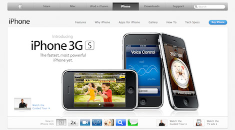
Now Design Simplicity does not mean removing functionality or access to information. This trend of simplicity is not as easy as reducing the elements and content in your user interface. To achieve the less is more effect, you have to develop a valuable user experience by utilizing a creative toolset. Think of the iPhone – the greatest innovation in modern mobile phones has only one button.
Single Page Websites
Each time a visitor clicks deeper into your site, a fraction of their interest dies. With the evolution of users, you can get to the point quickly. So in order to keep visitors’ attention, many designers are providing access to the core items needed to make an impression front and center. Think of the homepage as the main interface to all of the website’s content.When you start to layer some of the below items on the list including sliders, modal boxes and toolbars, you can provide pages of information without clicking off the page. iPhone App websites are a great example of single page websites in action.

Sliders
Sliders are a great way to provide indirect and precise content through a simple and visual interface. Instead of giving users heavy navigational options and a smorgasbord of direct content, I expect to see more content available indirectly with the use of slider and decision tree logic on the homepage or main pages of the site. This provides a more distinct website path and an appropriate experience for each user type.
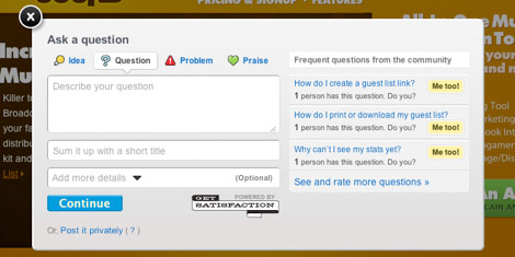
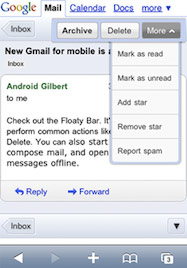
Modal boxes
Modal boxes, inherited from the dying desktop software standard, allow users to interact with the site without interrupting the flow of their experience. Why take the user to a separate page to login or watch a video when you can pop it up instantly on the current layout? Modal boxes will continue to spread in usage and functionality. Expect to see modal boxes used for data input forms, lead generation, account settings and more.
Smart Navigation and Taskbars
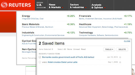
Continuing on the path of desktop/web app convergence, smart navigation and taskbars will dynamically shape the user experience. Smart navigation consolidates large categories of content and displays meta data to help determine the best path of navigation. Taskbars allow you to seamlessly interact with web content and enable websites to learn your preferences.
Reuters utilizes both to maintain a simple but powerful interface. Mouse over one of the four navigational items and get live market info or news before choosing your next page. The taskbar allows you to save, watch or read specific content or topics like a feedreader.
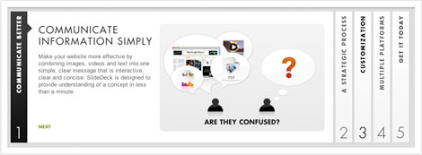
Text Is The New Image
Clever use of typography will continue to gain momentum this year thanks to the original influence of designers like 37signals. The proper use of large and bold typography provides a clean and clear message and can, at times, be more compelling than imagery. In some cases, design will see subtle imagery supporting the typography. When you really need to get your point across, you can’t beat words.
Larger Page Layouts
As monitor size and screen resolution increases so does the real estate for page layout design. This doesn’t mean that we should be laying claim to every available pixel out there. Instead it gives more room for whitespace so designs can present a clear message.
My Trend Wish List
Here are a few items I see when I look into my crystal ball. That doesn’t mean they will happen, but here’s to hoping.
Mobile Version Of Every Website
It’s great that today’s smartphones can view webpages in their standard web format, however, it’s just not an optimal experience for most websites due to screen size. I think all websites should auto-format based on the viewing device. Gmail, Facebook and Amazon have already taken on this standard. There are great tools out there such as Mobify that enable easy and inexpensive ways to achieve this. I believe that this will lead to more design agencies specializing in only the mobile format.
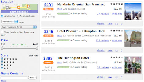
eCommerce Tweaker Shopping
Live search and filtering powered by AJAX have been present for some time in websites like kayak.com or Google Suggest. However, there are still many verticals that have not yet adapted this intuitive selection process. eCommerce websites should give users control of their shopping experience by allowing them to tweak their search results based on their preferences – color, price, social graph, size, features…etc. Right now, sites like Amazon force users to browse all results based on category or search term and then sort.They give users static results that equire additional searching or copious browsing to refine. The browsing aspect of an online store can be changed to a tweak by implementing AJAX sliders, checkboxes and other filtering inputs that enable the user to narrow down the results that suit them best. Users would spend their time tweaking a large pool of products to find the one that fits all their criteria instead of having to examine each product individually or use product comparison engines.
Smart Forms
Other than eCommerce sales, forms are the number one source of user action on the web. The more intelligent and user-friendly forms become, the better results of their conversions. Forms will continue to be more customized to user input. Forms already feature a lot of on the fly validation to correct errors such as improperly formatted email addresses before submittal. I believe that forms should continue to evolve and adapt to user input. Expect to see forms add, change or remove fields based on certain types of input such as gender, age or preference. This allows the website to better cater to the needs and experience of the user and gather more appropriate information. It should also reduce form bounce rates as they are more customized to the user type.
About the Guest Author
Chuck Longanecker is founder and CEO of digital-telepathy. To see his latest project, SlideDeck, please visit www.slidedeck.com.
Kendall
Great summary, simple is always better!
Ivan Plotnikov
Loved the post. ( as always ).
The only problem is to get the clients to the point where they will accept the idea that the web is evolving, and so should they.
Anne
Great post! I’m all for clean, uncluttered web design that is intuitive to use. I agree with your wish for a mobile version of every site, and I would add to that “accessibility”! The baby that’s being thrown out with the bathwater. My main focus this year will be adding accessibility to every site I develop.
Tenny
Always enjoy reading these kind of posts!
Stu Greenham
Awesome post thanks! I still think several of these are trends that were big in 2009 but I agree they will be around this year also!
Christian Hürter
Well, I think you’re right. But i still love the websites i can click through
to see something different and new on every site. It’s some sort of adventure for me. Sometimes, making too many reductions, isn’t the best way to fulfil the statement: “simple is always better”.
Hope there’ll be still some adventures waiting for me in the www.
Greets
Christian
Matthew Aebersold
Thanks for this post, it was an interesting read. Keep up the greatness!
New York Web Design
wow thanks for sharing this. It was fun reading your post..
cheers!
Tracy
Well said. I agree we must design clean, usable, accessible interfaces that guide the user without excess clutter. The goal is to get as many designers/developers, and clients, to embrace these principles.
Aaron
Very nicely written. It’s interesting to see how most of these come back to tweaks we can employ to improve the user experience.
BigM75
super atikel, großes kino
Avangelist
Beautiful round up, I am loving the jQuery comment preview you have here! Sorry that distracted me, which brings me onto my point! I hope to see less distraction in web and application development in 2010.
It would be great to see UX developers working harder to curb, but also enrich the requirements of the marketing and sales departments to create balanced interfaces.
Elizabeth K. Barone
Great collection of trends. It will be interesting to see what the next big thing is, and how we can use it to better our users’ experience and our design and development skills.
Kev Adamson
Nice article Nick. Bookmarked :)
Kev Adamson
Sorry: “Nice article Chuck” :)
Amber Weinberg
I also love simplistic web designs, but I think more populated designs (such as this site) is still great to look at as well.
No man army
Webdesignerwall’s background had been nicked by www . kefche . com
Wai Vuong
Love it, that’s the way I like to work! Great article!
Jeff Geerling
Re: Modal forms – Drupal 7 is going all modal for admin overlays… just sayin’
Arnold
great article. I could not agree more about the desire for a great mobile version of every website. I’m really enamored by the iphone version of appleinsider.com. awesome work there. not just a mobile-optimized site, but also some kick-butt iphone functionality integrated.
92pixels
super article
Miles
In a world where sharing is the keystone of social networking one page sites are a stupid idea. If a site has very little information, a promotional brochure-ware site for example, then one page with content might be just fine, but for a site with any content depth at all preventing people from linking to specific content is a pointless, if not detrimental, restriction.
Dimitree
Couldn’t agree more with this phrase “In 2010, clean is King”
Kate Madigan
In principle a trend for simplicity sounds good. But I’m afraid that in a year or eighteen months it will have degenerated into bland, lazy, homogeneous design. Not too convinced that 2010 is going to be a great year for web design – not from an aesthetic perspective, anyway.
Liam Giles
Love the principles and agree that it’s the right direction to be moving, just wish we could get clients to agree every time!
Jordan Walker
Do not forget cu3er!
Yog
Great info overall. Only problem I have with it is the slider example — in my book, sideways-rotated text is an absolute no-no. It shouldn’t require any conscious effort to read site content, especially important navigation elements.
Cory
The above “slider” isn’t a slider at all. It’s an accordion. A slider is a handle used to adjust a value (usually for a form), or other options.
Otherwise, solid list.
Chris
This is the last site that an article about simple, clean design should ever appear on ;) but still, a great read (and for the record I am still in awe of this site’s design)
Max Bucknell
Clean/Simple does not necessarily mean bland and boring. We tend to associate that with white and white can be taken as either, but look at twitter. It isn’t boring (at least I don’t think it is) and it does what it needs to very well.
Simplicity as far as I am concerned is about removing the superfluous and not letting aesthetics replace the fundamentals. Like building a house with no foundations I suppose. The basics much be sound before making something pretty. That is the whole point of wireframing. So I suppose instead of clean, the trend should be good.
Codesquid
These are all things that web design sorely needs. As the web grows, so does the sense of information overflow we experience when browsing. The last thing a user wants to see if yet another site chock full of pointless stock photography, cramped, small font text and flashing ads. Sites with clean designs will ultimately benefit from higher traffic and leads than their more ‘busy’ counterparts, is my bet.
Spacereal
Thanks for this post. Very useful for me.
内衣
wow!So great!
thx your sharing…
Feel of Design
hmmmm! means more precise…
Stu Green
Great article. UX and improved UI is definitely something that I’m going to be improving constantly with my project management app: http://projectbubble.com thanks for writing. Stu.
Carl - Web Courses Bangkok
Ohh I like the idea of single page web sites. I have actually found myself doing that recently. A lot can be said on a page, so if it is a simple product or service why not just use a few modal boxes for the standard contact form and about the company and get down to he nuts and bolts of the site.
Nice post, thanks!
Website Design Sydney
I’d like any of them but if there is a choice the – Fx!
Padizine
Great read, I loved the hint about airlines and banks. And you are right, typography is coming back and it’s getting better and better.
Otekst | webteksten
Text Is The New Image: I totally agree, and I’ve been pussing this agenda since 2003.
Daniel Dessinger
Not sure about the first one: single page websites. While it may become a trend, it’s not the best practice for SEO. Brands will have to invest more money in traditional advertising or push really hard in social media to send people to these one page sites, because they won’t show up for much in Google searches.
Julia
it’s a shame there is still no real importance placed on multilingual content and how to integrate that properly into the UX/UI. Putting a link or two on the side just doesn’t cut it anymore.
Dawn Robuck
Excellent summation and comprehensive overview of what we’ve been seeing out there. And I’m with you on the Ecommerce Tweaker Shopping – the psychology of wanting me to see more choices usually ends up ensuring I give up and don’t buy anything.
tom.higgy
One thing I’m expecting is a continued increase in use of JavaScript for effects and improving UI. As long as it’s used to enhance a website that works without this can only be a good thing.
Annoyingly, many websites (including certain popular social networking sites) rely on JS to the point that if it’s not available for whatever reason (no device support, to disable intrusive ads or any other reason), you end up with a broken UI and a much reduced UX.
On the large screen point, we’re seeing wider use of small devices (smartphones, netbooks) for web browsing. Best thing will be to see websites designed and coded so that they look just fine on a small screen but can fill available space on a larger screen. That’s a trend I’d like to see.
Chuck Longanecker
Thanks to everyone for all the great comments, suggestions and ideas. How did I forget iPad optimized sites! J/K…
I would also like to mention the trend of iterative design. This is different from the ever-changing design that you see on high fashion sites. Users have became more receptive to subtle design optimization. Depending on the content and goal of the website, the look and feel can evolve. This doesn’t mean packing on unnecessary features or slapping in more social media tools. It’s understanding your users, the flow of your site and results you are looking for to grow the design over time.
In the future, I would like to see more website evolutions and less website redesigns.
Beluga
Re: Mobile Version Of Every Website
I am not a big fan of web sites that send you straight to their mobile version when I look them up with the iPhone.
My phone gives me the ability to browse most sites easily, despite the smaller size. If you send me to your, often reduced, mobile site I get pissed off. Give people the choice, but don’t patronise them.
I was shocked to discover even the BBC does this. To get back to the ‘desktop’ version of the site you have to scroll all the way to the bottom of the page. Very bad style.
Worst no-no: links from Google to specific pages are redirected to your mobile homepage, from where you then must look for the page you wanted to go to.
chris
I have a real issue with some of the elements described in this article. First of all the vertical text on the slider is an absolute usability no-no, as are modal dialog boxes. Another sad trend that is being promoted here are large area designs. For once people are actually viewing web pages on smaller and smaller screens. The large screens sitting on our desktop are being used less and less. The web more than anything else has become a development platform. People are moving away from kitschy designs and towards sleek usable interfaces. Websites are now expected to be used and manipulated not just fawned over for their artistic elegance.
Drew
Great post. We think that 2010 will be the year for keeping it simple too and getting back to the basics! http://bit.ly/b3lIC8
Max
I’m with Beluga; I hate web sites that redirect me to their mobile site. I’d rather have the regular site every time.
RJC
Good insight to the next decade and UX/UI trends.
It definitely takes a lot more skill and thought to pull off that less is more in design while being able to retain all the content while still offering easy navigation.
I haven’t really tried to make a website that is adapted to the mobile browsers as well as dabble too much in forms. This article definitely has put those elements on my radar to enhance and include in my projects.
John
I agree! That appears to be the direction that a great deal of sites have taken coming into 2010. eCommerce Tweaker shopping may be a wish though (a nice one at that).
ronald
Thanks, great post, theres a lot to learn in this post,
Laya
very well summed up, excellent observation on the new trends , loved every bit of it, impressive and informative.
Tom Dougherty
Very useful guide. Some interesting insights here. Especially like the points raised around search result filtering. Let’s hope more eCommerce sites will begin to adapt in this way.
Jonathan Butterworth
I think you are right. I have already started moving toward more simple designs with less pages and integrating jQuery to allow for more information on one page without too much scrolling.
Manoj
In this article i liked the idea “Mobify” websites. Interesting fact that in future every one go for ask a mobile version of their website. The article is very informative. Thanks.
encoder
nice job!
i really would like a mobile version for all sites. it just bothers me that most of my preferred sites dont have a mobile version.
the basic technical difficulties: high latency even over 3G+. lack of fluid html navigation, no special usability, data oriented possibilities. however flash 10.1 will change all this. (on iPhone you will get a special app for flash sites, cant go hand in hand with safari).
but chris is right. we’ll see more sophistication in 2010, kitschy just dose not work anymore. you must offer a tool defining your company and letting the user to actually USE you. if this cant be done, you just have to go with special effects.
ps: this site is just on the verge of being kitschy but still pleasant, maybe in 2011 you’ll have to update.
capsiplex
i really would like a mobile version for all sites. it just bothers me that most of my preferred sites dont have a mobile version.
Sealth
This is a good overview. You could also include facebook style footer admin panels in this list. Being able to give the user the option to “show” or “hide” a utilities section at their own will and having quick access to common tasks. Soh Tanaka has a great tutorial on facebook style footer admin panels: http://www.sohtanaka.com/web-design/facebook-style-footer-admin-panel-part-1/
Werbeagentur Siegen
Great post! it is very special an interesting. Well done!
Ventura Web Designer
I wish that I-phones could play flash. Hopefully apple will accomodate for that.
Web Design
Awesome post
thanks alot for sharing
gyc
excellent examples, thanks for posting this!
yohan
nice info, thanks for sharing :)
Best animation institute in Chandigarh
100% right. i have done some these kind of app . send me more information about this
Penang Web Design
nice info…thanks for sharing…
Lauren
IE 8 doesn’t support sliders apparently. this makes me sad.
Top designer
Hello Chuck,
Thank you for this excellent post. Can I refer to you in my blog- I will add your name and a link to this page if it is okay?
Regards,
ArtyC
Good to know the latst trends in web design! Tx for sharing!
Christian
Great post!This makes my job a lot easier when im presenting the latest trends to top leaders in my company. Now I finally have a source document to back me up when designing new sites!Thanks!
Premier pixels
Good post! thanks for such info.
Las Vegas Web Design Company
ben
In a nutshell what you are saying the sites are becoming hub based sort of what M$ did with its “Windows Phone 7” interface. I think does make sense to display core items on front page.
Melvins
Valuable and very helpful information you have shared. I will use it in nearer future. Thanks for sharing such a great things.
Los Angeles Web Design
Gbejoro Stephen E Rev Dr
A Christian Website, where I can log in my Christian Videos; e-books; key words; for sale On Line.
jasons
When you do article marketing, your intention is to increase the number of visitors to your website. It is not our abilities that show what we truly are, it is our choices. I have look for such a article for a long time, thanks a lot.
facebook app developer
This is really fantastic advice, thank you so much
This is really fantastic blog i like it.
Juno Mindoes
white iphone 4 available now. It is the best news today.
lucy
Reading this post reminds me of my old room mate! He always kept talking about this. I will forward white iPhone 4 this article to him. Pretty sure he will have a good read.I procrastinate alot and never seem to get something done
Henry Peise
Has been looking for iphone 4 white Conversion Kit for quite some time? Come and select the latest white iphone 4 Conversion Kit home! You will totally love it!
pandora
Thanks for taking the time to discuss this, I feel strongly shoes ugg about it and love learning more on this topic.
atif
Nice, and thanks for sharing this info with us.
seo sem services
Good Luck!
Facebook Application Developer
I agree simplicity is the best :)
Term Papers Services UK
Hello
this is very informative post
i like this post
thanks for sharing info…
Dcaview
Great review — love pierogies — they are my comfort food reminding me of my dad that ate them often on Saturday nights uggs outlet
Trevor D.
Everlasting-Grafix is a San Diego Web Design Company.
altın çilek
That’s Great! Thanks for the post!
sdsad
sadsad
hcg damla
I agree simplicity is the best
Steph
EXCELLENT info, thanks! Finally, DESIGN is KING! ;)
Can’t believe I lived to see the day! Giddy Up!
web desiner philippines
Thanks for sharing this post very informative.
Ethan
Great list! Thanks!
Office in Singapore
This is great!!!This topic is truly relevant to my field at this moment, and I am really glad to discover your blog site.
Thomas jewelry
Thank you for sharing! Read your article, I very useful · ·
dexx
age of heart attack decreased with each passing day, he said.
prayersforfamily
An inspiration article good job.
top web design company bangalore
The article is interesting and i found lot of information.
pembe maske
güzel bir tasarım tebriler
complex41
And then he handed you the thirty-five 45
web design uae
What to Expect in 2010: UX/UI Design Simplicity – A great resource.Thanks for the info.
girls clothes
There are many design trends this year, however, I feel it is important to focus specifically on the movement of Design Simplicity.
girls clothes
Now Design Simplicity does not mean removing functionality or access to information. This trend of simplicity is not as easy as reducing the elements and content in your user interface.
Rickey Starrett
Thanks for one’s marvelous posting! I quite enjoyed reading it, you will be a great author.I will be sure to bookmark your blog and definitely will come back in the foreseeable future. I want to encourage you to ultimately continue your great job, have a nice evening!
kids clothes
I had never see a blog better than this one.
Thank you for your post.
Dutch icon designer
I’m all for clean and simple. I use these words in my webcopy quite a few times. I believe that getting rid of the clutter makes happier people of us all.
Accountants in Leeds
i truthfully enjoy your own writing kind, very remarkable,
don’t give up as well as keep writing due to the fact that it simply just worth to follow it. looking forward to see a whole lot more of your current well written articles, enjoy your day
Accountants in Leeds
backup camera system
I like the single and larger page layouts, they definitely are easier to navigate- for me anyway. I just read an article recently that suggested people streamline their sites to make them more easily navigable on mobile devices, which I think is a great idea!
Cardiff Web Design
Great article, most points are still relevant although I am glad that the single page website has not taken off as anticipated.
You can’t go wrong with a clean, simple layout
Ibiza yates
looking forward to see a whole lot more of your current well written articles, enjoy your day