In the past, we’ve been told not to use serif fonts due to its readability on low resolution monitors and poor rendering in WindowsXP. Now, with display technology advancing and IE7+ supporting ClearType by default, I think it is about time to change that rule. Take a look at the example sites that I’ve collected, you will probably agree with me that serif typeface will be the next web font trend.
Non-Web-Safe Fonts
If your target audiences are designers, don’t be afriad to to use the non-web-safe fonts such as Baskerville, Adobe Caslon Pro, Garamond, and Goudy Old Style. If your visitors are designers, the chance of them having those fonts installed are very high plus some are pre-packaged in the Adobe suite. Below are some good sample sites that use non-web-safe serif fonts.
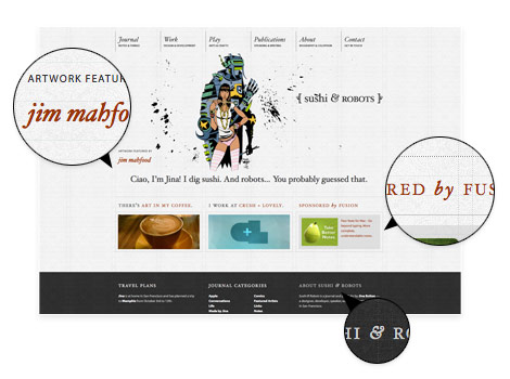
Sushi and Robots (Hoefler Text)
Jina uses Hoefler Text as her main heading and body text. The headers look amazing by combining the uppercase and italic style.
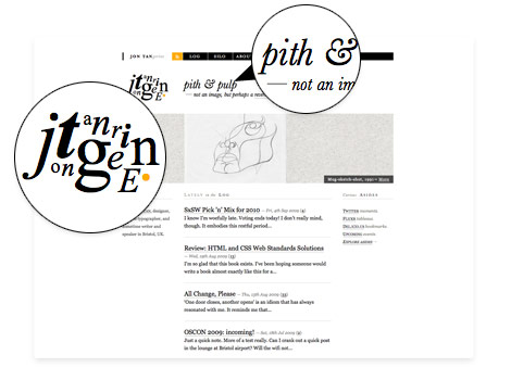
Jon Tangerine (Baskerville)
From head to toe, you’ve got to agree Jon has a beautiful sense of typography. I was impressed to find that the logotype is not an image, just CSS. The main font used in this site is Baskerville.
Rustin Jessen (Baskerville & Adobe Caslon Pro)
Rustin combines Baskerville italic and Adobe Caslon Pro uppercase to create a nice typographic contrast for the category titles.
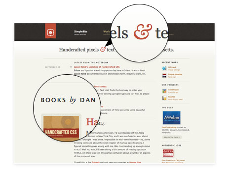
SimpleBits (Baskerville)
By styling the ampersands (&) and the word "by," the overall design is enhanced.
W. W. Norton
Another great use of Baskerville.

Web-Safe Serif Fonts
Below are some example sites that use web-safe serif fonts such as Times, Georgia, and Palatino. I find Georgia is a bit over used in most modern websites, so I highly recommend Times and Palatino.
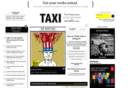
Design Taxi (Georgia)
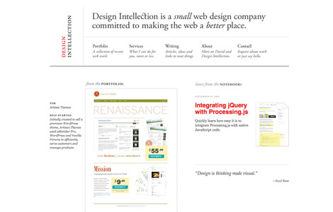
Design Intellection (Palatino)
Cynosura (Georgia)

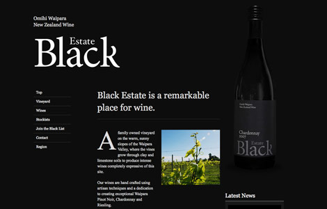
Black Estate (Times)
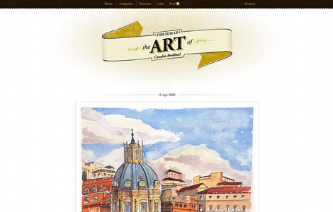
Bridinel (Times)
Made by Sofa (Georgia)

Design Work Plan (Georgia)

Typographica (Georgia)

Biggest Apple (Georgia)

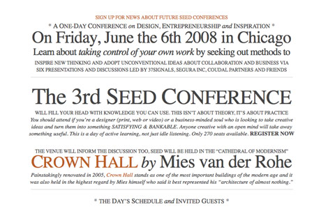
Seed Conference (Times)
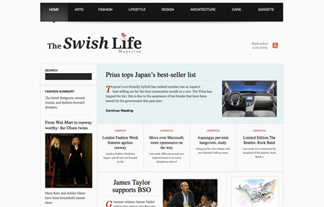
The Swish Life (Times)
More Examples…
Here are couple solutions for those who want to use non-web-safe fonts but afraid the visitors might not have the fonts installed.
- Image Replacement – Embed your text in an image and use
text-indentwith negative value to hide the text. - SIFR – Use Flash and Javascript to replace the text.
- Cufon – An alternative to SIFR, faster and easier.
- CSS @font-face – It allows you to reference fonts that are not installed on end user machine. However, this CSS rule only works in some modern browsers.
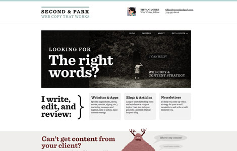
Second and Park (image replacement)
Carsonified (image replacement)

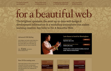
For a Beautiful Web (@font-face)
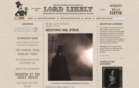
Lord Likely (@font-face)
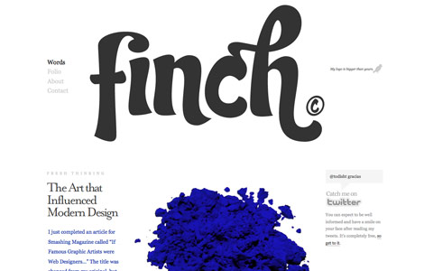
Get Finch (SIFR)
Noded (SIFR)

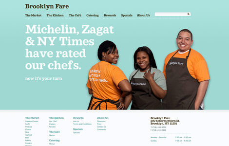
Brooklyn Fare (Cufon)
Yoosuf
Awesome post
Dave
I thought that the general rule was that serifs are okay for headers, but not for paragraph text? I personally have Clear Type disabled because I don’t like how it treats smaller font sizes.
Ronja
I agree. I always use georgia, but now i’m gonna try Platino :) Thanks for the inspiration !
Manuel
nice thoughts
manuel
h1brd
Great showcase of examples. Inspiration for the well spotted trend :]
Chris Hart
Its dangerous to presume that designers have any fonts available on their system other than those considered web safe. Most designers I know use some sort of font management system to keep the number of active fonts low for performance reasons. Meaning that quite often the ‘safe’ set of fonts available on my machine is actually smaller than a regular users.
But I do have to agree that serifs will certainly become more coming in the next few years on the web, in my opinion because of the increasing font display options that don’t rely on the user having the font on their system.
Robbert
Nice examples!
An other solution for using non-web-safe fonts is typeface.js http://typeface.neocracy.org/
SE7EN
Gorgeous examples.
but I don’t like serif in paragraph text, it’s hard to read.
Ted Goas
Fantastic collection of serif typography fonts… many of whom use web-safe fonts!
As per readability, I remember reading the san-serif is easier to read in short paragraphs and line-lengths, but serif is easier to read in larger amounts. Anyone hear anything like that?
Jhenrique - Brazil
Cool
Tks!!!!
Jonathan
Great collection! What I don’t understand is why more people are not using @font-face. Internet Explorer has had support for this since version 4 (using eot files), and most modern browsers have support with CSS3 (Safari, Firefox, Opera, Chrome soon). Judging by my own website statistics this hits 95+% of people, and is only going to improve.
I know it’s not perfect…but it does seem to be the way web fonts are going. Anyone have any thoughts on this?
Jimmy
They certainly look elegant. I’m using Palatino more now – apparently it’s used a lot in book printing as you can read it faster than other serifs.
The Frosty
I am using cufon on a few of my sites ;)
e11world
Georgia and Palatino have always looked nice to me and my favorite method from the above is SIFR still. Thanks for this nice collection.
Cyprian Gwóźdź
It seems I’ll have more job to do :-P
Chris Robinson
Great roundup, also don’t forget about http://typekit.com/ although its still in beta, it’s looking to be pretty promising and worth mentioning, sign up and check it out if you haven’t already.
Jad Graphics
WOW! This is an awesome round-up. Sushi and Robots is just so nice! I’m so jealous of that website.
Ginchen
I totally agree, the days of only using non-serif fonts are long gone by. A beautiful serif typography will always flatter and catch my eye.
I’m not sure if I just like them so much because they have been missing on the web for such a long time… :) I do especially like mixtures with non-serif fonts, where the serifed captions pop out all the more.
mushroom digital
Some excellent websites here to support the new trend. very inspirational in both takes. Thank you.
venfrancis
very nice post. this should open up for these fonts disregarded before since browsers doesn’t have support for cleartype technology.
thanks NL. God bless
glenroy
What about Rockwell? I am seeing it everywhere lately in TV and print, and now creeping onto the web. Is it only via sIFR or are there any examples of Rockwell bold out there using direct references or @font-face?
Ryan
Palatino should be removed from the web-safe font list. It’s only installed on OS X if Classic has been installed. Aside from that, Safari doesn’t render the Palatino Bold or Italic.
Lauren
Excellent post! Much like dropping outdated HTML commands de-emphasized the need for tacky “best viewed with” notices and the need for alternate pages, I think designing for the audience with regards to fonts will positively affect the need for more variety in and solutions for the many difficulties a designer faces with web fonts. Thanks so much, lovely screencaptures as well for inspiration and examples. Have a swell day.
Jon
Thanks for the kind words, Nick! http://fontdeck.com/ is something I’m involved in that’s also worth keeping an eye on for web fonts in the future. All the best to you and your readers.
Shane
Very nice. this new trend will make websites more exciting and enjoyable to view. All of these examples show the potential.
tj
I think that “We are Sofa” just wouldn’t feel the same with a sans-serif. Can you just imagine what it would feel like to sit on letters with such sharp edges?
Pedro
interesting. Thanks.
Michael Goodman
I’ve been using serif fonts for particular styles of projects for a long time. I don’t see why this is going to be considered a trend per se, but the sites you ahve posted are really beautiful and definitely note-worthy. Georgia is a fantastic font for web, in my opinion.
Jonathan
A good one that you missed is the newly re-designed latimes.com which uses “font-family: Georgia, ‘Times New Roman’, Times, serif;” for all of their headlines.
diseño imagen corporativa
Muy buen blog de diseño grafico! great blog! thanks from Argentina.
SiteArt
There are some really nice sites here… the sushi and robots website is lovely but the footer text display horribly for me.
‘We are Sofa’ = Brilliant! :)
mark sayers
nicely done.
I must be trendy as my site uses Georgia!
Yay for me.
Katie
please go to http://sugarloot.teen.com/entry/687651792 and vote me a 10! tryin 2 win a giftcard!
Fred
Never thought about increased screen resolutions and the dreadful IE effecting fonts. Good point, well made.
记忆
路过,帮你踩踩!
Dileep K Sharma
sIFR is great but it tends to break particularly in Google Chrome.
Joe
Its very locomotive web design. really I’m always fascination in web designing side. But I ‘m new this side, may be try to best afford ahead. Ok, thanking for good blog side.
Kevin Holesh
I love the showcase of beautiful non web safe fonts. It’s interesting to experiment with different fonts when you’re main audience is designers with tons of fonts installed.
One thing you should mention to is Typekit. I think that has a lot of potential for opening a wide variety of fonts for everyday use and it doesn’t depend on what the viewer has installed.
Jason Ran
Never knew how many people were using Baskerville in their sites. I’m currently using it one my site as well as Cufon to ensure everyone see’s it, not just designers. I have found that Cufon works really well if you want to use non web safe fonts. Good Post!
Rahul - Web Guru
Surely the Serif font trend has been catching up more and more grass in web development. More and more better designed websites having been coming up in the internet.
I’d also like to test the Serif Trend too.
Best Websites
Very interesting, great sites. Cufon link won’t work for me :(
Ellen
Thanks a lot for this post, Nick!
I’m very excited about the new opportunities for using a wider variety of fonts for the web, since I always loved typography a lot.
I think its great that you show some samples of sites using different techniques too. That’s very helpful :-)
Ross
I’m well pleased with this post! The sites are lovely and right up my street as I love my serif fonts. Also, the ampersand in Baskerville is something I’ve seen used a lot though have never been able to track down, I’m gonna be using it as it goes out of fashion :(
I was wondering what the sushi & Robots font face was too, lovely stuff
TCW
I’ll try the serif font, If have a new site to build.
Martin
i guess it’s already a trend for quite some time, great collection here
check out fontsquirrel.com for nice free serif typefaces for @font-face embedding
welshstew
Great list of sites – we use Georgia over at our web design forum
Alan Valek
I love serif fonts, lots of designers seem to stay away from them, but as this post proves — if styled correctly they look fantastic.
Quicken Websites
loved the site collection and the font examples from serif fonts family.
And even more exiting to use it in CSS, not a n image.
Elizabeth K. Barone
This is the first time I can say I’m ahead of the game; I’ve been using serif fonts on some of my sites lately and have seen many others doing the same. Hooray! :D
Anna [crinkle]
To what extent are there limitations in using Times / Times New Roman solely because it has long been the default web font? I must admit that if I see it on the web now, my immediate reaction (however unfounded!) is still “Guess they forgot to set their font family”. I love it, as a font, but I wonder whether the baggage it comes with is restrictive.
Jeremy Ricketts
This is one of the most useful blogs I read. And I read a lot of blogs. Like, a lot.
Really well done.
Sue
Serif fonts became popular again when ‘glossy’ designs exploded everywhere a few years ago, what some people call Web 2.0 designs, though I’m not sure that’s an accurate label. Anyway, nothing new here, but thanks for encouraging us to use non-web safe serif fonts.
Mark Carter
Oh my goodness me … does nothing stand still on the web?
Seriously, many thanks for your post which is cause for reflection ….
Ben
love this blog
Bjørn
The quality of the articles on this site is getting better every month. Keep up the good work.
Eko Subagio
hmm, i do not know sushi robot using serif font, i like jina with his co authored book about css, i follow his tutorial, i like this article
TheToyDetective
I’ve become very fond of Baskerville recently, especially as it is installed on many computers.
However, I still personally find myself avoiding the use of Times Roman; so it’s good to see your example websites using it well.
Hitesh
Nice collection. Thanks.
and must mention : a very nice design. I simply love it
Annabelle
Great research – I’ve noticed this trend appearing too.
Nice design! :)
AtiKuSDesign
I must admit I’ve also been noticing this trend loads recently. It really adds a certain class to a website, when used well.
I’m all for it being used more and more in the future
Ben Dunkle
Bookman old-style has always been a nice alternative to Georgia as the “other” standard serif font.
Social Icons
Nice trend spotting I find it very important to stay on top of design trends if you are a graphic or web designer.
clippingimagesc
Wow Nice trend spotted. Great post . Thanks for sharing this post.
Carson Shold
Targeting other designers always seems to make things easier, but I think it’s still necessary to take those that are not designers into account.
Take, for example, a portfolio website. You may impress all of the other designers out there, but they are not your potential clients. If you’re a design blog, sure, go nuts, but if you’re trying to get new clients – this is something you should avoid.
Cheers
Steve
These are great examples.
Minneapolis Web Design Guy
Good collection. Right now I think I’m going to mainly use serif as an accent font. They can help make certain phrases pop more, but I’m still not sure about making a full serif website.
Daniel Long
There are some really good examples in this collection. I especially like the ‘Second and Park’ example. It works really well within in the design and really attracts your attention. Using Serif fonts definetly seems to make a big impression on a website and something I will definetly bare in mind.
Djoh
I still think Serif fonts sounds … pretentious, ugly, too serious, boring…
Yeah, not a huge fan !
Jim
A very interesting post. I had not thought about fonts in quite this way but the sans really creates some interesting paragraphs and headings. Thanks for posting.
Peter
Thanks for this interesting post. It is a great inspiriation for designers more often use serif-fonts.
rx1
Take, for example, a portfolio website. You may impress all of the other designers out there, but they are not your potential clients. If you’re a design blog, sure, go nuts, but if you’re trying to get new clients – this is something you should avoid.
aledesign.it
Nice post! Sans Serif is a good font..in special way for titles…not for a text in the site…for me.
Sarah
Great examples :3!
Web Design Singapore
serif fonts always portray this very serious and elegant look. i love it a lot personally.
Rob
I’ve got to admint, Serif fonts always seem to look nicer. I personally go image replacement or SIFr to implement serif fonts into a design.
Attitude Design | Graphic Design Portfolio
I agree, these fonts look great – I especially like Georgia.
Jesse Wall
Love it. Anyone have an extra license for the Entire Hoefler Text!
Scott Beach
Thanks for the refresher on typography. Font-type is really the essence of any website, and should receive as much thought as any other element in the page design. Thanks for the reminder.
Clay
Considering serif fonts are designed to lead the eye and enhance visual flow it’s not surprising that they are finding their way into websites that can now forgo browser limitations. Great Article!
acai
I personally go image replacement or SIFr to implement serif fonts into a design.
Matt Peschong
great examples – lovely and impressive
Minneapolis Web Design
Terrific Examples
oliver
Hey guys! Seems there is a new free font site out there called http://www.fonts2u.com. Seems pretty nice.
Offers a really cool search engine. Check it out .. I am quite happy with it.
vincentdresses
喜欢你们的设计与技术,常来看看
Keefe
I think the main reason these serif fonts worked so well is partly due to the fact that they are sized at a larger size. If the serif fonts are sized at
12pxlike your site, it’ll probably be harder to read.Prasanta Baruah
Thank You. I am from Assam (India) & I am going to launch my website shortly. Your informations are very Useful to me at this stage. I need Help from all the experienced persons who having gained skill in this field over time. Thanx.
BlesS
My opinion is similar with keete,
Sanselif font is more difficult than Arial.
seems like hard.
Itelic style and more decorate, it’s uncomfortable.
It makes the trend for next but it will unformur.
Ofer
I’ve been using Cufon for some time now – It’s WAY better than SFIR.
It’s non-flash, it doesn’t mess up jquery sliding and other effects..
Recommended!
Mankato PC Solutions
Awesome Examples!
Ross Lund
great examples… very nice!
josh
we used sifr on t-mobile.com, and my.t-mobile.com with swiss and ag rounded. works on enterprise size sites, but can get a bit tricky with offshore maintenance. nice writeup!
Web Design
cool examples thanks for sharing
filesforflash
serifs are great for titles on the web. look better than sans serif
Penang Web Design
great example….thanks…
greenwoodwebmarketing
Nice samples. Its very cool. Thanks for this
Henry Peise
All of the iPhones are pretty bad during poor lighting conditions – and that’s where the new white iPhone 4 flash comes in handy.
Juno Mindoes
Latest iphone 4 white Conversion Kit with white color is now available, Let’s try!
Melvins
Great examples of amazing designs. This post shares different attractive designs as well as the tips how one can make use of CSS and other tools of designing.
Los Angeles Web Design
Ben
It’s nice to once and for all find a web site where the blogger knows what they are talking about
Cygnismedia
good blog really and good sharing
Facebook Applications Development
What a great blog post! Thanks for sharing it on your site.
tütüne son
we used sifr on t-mobile.com, and my.t-mobile.com with swiss and ag rounded. works on enterprise size sites, but can get a bit tricky with offshore maintenance. nice writeup!
formula 21
It’s nice to once and for all find a web site where the blogger knows what they are talking about
altın çilek
That’s Great! Thanks for the post!
hcg damla
It’s nice to once and for all find a web site where the blogger knows what they are talking about
Office in Singapore
This is not a nice article. It’s a great article!!! This will really be highly beneficial . Thank you for creating this!
Gaye Falvo
whoah this blog is excellent i really like reading your articles. Stay up the good work! You know, many individuals are searching around for this information, you can help them greatly.
Singapore Offices
This is great!!!This topic is truly relevant to my field at this moment, and I am really glad to discover your blog site.
Mark Hamilton
Amazing presentation, I will share it with our team of Web Designer in London and yes nice presentation.
Foursseasonssvcs
You have unique business goals and you need someone to make the vision of small businesses in real presence on the Internet.
Web Application Development
alex
Nice work! But i think that those sites will look better using @font-face
josh
Nice article, I really like your touching on websafe fonts as well. I’d like to see a followup with serif fonts and @font face kits. One the general I found a blog that’s pretty good about explaining fonts to clients who don’t know much beyond Times New Roman and Comic Sans:
http://www.back40design.com/news/m.blog/22/communicate-your-message-through-typography
Minnesota Web Development
Great examples, I can’t wait for a simpler way to include fonts in your site rather than using Cufon or Flash.
Graphic Design
Nice example i just love thsi example
yates en Ibiza
Stay up the good work! You know, many individuals are searching around for this information, you can help them greatly.