Back in the old days, almost every website had a sitemap where they listed out all the pages. The purpose of the sitemap is to help visitors and search engine spiders to find information on the site. Now, a lot of modern websites have dropped the sitemap page, instead they place the sitemap in the footer area. I’m going to review 20 websites (from big corporation to small portfolio sites) who organized their footer cleverly to enhance usability.
Benefits of Placing a Sitemap in the Footer
- Engage user click and visit duration:
As you may know, online readers don’t read everything on the page, they scroll and scan. Footer is probably the last place they look at before exiting. Placing a sitemap in the footer may attract readers’ attention and increase page clicks and views. - Make sure your visitors are not missing out:
Sometimes your visitors might be too lazy to click on the sitemap link or miss it all together, having a sitemap in the footer can ensure your visitors are aware of every page. - Use your footer to promote links:
You don’t really have to use the footer to list out everything, you can use it as an alternative location to promote important pages. - Save readers’ time:
Having a sitemap in the footer allows users to quickly jump from page to page. - You save the visitors a click:
By placing the sitemap in the footer rather than a separate page, you save the visitors a click. - Enhance layout design:
Don’t know what to put in the footer? Perhaps a sitemap can fill up the page and make your site look bigger.
Digg
Digg keeps their header nice and clean by placing only the content categories. The header is focused on the users while the footer is focused on the company.

Mozilla – Firefox
Thanks to the footer sitemap, with just a glance, I know exactly what pages are available on the Mozilla website.

Apple
What if you have a huge website (in terms of content), putting a full sitemap in the footer may be insane? You can learn from the clever Apple.com, split the sitemap into sections. For example, go to the Mac section, you will only see the Mac sitemap.

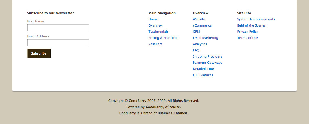
GoodBarry
Although GoodBarry doesn’t list out every page in the footer, but it does act as a sitemap where they list the pages with the most significant content.
White House
In the recent redesign of the White House website, browsing the site has been made easier by using the dropdown menus and sitemap in the footer.

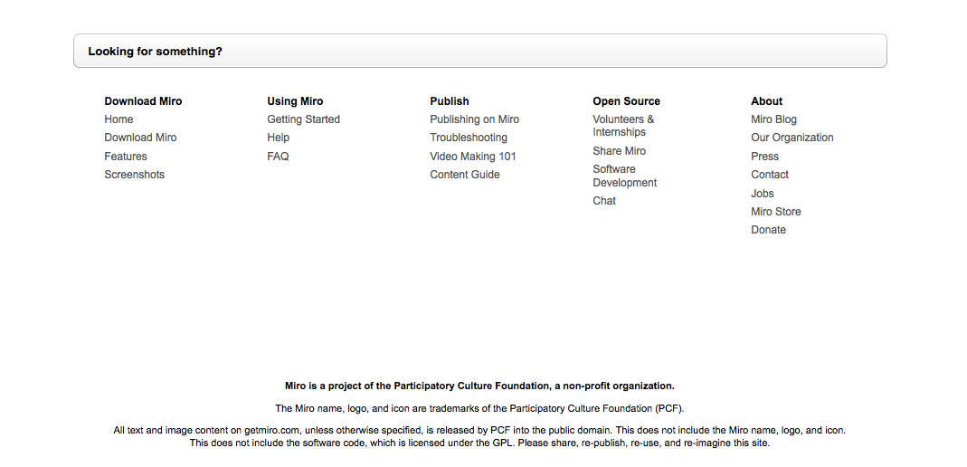
Miro
Miro separates the sitemap with a text bar “Looking for something?”.
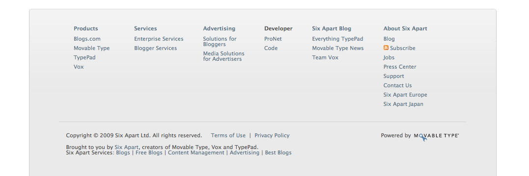
Six Apart
You may also use the sitemap to connect to your network sites. Six Apart is a good example. In the footer, under the Six Apart Blog column, there are links to their sister sites: Typepad, Movable, and Vox.
Clearspring
In Clearspring, they split their Services section into two columns: Launchpad and WidgetMedia.

SquareSpace
SquareSpace’s sitemap tells you which pages you’ve visited already. Notice the visited pages have a tiny check mark instead of the regular triangle icon?
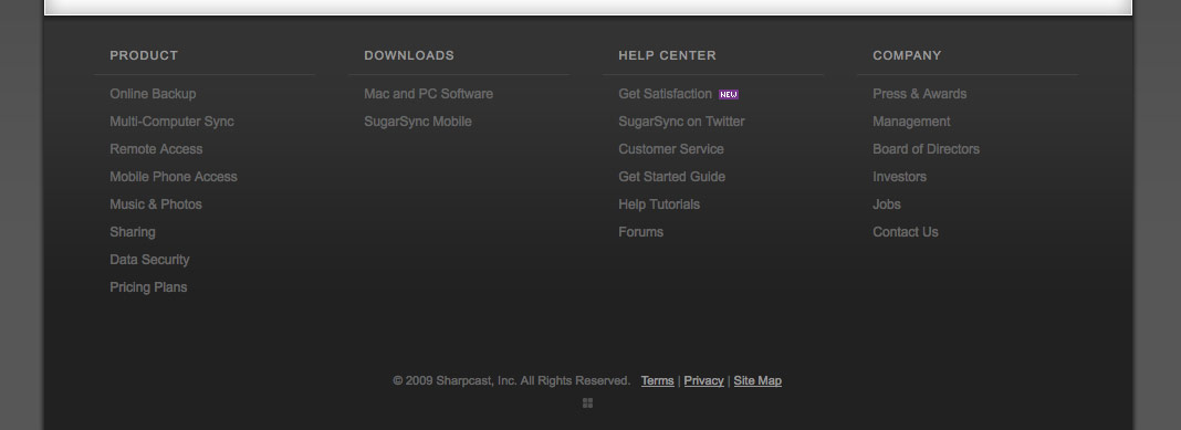
SugarSync
SugarSync displays only the main level of the site in the footer, the full sitemap lists all pages.
FreeAgent Central
Again, FreeAgent Central has a simplified sitemap in the footer with a link to the full sitemap.

FiveRuns
FiveRuns creatively organizes their sitemap to put the main focus on their products.

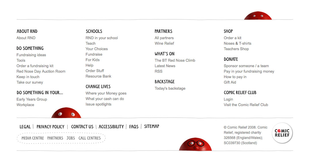
Red Nose Day
I particularly like the "red nose" figures in the footer because they make the sitemap stand out.
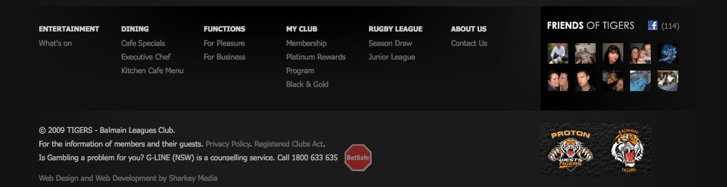
Tigers
Having too much empty space in the footer? Fill it with a sitemap. You don’t need to have a lot of pages to make a sitemap (Tigers is an example).
Get Satisfaction
Get Satisfaction saves their header space by placing the main navigation (which is also their sitemap) in the footer.

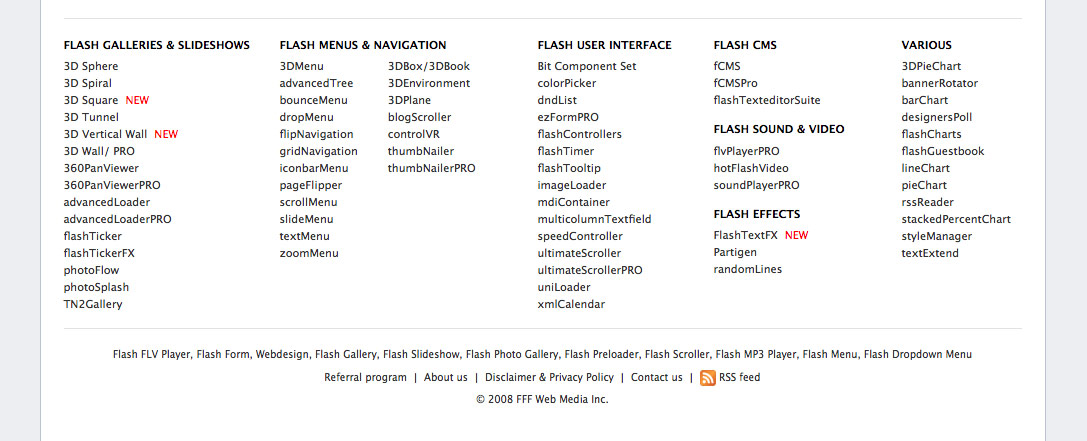
Flashloaded
Flashloaded sells Flash components, thus their footer sitemap only lists out the products.
Jamie Oliver
Jamie Oliver displays a simpified sitemap in the footer and also provides a link to the full sitemap.

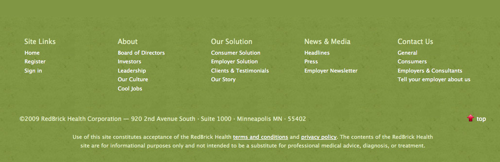
Redbrick Health
Nice and clean 5-column sitemap.
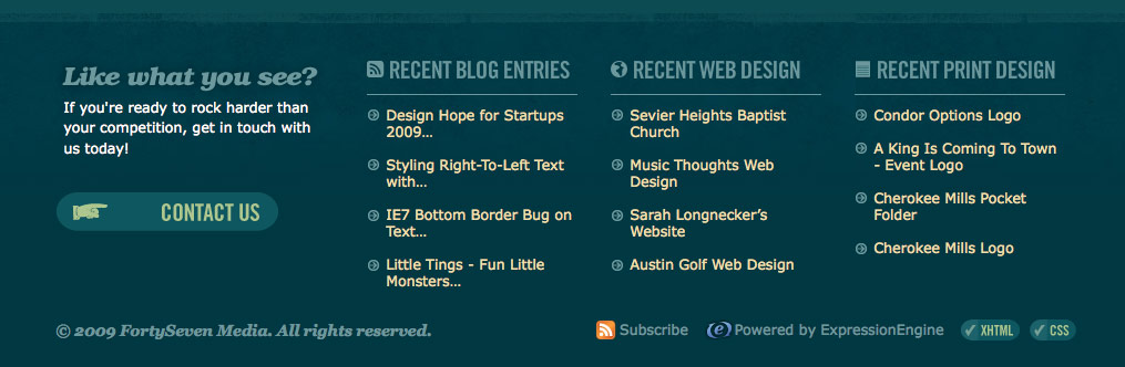
FortySeven Media
I’ve been showing a lot of big corporation sites. What if you have a smaller site? FortySeven Media is a good example of what you do with a portfolio site. They use the footer to display the latest entries of their blog and portfolio work.
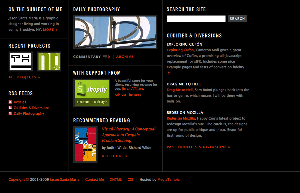
Jason Santa Maria
This one is my favorite. Not only does it look elegant, but it also attracts readers’ attention by laying out the recent activities of the blog in a beautiful way.
Tips For Designing Footer Sitemap
-
Categorize – organize your links in categories.
-
Use Headings – use headings or titles for each category.
-
Be Consistent – the order of the links should be consistent.
Cyprian
Greay post. Thanks Man!
Web Design Tasmania
Great Article and I think it is a good idea for the larger type of site.
But the more I think about it every website could make very good use of this because you do indeed create a better user experience. I might try it on my own site as well with my main sections and my twitter feed.
Chris
More great food for thought, cheers!
Realizzazione Siti Web Bologna
Super useful article! Thanks
Patrick
One thing I have noticed is that some websites have huge footers with sitemaps that seem totally unnecessary, because there just isn’t enough content on the website to justify having one. If your website is small enough to be totally accessible from the top links then what is the point in having one?
David Hellmann
Nice Pages. Sitemap in the Footer is a good idea and very useful.
Lieven
I agree with Patrick; There is only need for a sitemap when the site is complicated. A normal portfolio-site should work without it, otherwise the basic structure of your site is messed up.
A regular “work, blog, contact” should do the trick for those. Everybody knows this system, so why fill your page with extra info?
When you’re experimenting with structure,… well, that’s an other cup of tea…
Web Design
I agree, if the structure of the site is complicated then we do need a sitemap, otherwise for a simple brochure site if we dont have it also, it will work!
Amelia Vargo
A footer sitemap is an excellent idea. Do you think this would be good for SEO too?
Yappappeo
Great post. Grazie
DKumar M.
Nice Article!!
Curt
Good post! I’m happy to read your site!
2 Amelia Vargo: for SEO would be good an XML sitemap ;)
Roderick
Nice Article, thanks.
Note: I like the skinning job you did for the Thickbox jQuery plugin, may be a good idea for a future tutorial? Cheers
Craig
Some great examples here, it’s interesting to see some sites where the “footer” is just as big as the site!
Erick Patrick
It´s amazing what we can get from this articles… My skills rose up a lot after reading many of these ones…
And this article was well put here, many sites had been negating the footer strength, this is a simple and elegante way to rise show it up.
Greeting, from Brazil ;D
Bryan
Thanks! I’ve been pushing to update the footer in this manor on a client’s website, and this article gives great examples and support.
New Standard
Great post! Oh, the poor neglected footer!
Luke
Great post, another good example is Waitrose, a supermarket in the UK…
http://www.waitrose.com/
Zach
This is a great article. It’s a shame how much both the site map and the footer fall to the wayside on the design of a lot of sites.
tim
Great post, i’ve been thinking a lot recently about footer design for my next project. I will certainly take this into consideration.
Paul Seys
Another good example, if a little basic is the Redweb. The site structure is narrative and as you read through the site the footer ticks of the sections as you go.
Rebecca Murtagh
Bravo! Great post with show and tell.
Very refreshing to see designer that champions usability…and don’t forget to include XML site map for Google and to leverage sitemap and footers to support SEO!
Jorge Amaya
very interesting!
kaiz3n
I noticed this was the ‘in’ thing to do and I think it is very user friendly. =)
Daan
There’s also Skype, they have a great footer too.
But thanks for thid collection. You did a good job on this :)
Banago
This is really another great article and another place to look for footer inspiration. Thanks very much for sharing it with us.
Juanita
I forgot about using them that way on front end. I have been, lately, using them only for the search engine
trollsI mean robots :-)Kayla
I always saw these but never really took into consideration their full benefit. I may try this. Great post, once again.
tom h
Personally, I’ve always questioned why we have a footer. If it’s just being used as a navigation safety net, as it is in most of these examples, then the navigation isn’t working hard enough.
Contact details: ok, but these should primarily appear in close proximity to the content that prompts the CTA.
Legal: does the appearance of legal info in a footer carry any enforceable legal weight, over its appearance on a dedicated page?
What we’re effectively doing here is adding yet another block of navigation to be processed by screen-readers and compete for attention during the all important, yet brief scan-time that websites enjoy when visitors first arrive.
would love to hear your thoughts…
-tom
The Frosty @ WPCult
That’s how I’ve got mine laid out!
Ozgur Dincer
design, Design Trends and inspiration, thats what you mean :) thanks
Sklep Zoologiczny
Yup, another great post.
NJ SEO
A few years back the footer was frequently used for keyword stuffing. During the evolution of Search, at one time Google and Yahoo actually favored sites that used on-page keyword stuffing and under the hood stuffing in the meta keywords tag. Now that Google has a real good handle on the stuff masters, it opened up the possibility for using the footer for intelligent design. I’ve heard the phrase “Phat Footer” or “Phat Foot” used for the latest incarnation where the footer is used for navigation and sort of a “below the fold” block. I really like a beautifully designed footer – it can look great AND it gives SEO people a chance to send the pagerank earned on the homepage directly to interior core pages that you want to pump up for more rankings. Interior links pass juice just like exterior links.
Web Design
I noticed this was the popular thing to do and I think it is extremely user friendly.
Renzo
This is an excellent round up. This sites are definitely an inspiration to me.
thnx a lot!
Coffee - Mexican Web Design
You’re a genius… A sitemap in the footer is a better and more usefull way to catch the users atention.
Marco
You missed out on the footer of Tsavo Media which I really like, see here:
http://www.manolith.com/
websites designer london
hmmm, but i think in the same time it should be on the top part of the page too, a lot of people just look at the top part only, they does not know even that sometimes they have to scrool down. it sound funny but it is a fact.
Dwayne Paisley-Marshall
Awesome Post!
Jobs
You have done a nice analysis of web sites. Yes, that’s very true. It’s better not to have a separate page for sitemap because usually a visitor has got 0.1 chance out of a 100 possibilities of visiting the sitemap. Thus, better utilize the footer space. I guess that’s what it is meant for.
Michael Parenteau
Great Post!!! I really love the functional footer stuff out there now. I have also seen some really nice footer stuff with jquery sliding hidden divs for the sitemap to be revealed on click… just to make it so there is less Text… if that suits the site design anyway.
Josh
YourChurch.com does this too–combined with a drop-down alphabetical listing of ministries at the top of every page–to create what is possibly the most usable church website I’ve seen.
Jared
I think it’s a good idea to do it like that. This is a great post.
Tim Wright
I love the footer site map for last sites, doesn’t really seem to work for the smaller site though
ilz
Nice post, perfect timing.. I was just thinking of using a footer style sitemap on my personal site re-design.. Thanks!
Chris Robinson
really nice post, and a great collection of some nice footers…dugg!
Jesel Morga
New trend for web design, thanks for this post
Franke
A dutch store with an extreme sitemap: http://www.hema.nl/
Rizal
yeah, that’s really useful. save the click.
but why you dont use it at this site ?
arslion
beautiful collection and great ideas..
Lui
yeah! its getting change now…
Suchmaschinendreher
It’s a good idea! Thanks!
The Reveller
http://www.birminghampost.net has a smart looking sitemap footer but also has a separate sitemap page too.
Wish uni
I love The White House’s footer the most.
I saw it 2-3 days ago and I came to think more about footer then WDW post this.
How amazing.
Jonny T
Good post I had noticed this on site and hadn’t really put much thought into in I could see it even enhancing your ranking in SEO. Will definitely consider using site map as footer on future designs, and redesigns.
Montana Flynn
http://box.mepholio.com/ has a great footer inspiration section! I really need some work so if anyone needs some SEO/Marketing/Design help let me know.
Randy
I’m curious, Nick (author), you don’t use a footer sitemap… how would you in this wildly fun layout YOU use, do this? All of the examples are very clean site, not really expressive though, show us your example of how you would implement this concept.
Jeff
Another advantage of placing the sitemap in the footer: Improved site-wide accessibility! (You actually hint at this in the benefit labeled “Save readers’ time,” but what I’m pointing out is specific to people who use assistive technologies)
As screen readers like JAWS and Window Eyes scan page content, the last thing they “see” is the footer. Placing the sitemap there positions the person using a screen reader to choose whatever is next, to navigate from that point rather than returning to a typical navigation menu near the top of the page. For the same reason, I’ve placed navigation menus in the right column of three-column layouts (with main content in the center of the page, the right column falls next in the usual order, and the footer is last).
Carly
Lets not overlook the added SEO benefits – site wide interlinking.
We tend to use dynamic sitemaps in our footers, use one list to link the most relevant pages in that section, then the other 2/3 columns to link the rest of the sections.
Calvin Tennant
http://www.google.com/support/webmasters/bin/answer.py?answer=40318&hl=en
Google sitemaps?
WelshElvis
Virgin Media in the UK have just redesigned their homepage and gone this route – http://www.virginmedia.com/ – a huge footer with lots of links.
Floris Baan
http://www.brightcove.com/ has a nice footer as well. I also start using this “technique” more and more…
Jill Skamp
Great examples… check out PurpleFog.com: http://www.purplefog.com
Justin Dorfman
Great Tutorial!
I <3 WDW
The Website Designer
As a web designer I can see the benefits of using an entire sitemap in the footer from a usability point of view, However this should not detract designers from creating a clear and easy to use navigation for theiir website.
Rick
Good one! This is probably one of the most useful tips that I’ve read today.
DJ
Love your blogs! This is very useful info, and will be changing the ways I design my footers. Thanks for the great content.
James Mann
I really like the white house web site, and i like the fact that Obama isnt afraid to venture and use the digital world to reach the public.
Nice design and user friendly.
steve
Another great post
Kris
Definitely planning on incorporating this idea into one or more of my websites soon! Great advice, thank you!! :)
~Kris
Thijs Visser
Yeah, just follow the crowd…
Come on people, find out for yourself how to best design a sitemap page.
I kind of dislike these top 100 sites that all use the same design, just because the there are 99 other websites that use this technique.
This makes you think less about design principles and why footers like these work. Just because they work doesn’t mean you should use them.
It’s ok to invent another wheel.
CZ
Great list, great SEO idea.
Another good one is my web host provider Logicweb
http://www.logicweb.com
Ben
We’ve tried to take a more evidence based approach to designing the footer, and here’s what we’ve found:
1) footer links seem to typically outperform the same link in the top nav
2) a “fat footer” isn’t that great for SEO
3) in some sites, a thin footer will outperform a fat footer
You can see more on post here: footer design results
@Thijs – totally agree – consider why you should add a sitemap in there rather than just follow the smashing magazine etc “top 100” list
I think Jason Santa Maria’s example is a good one- extending the content and making it useful, rather than trying to stick everything plus the kitchen sink down there.
Creamy CSS
yes, it should be easy to navigate and user friendly,.. not for seo puropses.
Robin
Let’s take this to a different level. Anyone have a site that uses a footer such as the one’s described that would be willing to show the google analytics click-throughs? Would be nice to some rough percentages of usage. Personally, I can’t remember 1 single moment in all my web surfing where I clicked on a footer link.
Thanks.
Heather Kyle
I really like the idea of having a more comprehensive sitemap in the page footer. I think this is a technique that is definately catching on all around the Web. As a designer, I would have to say that the page could get a little clunky when listing a large number of links. I do, however, like the idea of only listing the pages with the most significant content. Currently, when designing websites, our company lists only the main navigation in the footer. It might be helpful to include some additional links for the purpose of user convenience. It’s definately a topic that’s worth bringing up at the next staff meeting. Thanks for the insight.
Ben
@Robin – I’ve outlined uplift that we found here:
large footer design testing results
Keep in mind that we found significant improvements to this approach (as in, like for like clicks typically increased), but there were also several significant negatives. One was a negative SEO impact. The other was that our users achieved goals *much* better with a thin footer.
Our key learning was that it really suits some sites, and is quite detrimental on others.
IDEMiUM
Thank you for this inspiration.
The post of Uxboot is also really interesting.
http://www.uxbooth.com/blog/6-things-to-include-for-a-user-friendly-footer/
Pradeep CD
nice list…
thanks for the idea…
Dan O
Great article! I had done some r&d on sitemaps a little while back. I found that HP had a really awesome set-up but I havent been to their site recently.
Atlanta Web Design
Great SEO idea, but not always fitting for every design.. perhaps if you hide the data like the comment guidelines and have it expand on click.. problem is search engines ignore anything that’s hidden I believe.
sadhu
thanks for sharing ^^
Nathan
As a designer, I would have to say that the page could get a little clunky when listing a large number of links.
I recommend you to consider some things before building any e-commerce website for your purpose —>
-There should be a consistent theme and design running
throughout your site ie same header image and/or logo, slogan,
navigation, copyright and colors.
Check here >>> Website Design Company
Static
Thanks for the article. pretty useful and inspiring!
Web Design
Good suggestions. The expanded footer is great for usability and SEO. I like the fact that from any given page I can jump deep within another section of the site yet by putting it in the footer it doesn’t clutter the page I’m currently viewing.
Fred McCoy
Not sure why you included Digg, Firefox, and Apple, but the rest are great examples for your post. Thanks a lot for the share.
Atiq
nice I love the collection.
Johnson Koh
Fantastic post. Thanks for sharing!
MeiLin Miranda
This is AMAZINGLY helpful, as are all the design resources here. I’ve been out of the game for a while, and it shows in my designs. Thank you for this site.
web agentur bonn
awesome collection.. thanks
Sam Catan
wow thanks for putting such a great effort to make these wonderful tips
AlfredN
Nice one, quite the inspiring post.
Trevor Collins
Hi,
Thanks for the information. I am in the middle of overhauling my web site so this info is greatly appreciated. Indeed I will be speaking to my web designer tomorrow about it.
Howie
Its amazing how many people will still navigate a site using the site map. Some top examples of site maps here, nice stuff!
Bekka
Wow! I’m about to redesign the footer on the company website, this has been really helpful. Now I just have to think of a way to organize all of the footer mess.
Shannon
The footer is all too often overlooked in terms of web design. Thanks for bringing attention to a neglected area!
Marijan Šuflaj
Thanks for this post. You gave me some good resources, because I’m planing to design my own template so this is good inspiration.
Thanks once again :)
Miss Blossom
I’d never realised that this was a site map – I’d often see it and thought “what a good idea” but never really thought much more about it…
I’m definitely going to think about incrporating this into my client’s sites from now on.
Thank you!
Casper
A footer is also very helpful for retail websites like the dutch website of hema.nl. The footer can be used to put all the categories and sub-categories in list view. This is also very SEO.
http://www.hema won twice the Dutch Online webshop Award
(check the tagcloud at the homepage too!)
Brad
Great Post. Some nice inspiration as well.
Amjad Iqbal
it’s a good idea. thanks
Edd Turtle
Wooo, I like it. I’d noticed it before on Chris Coyier’s website, css-tricks which I really like.
BenSky
Great article, sourced quite a few designs there too! I’ve used this method in a couple of recent designs i have done, and in some cases it does work very nicely not only from a navigation point of view but from a content filler also if the pages of a website are a bit sparce on content.
Is the traditional nav bar under threat from the footer mini-sitemap??
Nick
Whats the impact on seo of creating such a sitemap at the foot of the page that is hidden but expands on mouseover?
don
Cool way, i will make it just like that on my next website
Guillaume
Thank you for these rewiews. Not always simple to design a great footer.
Criss Redman
Great article, some nice inspiration as you can see already applied on redweb website. Good for seo too.
HostPipe Web Design
A really informative articles with some great examples of sitemapped pages. Definitely going to consider using this format on some of my own sites.
ys20.cn
very good!
design
thank you sharing
francis
nice to read
ReTwurl Short URL
I do like the layout on some of these site maps. I think I will rearrange mine. Thanks for the list you provided.
Carl - Web Site Design Instructor
I really enjoyed this post and infact I have used some of the sites as inspiration for a new site we are working on.
I do have a question tho……..how do you find all these sites for examples?
Steve
Our church has a great sitemap in their footer as well: Church on 99. I think footers in sitemaps helps make a site a lot easier to navigate, especially when the primary navigation doesn’t have dropdown menus.
Sam
It’s interesting to see sitemaps making a comeback. We have noticed some people testing their sitemap’s effectiveness recently. Mind you, it’s important to know there is a big difference between a site map and an information architecture.
Venkat
Great list to get inspiration.
I like the breadcrumb navigation use in apple site’s footer.
I like the “maximize the hover use” ;) of mozilla site’s footer. But it seems consistency is missing. Though most of the out going links (only) have arrow (on hover), some are missing.
GoodBarry attempts to get subscription finally @ footer. Good Idea!, perhaps they can add a site search too. I know they have one right at the top, but visitors may give it a last try @ footer.
Clearspring has nice footer design and clever use of top of page link. :)
João Henrique -Designer from Brazil
Very nice!
sompylasar
CodeIgniter site has its documentation sitemap on the top; it is hidden by default and gets out by a click on the button called ‘Table Of Contents’.
http://codeigniter.com/user_guide/
Thyago
Also, microsoft’s site have a site map on the footer.
Papirne case
Very, very nice, thank you
niftygoodly
If you are looking for psd templates check out http://www.venuswebdesign.com
Ian Alexander Wood
I’m definitely an advocate of the mahoosive footer. It’s just nice to have all that meta sitting waiting at the bottom of each page.
burak - delizade
I generally examine footers as long as headers. very important part.
Holly
Great post – really made me think!
Edgar Leijs
Thank you. This is exactly what I’m going to do with a project at work. Especially for long stretching pages these kind of ‘sitemap’ footers become very useful!
cennet
Thanks What’s the problem here? Google could bury the meager profit number from even the biggest media conglomerates.
cennetevi
these are awesome!
thanks for putting in the effort to get this list together
cennet
Thanks Thanks What’s the problem here? Google could bury the meager profit number from even the biggest media conglomerates.
cennetevi
these are awesome!
thanks for putting in the effort to get this list together http://www.cennet.gen.tr
cennetevi
Thank =)=)=) you http://www.cennet.gen.tr webdesignerwall Thanks
A Web Designer
I like the large footer myself, however i am trying to get a large footer to work with a large CSS background photo. The photo can not be infinitely long so I have a small problem. Oh well, I’ll figure it out.
eCommerce Design
Great examples and some nice site designs.
cool fashion
Nice effect. Learned.
lewie
really cool examples
ls3-solutions.com
bagsin
Cool effect
Larry
Good ! a really upmarket output indeed. Thanks :)
Harry
As the saying goes,learn as you work and work as you learn.Websites are getting more and more easy and snazzier to use and go through.
Don
What really attracts a new visitor to a site is the appearance,layout and the “feel”.As important as maintaining your physical business location.Effective layout means you are a no nonsense person and like to place things where they are most accessible from.
Garry
Practicality and originality,if these two yardsticks are met then the site is worth looking into.Imperative to comment that the header footer is like the head and toes of any site.If you have them you have “your” site otherwise it is just “another” site.I liked this one.
medyum
good nightsds
Peter H
Excellent examples… very clean and intuitive approach.
artnok
The fact is that this new sitemap relay, hugely participates to re-design the bottom of websites, becoming essential part of general design on the page…
jpondry
On the verge of revamping my entire site. This is very good information and thought provoking. Thank you for taking the time to assemble them for people like us.
Jo
I’m in the process of doing this too, but I’m wondering about the SEO implications for large websites. I’ve heard that Google crawls only the first 25 or so links on a page, so if the page already has a lot of links (internal and/or external), I wonder if the footer sitemap idea might backfire a bit. Do you have any information about the SEO side of this? Thanks, and by the way I really love your site design!!
Body2Shape
Wow I really like the examples shown, some great effects here, Thanks!
justintime
how would thought that larger vertical lists will sneak into footers. But it is def. easy way to fill the whitespace.
No_limits13
The gold outflow means that France must eventually contract its inflated paper francs in order to prevent a loss of all of its gold. ,
bakedthemes
Great compilation, gave me a bunch of ideas for my new themes.
Mike
The fact is that this new sitemap relay, hugely participates to re-design the bottom of websites
Gary
Hey guys check out the sitemap of this site. I think its pretty awesome as well. Worth a pick. ^^
Souika
I think this website is a good example : http://www.avenir-sante.com/ of modern footer navigation.
Check
Hey check out the sitemap of this site. I think its pretty awesome as well.
JMC Website Design Blackpool
I’ve seen a LOT of portfolio websites use this technique. Maybe a little too often sometimes, to the point that portfolios look the same…
vincentdresses
喜欢你们的设计与技术,常来看看
Attitude Design | Graphic Design Portfolio
Thanks for this post – some great site map layouts shown here.
best flash stock
Nice tips, it all makes sense, and every day more and more sites implement site map in footer. But i have some doubts about too many links in home page, because that is not seo friendly, and sitemaps often have too many links, not sure google likes that.
Vince
Great roundup of footer content! I will definitely be using this in my next page design
Charleane Alves
Oi adicione pois gostei do modelo.
Web Design
thank you for this post!!!!!!!!!!!!!
Extreme Acai
Ok, that sound amazing i am going to try it on my site
Get Rid Cellulite
great thanks a lot i am going to try this on my site i hope it will work
I.T MONTREAL
These are definitely great examples of site maps in the footer!
It can definitely offer some benefits as mentioned by engaging the user and duration that they visit your site, it makes it easily and accessible to view the site map, the footer can be used to promote links and obviously it can enhance the design of your website. When designing your site; you always have to think of the visitors who are viewing your site and what they can benefit from your site; whether its fast loading time; easy access and clarity of content or just scanning through an attractive/appealing web design concept.. I am actually part of a web programming company that specializes n a variety of things including website design take a look at our website above! :)
data recovery mac
I was in search of the best practice to make the sitemap for my website this post really helped me a lot but what I was thinking that the site maps made to solve two purpose one for the user ease and the other that the crawlers visit the site but in this footer version of the site map I think only the user point of view will be served not the crawler. As it can;t be that mush details that we use to make while it was on the dedicated page, but still I need to move on with the latest trend , Please guide me if I am wrong
Paul
Nice round up – I’m not sure I totaly agree with the bullet-points in the post intro though… If users are engaging through your footer, then I kinda feel you’ve not done a good enough job further up the page.
I definitely see the benefit of sitemap footers if you have long pages however, where your users might become ‘stranded’ from the main site navigation (assuming this is at the top of the site). Also, I’ve always assumed that it’s great for SEO.
Test
culo
LCD Sharp TV
great thanks a lot for sharing :)
LCD Sharp TV
that was useful thanks
small business website design
thanks for this valuable post
Plumber NYC
interesting post thanks
martin
thank you so much! it’s extremely useful for my current project!! and saves a lot of time :)
Ted Thompson
Some great ideas for site map design.
Penang Web Design
some great ideal to design the footer…thanks…
Austin
Every weekend i used to visit this website, for the
reason that i wish for enjoyment, for the reason that this this web page conations actually fastidious funny stuff too.
San Diego Mobile Notary
I use sitemaps in the footer of my WordPress-themed sites. This does create its own dynamic page that will get crawled by search engines well. Those that want to look at a sitemap would view it too, but i question whether this is needed for any site other than the most over complicated sites.
Thanks for the article though.
San Diego Mobile Notary
logo
thanks for post.
Silviya Howe
Very nice, thank you very much
Packaging Design Consultants
Good Post !!! that Answers why most websites are utilizing the footer space.
Keep Up the Good Work!!!!
benson
I was reading something else about this on another blog. Interesting. Your position on it is diametrically contradicted to what I read earlier. I am still contemplating over the opposite points of view, but I’m tipped heavily toward yours. And no matter, that’s what is so great about modernized democracy and the marketplace of thoughts on-line.
Design for Money
Very Informative!. Kudos to you and your designs
Techniques
Hmmm. Interesting and valuable post.
Jo
Congratulation for your site. Very well written too !
would you plan to make a post on a graphical sitemap ?
mermer silim
tnk you
Darryl Edwards
Thank you so much for this post, it is just what I needed to give my website footer a much needed boost and overhaul!
uk
Some great ideas. Thanks for this post!
Mr.willsons
Thank you for sharing , you r website is very g ood
willsons
AND GOOD ,thank you
Melvins
Very creative post. Thanks for sharing.
Los Angeles Web Design
willsons
When you do article marketing, your intention is to increase the number of visitors to your website. It is not our abilities that show what we truly are, it is our choices. I have look for such a article for a long time
jozhtosn
It relies heavily on touch because the pages I have a user acting on, are usually a collection of child records. uggs outlet Caching is a big help in this respect.Thanks
ugertlet
fgdd lik fe m udah 4 tahun. #hoax
willson
Thanks for sharing. I get satisfaction from this site. preserve it up. uggs outlet
Mark Hubbard
These are so incredibly well thought out, I’m having such a hard time redesigning ours right now… I want to use all the ideas of inspiration, but that would mean I’d have the worlds longest footer!
Henry Peise
No wonder, with white iphone 4 in your hand will make you be the focus of the crowd! You won’t miss it!
tode
it’s so great, thank you for sharing
Juno Mindoes
I just heard the gossip that since there’s some technic problems on white iphone 4, iphone 4b is going to release. It that true?
Ben
That’s Great! Thanks for the post!
Kirill
Test comment
ROAdmin
Thanks for sharing – I will think about using a sitemap in the footer.
tütüne son
These are so incredibly well thought out, I’m having such a hard time redesigning ours right now… I want to use all the ideas of inspiration, but that would mean I’d have the worlds longest footer!
Calgary Web Design
Nice Templates!
formula 21
it’s so great, thank you for sharing
altın çilek
These are so incredibly well thought out, I’m having such a hard time redesigning ours right now… I want to use all the ideas of inspiration, but that would mean I’d have the worlds longest footer
hcg damla
Thanks for sharing – I will think about using a sitemap in the footer.
Offices in Singapore
Splendid work. Thank you so much for this post. Interesting content.
Singapore Office
This is not a nice article. It’s a great article!!! This will really be highly beneficial . Thank you for creating this!
zeninho
I have website and found that article very Useful…
THANK YOU
Geek
Thank you. Very good Article. This was exactly what I searched for. I love this modern footers. I think I am going to subscribe to your rss feed. Regards from Germany.
Pablo Ambram
Thanks, very good article. It would be nice if you could point out some WordPress plugins to create, or themes that have this modern footer sitemap already incorporated. Thanks
Gary
Nice article, very good content.
DeenRose
Very Useful Article for website owners…
eSparkInfo
Best structure is defined by Mozilla. I want to develop best HTML sitemap on website. I read entire post & assume that: HTML sitemap and footer section both are too important for users.
Montreal limo
Very useful Article for footer & Site map Designer team .
panax clavis
Very Useful Article for website owners…
mary
Great article!!!! thanks
Rutuja
Thanks for such a nice article!! Very useful..
hemroids
i think that it looks more professional to have private policy, sitemap, etc in the footer. However, how do you create this in wordpress? I am missing it on your site. This is a very usefull site.
philip hastings
Pretty cool. Thanks for sharing.
Hiren Modi
This is such a great blog post! I was searching for “How to create best HTML sitemap?” on Google and land on this such a great blog post. This blog post have quite different subject from my requirement but, I suppose to indicate that suggestions will help me to design great footer with my eCommerce website.
BTW: I am searching for best blog post or solution which help me to design such a great HTML sitemap and improve my indexing over Google. Can any one help me in same direction?
pembe maske
I suppose to indicate that suggestions will help me to design great footer with my eCommerce website.
Mark
great well research post, thanks it was very helpful :)
Lovelylines
Very interesting post ! Thanks a lot ! :)
Luci Juvera
Excellent post. I was checking constantly this blog and I’m impressed! Extremely useful information specially the last part :) I care for such information much. I was looking for this certain information for a very long time. Thank you and good luck.
Mazhar shahzad
Very Help full post i really impressed.
Danielle Callahan
Great ideas here. Thanks.
emavens
Yes I really liked the footer design of FiveRuns , I found this page through Google search when I was searching for inspiration for Footer Designs. Thanks for posting such an informative article and website collection to Inspire web designers like me .
Kundan Singh
great collection of sitemaps can you post some more examples just like infographic with sitemap model one because its more attractive
Mark
Thanks for this post. I’m just learning about sitemaps and the actual function they can play in website optimization.
Would it have the same effect from an SEO perspective if I just placed a link in the footer to a page which has a sitemap?
Burton Web Design
Really helpful post, thanks!
Gift SMS
Nice, very good. Will definitely choose one of those.
Johny
Very Very interesting post. There are some other good ones I found on
Yahoo
Cheap Flights to Dubai
wonderful i like this idea thanks for sharing dude.
thanks
Kevin
Today I revised some of those websites, and all them changed the footer style.
What is the best footer for users and SEO in 2012 and why? I think this would be a nice read
Andre
I come back to this site after an internet worm hole adventure. And you still post very relevant topics. I think I love you. . . . . I’ll leave now.
sarah
Thanks for such a nice post
26126
fsdfsdfsd
thiết kế web
Thank you for the auspicious writeup. It in fact was a amusement account it.
Look advanced to far added agreeable from you! However, how could we communicate?
OptiMatrix
well, this is very good post. I have personal experience of this stuff. When I started my site at that time I did not put all links at footer section after then I read somewhere and put links at footer section then simply I good good traffic. .
Thanks for posting this kind of valuable post
SPI
Thanks for sharing….I am just about thinking of doing that…..
Recalled Products
Really very nice and useful information sharing. Thanks for that.
Simpliweb
Nice point ! improved user navigation experience, and you are a “small fish” website, it is always good to follow the “leaders” experiences… I did apply this strategy on -some- of my web pages (when needed)… btw, thanks for this cool webdesigner oriented blog… keep up the good work !
Azlan
I have followed the 3 steps as mentioned by the author:
Categorize – organize your links in categories.
Use Headings – use headings or titles for each category.
Be Consistent – the order of the links should be consistent.
Now, how do i add these into the footer? I am stuck with it.. Can anyone help..?
THanks
David Cantor
I want to create a separate page for the HTML sitemap, does anyone have any good examples of those? They say it can give you a decent amount of internal SEO benefit by using the internal linking. I have also heard that you should place the sitemap in the upper left hand corner to ensure that the Google bot follows that link first, any thoughts?
rashi
how could i see my code ?
MathewMe
Great collections of footer design!! Totally love your blog that offering some fantastic ideas…. keep up the good work!!
DymoLabels
hi
i really like your collection
i needed it badly
thanks for sharing
Michael Mulholland
Really useful, Thanks :)