Viewport Meta Tag For Non-Responsive Design
I’m sure you all are using viewport meta tag for responsive design, but did you know that the viewport tag can also be very useful for non-responsive design? If you ...
CSS Social Buttons
I’m proud to announce my latest CSS experiment—The CSS Social Buttons. They are not another "pure CSS3" or "HTML5 canvas" icons. These icons use the basic traditional background-image technique. The ...
CSS3 Image Styles – Part 2
Previously I wrote two tutorials on how to style the image element with CSS3 inset box-shadow and border-radius. The trick is to wrap the image with a span tag and ...
Playing with SVG Design
After years of quarantine, the Scalable Vector Graphics is finally raising fame as a feature of HTML5 with full native browser support. Vlog.it, by Marco Rosella, is an experimental site ...
iPhone Safari Viewport Scaling Bug
Those who create responsive design for iPhone may be aware of the viewport scaling bug in iPhone Safari. The bug occurs when you set the viewport width to device-width and ...
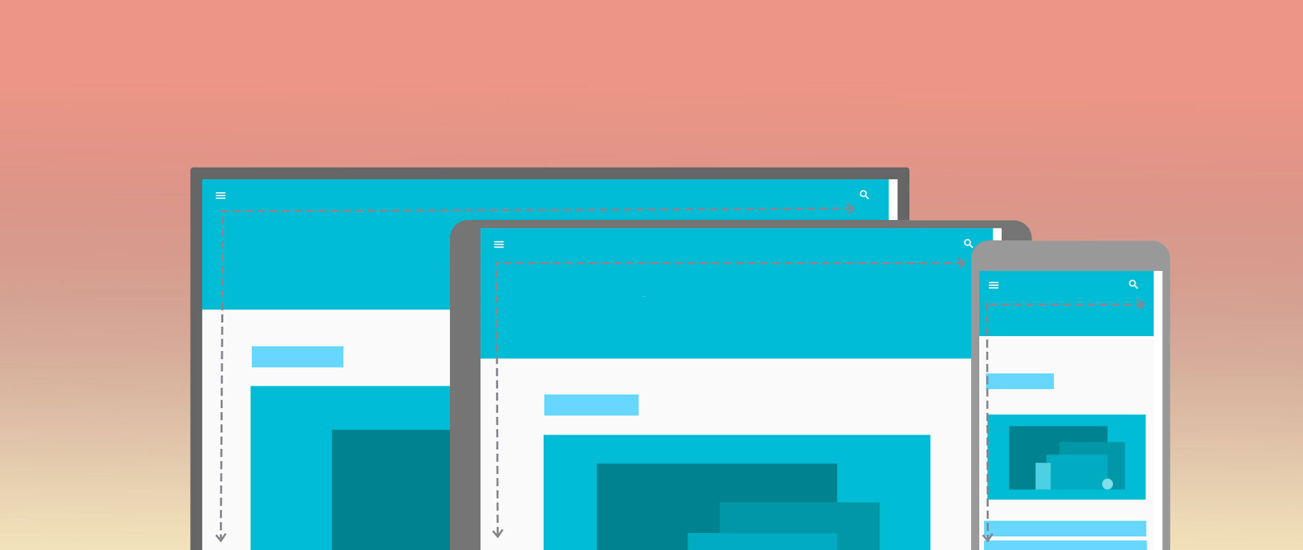
Responsive Design with CSS3 Media Queries
Screen resolution nowsaday ranges from 320px (iPhone) to 2560px (large monitor) or even higher. Users no longer just browse the web with desktop computers. Users now use mobile phones, small ...