Last month I had the opportunity to speak at Frontend 2010 (hosted by IXD) in Oslo, Norway. My topic was about beautiful design. I talked about how you can make beautiful websites by putting the extra detail in it. As promised, here is the slide and brief recap about my presentation. I apologize for the delay. You may also download the slide at SlideShare.
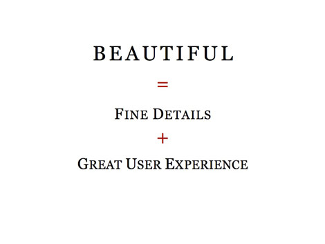
Beautiful = Fine Details + Great User Experience
My topic was Beautiful Design is All About The Details. First I talked about how I incorporated the details in two of my latest projects: N.Design Studio redesign and Themify.
1. N.Design Studio
The overall design of N.Design Studio is very artistic. I’ve incorporated a lot of my illustrations into the design and paid great attention to the details such as the typography and layout elements. It is like a piece of art.

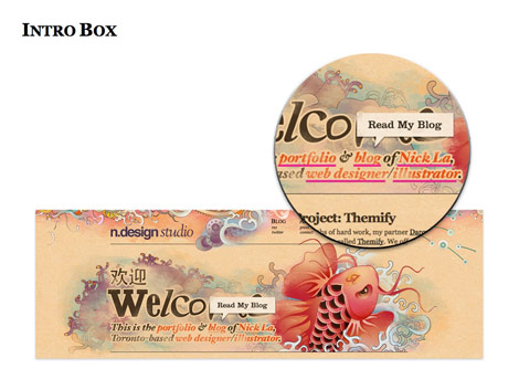
Intro Box
The intro box on the homepage is visually appealing and has a function at the same time. It tells readers everything about me and provides links to the major sections of the site.
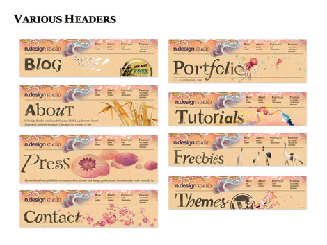
Various Headers
Instead of having the same header throughout the site, I spent the extra time to design a different header graphic for each page/section. Each header has different illustrations, height, and font styles. The fonts are randomly selected.
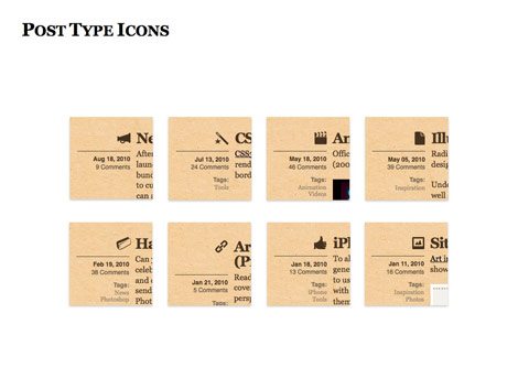
Post Icons
Then on the blog page, each post has an icon associated with the category.
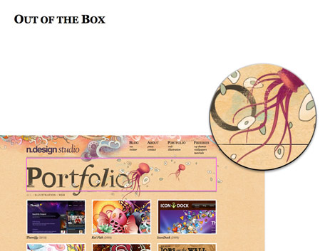
Out of the Box
I made the design seem out of the box by extending the graphic elements outside the boundary.
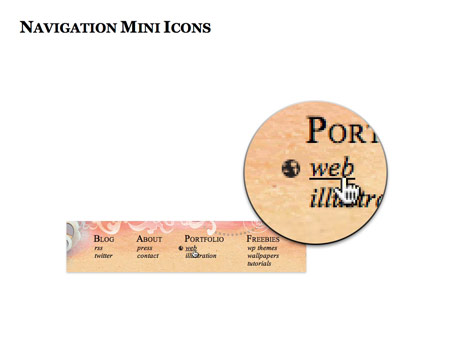
Navigation Menu Icons
When you hover over the menu buttons, it will display a tiny icon as the hover effect.
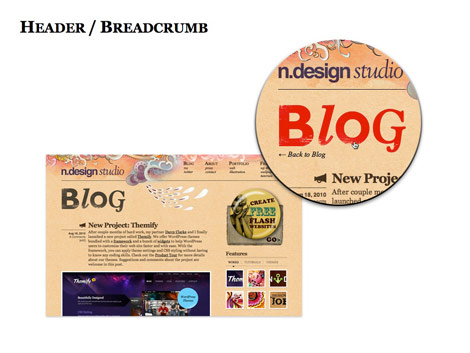
Header / Breadcrumb
The header on the blog post also acts as a breadcrumb. It takes you back to the blog index page.
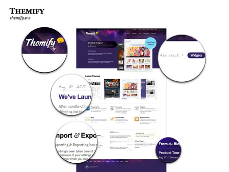
2. Themify
Since Themify sells WordPress themes, I couldn’t go too crazy with the design. It has to look clean and professional. But it doesn’t mean my design have to be plain and boring. Instead of spending time on the graphic, I played around with the typography, CSS3 effects, and subtle details.
Smile
To add a little fun, I’ve designed a smiley face as part of our logo.

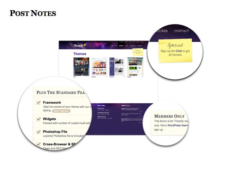
Post Notes
I’ve design various post notes to highlight the annoucments and promotional messages.
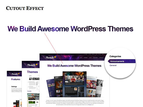
Cutout Effect
As you may probably know, I like to play around with headings. On Themify, I thought it would be interesting to make the headings look like they are being cutout.
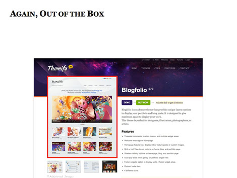
Again, Out of the Box
Again, I extended the image out the boundary to make it look out of the box.
Pixel Details
When I design in Photoshop, I often design in the zoom-in mode. I pay close attention to the pixel. Below are several case examples that I’ve encountered while designing Themify.
Homepage Feature Box
On the homepage feature box, when the large Georgia font is placed with the small Arial text, it looks like it is being pushed to the right by 1px. What I did was apply -1px margin-left to make them look align together.

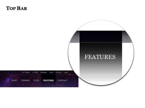
Top Bar
On the top bar, I used a very light gradient bar to separate the navigation. I made the gradient overlapping so it looks more interesting.
Form Fields
When styling web forms, we often use solid border which looks very flat. To add more depth to the input fields, I styled it with multiple shades of gray.

White Space Issues
Next I want to share with you how I solved the white space issues while designing the themes page. On the themes page, I initially wanted the images to be borderless. It looked fine if the image has a color background. But if the image has white background, it will blend with the content background leading to a white space issue.

Quick Solution = Border
To sparate the images from page, adding a border to the images is probably a quick solution.

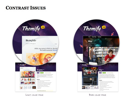
Contrast Issues
However, the border doesn’t play well with my out-of-box layout on the theme detail page. The border appears fine with the light color images. But the border looks like a white stroke with dark color images due to the contrast.
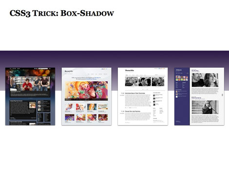
CSS3 Tricks: Box-Shadow
An alternative would be: use box-shadow with RGBA value instead of opaque border.
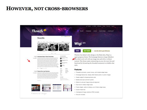
Not Cross-Browsers
But CSS3 box-shadow is not a cross-browser solution.
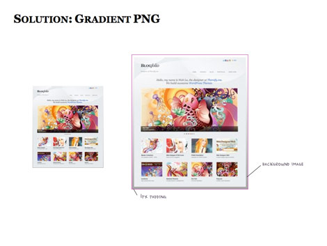
Solution: Gradient PNG
Then I came up a solution: instead of using border or box-shadow, I use a gradient background. I apply the gradient PNG as a background image and 1px padding which seems like a 1px graident stroke.
Final Result
Now it works with any image on either white or color background.

CSS3 Enhancement
Although CSS3 is not widely supported by all browsers yet, but it doesn’t mean we can’t use it. We can use CSS3 to enhance the design. The most commonly used CSS3 visual properties are probably: rgba, border-radius, box-shadow, and text-shadow.
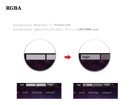
RGBA
I use RGBA to enhance the login form fields.
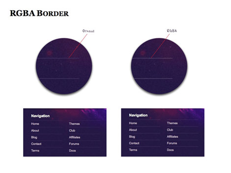
RGBA Border
On the footer, I use rgba value for the border color.
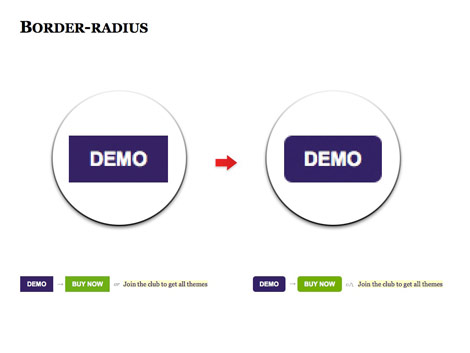
Border-radius
Border-radius is used to make the rounded buttons.
Box-shadow
I apply a very subtle box-shadow to add more depth to the design.

Hover Box-shadow
Box-shadow is used as a mouseover effect on the theme screenshots.

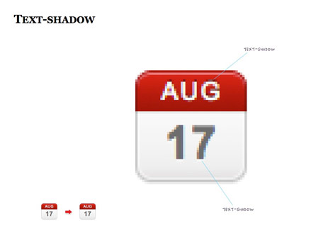
Text-shadow
Text-shadow is used with the calendar icon to make it look more 3 dimensional.
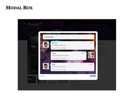
Javascript Enhancement
Nowadays having a beautiful design is not good enough. Your site needs to have a good user experience. There are many Javascript libraries and plugins that can help you to enhance user experience. Below are couple examples on how I use Javascript to solve cluttered space problems.
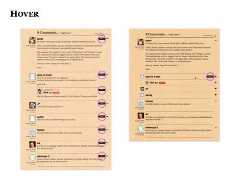
jQuery Hover
On N.Design’s blog comment list, instead of having the reply buttons on every comment, I use jquery to hide all the reply buttons. When the user hovers over the comment item, the reply will appear and makes my comment layout looks so much cleaner.
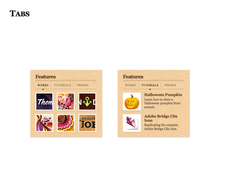
jQuery Tabs
On the sidebar, I use jQuery to display the content in tabs.
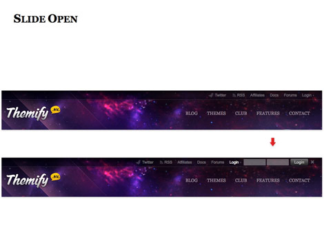
Sliding Login Form
jQuery is used to handle the sliding login form.
Feature Slider
The slider is powered by a plugin called Cycle.

Image Lightbox
The image lightbox is by prettyPhotos.
Other Examples
Below are the sites that I think it has great attention to details.
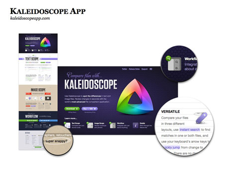
Kaleidoscope
This is one of the best one-page designs that I’ve seen. Every section features a different layout theme that is consistently tied together.
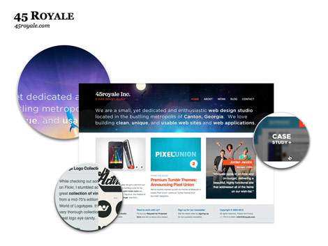
45 Royale
45 Royale offers a day/night theme which responds on the time of your visit. Pay attention to the rocket in the header illustration. In the day scene the rocket is launching at the bottom and for the night scene the rocket is in the space.
Basecamp
On the homepage intro graphic, notice how all the arrows are gray, but the arrow pointing toward the "See Plans and Pricing" button is black? It is a minor detail but helps draw attention.

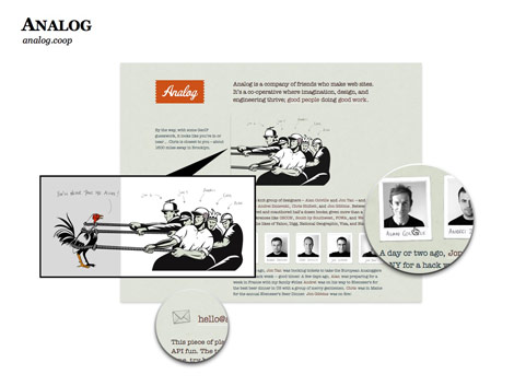
Analog
Anyone spot the hidden rooster on the illustration? View the illustration in a new window and you will see the hidden rooster. It might be unnecessary, but very memorable.
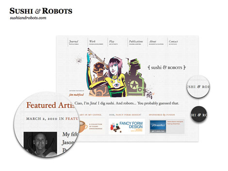
Sushi & Robots
Impressive typography work.
Pictory
Pictory not only showcases beautiful photos, but has excellent user experience. I particularly like the Twitter’s comments submitted by the users; it adds more meaning to the photos.

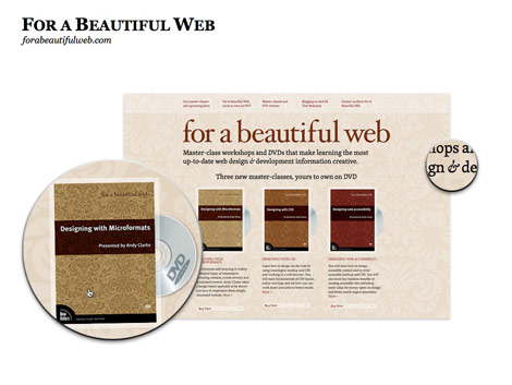
For a Beautiful Web
I’m impressed by the spinning DVD disks done by Webkit transform.
Conclusion
A detailed design doesn’t have to be very busy and graphic-intense. They can be some minor touches like the arrows on Basecamp, beautiful typesetting like Sushi & Robots, or simple animation effects like the spinning DVD on For a Beautiful Web.

Thank You
Big thanks to those who attended my presentation and Frontend 2010 inviting me to speak. Don’t forget to check out their next year event Frontend 2011.
Rick
Truly inspirational! Thanks for an amazing article.
ddsign
Congratulations! I think that all those details improve the design. Your layouts are very beauty.
Shebby
Thank you very very much!! That was an awesome insight into what your thought process involved :)
glynn
Absolutely amazing…these are the things that you just don’t notice but if they weren’t there websites would lack a lot of life! Has the talk been uploaded as a video anywhere?
david
thanks for the inspiration, some of the things you’ve pointed out will be used on my new site.
Dave
Great slideshow Nick! I’ve been looking for something like this a long time. Is there a video of your talk somewhere? Would really like to see you thoughts about design and layout of text content too!
Matt W
Looks like it was a fantastic presentation… did it happen to get recorded?
Nick La
I think Frontend/IXD will be releasing the videos.
helium
An absolutely fantastic and interesting insight into your process. Thank you so much for sharing, and excellent work as always.
Kihwa
Thank you so much for sharing! I love your design and I totally agree with you on the importance of details and the UX.
Imobiliárias em Sorocaba
Your delay in write some new articles doesn`t matter as long you continue to produce them with so many and rich details of the process. Thank you again, Nick!
adikahorvath
A lot of useful tips
Web Designing Chennai
Very good tips , it will help to the begainers
derek
always awesome~
aieie
good
Darkened Soul
Thanks for this post, looks great ;) should’ve been there.
Jenn
Great presentation you have great design skills!
Gaurav Mishra
Worth the SHOW! *Kudos*
Webranes
Those are really great web designs! You’re really good. I like the various headers idea.
Crimeadesign
Thx very much! Very useful tips, it’s great!
Robert Web
Fantastic attention to detail on your site, you can tell you put a lot of thought and effort into n.design studio
Sites Sorocaba
Fantastic, I’am from Brazil, magnification article
Web Tasarım izmir
Awesome details. Nice presentation. good work.
Yvonne
I enjoyed the read, thanks a lot for sharing!
iPhone App Development
I enjoyed the slides. Thanks for the share.
Tech2connect
I like your post. thanks a lot of sharing with us
malaysia web design
wow…this is amazing…i get a lot of inspiration here…thanks for sharing….
意美
I like the ico!!!
POG
it’s really nice article’s.thanks for sharing..like all
vidanjör
I enjoyed the slides. Thanks for admin..
Steller Designs
This was great. Thanks for the tips! You are definitely one of my favorite web designers around. Keep it up!
ben
Great to learn how you do your work. I am your great fan. there are so many things you can learn but also so many things you just can’t :-(
Designer sunglasses
Great recap, I can’t even believe you were able to write that.I got so much anxiety just watching that and I thought I was the only one who had unnatural rage/hate for Kelly, glad I’m not the only one, as I was getting concerned. These women show that you can age without maturing.Designer sunglasses
Imóveis Sorocaba
Loved the slides! Keep goind, man. I`ll try to use it in my own project:
Imóveis Sorocaba
premier pixels
I like your slides.Keep it up!
iguoguo
真是细节决定成败啊。
Web Designer from Poland
Great review. Your design is really reach in HQ details. I admire it a lot. And what I appreciate even more are your drawing skills. This is unique skill, even in world web design…
Swoppers
I always love N.Design Studio … Thanks for featuring them :) great job!
xcubelabs
Great slides. Keep it up. :)
Luan Ramos
Very goood!!
Air Jordan Fusion
Just it,good!
John
Perfect design!
Henry Peise
But to really see the difference between these cameras I put together an overview containing 100% crops. It’s not fair comparing the white iPhone 4 with an 18 megapixel DSLR but it’s good to have as a reference.
Juno Mindoes
White iphone 4 Conversion Kit is now available. Though White iphone 4 Conversion Kit is suppose to release until next year, but now, you got a great chance to buy White iphone 4 Conversion Kit.
n55lW
I always love your design~ ka yau!
Ben
That’s Great! Thanks for the post!
Webdesigner 4 Drupal
Thanks for this great article, just scanned trough it. But will definitly read it later on. Wished you have a youtube video of you presentation.
Gunjan Solanki
this is the best article for all web designer.
شات صوتي
thnks
goooooooooooooood
min:(
Ralph
Thank you for your sharing this informative article.
Ralph
Raymond
Thank you so much for this lovely site
shuaib
Thank you so much for sharing such nice piece of information
shuaib
thank you for your sharing this informative article
Uçak Bileti
really Great! Thanks for the post!
kilo aldirici
ignore weight
happmaoo
看到这个鞋盒我真的无语了
diş beyazlatma kalemi
All whitening formulation is applied by dentists with quality features, powerful, secure, and very reasonable prices, as well as the missing handbag is a unique product design, fashion styling you will not ..
css splash
great collections csssplash | Web design Inspiration Gallery
cheap christian louboutins
with the help of it, we can clear christian louboutin high heels open which a door.
collezione borse
I enjoyed this post Abhishek. It was certainly creative and not what I was expecting when I clicked on the title – a title I might add, which is quite good. I know I had to find out what ways ‘guaranteed’ I could grow my list.
Pandora
I may never be a typophile, but articles like this may just help me bridge the gap. Thanks for the hard work.
Min
Finally I had some time to seat down and watched the 40min of presentation you did. It’s quite impressing! Admire your work and thanks for sharing tips with design community~~~
Pandora Jewelry
thanks for sharing such informative and fantastic post..
dexx
Recent surveys, children of depressed mothers’ negative patterns of activity occurring in different brain reveals. This is for children of mothers who take more risks in the future is going to have depression.
replique montres suisse
Certains sont bons alors que certains sont mauvais. Sois sage lorsque vous faire du shopping en ligne.
Anılcan ERÇOLAK
great!
Réplique Montres
OK,I love like it
orhanbt
This is verry good.
NFLJERSEYS
This sort of clever work and reporting! Keep up the terrific works guys I’ve added you guys to blogroll.
complex 41
And then he handed you the thirty-five pound paroskii.
complex 41
And then he handed you the thirty-five 55
complex41
And then he handed you the thirty-five 45
Translation Services
It must have taken a lot of time to find such intricate details.
But it sure is great work and I am impressed by how designers go into such miniscule aspects of their work.
Click Here!
Yet another issue is really that video gaming became one of the all-time most important forms of fun for people of nearly every age. Kids have fun with video games, plus adults do, too. The XBox 360 has become the favorite gaming systems for many who love to have a lot of activities available to them, and who like to experiment with live with others all over the world. Many thanks for sharing your notions.
Brigida Billington
It’s a pity you don’t have a donate button! I’d most certainly donate to this brilliant blog! I guess for now i’ll settle for book-marking and adding your RSS feed to my Google account. I look forward to brand new updates and will talk about this site with my Facebook group. Talk soon!
cheapjerseysus
I look forward to brand new updates and will talk about this site with my Facebook group. Talk soon!
Mejerseys
Cheap but high quality jerseys from http://www.mejerseys.com
NBA, MLB, NFL, NHL and customized jerseys with $17.89
deepak sharma
that was amazing… the breadcrumbs was not the perfect one…..
magazin
Certains sont bons alors que certains sont mauvais. Sois sage lorsque vous faire du shopping en ligne.
fake ray bans
fake ray ban singapore.It must have taken a lot of time to find such intricate details.
Dymo Labels
hello sir
i really like your collection
this post very useful for us
thanks