Hero headers or hero images are one of the most frequently used and aesthetically pleasing web design trends in 2016, and will likely remain strong for a few years to come. The term “hero” is often interchanged with “jumbo” and refers to full-width graphics or photos seen at the top of a post or page, like you see in?this one! There are several ways to use a hero image in web design, from full-screen backgrounds to simply adding visual element?to the page’s content.
Most hero images are eye-catching photographs or graphic art which directly relates to the content. As trends evolve, new and exciting ways to add even more interest to hero headers are being used, including animated backgrounds, video and simple scroll effects.
When it comes to visual storytelling on a personal or business?site, nothing is really as relatable and descriptive as a photo. In this tutorial, you’ll learn a simple, elegant way to add a zooming scroll effect to your hero images using modern CSS that is both responsive and engaging.
Image Zoom on Scroll
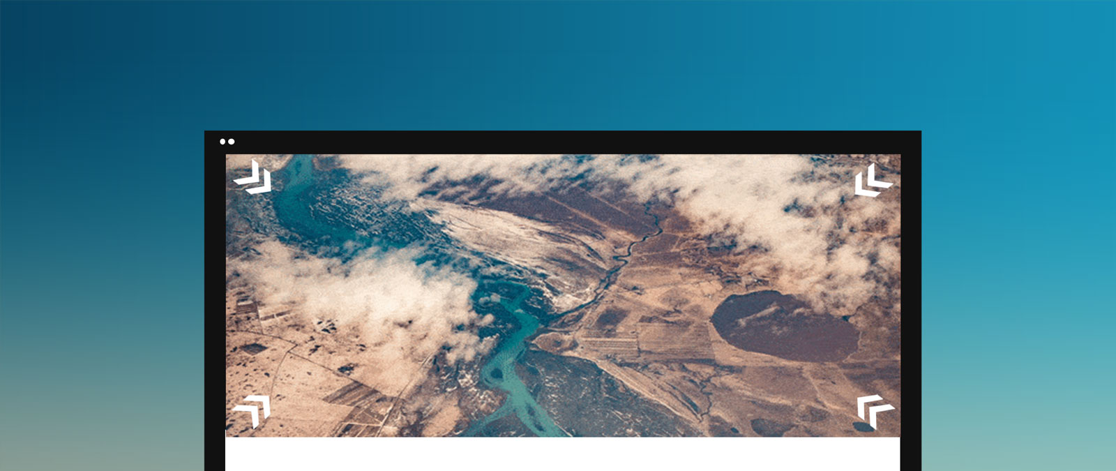
Like parallax effects, this trick zooms your hero image while scrolling down and is a fun way to add motion and interest to photographic content. Use it to give your visitors the feeling of gently falling using an aerial photograph like the demo, or maybe choose a busy photo where zooming in gives the subject more clarity.
There are multiple approaches to scaling images in CSS. Below, we have two slightly different versions. The primary difference is?how the image is handled in your layout and whether the zoom needs to be relevant to a specific parent element or the element the image is filling.
The first technique below is applied to an actual image element, versus a background fill. This has the advantage of being fully responsive and makes it easier for you to implement additional functionality such as a lightbox or other click behavior if desired.
For best results, high-resolution photos should be used. If that isn’t possible, you can add an additional blur effect to your zoom to help take the edge off any pixelation. To enable blur, click Edit on Codepen and un-comment the code in the JS window. To export the code to use on your own project, click Export from the CodePen edit page.
See the Pen Hero Zoom on Scroll by Vail (@vailjoy) on CodePen.27486
HTML
The markup is super simple. It places your desired image in the main <header> element using an image tag and gives the <header> element a class of “zoom” that we will use in the jQuery snippet to select it:
<header class="zoom">
<img src="http://www.goodfreephotos.com/albums/iceland/other-iceland/aerial-view-of-a-river-in-iceland.jpg" alt="zoom me">
</header>
In WordPress, this might look more like this:
<header class="zoom">
    <?php if ( has_post_thumbnail() ) : ?>
      <a href="<?php the_permalink(); ?>" title="<?php the_title_attribute(); ?>">
    <?php the_post_thumbnail( 'full' ); ?> </a> <?php endif; ?>
</header>
CSS
To control the height of our hero image area, we’ll use a simple padding trick. 55% is a good standard for most sites and will work with most images that use a 4:3 or 16:9 ratio.
.zoom{
overflow: hidden;
padding-bottom: 55%;
}
In our CSS applied to the image element, we use position: fixed; to keep it in place on scroll, and transform: translateX(-50%); to handle the scaling of the image as the zoom effect takes place.
.zoom img{
position: fixed;
top: 0%;
left: 50%;
transform: translateX(-50%);
}
Learn more about transform or position.
JQuery
$(window).scroll(function() {
var scroll = $(window).scrollTop();
$(".zoom img").css({
width: (100 + scroll/5)  + "%",
top: -(scroll/10)  + "%",
});
});
We use the fantastically flexible scroll function to apply some CSS to our image element by selecting “.zoom img” when scrolling is detected. The script will elegantly scale the width of the image a tiny bit for each percent of the window scrolled.

Alternative
Another technique is to use the background-size property where your hero image is a background fill on a container. You may need to go about it this way if you want to allow for dynamic content inside the header area, such as titles or post meta.
See the Pen Hero Zoom on Scroll Using Background Size by Vail (@vailjoy) on CodePen.27486
HTML
The main difference here is we trade a heading for the img element:
<header class="zoom">
<h1> Iceland</h1>
</header>
CSS
Then we set the header background in CSS:
header{
  min-height: 90%;
  background-image: url(http://www.goodfreephotos.com/albums/iceland/other-iceland/aerial-view-of-a-river-in-iceland.jpg);
  background-size: 100%;
  background-position: center center;
}
The background-size property is set to an initial 100%. We will increase this little by little as the page is scrolled using the jQuery snippet, the same way we increased the image width relative to its parent element in the first technique.
Note: There are also many ways to go about setting the header height, incuding Javascript. We went with a really basic technique using percentages here for the sake of simplicity.
jQuery
The jQuery snippet is almost identical, you just need to adjust the CSS selector used, and the property to apply the changes to:
$(window).scroll(function() {
var scroll = $(window).scrollTop();
$(".zoom").css({
backgroundSize: (100 + scroll/5)  + "%",
top: -(scroll/10)  + "%",
    });
});
The Easy Route
Don’t feel like implementing this yourself? You can easily apply this effect to any Themify Builder row element in Themify WordPress themes by selecting the Zoom Scrolling Background Mode under the row’s Styling options. Learn more about the Themify Builder here.
Don Cullen
Appears to be not responsive. Am viewing it on an iPhone 6s.
Vail Joy
Hi Don!
The first method will be more responsive than the second (as background fills are not inherently responsive and may need more care). You can see in the codepen window vs full screen that it works at various widths. Please also note that these are intended as instructional tools, not project drop-ins, so may not include things like a full set of media queries. I do see folks struggle with responsive backgrounds often, so we’ll see about writing up a tutorial on that in the near future!
Florian
If you care about performance, you should use translate and scale to perform the transformation of the image in example 1: http://codepen.io/knusperpixel/pen/VmpKpm
Vail Joy
This is another great way to handle the scaling in the Javascript snippet! The method to use depends most on the implementation and any restrictions in place. In general, I agree that your method is more fluid. Thank you for sharing!
Dan
Hi. This is great, thanks for the tip. How do I make the the image zoom less for a more subtle effect?
Vail Joy
Hi Dan,
If you look at the codepen, the zoom is controlled by the scale level. Check out the scale spec to learn more about how it works: https://developer.mozilla.org/en-US/docs/Web/CSS/transform-function/scale
Jules
Two things:
1. Hero Images may be “aesthetically pleasing” to the designer – but they get in the way of the Visitor accessing the real content – or doing real work, by making the Visitor do extra work (i.e. scroll) .
How can I make my browser block “hero images” ?
2. ANY animation is distracting / annoying.
Quite the opposite of “engaging”, zoom on scroll makes me want to go elsewhere.
Again, how can I make my browser block these unwanted intrusions.
Thanks