
I’m sure you all are using viewport meta tag for responsive design, but did you know that the viewport tag can also be very useful for non-responsive design? If you haven’t got the time to convert your design to responsive yet, you should read this article on how to use viewport tag to improve the appearance of your design on mobile devices.
General Use of Viewport Tag
Viewport meta tag is generally used for responsive design to set the viewport width and initial-scale on mobile devices. Below is a sample viewport tag.
<meta name="viewport" content="width=device-width, initial-scale=1.0">
Using Viewport Tag for Non-responsive Design
As you may know, the default viewport width on iPhone is 980px. But your design might not fit in that range. It could be wider or narrower. Below are two examples where you can utilize the viewport tag to improve the rendering of non-responsive design on mobile devices.
Example
Take a look at the Themify site on your iPhone.
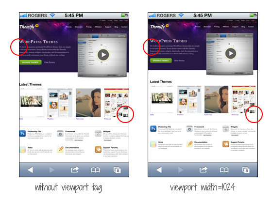
The screenshot on the left shows how the site would render without the viewport tag. As you can see, the page is touching on both sides. I added viewport tag to specify the viewport width to 1024px so it leaves some margin space on the left and right sides.
<meta name="viewport" content="width=1024">
Another Example
If your design is too narrow, it might also cause an issue. Lets say the container width of your design is 700px and it is not responsive, it would look like the screenshot on the left where there is a big empty space on the right.
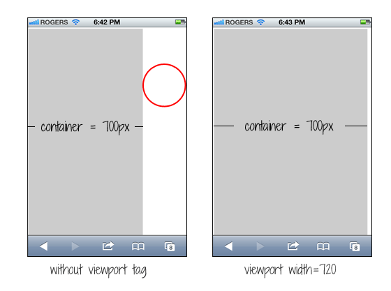
You can simply fix this by setting the viewport width to 720px. The width of your design doesn’t change, but iPhone will scale it to fit in 720px.
<meta name="viewport" content="width=720">
Common Mistake
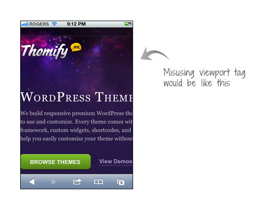
A common mistake is that people often apply initial-scale=1 on non-responsive design. This will make the page render at 100% without scaling. If your design is not responsive, users would have to pan around or zoom out to see the full page. The worst case is combining user-scalable=no or maximum-scale=1 with initial-scale=1. This will disable the scaling and zooming capability of your site. With scaling disabled, users have no way to zoom out to see the complete page. Remember: if your design is not responsive, do not reset the initial-scale or disable scaling!
<meta name="viewport" content="initial-scale=1, maximum-scale=1, user-scalable=no">
Resource Links
35 Comments
Comments are closed.
Tom
“…if your design is not responsive, do not reset the initial-scale or disable scaling…”
I do fully agree on not disabling the zoom. However, I recently came across a design (which involved fixed elements), where the iPad/iPhone got the initial scale wrong. I was able to fix it by setting different initial-scales for each device (with the help of some javascript). The devices can still zoom in and out perfectly.
What’s wrong about that?
Nick La
It depends on the situation and result. Will need to see the site that you mentioned.
Tom
I linked the page on my reply’s name. The setting is done in application.js in case you inspect it. The odd thing was, even if I threw out the (100% width) header & footer, so that only the fixed width (1064px) container was visible, the iOS devices were not scaling right – if I remember correctly the page was to wide.
Anyway…a fun fact I found out with this project: the iOS devices refuse to load ( tag embedded) pictures that are larger than certain (pixel) sizes.
Google for “Know iOS Resource Limits” and you’ll find a document on apple.com talking about this. I’m pretty sure though it’s outdated as it says “devices with 256MB RAM” and also the pixel-limit mentioned is not correct anymore.
Note that this issue seems to apply for ALL devices – even the older ones, so it seems to be something that has changed with the iOS version. I tested it on all devices on xcode simulator + a real 1st gen Ipad + a real iPhone 4.
Try reproduce if you like.
Create a blank jpg file in photoshop.
Embed it as an image tag into a html file (I used html5, not sure if that matters anyhow).
3200 x 1638 <- loads (that'd be 5.241.600 pixel)
3200 x 1639 <- does not load
Knowing this can save a lot of headaches when creating a mobile friendly image gallery (which is actually not used on the page I linked, it uses galleria.io).
Maybe you want to blog about it some day.
Devin
Thanks for the tip Nick!
Dean
I didn’t know that viewport tags can be useful on non-responsive design, thanks for the tip.
Aleks
Nice advice, will keep in mind.
Tin
Thanks for the tip Nick!
Patrick
Hi Nick, thanks for sharing. An out of topic question here, do you plan to upgrade Themify, so that it have responsive feature?
Nick La
Yup. Expect a Themify redesign soon.
jarrett
hey when i first found out that i could manipulate browsers to find my site easier it wasn’t working for me at all, then i found out put tags for however i would look for the site instead of how other people would, well then they started workin, thanks for the phone tip, thats how i started my page anyway….
matoweb
this is what I was looking for as I’m in the phase of testing my website on mobile devices… i really didn’t like how it was displayed. It will look better now, thanks to this post.
Mohit Seth
A very good thing to know. It helped in 1 of my project that I am working but not actually thinking to have a mobile website for it.
Thank you for sharing the article.
Designersblog
Hey i just found this website and i think it is great! I enjoy reading your blog posts very much. I will continue visiting this website as it has great content.
Thanks!
Franz
Great post. It’s always important that we design for both mobile and desktop. These small tricks will enhance your users experience greatly.
Dhafian
WOW.. this is really nice share. I just want to say thanks for this post.
Design Hash
well done, I now learned the importance of viewport.
Andres
Thank you for such instructive article. Looking forward for more.
Learn How To Blog
I love the Themify site on the iPhone. Thanks for sharing this. Cheers!
Adam
Awesome!
Thanks for the viewport meta tag information. I was just using it earlier today for a responsive design and was curious of it’s other uses.
Gunjan Solanki
Thanks for sharing.. its really useful…
thanks,
RoseHosting
Very helpful tutorial on adding a viewport tag to specify the viewport width for non-responsive design. It seems to work in all Android versions.
Roman
Ey, Nick, where U at? I’m impatiently waiting for Ur next articles to read. Greetz!
Lorraine
I’ll certainly be adding that in to my sites in future, great info.
Steve Bonin
Nicely written. I now understand the importance of the viewpoint tag and will use it properly in the future. Thanks again.
Mandeep Singh
I guess you learn something new everyday. I was not familiar with this meta tag. Not sure if this will come in handy anytime soon. Most website I work with are designed using media queries, for responsive design?
Vapor Paul
This is very useful for our web designers. thanks for sharing….
Pixel Media Group
Thank you to everyone who contributed to the
Progflicks
Wow, great post. I was just searching for something like this on google and found it
Phoenix Web Design
Thanks for the tip. It is a great help for some issues with a current client. Problem solved. I think I will share this with my web design friends on Facebook.
evereq
Well, 100% make sense! I make “common” mistake – some parts of site was responsible, while others – not yet (i.e. in the progress)… so set content=”width=1024″ saves me :)
Thanks!
Ramon Garzone
Liquid-crystal-display televisions (LCD TV) are television sets that use LCD display technology to produce images. LCD televisions are thinner and lighter than cathode ray tube (CRTs) of similar display size, and are available in much larger sizes. When manufacturing costs fell, this combination of features made LCDs practical for television receivers..**:
http://caramoan.coTake a look at all of the most recent content on our personal web portal
Afzal
As we know that meta tag is one of the vital part in any web designing and this post deeply define its all aspects.
Market of cleaning supplies
Hello !
This is an impressive detailed post about meta tag. Meta tag is too much important for the best designing, indeed. I totally agree with the common mistake, which usually people use to do.
so thanks for sharing this post.
Market of cleaning supplies
Brand Design Toronto
Meta tag is one of the vital part in any web designing. I fully agree, the common mistake, which mostly people use to do.
Cynthia Lewis
It’s really helpful. Nicely written. Thank you for sharing.