As you have probably know, most online readers don’t read line by line, instead they scan (from one point to another). For this reason, designers create typographic contrast and flow by emphasizing certain text. Contrast is important because not all the content within a page have the same value, some have greater significance than the others. By creating contrast, you can direct the reader’s attention to the important messages and at the same time enhance the visual appearance. Here are seven basic methods on how you can create typographic contrast.
1. Size
Larger font size indicate higher priority because it draws reader’s attention, therefore this method is commonly applied on headings.
On the other hand, you can de-emphasize by using smaller font size.

2. Typeface / Classification
Contrast can be achieved by mixing different typeface classifications. However, due to limited web safe fonts, there are only two main classifications commonly used: serif and sans-serif.

Generally, to create a contrast between the headings and the body text, we use serif font for the headings and sans-serif font for the body, or vice versa.

If you want to go beyond the web safe fonts, there are two more options:
-
CSS image replacement, that is to use CSS to hide the text and replace with a background image.
[css + bg image = static graphic img] -
sIFR (Flash replacement), that is to use Javascript and Flash technology to replace the text with the embedded font.
[Javascript+Flash = any font dynamically]
Note: CSS image replacement or sIFR is not practical for long paragraph, so they are normally used for headings.
3. Color
Color contrast is a common way to distinguish between navigation, headings, link, and body text.

You can use faded color to indicate something that is disabled or not available.

Sometime you don’t need to make something bigger to get more attention, you can create emphasis by using brighter color, such as red.

You can also use color to distinguish individual word within a group of text.

When small font size combined with lighter tone color, the importance of the text is further de-emphasized.

4. Cases
When the same typeface is used for the headings and body text, contrast can be established by changing the case. Uppercase tends to get more attention than lowercase, therefore it is more suitable for headings. The CSS property to transform text to uppercase is text-transform: uppercase.

Tips: avoid using uppercase in the body text or in long sentence because it will reduce readability.

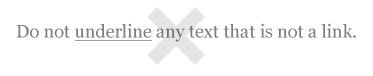
5. Style and Decoration
One of the common mistakes made by most editors (particularly the Microsoft Word users), is the tendency to use the underline decoration to emphasize certain text. This is a big mistake in web typography. Readers will misinterpret the underlined text as a link because the browser underlines the link by default. So, do not underline any text that is not a link when posting on the web.
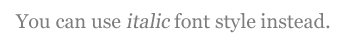
Instead, you can use italic font style.
6. Weight
Making certain text heavier weight (bold) can also create emphasis.
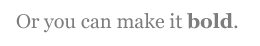
Another common mistake is that people tend to bold the entire line of text. By doing so, the emphasis/contrast of the text is lost.

7. Space
Space plays the most important part in maintaining flow of your design. Good use of space will tell the reader where to start, when to pause, where it ends, and what to do next.
There are various ways to create space:
- Block break (
paddingormargin) is the space in between the block elements. - Paragraph break (
paddingormargin) is the space created after the<p>element. - Tracking (
letter-spacing) is the space in between the characters. - Leading (
line-height) is the space in between the lines. - Indentation (
paddingormargin) is commonly used for blockquote and list elements.
Conclusion
Let’s put all these methods together in practice.

Efrain
Like always… very usefull stuff. Thanks.
tAlpA
thank you!!!
you post are better than the lesson I had at school!!! :-)
Florian
Indeed very intresting.
R.Bhavesh
Wonderful, outstanding article as always nick!. This would really be helpful to me updating my released and upcoming themes.
You have covered typography in simple but powerful way.
gbsigz
Great stuff, always a pleasure reading your articles
SasaVtec
This is very nice, thanks once again for sharing.
Fabio Sasso
Very good post, thanks for sharing…
Grant
Great article, pleasure to read!
Kai Schaller
Excellent read, especially since I’ve been wanting to learn more about typography lately!
AL
Very well put and easy to read.
I might just add that the cause of design clutter is trying to give equal prominence to a lot of items using one or more of the techniques presented in this article. The basic rule is: if you emphasize one item on a page, you need to de-emphaisize another.
David
good and usefull but many of this things are hopefully normal for a designer.
but please wrote more interessting articles, nice to read!
Davey
Good stuff, Nick. Always good to remember these!
Marianne
Thanks so much! What a great post on web typography!
Timothy Diokno
sIFR (Flash replacement)
I wondered how other sites did it until you told us!
Franco
Very very good post, thanks a lot !
Machiel
Nice Article.
Gives a short to the point round up of possibilities with type and some of the dangers… Especially on a site with multiple columns and different block of text the blance is always important.
JoK
Really great article, all the bases that a webdesigner has to know in just 1 page.
Great work and nice blog !
Milan
Hey I like your blog and your articles are grate! But I think it schould be normal for a good designer, to pay attention to those basics… but nevertheless its a good and helpful article!!
Mohammed
thanks a lot.
Sara
This is a wonderful writeup. I love to read about web typography, and you’ve summed up all of the most important points right here in one article.
Your website is always a great read. I look forward to checking it every morning when I come in to work :) Thank you!
Johan
Thanks alot for the great tips, really helpful!
Cláudio
Always good to remember these, thanks for sharing, Nick :)
steph
hehe, thanks teach
Zach
Great post! Good typography tips are always good to read! Except tracking is the control of the space between characters in an entire line of text, Leading (led-ing) would be the space between lines of text. Good stuff!
Zinni
# Kerning (letter-spacing) is the space in between the characters.
# Tracking (line-height) is the space in between the lines.
This is incorrect, The correct Definitions are as follows:
Kerning, is the space in between A PAIR of Letters, manipulation at this level is not really possible with standard HTML / CSS.
Tracking, is the space between letters in a body of text. This is different than kerning, because kerning is just a pair of letters.
Leading, is the space between to lines of text, and is set with the line-height attribute in CSS.
Nick La
Thanks everyone for correcting leading and tracking. It is now updated.
Carly
Everything you publish on your site seems to go hand in hand with either what I am interested in at the time or something I want to learn more about…I’ve been looking around, studying source code and asking for feedback about my own typography, and wanting to improve my knowledge about it, and your article has helped me loads, thanks Nick!
loxodon
great job, thank you for these helpful tips.
Joefrey Mahusay
Nice Article..Thanks for sharing…
Fearz
I don’t get what the point of this is. This is all common sense, this is a tutorial for beginners right? Cause everyone pretty much knows this stuff. Write something else that is more useful you nut.
Søren Sprogø
Nice article! Very much for beginners, yet it contained a tip or two that I’ve never thought about :-)
Btw, you should include some explanation to what exactly serif / sans serif is. Beginners normally doesn’t know.
(http://en.wikipedia.org/wiki/Sans_serif)
Nathan
Now this is a good post! Its very informing and I am sick of people using horrible text. This is perfect and makes me want to make a very CSS based layout oh so soon!
Good work, again!
Nathan
Darren Cornwell
Great article, what amazes me is that your final design (where you bring it all together) looks exactly like the Scribbish theme I currently use. Great minds think alike eh? Great read, will be visiting often.
SAT THU VO TINH
NUOC MAT KE CHUNG TINH
gary shaw
another surperb article – dont normally post comments… but you keep coming up with such interesting posts/articles that i just wanted to say keep up the good work. You have help me out alot over recent months – so a big thank you!
Geo
@Fearz
Perfectly valid comment / opinion even if many may (and do appear to) disagree with you. That is until the last two words (you nut). That just devalued your comment, reducing any validity or credence anyone may have given it, and demeaned you into the bargain.
And think a bit more before putting forehead to keyboard next time. You say “I don’t get what the point of this is.” But then you say (ask) “This is all common sense, this is a tutorial for beginners right?” so perhaps you were nearly there and you rather DO get the point.
Robert
Very nice and cool tutorial – It made me thinking about the fonts I use on my blog. There would be some changes soon:) – Thanks, Robert
Scheiro
Excellent article, very interesting for me. The CSS to hide the text and replace with a background image is really nice !
Thanks for sharing.
Carly
@Fearz – I think this tutorial has helped me think about choosing fonts more carefully. Not just using anything I can think of at the time, or always using the same thing over and over.
Sam Hardacre
Great piece!
Robin
Good piece on some of the basics of typography. It seems to be a topic that’s finally getting some much needed attention from web designers. In addition to the things you highlight in the Space section of the post, I would also be tempted to do some playing around with the word-spacing properties. You can really improve the readability (or…scanability?) of your content with a bit of work there.
On a side note, just wanted to say that I find the overall design of this site to be really inspirational and engaging.
Luis Felipe
Certainly great hints and guidance. I find this very easy to understand. Thanks for putting this together.
I’m currently creating a new layout for my website so I’ll be gathering various things from this site.
Thanks
Dustin Brewer
Fantastic article on typography, one of my favorite posts yet. I really enjoy the imagery, it adds a lot to the idea you are conveying.
outwindow
so good an article,maybe we neglect so many details.
Ulee
Great job! This was a very precise and informative article. You should think about adding a Float button to your site, so people vote for your article on design float.
Michiel van der Blonk
According to the Windows User Interface guidelines (see http://tinyurl.com/267a9b) disabled buttons have grayed out text, where enabled buttons have black (or default color) text. Most people are used to this, and that is why I would advise not to use gray text on buttons. Actually for best readability I would never use gray text, but it seems more popular than ever :-(.
Naila DXB
Nice sharing !
ZombieLoffe
Nice article. Brings out some good points.
Lawrence the Photographer
Good ideas about font types and contrast. It’s especially good for those (like me) who are starting out ;D
Peter Mikolajski
Michiel van der Blonk raised important issues and I would like add one more:
Small fonts needs to have greater contrast to be readable and I would be very careful with this particular tip. Please use Colour Contrast Analyser tool/Firefox extension to check readability because small light grey letters are hard to see even on well calibrated monitors. Uncalibrated monitors can make it invisible and yes, invisible text is really not important ;)
Overall this article is really good, thanks for sharing :)
David
Good article. While I already practice these guildlines – I really needed something like this to share with others. Consider it bookmarked ;)
SupaFly
Wow going to bookmark this will help with me teaching people basic web design maybes
5ivedance
Nice tips,bring me some points I never pay attention to.
jack
as usual your’s topics is great
please see this site http://www.xyzo1.com
and tell me what you think
Sheilla
Good point, as usual you always bring attention to details :) Thanks for sharing the tips!
Dodski
This tips really good. It really help a lot.
I got tips guys on how to make row and column. visit my blog.
Greg Ponchak
love the topic, great info
Jenny
Great tips. I’m gonna try it out with my new design. Thanks.
tad
Wow, very informative and detailed tutorial. I am always a fan of your art and tutorial. Keep it up and more power
vakantietraveldir
Very nice tutorial! I like the way you explain it.
VistaMedia
Yes, this is first axiom for great design work…:-)
1. Contrast
2. Justification
3. Propinquity
4. Repetition
sarvnaz
hi
very biautiful your weblog please add me
Elliott
I check this site every day and no updates for 23 days :( What’s happening, Nick? Hope you’re ok!
Joomlabased
This is the good tutorials. I see some websites they do it very good.
狮子的牙齿
可惜我看不懂英文.
my English is poor .so sorry i like this page.
5ivedance
Space plays the most important part in maintaining flow of your design. Good use of space will tell the reader where to start, when to pause, where it ends, and what to do next.
I will remember this words add to my work. Some times I completely ignored this would help a lot to our design.
Ralph
Thank you for your great work and some ideas for the modern text structure.
Ralph
Hakan
Thanks
almog media design
really good thanks
Gastón Alegre
Thanks for this!
Ardianto
Thanks
Atof
fANTAStic ! and Really helpFull !
punk
Fantastic and Helpful indeed :) Thanks.
Na Na
Very easy to understand. Thank you
Alexander Mannewitz
Typography is/was becoming one of the key ingredients of the big web design cookie. This article is well written and a very informative resource for understanding, how much typography matters.
Thanks for your conclusion.
Emprenye
Very easy to understand. Thank you
Dave
Great simple tutorial.
Thanks!
chesco
Thanks! Really helpfull.
Alvin
Great Article
Jacob
Very nice information in this post, while reading it everything made sense and I feel dumb for not using these before.
Milinda Lakmal
Thanks for the nice article. Can you published the code for that last example screen shot you have put. The source will be really helpful to beginners.
Weverton Naves
Wonderful. Impressive as some articles make us realize this because something is really good, and simple way, without the need to break the upside unveil these mysteries.
barry
Easy to digest, nice one
Chris Laskey
Nice overview of typography. Thanks for the right up,
Cheers
Tsiry
Very useful, thanks!
Dragolux
Thanks for the tips! These will come in handy once I get off the ground with my web designing.
naran_ho
really good tutorial, useful and simple, thanks.
The Bildschirmschoner-Man
Con este post explicaste muchas cosas profundas. Si todo la gente van a respectar tu palabras vamos a tener un internet mas lindo! Gracias!
Milinda Lakmal
Can you please put some example code for the last image you have put in conclusion section. It will be really helpful.
petnos
Its really great tuturial. Thanks a lot.
Ricardo
Very useful article on typography.
Inerxia
Great article. The Five simple steps to better typography from Mark Boulton are very usefull too. Thanks
LOmiG
thanks for this great post ; very clear, useful. I will stard to use some of your advices today !
thanks
bastiaan
whatevvvaaa
bastiaan
I DONNT CAREE
Web Designers
Really nice tutorials for web designers….!
Vanessa
Found you thru Annie at Blog U. It is sites like this and Annie among others that make me want to make creative changes on my site. You have a great talent. Thanks for sharing it! I will be visiting more often.
Creative designs
More creative, excellent designing skills….!
SEO - Search Engine Optimization Philippines - Perth Australia
This post is very useful, thanks!
hanavana -Philippines
all tutorials, tips and advices are greately appreciated,and very inspiring as well, esp.for a beginner like me who wants to be like you, i hope that anyone who finds it boring, or people who doesn’t appreciate effort of others, should keep quiet and refrain from talking like a mocking bird, air head like # 97, 96.
show your talent dude….!!!
David
simple typographic tips like this are always good to keep at the tip of a designers fingers even if you have been working for type for years, it never hurts to review the basics from time to time :)
Best Logo Maker
Nice stuff, it will be good inspiration for logo creation.
People Search Dude
I like the tip where you mention:
“Tips: avoid using uppercase in the body text or in long sentence because it will reduce readability.”
It’s also important to remember that uppercase body text will also slow down reading.
Stephanie
I’m definitely going to show this to some of my friends, definitely something that is essential to learn.
rryan
Very essential tips, and great advice. Keep it up…
Peti
Thank you, i was following your description and happy with the results!
tomus
i like the artivle it’s worth to read and got usefull information, thanx and nice website!
kamal thakur
I think I will find lots of useful information here…
Came here looking for typography..
Brad Strickland | bradstrickland.com
This was a great type overview. Most don’t even think about use of color, case and weight for emphasis.
design
Great Site for web designers and CSS ideas
Logo Design Works
I was in the process of creating a new case study on our website when I came across your website. It gave me a few ideas for my typography.
Thanks!
Skracanie linków
Outstanding post. I’m webdesigner but didn’t know about few things… I’m ashamed.
Milan
Nice article. Thank you!
Bellatrix
This is very helpful info! I find myself actually doing most of these. I would like to see a post on typography but mostly analyzing quotes, sometimes, well a lot of times I have worked with adding testimonials, and sometimes I get bored doing so, some inspiration in this typography would be NICE.
Awesome post!
Carlos Hermoso
Typographic contrast and flow is a very important issue to keep in mind. Good post
Meghana
very good stuff shared here! thanx :)
Tom
I like the case idea, using text-transform: uppercase to increase contrast
Tuan Anh
Nice post. Thank you very much. Can you write more articles with more details about this topic?
Rob Russo
I just stumbled on this article via Web Design Ledger. Great article!
I still run across sites that underline non-link text and it drives me batty. I always hover over underline text (even if I don’t plan on clicking) just to see the hover effect. Must be a nervous habit…
Agent R
Please, fellow designers, for the sake of sanity — do not mix serif and sans-serif typefaces when creating art.
Mike
@Agent, I think it’s ok to do so.
Thanks for article. Actually my third read since it’s been out..
Felipe
2. Typeface :
sIFR now has 100% JS equivalents like Cufon (or @font-face + Cufon) provided that the license of the font used permits this use.
rahulmax
Awesome article! Thanks, Nick.
flashfs
Objective explanations. Cool visual conclusion. Thanks.
zhaiduo
Very useful! Thanks.
Jako
Nice post. Thank you very much. Can you write more articles with more details about this topic?
bagsin
I love this post, it is really useful for beginners like me.
Cyrus
Great , Typographic Contrast and Flow
Great article. CSS saved web design
Cyrus
Visit http://www.psdtoxhtmlcoder.com
Carl114
Perfect article. Good advice. Thanks! :)
Mike
wow! such a great gift! reall great tuts
alex
a great article, this works in IE 8, opera and mozilla.
visit my website http://www.onlycatsanddogs.com
Jami Mullikin
Even after doing this for 15 years, it is a good to have a refresher every now and then. Thanks for the post.
Alireza
thanks for your useful and helpful article.
this is one of my works: http://www.bazel.ir
vincentdresses
The designs showed here show what simple and tasteful design is all about. Another one to consider
J.T. Shaver
Nice post! I wrong something similar on My Blog.
blogger widget
i like this thanks for tutorial
Active Computech
It really explores the anatomy of typography explicitly..! Regards…
http://www.scalablevectorgraphics.info
Web Design
amazing article. thanks so much for sharing!!
sivaranjan
Your website is incredibly beautiful and useful. I have taken liberty to add this article to my CSS aggregator site. I hope you wont mind that.
PhoneCurry
Very nice article.
Will use these tips in my own startup website (www.phonecurry.com) – it currently has good functionality but lacks seriously in design. I am therefore trying to learn good design practices online and your site has been very useful.
Thanks!
sangeeta
Very nice article…I have one question.
What is that method called where colour or font style is used to break one word into two…
for example…
if the word “Example” is written… then the words ‘AMPLE’ within it, will be written in a different colour or font…. so that the person reads both…. and to make user read it as “Ample Example” the size of “Ample” would be bigger than the rest of the letter i.e. e and x, in this case….
Does anybody know it?
kl pontz
This was a great post! Being newbie, it’s great to find a resources that outlines the fundamentals.
sanjay
nice tut! im a newbie and this opens my mind about typography..i will put you on my tutorial page in my website, hope that’s ok? thanks again!
Haliyikama
good site
Buz
admin thanks for this website.
Cöp Konteyner
I always follow your site thank you
facebook
very handy and helpful tutorial also its a free :) .. i love this site
i love WDW
aniya22
What is the language used on the examples? Latin?
Brett Widmann
Very nice tips. Keep it up!
mikwillson
Your article’s resource box should help to persuade your readers. No matter how amazing your article is if it’s not succeeding in driving traffic to your website uggs outlet
Henry Peise
Recently i am looking fot the white iphone 4 conversion kit. If you have any recommendation, plz tell me. I will be very grateful!
Juno Mindoes
I just heard the gossip that since there’s some technic problems on white iphone 4, iphone 4b is going to release. It that true?
Uçak Bileti
uyan uyannnn
Ben
Hmm, let’s see.
tütüne son
very handy and helpful tutorial also its a free :) .. i love this site
altın çilek
I always follow your site thank you
hcg damla
Very nice tips. Keep it up!
شات صوتي
thnks
goooooooooooooood
min:(
teem
Mike Sinkula
As much as the choice of type is important, the appropriate use of typographic measurements and white-space is an important tool of the trade when setting type for the web.
How To Put On A Condom | How To Get Taller
Yup. Contrast does work to call attention. I prefer using bold and bright colors…
Mike
thanks for the SPAM, idiot.
How To Get Taller | How To Put On A Condom
Contrast does work for lengthy articles or pieces. Thanks for this tip.
ana
no encontre lo que buscaba pero es importante lo escribiste bay bay bay besos
Raynoch
Inetlglinece and simplicity – easy to understand how you think.
dexx
Excessive fear, anger, and work under stress last pregnancy, infants can lead to excessive hassaslığa. Intense emotions, going through the mother’s blood circulatory system and brain functions that affect the baby in some leads to the release of chemical
Fantazi ayakkabı
Thanks admin ,very useful, help me a lot to improve some of my sites…
fantazi ayakkabı
Thanks admin ,very useful
Lassar
You was talking about using italic font instead of underline for emphasizes.
Well italic font does not really cut it for emphasizes.
I have tried bold for verdana font. And it just looks ugly.
There are places in sentences and words that no one would expect to be a link. If so, they would be a prime candidate for underline text.
Or how about using ‘underline text’ for extra emphasizes.
The only other choice is color. As you know a different color text means a link. And yet I see you use color text in this web page.
The worst thing that can happen is the reader finds out it is not a link.
So what other choices do we have when it comes to emphasizing words besides underline?
I.C. Spot
LOL that was the most illogical argument ever. It’s ok to use underline (which is ALWAYS rendered for a link), but it’s not ok to use color because that could possibly maybe mean it’s a link? Don’t cross a side street, you might get run over by a car. I recommend crossing highways instead!
eczane
Thanks for sharing and keep up the good work. That is a great article.
eczane
siteniz tek kelimeyle süpe
Genesis
this web site wasnt helpful at all >_<
Jenelle Andriopulos
I have learned result-oriented things out of your blog post. Yet another thing to I have noticed is that typically, FSBO sellers can reject a person. Remember, they can prefer to not ever use your providers. But if you actually maintain a comfortable, professional connection, offering assistance and being in contact for about four to five weeks, you will usually be capable to win a discussion. From there, a house listing follows. Thank you
Moliva
I like this blog !muy great !
yemek tarifleri
Paintingasd on the tablet is fun, but to do cool things need work.
Lenard
Good stuff.. typography is really important. A lot of start-up web designers aren’t familiar to this, but like me, as i go along, learning and discovering sites like this, I tend to realize that I still have lots to learn, even the basic ones that creates big impact on web design. Thank you for sharing this Nick.. :)
Therese
The part about underlining didn’t occur to me. I guess there are a lot of differences when it comes to print and web typography. Also, i think you should check this infogaphic about professional typography by Cardprinting as well: https://www.cardprinting.us/blog/2013/03/guide-to-professional-typography/
DymoLabels
hi
i really like your collection
thanks for sharing
keep it up