Last week I demonstrated how to build a split-screen website layout using CSS flexbox and viewport units that offers an alternative way to present a brand’s featured content. Clicking on one side or the other navigates further into the site without a page load, using CSS transitions and 3d transforms. This week, I’ll show you how to use these same techniques to add animation and movement to the content and buttons.
See the Pen CSS Responsive Full Screen Duo Layout With Overlay Content by Vail (@vailjoy) on CodePen.27486
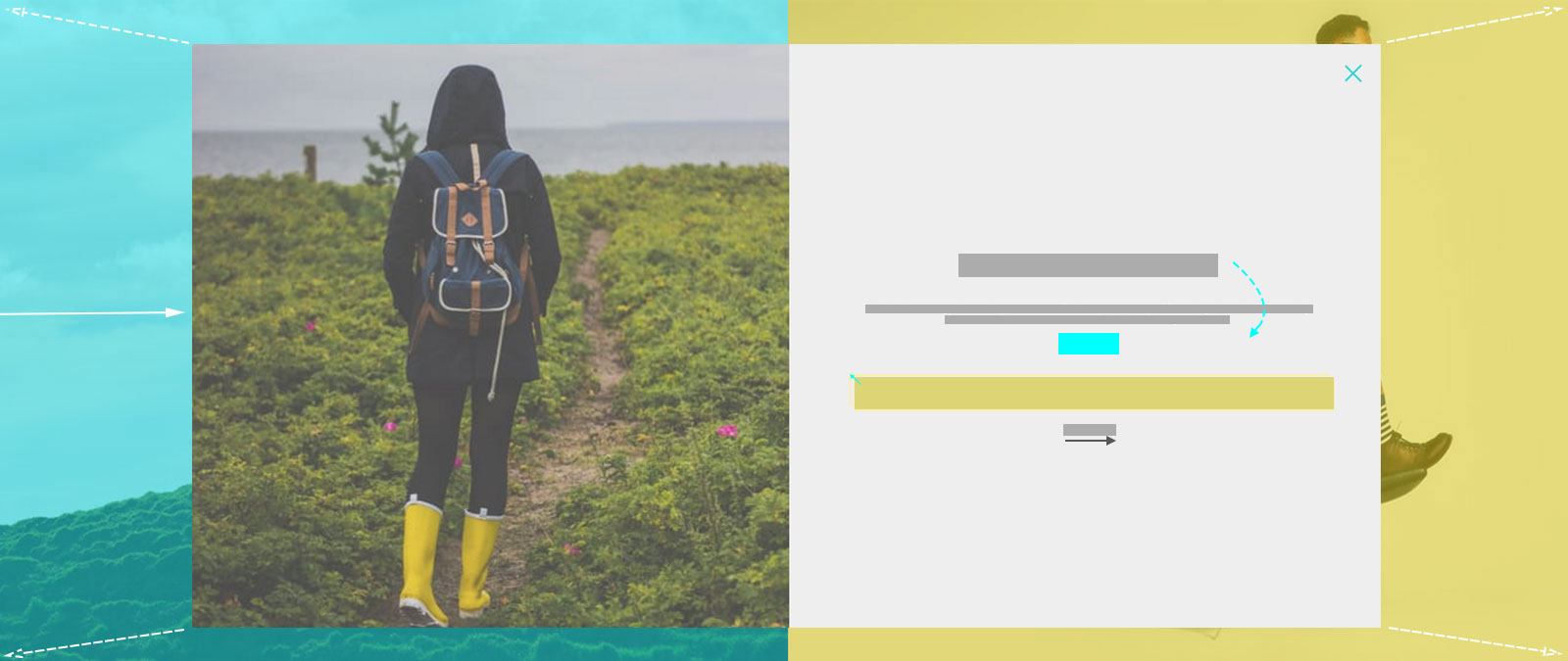
Structure
If you followed along for part one, you should already have created the overlay, or wrapper for your content and added a jQuery snippet to animate its entrance using Animate.css classes. Here is a refresher on which pieces we start with, using the left or west side as an example:
<div id="west-overlay" class="overlay">
content goes here
</div>
$("#west .content").click( function() {
    $("#west-overlay").addClass("animated fadeInLeft open").one('webkitAnimationEnd mozAnimationEnd MSAnimationEnd oanimationend animationend', function(){
        $(this).removeClass("animated fadeInLeft");
      });
});
In keeping with the two-column style of the design, this page will also use flexbox to create a single column within which the content can be layed out:
<div id="west-overlay" class="overlay">
  <div class="grid">
   <div class="column">
    <img src="photo-url"/>
   </div>
   <div class="column">
     <div class="product-content">
        <h1>Rainbow Chasers</h1>
        <p>...</p>
        <div class="price">
          <span class="currency">$</span>
          <span class="amount">89.99</span>
        </div>
        <a href="#" class="buy-button"><span>Buy Me</span></a>
        <div class="size-guide-link underline-link">Size guide</div> </div>
      </div>
  </div><!--End Grid-->
  <div class="close-icon">
    <div></div>
    <div></div>
  </div></div>
</div>
Within the overlay, we have created a grid wrapper to hold our flex items, starting with two columns. The left column holds an image, and the right column holds our page content, which in this case is a heading, description, price and call to action for a featured product. Spans are used to allow us to style specific text elements separately without affecting how the text naturally sits in its parent element.
Finally, a close-icon is created in pure CSS and placed within the main overlay, consisting of one main div and two inner divs to create the X.
Styling
The existing grid rule used for our main layout is applied to setup our flexbox.
.grid {
  position: relative;
  width: 100vw;
  height: 100vh;
  display: flex;
  flex-direction: row;
  flex-wrap: wrap;
}
To vertically center the content responsively, we will use table. This could also be done with flexbox inception, but table is much simpler. Learn more about vertical centering here.
.overlay .column{
  display: table;
  height: 100%;
}
.product-content{
  font-size: 1.4rem;
  padding: 10%;
  display: table-cell;
  vertical-align: middle;
}
Animating the Content
This demo makes use of two kinds of animation – the static kind gained through transitions, and the more complex kind using keyframes. In the case of transitions, you select the property you want to transition, which can be anything from a background gradient to a transform. For animations, you select the keyframe block. The magic happens once you declare the duration length for the animation or transition.
The transition timing function is what controls the values of intermediate states between the start and end declarations. It’s optional, and defaults to ease. When dealing with simple animations and transitions, you’ve probably used ease-in-out to make link hovers, buttons and other simple movements appear more graceful, but transition is not enough to move an element along a path on a specified timeline, allowing it to change in multiple ways. That is where CSS animation is useful.
When the diamond area of our layout, selected with #west .content is clicked, our content div with the ID of #west-overlay will get three new classes: animated, fadeInLeft and open. When the animation ends, the animation classes will be removed.
- The open class makes the div visible and adds a transition effect.
- The animated class, provided by Animate.css, sets up the animation duration and primary rules for the movement.
- The fadeInLeft class, provided by Animate.css, fades in the div and moves it into position from the left.
You can change the animation type by replacing fadeInLeft with any of the available animations in Animate.css, or with your own animation name. Here is a look at what fadeInLeft looks like using CSS animation keyframes:
@keyframes fadeInLeft {
  from {
    opacity: 0;
    transform: translate3d(-100%, 0, 0);
  }

  to {
    opacity: 1;
    transform: none;
  }
}
.fadeInLeft {
  animation-name: fadeInLeft;
}
Pretty simple, right? Over a default animation-duration of one second, the overlay div will fade in and be moved into position.
The content of the overlay can be animated in the same way, using an endless combination of styles. Create another jQuery statement inside the click function for the #west .content selector:
$("#west-overlay .product-content").addClass("animated flipInY ").one('webkitAnimationEnd mozAnimationEnd MSAnimationEnd oanimationend animationend', function(){
  $(this).removeClass("animated flipInY");
});
Delays and Duration
So when the diamond area is clicked, both the overlay animation and the content animation are kicked off. If you wanted your content to begin animating only after the overlay does, you would tuck it into the one function instead, just after $(this).removeClass("animated fadeInLeft");
Using what you’ve learned about using these functions, you can select any part of your content to animate it separately, such as fading in the image, sliding down the heading and then flipping in the button, for example. To add a delay for the animations, or make the animation slower or faster, the following properties can be added to your CSS rules for the element you are adding the animation class to:
.product-content {
  animation-duration: 3s;
  animation-delay: 2s;
}
As you can see, the visual effects are achieved through transitions and transforms, whereas movement along a path is achieved through the additional use of CSS animation. In the next section, we’ll look at the static effects used to add more interest and life to the interactions on the page, meant to entertain our visitors and keep them more engaged.
Interactions
Button
To get the layered look of the button, we use styling of pseudo-elements ::before and ::after, and a span for the button text so we can position it properly when the button is pressed.
A transition is added to the span to give the transform we will add on hover a smooth animation.
.buy-button{
    height: 50px;
    width: 100%;
    margin: 2rem 0;
    position: relative;
    background: #eee;
    border: 3px solid #f9efb2;
}
.buy-button > span {
  display: block;
  position: relative;
  font-weight: 700;
  font-size: 1rem;
  text-transform: uppercase;
  color: #1f1f22;
  transition: opacity 0.35s, transform 0.35s;
  z-index: 10;
  line-height: 60px;
}
The pseudo-elements are given a border and transition to match the above. They are offset using absolute positioning and sent behind our span using z-index to give the button some dimension.
.buy-button:after, .buy-button:before {
    content: '';
    position: absolute;
    top: 0;
    left: 0;
    border: 3px solid #f9efb2;
    transition: opacity 0.35s, transform 0.35s, ease-in-out .3s;
}
.buy-button:before {
    background: #FFF;
    margin: 0px 0 0 0px;
    top: 5px;
    left: 5px;
    width: calc(100% + 2px);
    height: calc(100% + 2px);
    z-index: 1;
}
The hover effect is created using translate3d to move the top face of the button a few pixels backwards. Simple!
.buy-button:hover span,
.buy-button:hover:before {
    transform: translate3d(-4px, -4px, 0px);
}
Link Underline
Next we have a subtle "animated" underline on our Size Guide link. The line is created using a pseudo-element:
.underline-link::before {
    content: '';
    position: absolute;
    bottom: 0;
    left: 0;
    width: 100%;
    height: 1px;
    background: #202023;
    transform-origin: left;
    transform: scaleX(0);
    transition: transform .2s ease-in-out;
}
The transform-origin: left declaration draws the line from the left. Remove this if you want it to grow from the center. The transform: scaleX(0) declaration establishes the starting point as 0 which we will grow to 1 on hover, and a basic ease-in-out transition is added to the transform to create a smooth "animated" look when we change its value on hover:
.underline-link.active::before,
.underline-link.hovered::before,
.underline-link:hover::before {
    transform: scaleX(1);
}
Close Button
Going back to transition timing functions like ease and linear, you may have noticed that they are somewhat limited. If you want more control over the speed of the effect as it is played out, the cubic-bezier property does the trick. To put it simply, cubic-bezier allows your transition to play out along a bezier curve rather than a straight line, allowing for 4 points of control rather than two. This can be used to create more dimensional effects, or in the case of our Close Button, to give each "leg" of our X the appearance of separate animations while only applying the effect to two divs.
.close-icon div {
    display: block;
    height: 3px;
    position: relative;
    transition: transform 0.6s cubic-bezier(0.19, 1, 0.22, 1) 0s, opacity 0.4s cubic-bezier(0.19, 1, 0.22, 1) 0s;
    width: 36px;

}
The button itself is created from our two inner divs and the ::before and ::after pseudo-elements, formed into an X using translate3d transforms.
.close-icon div::after, .close-icon div::before {
    content: "";
    display: block;
    height: 100%;
    pointer-events: none;
    position: absolute;
    width: 100%;
}
.close-icon div::before {
    background: none repeat scroll 0 0 #34d5cf;
    opacity: 1;
    transform: translate3d(0px, 0px, 0px);
}
.close-icon div::after {
    background: none repeat scroll 0 0 #ead918;
    opacity: 0;
    transform: translate3d(100%, 0px, 0px);
}
.close-icon div:first-child {
    transform: translate3d(0px, 10px, 0px) rotate3d(0, 0, 1, -45deg);
}
.close-icon div:first-child::after, .close-icon div:first-child::before {
    transition: transform 0.6s cubic-bezier(0.19, 1, 0.22, 1) 0s, opacity 0.2s cubic-bezier(0.19, 1, 0.22, 1) 0s;
}
.close-icon div:last-child {
    transform: translate3d(0px, 8px, 0px) rotate3d(0, 0, 1, 45deg);
}
.close-icon div:last-child::after, .close-icon div:last-child::before {
    transition: transform 0.6s cubic-bezier(0.19, 1, 0.22, 1) 0.2s, opacity 0.2s cubic-bezier(0.19, 1, 0.22, 1) 0.18s;
}
.close-icon:hover div::before {
    opacity: 0;
    transform: translate3d(-100%, 0px, 0px);
}
.close-icon:hover div::after {
    opacity: 1;
    transform: translate3d(0px, 0px, 0px);
}
A cubic-bezier transition is then added to the opacity and transform to get the effect of each "leg" flying in or out when changed on hover:
.close-icon:hover div::before {
    opacity: 0;
    transform: translate3d(-100%, 0px, 0px);
}
.close-icon:hover div::after {
    opacity: 1;
    transform: translate3d(0px, 0px, 0px);
}
Finally, we need to add one last jQuery function to animate and hide the overlay when it is closed by clicking on our close button.
$("#west-overlay .close-icon").click( function() {
      $("#west-overlay").addClass("animated flipOutY ").one('webkitAnimationEnd mozAnimationEnd MSAnimationEnd oanimationend animationend', function(){
        $(this).removeClass("animated flipOutY open");
      });
  });
Here we add the Animate.css class animated and our chosen animation class, detect when the animation ends with one, then remove the animation classes as well as the open class to hide the overlay and bring us back to our main layout.
Webtady
css3 comes from the new transition and smooth effect animation .
so thanks for published this article.
mk
why not responsive layout?