Last week I talked about 960 Grid System is Getting Old. Surprisingly a lot of comments have been made. It seems like people are using 960gs because of the "golden ratio" — all numbers are even. I’m a designer, not a grid scientist. Why restrict your layout so that it can fit into this 960gs? A grid is supposed to help you in design, not to limit your creativity. The 978 grid, that I mentioned before, is not just about increasing the page width, but to loosen the gutter space so users can read it more comfortably. Today, I would like to write a follow up post to further ellaborate on some of the points I brought up initially.
Problems with 960.gs
Narrow Gutter Space
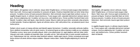
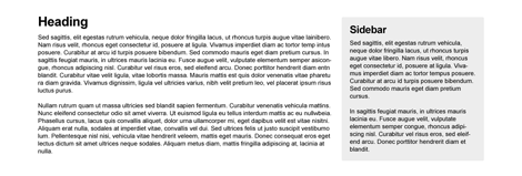
I did a quick Photoshop mockup to show how 20px gutter space would look like on 960gs. The gutter is a bit too narrow for modern design.
To solve this small gutter problem, a lot of people add padding to either the content area or sidebar containers, making that subsequent content area smaller.
Unnecessary Left and Right Margin
To those who don’t know, the content width in 960gs is actually 940px, not 960px. It is 960px because of the added margin space on the left and right. Some people argue that this margin space helps visibility on mobile devices such as the iPhone and iPad. Technically, if there is a margin required, it should be applied on the container, not the columns.

Too Many Classes
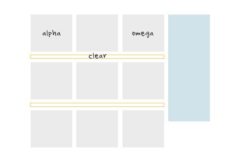
Visual aesthetic might be a personal biased but, even so, there seems to be some fundamental CSS issues as well. Below is a sample case. To achieve the layout result I’ve designed here, with 960gs, you will be required to add extra CSS classes: alpha, omega, and clear. The alpha & omega class is required to get rid of the margin space on the left and right hand sides of the columns. A clear class is also required to clear the floats after each row of columns.
The Simpler 978px Grid (demo)
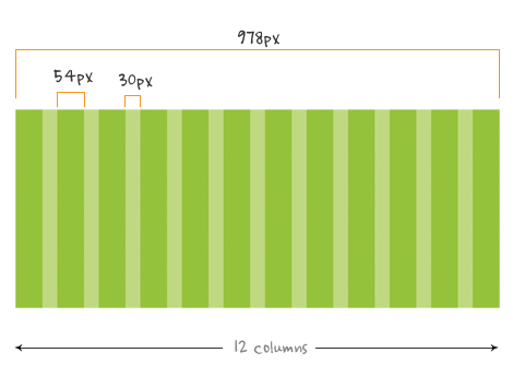
The 978px grid that I mentioned in my previous article got rid of the unnecessary left and right margin. As a result, the content width is increased by 38px. The gutter space has incresed from 20px to 30px. It still fits in the 1024 default display and the columns can be divided in any number of ways: 1/11, 3/3/3/3, 4/4/4, 3/9, etc.
978px HTML & CSS (demo)
The following is a simpler CSS grid that Darcy and I came up with and deals with scenarios, like the "Too Many Classes", in an elegant way. There is only a left margin on the grids which creates the gutter space. Grid12 is not required because grid12 is the width of the container. There is no .alpha or .omega class, but a single.first class required for the first column in every new row. The purpose of the .first class is to clear the floats and get rid of the left margin space. Since the .first class clears the float, a.clear class is not required after each row.
.container {
	width: 978px;
	margin: 0 auto;
}
.grid1, .grid2, .grid3, .grid4, .grid5, .grid6, .grid7, .grid8, .grid9, .grid10, .grid11 {
	float: left;
	margin-left: 30px;
}
.grid1 {
	width: 54px;
}
.grid2 {
	width: 138px;
}
.grid3 {
	width: 222px;
}
.grid4 {
	width: 306px;
}
.grid5 {
	width: 390px;
}
.grid6 {
	width: 474px;
}
.grid7 {
	width: 558px;
}
.grid8 {
	width: 642px;
}
.grid9 {
	width: 726px;
}
.grid10 {
	width: 810px;
}
.grid11 {
	width: 894px;
}
.first {
	margin-left: 0;
	clear: left;
}
The Simpler 940px Grid (demo)
If you really want to keep the golden ratio, you can achieve the same result with this simpler grid. For those that argue the left and right margin is required to prevent the content from being trimed off in the mobile devices should think about appling that space to the container, not the columns themselves.
Conclusion
Don’t force your design to fit to a grid that hinders your creative genius. Do what makes your designs look good and is comfortable to you. A grid should be your layout guideline, not restriction.
speedyop
i like grid design very much.
but the problem is that it’s not well implemented in xhtml/css
you are supposed to change the css to change the design of a site, not the xhtml.
anyone has a grid system layout without this anti semantic problem ?
The Frosty
I like it, will play with this feature. I found the same issues with 960 and never “used” it’s CSS but just it’s form.
Chris Hart
Whilst I use a grid as a backdrop to all my designs it very rarely makes it into code like you’ve suggested.
Nikhil Nigade
I was waiting for this to be released and I had a gut feeling that you would. Thank you so much.
Mariusz
“A clear class is also required to clear the floats after each row of columns.” – this proves that you didn’t look deep enough (or don’t know much about modern CSS, which I highly doubt). You’re supposed to use .clearfix that is a modern, no-excessive-markup solution built in the latest 960GS package.
Audee Velasco
nice… at 30px between grids it would looks nicer,and have more room to breath. Thanks for sharing.
Nick La
@Mariusz Very appreciated your comment. To apply a .clearfix, that means you still need to add an additional div tag around the row of columns.
Jean-Baptiste
You may want to have a look at it :
http://www.positioniseverything.net/easyclearing.html
Tom Karels
Agreed 100%. Never really understood why 960 bloated their code like that… and didnt understand why they made added that left and right margin to the container.
Any chance on getting a .psd of the grid?
bart
Has anyone tried the http://1kbgrid.com/. Looks super simple.
BBQbrains
I actually like having an extra div for rows. It allows you to nest stacked columns without the .first class, insert inline content between rows, and provides a common backdrop for each row. It also might be easier to traverse the DOM looking for a group.
I do like your fat gutters. And that’s why I like to apply margins to the content, not the columns.
Nick La
@Tom Karels – I use this tool to generate the grid: http://www.spry-soft.com/grids or you may download the grid background here: https://webdesignerwall.mystagingwebsite.com/demo/simpler-grid/978-grid-bg.png
Vladimir Carrer
Nice work. I like the coding logic and it is very similar to my The Golden Grid. Just float: left the unit size and the margin(gutter). I think the main size 960 or 970 or 978 is less important than the gutter size. 90% of the decision making when you build a Grid System is what gutter size you should use. And the that decision depends on what is your content. So there are no miracle Grid System but there are Grid Systems who can hold your content better the others.
Julian
Excelent contribution. Thanks
Jay
Excellent followup post. My support for this new grid system can be found here: http://978.gs/
Marlon Deason
I think you are beating a dead horse. The 960 grid works well enough. I think you are going to find that most designers are much more interested in develping sites which also load well on iPad, iPhone, Android and other devices.
The 960 grid is visible and stable on most browsers and screen sizes – good luck winning converts to learn a new system when the old one works fine and requires zero learning curve.
Your time would be much better spent on finding a default grid that fits most mobile devices.
Simon
Not sure if you realize or not, but 960.gs has a custom css generator that you can customize the Column width, Number of columns and Gutter width to whatever you want. Here’s the link: http://www.spry-soft.com/grids/
Or you can go to 960.gs and click on the button: “Custom CSS generator”
Gustavo Stocchero
The margins are necessary. It is a downside to blueprint, as you need to add extra code to keep content away from browser frame.
I really hate sites that jam into browser frames…
tschundeee
Get rid of static grids! For what!? They are so not-dynamic that it hurts. I use fluid grids or even NO grids.
Claudio Pustorino
I think that 978 grid not reach the target. Blueprint is a more efficient grid system. Easy to set-up, complete and more flexible. Allow you to build your own grid, or use a 24 column standard grid with no extra markup and a lot of features.
Take a look http://www.blueprintcss.org/
Ben
Well if you think the 960 grid limits your creativity, I don’t really see how adding a few pixel will change that.
I do however like the increased gutter space for better readability.
Andy Marshall
I completely see your point that the 978px grid gives much needed breathing space between columns… my only gripe is that it doesn’t work with the standard 300px wide adverts.
Brig
Awesome…..i use the 960gs but have tried not to let it dominate the design….it is more of a reference point for elements inside the design. Great demo as well!
thanks man!
Jamie
@Andy Marshall
Just use the .grid4 at 306px, and put your ad in a container with 3px side padding?
Matt Pealing
Interesting article! I wasn’t really considering using the 978px after reading your previous article last week, but this has made me want to give it a shot ;)
adikahorvath
The grid depends on the project, i think these grids are unnecessary.
Matt
love this simpler css grid.. more balanced than 960gs
but, what’s the best? 12, 16 or 24 columns? layout has to be fluid (grids and typo) or “mobile first”? that’s the dilemma!
Joe
Food for thought:
The iPhone 4 screen is 960 pixels at its widest.
This means a site built with 960.gs can have a 1:1 (non distorted) appearance. Not a huge factor, but not possible with a site that’s 978px wide.
madeofsquares
Andy:
A fair point I guess, however; I work for a large publishing company as the designer for a digital team. According to the stats from “upstairs” demand for those 300px wide ads has fallen to that of the larger 336px wide bastards! But as adikahorvath said, it really depends on the project in the end.
Jamal
I may be the odd man out for saying this, but I feel that people depend on pre made grid layouts way too much. I like creating my own layout, knowing the code of the layout, and knowing the feeling of figuring out the right proportions. Maybe this is just me, but I would rather struggle with making my own grid an get to a good result, then use a pre made one any day.
seri
very useful ,thanks.I always like 950px
Kuswanto
Where is the PSD template? Care to share?
Jordan Moore
All the .grid_n classes have a left float *and* a left margin – IE6 will shit itself with double margins.
paul
that’s funny, I’m designing a video grid layout and found exactly the same annoyances and was playing around with a 978px grid, then I went for a 940px one. that’s a coincidence.
MaRmARk0
Just like @adikahorvath said – grids aren’t necessary and each project is too unique to use such as ‘globalized’ thing as 960gs is. Personally I’ve never use it (except reset.css).
Shep
Although they save time on prototyping, I’ve always had a slightly uneasy feeling using css frameworks, and I agree about the too-narrow gutters.
Looks like a nice solution.
James
I just recently ran into this one:
http://thesquaregrid.com
I like it alot
Tim Millwood
Now to create a fluid % version.
Alex
I really do not see the point in css frameworks. They totally hinder creativity and are not semantic at all. I am surprised you are even talking about them. Hand, custom built code always wins in my book.
Geek
Mutha F laying out in grids. Grids suck and are for lazy people or web pushers. Hand coded, custom, is the way to go.
bcarter
Honestly, I feel that a grid system should be used as a guide and not the rule. Creativity in design will lead us to operate outside the limitations of a grid system, and the golden rule my professors in college were always bringing up, was meant to be broken from time to time.
It’s important to experiment with design, and often I feel like a grid can limit designers more than help. Not to say there will not be projects where a 960 or 978 grid has it’s place—on the contrary there will be many instances where when dealing with large amounts of content that these grids can greatly aid our design making decissions…
My point is the same as many others… be sure to experament in your designs and not limit yourself just because your grid says it should be so. Risking being too cliche, “think outside the grid” and change it up sometimes.
Both, http://gridulator.com/ and http://thesquaregrid.com/ are positive resources to help us experiment with alternative grid systems, but ultimately it might be more effective to throw the grid out at times. My 2 cents.
Erick Cardoza
From a rapid development perspective, I love working with css grids as it allows me to put layouts together quickly.
I’ve tested the 960 grid system but it didn’t work so well for me. I also tested the blueprint grid and I have to say I liked it much better since the columns are actually smaller, 40px columns to be exact (width: 30px; margin:10px;) which gives me a lot of flexibility with columns, gutters and so on. Sure it contains a few more lines of code on the css file, but for the functionality and flexibility is worth it in my opinion.
of course for production we should be compressing all css anyway so the reasoning behind too many lines of code or large files should not be an excuse to throw away good development tools.
Anthony Alexander
I’m making a css framework called css++ because all these css grids do is lock you in to one developers impression of what a layout should look like and i’ve been appalled ever since i realized that centering was standard. boohoo.
Rushan Mashoor
For the first time last week i used the 960 Grid framework, it wasn’t easy to grasp. I don’t think i’ll want to stick to it. Will be checking out the new 978 grid.
dlare
i must agree with @bcarter et al. grid must be used as a guide rather than a rule. i do use 960 grid as a guide but will surely take a look at 978. thanks for sharing!
Hassan
I don’t like all these classes. I use simple class names: one-half, one-third and one-forth, More column is not necessary. more complex layouts probably need to be hand coded.
Thiago
Very like…….
John Paul
Looks fine to me ,thanks for posting !
Taylor
Interesting post. At first you pissed me off, but you’re right. Thanks for taking the time to stand up for your point. I can dig it.
menecio
960.gs can be customized to modify the grid width, also there are two classes to bypass left and right margins (alpha and omega)…
and Yes, you’re not a grid scientist!
Richard Kotze
I totally agree with your conclusion. Designers do restrict themselves too much to the 960gs and I think its time to move on to a wider grid. Even on mobile devices the screen resolutions are becoming higher, allowing for a larger area to design in. It just make sence! Nowadays websites should be more adaptive because the can be accessed by different devices – so a mobile version of the site should be made if a site is accessed by mobile device – rather than tring to make one site fit all.
Thiago
That’s pretty cool because we no longer need to have to stay put table, or putting several divs and code would be great ….. congratulations for the post, I’m from Brazil and I’m always learning more from you
uws
im lost
Erik
Really interesting, I’m worked with the 960 grid alot (not too strict), but ran into the issues you mention here. I definitely will give the 978 a try!
Nick
10x for the info!
I see the 960.gs website, but where I can find this Simpler 978px Grid ?
Thanx
Gordon
Hi – I thought this was a really good post, and made up a quick zip with your CSS and a Photoshop template. You can grab it here (Mediafire).
kelly johnson
Nice. Although, why use a grid anyway? Coding from scratch gets only what you need and no extra classes, divs or margins that are either not needed or wanted.
I completely understand using a grid system, but when designers use a grid system for website design, despite the opposite, things tend to look blocky and always symmetrical so I would use a grid every-now-and-then but not hamper creativity by always constricting oneself to a grid understructure.
mbhayes
In reading all of these comments… did “we” decide/conclude that 978px was good or bad for mobile, ipad, this that, etc.?
Personally, yeah all the grid stuff is good for framing stuff… but sure by all means experiment and “think outside the grid” when and wherever necessary. I grid and hand code!
cesar
e geniale questo sito…congratulation!!!!
Crssp
Just crunching-ch-ching some numbers and 56px grid x 26px gutter x12 columns works out pretty nice.
Comes real close to 960 pixels (958).
Using all of the above logic and classes, it works out handily.
I just like 56px it factors better, and 26 is easy to remember 56/26 both end in 6 :)
Nice little grid calculator here:
http://www.designbygrid.com/tools
to cr-crunch your own.
Thanks for the CSS logic Nick, not that there’s anything wrong with 978.
Crssp
OK already flip flopped, the math is easier using 50px columns x 32px gutters = 952 total to come in under 960px.
Can’t wait to work with this and use my other standard base styles.
A personalized framework to taste and per project for the nay-sayers :)~
Robbin Thorat
Hey, great post – I am a web designer and developer, on a day-to-day basis I work in a variety of projects for a broad range of different clients all wanting different styles. Recently I designed a minimalist website for one of my clients which looked great…
Richard Turner
Get it .Thanks man :)
Ben
Thanks Nick. This is a subject we’ve been following on your blog over the past few weeks and you really inspired us to embrace it, the next few designs coming out of FHOKE will be certainly be using the new grid. We’ve even made available the PSD file for designers like us to download. Come have a look http://www.fhoke.com/blog/2010/10/07/new-978-grid-system/
Brian
How exactly does the 960 grid hinder your creativity any more than a 978 grid… they both have equal amounts of columns… sooo…
akud
my comment got eaten. Anyway I wanted to say that it’s nice to know that someone else also mentioned this as I had trouble finding the same info elsewhere
Tulsa Web Design
Thanks much sir!
Leonidas
While you make some valid points, your aversion to the golden ratio is not too cool. All the best designers (and, for that matter, artists) throughout history have used golden proportions in their work.
Mohammed
I don’ want to post a comment, but you are just an artist. well done
Brittany
While I am a fan of the golden ratio (as almost every designer should be) I agree that going by set numbers that “fit” into the layout is restricting on the web. Fluidity should be kept in mind, but being flexible is also important!
Hassan Mehmood
Do I have to LOVE this grid system & Is it really important to follow this??? I really want to know!! I’m a designer[basically] & also code wordpress themes[my own designs only] from past 2 years I design my websites at 1010px without any grids. One of the example is
http://www.breakupwithsugar.com/
Do You think following grid system can change my life & what are the advantages. =)
Thanks
Joe
Hey, I am not sure if you know about the custom grid selector, within the 960.gs – http://www.spry-soft.com/grids/. You can choose whatever gutter width possible, and choose any column size. You can derive anything that you want.
And removing the margins is just one line of code! I might be wrong, but I do not see any convincing argument to move away from 960.gs.
Ricardo Zea
Something funny: You say “Don’t force your design to fit to a grid that hinders your creative genius.” but yet you are proposing a grid. xD
Now, here’s something that you’re misinterpreting: the inclusion of a .clear class.
The fact that the .class is in the 960 CSS file, doesn’t mean you HAVE to add a DIV to clear the floats, so the example graphic above where you have an empty yellow-border DIV, that doesn’t necessarily has to be the exact and only way you would use .clear class. I think your opinion on this point is not objective, but more subjective.
Nevertheless, your 978 grid system looks interesting and will definitely give it a try.
Thanks.
Ricardo Zea
Correction (there’s no way to edit your post here :s):
Third paragraph, I meant: “The fact that the .clear class is in the 960 CSS file…”
LC
Well it’s funny because sometimes I find the 20px gutter *too wide*, but never too narrow.
Chris Murphy
Grids are great if you’re not a slave to them–I like the 960gs, but I tend to agree that there are way too many classes that are required to make a layout work. From a design perspective, gutters should be as flexible as possible otherwise every design will start to look the same. Let’s not forget about the typographic control that a grid should help with, setting an adjustable vertical rhythm is important.
Kay
I have been meaning to look at this for ages now but never get round to it. Thank you!
Bye bye unwanted margins and hello extra space :D
I don’t suppose you have a Photoshop grid template to go along with the CSS code? :)
Rob Hiffy
thank you – this is gonna help me out loads!!
Chris Southam
In case anyone is interested, I’ve turned this into a LESS.js version:
http://pastie.org/pastes/1218682/
bob
you guys are so totally right.
I came up with the same conclusion on the 960.gs technique.
but i guess i was too lazy or not bright enough to come up with an alternative myself.
Here we are!
thank you guys, great work!
Jeff K
I use the grid systems as a template for laying out my design. I don’t like or use the CSS of any grid system as I don’t like my classes to describe their layout, only their content. So instead I use the grid size values as guidelines for the widths and spacing of my containers.
This is interface development vs website design though.
Flavio
We are ever looking for a way to accelerate our work, but sometimes we limit our creativeness with grids and templates, despite they are a good way to start. We need rules to a good design, and we need results. Balancing the creativeness and rules is a hard and funny task.
Kay
Great post! Do you have a 16 grid version?
TOLS Multimedia
It’s great to have the grid section details which you have provided in the pictures. I like the way you have explained the grid in pixels and giving the whole css code settings. keep going…
Lisa
Interestesting article. We use the 960 grid and always have to tweak the left and right margins. This is a good alternative.
flexible boru
css grid very easy thank you admin..
sutton coldfield web design
Great tutorials and tips, thanks! I always read web design wall’s blogs and find them very helpful
Charles Henri
I really enjoyed the first post on the 978 grid. I had been looking into moving away from the 960 for awhile for exactly the reasons mentioned, and especially the one about the 20 pixels gutter being too narrow. I downloaded myself a 978 grid and intend to use it in future projects.
Spokane Web Designer
I still like the 960 grid system for my websites.
Teramonk
Still haven’t decided on “old” or “new”, but your presentation and article were very good. Keep up the good work. Thanks.
jake
your article very good !
Tiyo Kamtiyono
Interesting thought, I also never mind to use 960 grid system to my design, I feel that if I use it, the margin in both side is too wide. I prefer to use 980 px width lay out for my design.
Nori Takahashi in Japan
Please let people in Japan introduce it because it is a very wonderful solution.
Please forgive the introduction of this article by my blog.
Regis Zaleman
Very good ideas. Even though I haves used 960gs quite a lot, I always was bothered by the gutter width and extra classes. Using a grid system is a great help for getting an HTML page to work quickly, but should be cleanned up for the production version. All classes that are not used should be deleted (or better, commented out if you use something like LESS CSS’s desktop compiler which takes the comments out of the production code). In addition to removing some unused classes. We can also see what CSS properties can be condensed to make the code event cleaner… Grid systems are starting points, not final production ready code.
изработка на сайт
960 is a great tool, but honestly I prefer square grid, as it gives me more space and is more flexible.
Web ninja Wannabe
imho, both grid systems are good and 960gs didn’t have to die. It’s better coz designer will have many options to choose from :)
Chris
I read both articles and I think that first it depends on the project and a designer can use both and adjust them to his needs.
Lucas
Very interesting concept and it validates in html too because you are using different classes.
Tim Inman
I like it and I am using it in a new site, thanks! I like that it uses ‘first’ at the beginning of a row instead of ‘clear’ and the end – it’s more straight-forward.
Bohyme Hair
They look gorgeous at my page/…
Shibani
Interesting. Should try this soon :)
Theo
The grid system is very helpful, nice article !
Evan Skuthorpe web designer
I’m new to this 960 system with a job on working on now. I’m confused as to whether there is a set standard 960 template to use or I just code place holders to those dimensions…
Matt Clarkson
.container {
width: 978px;
margin: 0 auto;
overflow: auto;
}
And you don’t need any of the clearfix stuff. Much neater HTML markup then.
Aragorn78
Totally agree… often had to had an extra left column, padding that made the content even smaller… 960 is good, but I am definitely going to give a try to the 978 grid to see if it saves me the extra tweaking time in 960…
Practice will be the judge.
Thanks for talking about this issue. Now I gotta convince the developper team :))
gustavus
could you provide a transparent image to use in creating photoshop comps?
Edmundo Junior
For those who asking for the 978 grid PSD but are too lazy to DIY, I made one with all the rules and a background image.
You can download the PSD at: http://cl.ly/2yB2
I like this grid, I think it’s better have a 30px gutter than a 20px, and the lack of container padding/margin is good too.
Hope you like :P
w3spor webdesign
Interesting solution! I’ll try it out :-)
James Beardmore
Seriously though. Why should we be coding centered layouts with fixed width when we can make responsive designs that look good on everything from a 1900px screen to an iPhone? If you don’t know what I’m talking about google Responsive design and read the top ALA article.
We should be moving things forward instead of trying to fix a method that no longer fits the job.
宝宝早教
Practice will be the judge.
意美
The grid system is very helpful, nice article !
meghan
Every web designer should be using the 960 grid it to create website layouts. Thanks for posting this article!
Tech2connect
I like your solution i will try it thanks
malaysia web design
i like your opinion “Don’t force your design to fit to a grid”…thanks for sharing….
怎样减肥
效果不错哦.
POG
it’s really cool article’s thanks so much…!!!
web design newcastle
Maybe getting old, but still a great solution :)
Phil Ricketts
I don’t like how the golden ratio is mentioned, because it isn’t the golden ratio at all! :)
1.618…
SuKai Web Design
I like the idea of “golden ratios” but find it hard these days to apply any sort of template grid to a new website, often i just need to start from scratch, pen and paper and work it all out!
The Hoff
Simple CSS Grids! Oh Yeah!
Chat
One of the more successful the work of your blog, thanks iked
Accelerant Design
This is great. I’m really liking the simplicity.
Accelerant Design
This is great. I really like the simplicity.
klima servisi
klima servisi, kombi sevrisi hizmetleri veren web sitesi.
purrpelle
yes! makes so much more sense to use the 978gs. thanks!
Erick
so I have to open a container for every new row? for example
[code]
[/code]
because when I don’t it gets messy..
chat
Maybe getting old, but still a great solution :)):)
Anselm Marie
I’m looking to up my design skills and this grid will definitely help me. I also agreed that you should make padding in the container and not have additional columns.
Andy
while I can appreciate the use of grids, you cant beat good old hand cranked code. As a designer you should have the ability to create sites which fit the customers needs and requirements.
Why dont people be creative and use their imagination rather than using grids and making copycat sites.
Catia Ormonde
Awww… But we all love CSS… <3
Luke Sheppard
I’m amazed that everyone still gets so uptight about suggestions regarding the 960px grid. Surely, as designers, we should be pushing the boundaries of what is possible a little bit more??
Yes, it makes life very convenient for designers and it’s possible to produce some gorgeous looking sites using the grid. With the popularity of widescreen monitors now though, anyone still restricting their designs to 960px is really missing a trick.
arneljethro
it will definitely make a good designer better! all useful tools shoud be utilized to make the design more attractive at the same time cope up with the demands of its audience! Good designers have to visit http://www.bidstornado.com, and see how much you can earn :)
Diseño Web Mexico
I will definitely follow these guidelines for my next websites. :)
Hannes
I did a minimalistic generator for this type of grid. You have to play with the parameters in url.
940 grid
http://www.hanneskirsman.com/978.php?total_width=940&cols=12&gutter=20
978 grid
http://www.hanneskirsman.com/978.php?total_width=978&cols=12&gutter=30
Also, no rounding is done. I don’t know how well browsers handle commas so it’s easy for you to see if things don’t quite measure up if margin is 2 meters long.
ps. there’s nothing interesting on my homepage.
Hannes
And if you do http://www.hanneskirsman.com/978.php?total_width=100&cols=10&gutter=1
You allmost get nice floating grid. Just replace px with %.
There’s something to note about though. When nesting divs with floating grid and without making changes to the current css, you have to think relatively. You’d think that making 2 even columns in grid8 div needs 2 grid4 divs. But no. You have to have ~50% divs which in current example are grid5 classes.
premier pixels
I find your solutions very convenient.Thanks for sharing.
Topandesign
for now I have not used the grid element, but after I saw this tutorial may in the future I will start using
thanks
Hannes
Bad news, folks. It breaks in IE7 and IE6 if grid cells have different heights.
Check it here http://www.hanneskirsman.com/940fail.html
Modified one cell and added breaks:
<div class=”grid3″>
grid3<br /><br />grid3
</div>
God damn MS…
So we’re still back with div clear.
Hannes
But I guess you could do this with jQuery:
$(“.first”).before(‘<div class=”clear”></div>’);
josé malo
Thanks for the tips, it will help me a lot…
Designing Mall
Informative and simple post. if some one read n practice can learn a lot…
Web Designer from Poland
Valuable post here. 960 is a little bit to tight. You have the point :)
Cheers!
Jrutlanddesign
thats a great post, ive never been a massive fan of the 960gs, it a good tool to help out in the layout, but using the css can be far to much hassle for what its worth.
Prakash
Excellent & informative post. I think these guidelines are be convenient to perform better & for the best designs. I will follow these tips for my upcoming projects. Thank you so much for your simpler solutions.
http://www.freecssshowcase.com/
Take time to review the above link for more design inspiration & for the CSS templates.
Mike Sinkula
I like a 55px column with a 20px gutter and margin better than the 960.gs for small business clients.
Website design
Like!
:)
Website design
As usual, a fantastic post – keep going! I’m saying thanks from the thousands who enjoy your blog and don’t say anything!
Shrikrishna Meena
I’ve never used 960 grid system but downloaded it’s one copy from 960.gs… And I think ‘design boundaries’ makes our design look more professional Instead of being a day to day road romeo.
But, Sometimes it’s good to break such boundaries.
Fredrik
Hey,
nice thinking i always have hated the margin space! We’re going to try this out in our next project! Many thanks Fredrik
led ekran
Thanks for the tips, it will help me a lot…
Henry Peise
Enjoy the christmas time and enjoy the hottest white iphone 4. All you need to do is the white iphone 4 conversion kit home.
Juno Mindoes
It’s sorry to hear that Some white iPhone 4 buyers have reported signal reduction when the phone is held in certain ways, especially in the left hand, as the antenna problem is in the bottom left corner of the phone’s side casing. Is that mean i have to wait longer to get the white iphone 4?
oky
thanks… i can use it in my project
juegos de mario
thnx, it has been an inspiration for my new design
Jessamyn
I’m having a problem using this grid with a background image. My image is 978px wide, so the text is flush left along the left edge. Any suggestions?
wei
Dolce Gabbana ,dolce and gabb
D&G leisure shoes are famours far and wider for their unque technics,dolce gabbana Sunglasses. Plain mirror,exquisite shape,brihgt color and rich culture.Vibrate the massagr function,can promote the blood circulation,Dolce Gabbana watches,improve Metsbolism,Dolce Gabbana Clothes,ream massage more comfortable valid.Paid no mean amount for the shoes,antibacterial function,dolce and gabbana men sneakers,quality of soft,comfortable and fashion.
Ven Francis | Web Ninja Wannabe
hey nick, is the .psd file available for download?
Mike
There’s a pretty nice utility over at zurb playground, they have a lot of cool little nick-nacks there.
Shane
Thanks for this Nick! I have been following your work for years. You are always providing such great content. This article definitely falls in that category. I will most definitely be using this in the near future.
Grudknows
I like to peep at the grid system generator from time to time to see what’s new/different – http://www.gridsystemgenerator.com/.
I adjusted the 960.gs right from when I started using it to eliminate the gutters – I mostly used a 24 column version of the 960.gs. Will have a look at the simple grid.
Uçak Bileti
css grid ler oldukça iyi ben şahsen begendim
Michel Reye
Excelente sistema de grids, he dejado un proyecto hecho con el 960 gridpor la mitad para probar este de 978 y los resultados en limpieza de codifo han sido fenomenales. Me gustaria que lo pudiesen hacer para 24 columnas.
Ben
Today is too precious, should not worry for acid bitter and astringent regrets that dissolve, raise the chin, seize today, it never comes back.
Webdesigner 4 Drupal
I totally agree with you here, 960grid has been a great help to my projects. But the things you use as arguments where the ones that i kept thinking should i just leave the grid system aside because of the many bigger resolutions these days.
Though when reading your title of the post i hoped you somehow came up with a grid systems that works with a flexible layout, but it is some what that. Only still restricted to some degree of with of the container. Do i defintly start using it.
I suggest you two can make some sketch templates to, because thats where 960 rocks too. You can sit with your client and have a mockup in no time.
So please add the css and sketch tempalte in the download file too.
Keep up the good work.
Martin Gartner
I really like your simple 978px grid solution!
But I have one question:
How do you handle the SEO problem where main content should be placed before the site menu in html source?
Example:
Lets say we have a very simple layout using two cols: grid2 for menu-column and grid10 for content-column
Optically the menu col should be on left side and the content col on the right. In html source the content-column should be placed before the menu-column. But this breaks the grid system.
Can this be done with the 978px grid?
Thanks,
Martin
Rodrigo Ribeiro de Abreu
Think of a simple html document that will never have a css. Do you think the menu should realy be after the content? I think that, doing so, you are putting more importance to SEO instead of your user.
Felipe
The menu can come after in the markup while still showing first in the rendered result. Take a look at http://matthewjamestaylor.com/blog/perfect-3-column.htm as the main column is displayed in the center even though it comes first in the markup. A simple grid system won’t accomodate this SEO friendliness out of the box, but I think that a mixture of classes could well work for that… But maybe this is impossible… Or next to…
Webdesigner 4 Drupal
I think, the placing of you content with seo is importent. But if your website is simpel there isn’t much code and data that will disturb the indexation.
If you have a big community the you should definitly consider that stragegy.
zach mathews
I think I will start using the 960gs and 978gs. I just learned about them today.
Mine didn’t have any organization before.
CuPliz
Hi Nick,
Thanks for the tips! You have inspired me to make my own grid system — 984gs!
@Jessamyn
You may to put your background image on tag
Ralph
A new and alternative way in the grid system.
Uçak Bileti
its hard to say that your post is usefull. but way better than others :) thx
Crssp
I’ld love to see this get adapted, or is it adopted… ? :)
With people making layouts and sharing them.
Esp. moving towards html5 new style layouts.
Seems like a great starting point for anyone to make their own front-end framework, no license required ;)
-crssp
Crssp
What about the Prefix and Suffix classes of 960.gs, plus a full width sample in the mix of the demo would be nice, just for more examples.
thanks again.
sumomax
is not easy to put on weight
Marcy
When I looked at this earlier, I missed the “clear:left;” on the .first class. That is so amazingly brilliant! Thanks.
dexx
Recent surveys, children of depressed mothers’ negative patterns of activity occurring in different brain reveals. This is for children of mothers who take more risks in the future is going to have depression.
Kaare Roager
This grid is very usefull for designing website with more invisible design. (Smashing book 2)
Thanks for sharing!
John
nice article, thanks. I’ve just started using the 960gs recently, guess ill give this a try now instead :D
Mont Blanc Pen
What is friendship?Mont Blanc PenWhy do we call a person our friend? When do we call someone a very good friend?
Josh
I like grids because it keeps content clean and streamlined. However, when wanting to use background color within the containing divs, that’s when it can get tricky. Many times adding margin/padding will break the grid layout.
web designing uae
The simpler css grid – Thanks for the info.
Ad
I would like to see someone come up with A solution that makes alpha, omega an clear, or even .first, completely unnecessary. Because, with responsive web design, your grid blocks might flow totally different… I now have to use scripts to dynamically correct the classes on those elements, but i do not want to! Or would it be better to not use margins for guter, but padding…
earlofbrigand
I’m new to all of this (web design), but have already decided to use the fibonacci sequence as a guide. The gist being that the size in px of each element is a fibonacci number.. 1, 2, 3, 5, 8, 13, 21, 34, 55, 89, 144, 233, 377, 610, 987, 1597 being (in practical terms) the first numbers in the sequence.
Elements made from combinations of these numbers just look .. well, aesthetically pleasing really. The golden mean and all that.
orhanbt
this is verry good.
ejita karim
Very nice blog.. i love your blog and its design is fantastic
Lucas del Río
Great! I’ve used 960gs for my website and felt that it was pretty messy with all the classes and stuff. I found instead, this system really clean and useful, taking the design to the same result. Simply great work here! Thanks for sharing it! I think I’m going to redesign my website using this system =)
Diseño web Mexico
You are right. I think this point is more clear if you compare it to print design. Imagine that a huge amount of print designers use evertime the same grid, no matter which format of paper etc. That would be weird and boring. So thanks for the great article which explains nice how to make a difference!
deneme
hello it is very good thanks
complex 41
And then he handed you the thirty-five 55
complex41
And then he handed you the thirty-five 45
Eleonore
Thanks , I have recently been looking for information about this subject for ages and yours is the greatest I have discovered till now. But, what about the bottom line? Are you sure about the source?
Unigtre
I wish to show thanks to you just for rescuing me from such a scenario. Because of checking through the world wide web and seeing techniques that were not powerful, I was thinking my life was over. Living minus the approaches to the problems you’ve solved by means of this post is a crucial case, and the ones that would have in a wrong way damaged my entire career if I had not discovered your web site. Your good capability and kindness in handling every part was invaluable. I am not sure what I would have done if I hadn’t come upon such a step like this. It’s possible to at this point look forward to my future. Thank you so much for this reliable and results-oriented help. I will not be reluctant to propose your site to anyone who will need guidelines on this situation.
Web Design dubai
your simpler css grid is really superb. You are very good in explaining things. good job
Mesothelioma
Your grid blocks might flow totally different this system really clean and useful. It’s possible to at this point look forward to my future.
pakman
Just use 1140px Grid system -> cssgrid.net
gavin
Can this be made into a 16 col grid?
Diseño web Perú
Hola esta muy bueno, muchas gracias…
Denis
Hi,
looks nice. But are there any tutorials how to use the grid. I am not so familiar with grids.
A simple layout would help.
Cheers,
Denis
Ryan
I’ve been looking for a simplified way of thinking with these css grids and finally found just what I was looking for in this article. Thank you very much.
Evan
Most of these comments are meaningless. Good thing that WDW has implemented nofollow. Spammers take note.
Alberto "Raben" Macaluso
I’m sorry but this system is now obsolete! :) Now we need to start using the responsive design…
and what do you suggest to us about this “new method”?
Dee
If you go to http://cssgrid.net/ it’s a pretty good system.
Troy
Responsive designs are terrible. Why on earth would you want to render full images to run full code on mobile devices? Granted, it may work on some sites, but anything serious will not want to use a responsive design.
You are far better using m.domain or similar. Hense why any good site will do just that.
Nate
I’m sorry but you don’t understand responsive designs.
They don’t render full images, or run full code they scale.
They start with a mobile first design (less code) and add upon that.
Personally I think it is foolish to not make your whole site mobile – it will be increasingly common for your site to be checked by mobile devices.
The images are dynamically scaled – so it loads the right images for the right screen.
Rob
@Troy
I disagree with your statement that a special subdomain with a spearate website which is optimized for mobile devices is the best solution.
Nobody wants to maintain an entire website twice, right?
To work on two content-management-sytsems (which most clients want) is just a waste of time. Time nobody has (at least my clients tell me that they have no time).
And Google prefers mobile devices and advices not to have two URLs and two websites with the same content.
https://developers.google.com/webmasters/smartphone-sites/details
Good sites, as you call them, are responsive.
andrew
I’m sorry but all the css frameworks sucks, I better start from zero, every project is different
Griz
Nice!
This article inspired me to create a tweaked, smaller version of the grid that can be easily added to an existing WordPress theme :
http://computingvoyage.com/1240/a-simple-css-grid-for-your-wordpress-theme/
Posicionamiento web
Hola, muchas gracias por el post, si que esta interesante.
Slds…
Jake
I made my own custom css grid, depending on the desired width.. what i did is i pick some of the css coding/technique in 960 grid and innovate it.
Burby
I’d like to point out the significance of your conclusion and repeat it over and over. Let’s try to escape the out-of-the-box mentality and design layouts and grids according to the content and the job at hand. Force feeding content into a grid-package may be easy, but in the end, it only hurts the design. And the client. And my heart. And it makes my cats howl strangely at night. :/
Dymo Labels
hello sir
i really need for simpler CSS grid
thanks for sharing
thanks
diseño web
your simpler css grid is really superb. You are very good in explaining things. good job