Lately, I’ve been blogging a lot about Responsive Design. I’ve covered the technical side of media queries, basic implementation, full design tutorial, some CSS tricks, and a list of awesome responsive sites. Today, I want to talk about setting breakpoints in responsive design. How should you set the breakpoints? What is the general guideline? I’m going to share my view on setting breakpoints.
Do you have a list of generic breakpoints that are commonly used?
Some like to set the breakpoints base on the devices’ resolution. For examples: 320px for mobile, 768px for tablet, 1024px or higher for desktop. Personally, I’m not a big fan of setting breakpoints base on device resolution because there are too many devices out there. And what if the device resolution changes? To be more bulletproof, breakpoints should be based on the design and content.
So what is the general guideline?
In my responsive design workflow, I generally test the design by resizing the browser window. Watch how the content flows when resizing and add a breakpoint whenever the design breaks. There is no specific rule on how many breakpoints a design should have. The rule of thumb is to make sure the design and content flow nicely on any viewport width. I will use two of my sites as examples: Web Designer Wall and Best Web Gallery.
Web Designer Wall
On Web Designer Wall, I have 5 media queries: 1000px, 760px, 600px, 480px, and 320px. But in term of major layout changes, I only have three: 3-column with fixed side header, 2-column with top header, and a single column layout where the sidebar drops below content.
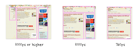
The 2-column layout breakpoint is set at 1000px. The single column is set at 760px. The other breakpoints are necessary to ensure the content flows nicely across all breakpoints.
Best Web Gallery
On Best Web Gallery, I have 3 media queries: 1240px, 800px, and 480px. In term of major layout changes, I have two: 4-column and a single column layout.
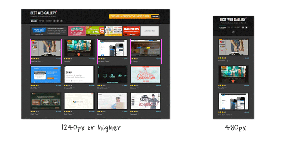
In this case, I don’t think it is necessary to have more layout breakpoints (ie. breaking the 4-column into 3-column or 2-column) because the post container doesn’t break on small viewports.
What is your view on breakpoints?
Do you have a different approach or opinion about setting breakpoints? Please comment in this post.
97 Comments
Comments are closed.
Jaap
This approach to breakpoints is freakin awesome…keep up the good work.
john
I let the site build it self… So i guess my break point could be anything really… I dont do moble sites because as u said there are to many devices out there…
Paul van der Heyde
“To be more bulletproof, breakpoints should be based on the design and content.”
That’s excellent advice!
Leo Lanese
setting break points, for testing proposes, is OK. The number it depends on the project but we can easily use:
0-320, 321-480, 481-768, 769-1024 and 1025-1366
covering: MF, S, M, L and XL
Mathieu AV
setting breakpoints depends on your content, your audience and devices…
You have to deserve the best experience for your user on each device.
For instance, if your website is about photography, images and videos, your audience is photographers, graphic designers (with 26″ wide screen)… you should provide a normal 960px desktop version, a wide screen version, a tablet version, (a TV version ?) and may be forget about mobile phones…
http://www.nealite.fr/blog/wp-content/uploads/2012/06/nealite_responsive_breakpoint.jpg
Brett Jankord
Yeah that makes sense, especially since photographers and graphic designers don’t have mobile phones
Ryan
Not sure I can agree with that – unless the website in question has Analytics to support the idea of not being mobile compatible. To ignore mobile all together seems short-sited otherwise – especially considering the common projection of mobile taking over desktop usage by 2016 or sooner.
Web Design Wolverhampton & Birmingham
Very interesting article, thanks. We usually base it on the content. If it looks pleasing, then that’s where it will go, if not then we’ll put the breakpoint elsewhere.
Kev Adamson
Good stuff Nick :)
Indeed, a manageable approach is to allow the content and layout to dictate – what I would call – “hard” breakpoints. When a design “breaks” when you re-size your view, that’s a good indication that a hard break-point is required (an overall layout shift). When re-sizing and certain areas look a bit odd, then it’s perhaps a good idea to add a “soft” break-point (something which merely tweaks one or more elements on the page to suit). A fluidity should cover all points in-between.
For anyone interested, this is “How I’m skinning my responsive cat”:
http://www.kevadamson.com/talking-of-design/article/how-i-am-skinning-my-responsive-cat :)
Ethan Hackett
I also like your view of breakpoints. Though I instinctively followed that anyway.
I use Foundation (by Zurb) as my responsive framework. They based their framework off of lots of device testing but occasionally I will change the breakpoints to occur sooner if the design needs it to.
Dexter Adams
Definitely have to be conscious about setting breakpoints…I know how frustrating it is to see a great design sullied by horrible display. Great post!
Chris
Thank god. I just built my first fully responsive website and instead of using device specific breakpoints I resized the browser and made a note of when it broke.
To help I wrote a little script which outputs the current viewport width to an absolutely positioned div so I know what the break point should be. I’m sure there’s something better out there but it really helped me decide.
Really really glad I read this. I had it at the back of my mind that they should all match the devices but went against that.
Thanks for the reassurance.
Chris
Jon
Very much agree. As Mathieu said above, it will depend on content, but I’ve always advocated to the people at my company that if we are doing a responsive design, we absolutely do not base it off of devices (or solely devices). Of course, it was the first thing they wanted to do (“Let’s make an iPhone, iPad, and desktop layout… that should do”). I was easily able to convince them that not only are you cutting out who knows how many devices, its also easier to maintain both now and in the long run.
The article that made me want to go with the “design breaks” approach was this article: http://designshack.net/articles/css/responsive-design-why-youre-doing-it-wrong/
So far it works very well and makes much more sense than doing a “device breaks” approach.
MJ Meyer
Great read! I agree 100%. You never know what tomorrow’s device dimensions are going to be. I’d rather do it this way, than design a 100 sites and have to redo all of them in a years time…
I would like to add though, I do believe the way you set breakpoints and the way you “do” responsive design is exactly that. Responsive. I don’t believe that setting generic breakpoints is responsive design, that’s adaptive design.
I’ll leave you with a quote from Jeffrey Zeldman: “Our understanding of ‘responsive design’ should be broadened to cover any approach that delivers elegant visual experiences regardless of the size of the user’s display and the limitations or capabilities of the device.”
P.S. Here’s a really cool Chrome extension that shows you your browser dimensions when resizing it to help determine where your breakpoints are… https://chrome.google.com/webstore/detail/kkelicaakdanhinjdeammmilcgefonfh
Sue
I think this is great. I agree with your method. I don’t have generic breakpoints, but I resize the window width gradually from large to small until I can’t go smaller. If the transition is not smooth I go back and make a breakpoint where the design breaks. I keep doing this process until every size works. Who knows what screen size someone will use. Sometimes people do resize the window to some obscure size so they can work on other things to the side.
Stuart Robson
Hi,
As mentioned via the twitters I kinda think that some ‘generic’ breakpoints aren’t a bad thing. If like me you can ‘see’ what a design might look like (albeit in your head) on a phone or tablet then you might as well start with some breakpoints to work out those designs.
I wrote about this here –
http://alwaystwisted.com/post.php?s=2012-04-28-a-common-set-of-breakpoints-to-start
Skweekah
Good writeup. Really important to think about structure of your site before even starting. I’d say the trend will be — think mobile, then think desktop.
Eric
Start mobile first, expand until it looks like shit. Pretty good rule to follow!
Slavyanskiy Boy
Thank You for Best Web Gallery. Very interesting and inspiring resource.
Nick
Yeah totally agree, that’s the way I approach it. Refresh, resize, adapt. Rinse and repeat.
Wouter J
I use breakpoints the same way.
But I make sure my page has at least 3 media queries: desktop, tablet and mobile. Not the hard sizes, but just something around there and fitts with the lay-out.
Why I do that? That’s because of the Responsive Typography, text should be other sizes on different devices. Some interesting article is: http://informationarchitects.net/blog/responsive-typography-the-basics/
PS: You first 2 intro sentences are just spamming links to other articles, aren’t they? :)
custom icon design
absolutely useful website. but I think the breakpoint is based on content and structure about the website you designed.
Mohammad
I think you hit the nail on the head when you said that you can’t simply use the different device resolutions to set break points.
My belief (and experience) has been that the breakpoints COMPLETELY depend on the layout of the site. There’s no telling what breakpoints are necessary until you know what elements you are dealing with.
That’s my main complaint against responsive grid frameworks such as twitter bootstrap. Sure, its great to have a set of “defaults” for how columns should act. But what if one of your elements spans a few columns but shouldn’t “break” until a certain width (other than the standard resolution points) is reached? Then you’re stuck reassembling the layout and hacking up what was set as a default action in the framework.
End of the day, if you are creating truly custom layouts, you will need to utilize a truly custom set of actions – including media query break points.
The market value of this comment is .02 cents, of course.
Shubham Sharma
Indeed an awesome article to refer. Thank you, Mohammad.
Alessandro
I would say that each design will present its own challenges when resized. This means that breakpoints should vary from project to prject to accomodate the new resized design. I fully agree on the article.
Mitch
Agreed. The goal of responsive design is to look good at any resolution. That means taking advantage of however many pixels the user may have. In my workflow I prefer to let the design elements define their own break points.
robe avocat
usually, i used to set breakpoint to 980px, because it’s seems to be the most common (pc) resolution. (1024 – the scroll bar on the right side). but, you can try to make full liquid design, which is more adaptable but more difficult to succeed. but bmore beautiful too :)
Maneet Puri
Great and really informative! I agree with @Mitch. A ‘Responsive’ web design is all about making a website user-friendly and setting breakthrough points in a responsive website depends on the site design. A responsive website may look good at any given resolution but certain website elements prove to be a vital deciding factor when it comes to setting breakthrough points!
Suzi PPC
Absolutely agree. Design and content first, then when it looks awkward/broken then bring on a breakpoint.
Rex
It’s fun.
Ryan
I think CSS-Tricks has an amazing responsive system. I’ve looked over it a million times for my projects and get stumped on how it’s so freakin smooth during transition (not to mention that kick ass little frog that changes with it!). I’m guessing that it utilizes some crazy combination of set breaks and JavaScript. I think it’s a site to be modeled after on “perfect responsive utilization”.
TheloniusMonk
Yeah it’s nice. That little frog has got some serious swagger! Smashing Mag is also crazy in terms of it’s responsiveness.
Nick, your tutorials rock, and your site design; man I can’t get enough of it. The drawing you’ve got at the top… Just Beautiful!
Best.
patent search
In today’s market responsive website has too much important because everybody want to see their website in all screen like web, mobile, ipad, etc. So we should make it in responsive form. And above points are very much useful for making it more easy. Thanks a lot for sharing this blog.
Carl Brown
Responsive web design and break points are one of those new ideas that is blurring the lines between the science of web development/ user interface design and the art of design.
It has to do more than just look good. We have to remember that it’s about creating an elegant and seamless user experience that works effortlessly on all device resolutions.
there is no formula for that. it takes a fresh take and original thought about what the content you have to display is and why you display it.
I’ve worked with everything form 2 to 5 breakpoints in projects and there is no magic number.
the new MacBook Pro with retina display is going to change the way we think about that again. And probably require some of it’s own new considerations for high pixel density screens.
picjew
Thank you
It was a great help
طراحی وب سایت
Thanks dear
Chris Devlin
I agree with @Alessandro. The break point will vary for each every project according to the design.
Very useful comments regarding responsive design. Thanks all.
Paul
I think many people miss the importance of responsive design. While I agree that one cannot predict the various screen resolutions in which a site is viewed, you can choose the most common sizes based on market usage. I start down at 240 and work up through the largest layout set by the designer. I have yet to find a screen size that my sites have not looked optimal in. A true responsive layout should be constrained to only the layout … use different images for the different sizes of your media query to ensure your site is still fast loading for small devices … and PLEASE be respectful of peoples download usage on mobile, note that most mobile providers are charging users for a fee for data usage … A 10 mb image scaled down for 320 is still a 10mb file … . The sites that I have developed using responsive all take a unique perspective tot he layout by switching imagery up on various size layouts.
Webdesign - NL
Image dimensions are the biggest problem with most websites. Luckily our own CMS is able to dynamically resize / resample / crop and compress images on the fly so they suit the needs of the visitor. When we find out a certain sizes needs more compression the system uses the original image to fix that. Makes our work a lot easier ;-)
Glen
A quick note, just because someone is using a mobile phone doesn’t mean they’re viewing your site on it. They could be tethering and looking at it on their laptop with a larger screen. How in the world are you going to account for users that tether devices?
Moreover, today’s image tools allow us to optimize larger images better than ever (i.e. 450 x 300 @ 16k isn’t all that bad). There are sites that use scripts larger than that.
Developers and designers need to work together to optimize their entire site. Images aren’t the only type of file with size that can swallow your data usage. I would bet scripts consume just as much data, or more than the images do.
I’m not against optimization and I absolutely love responsive design, so don’t get me wrong. Just saying there’s more to it than images alone.
Bakirkoy Arcelik Servisi
Thanks for sharing.
arcelik beyaz esya servisi bakirkoy
Kenzie
Shrink, Share & Get Paid!
Go To http://netfly.com/?r=1 to get paid for your posted links!
Chris
I agree that designs vary from project to project. Breakpoints should be applied as needed. Great post and comments!
YJA
Ho’oh aku nganggo iki cung :D
max-width: 1000px
max-width: 850px
max-width: 700px
max-width: 550px
ex:
http://aku.cahcepu.com
uxzeal
Impressive Article…
Debbs Hosting
Great tips! When I design sites, usually, this is the part that frustrates me the most. Yes, everything looks in place when you put the site together but sometimes, we tend to overlook this aspect that can be very important to the overall image of the site.
Jeremy Stroud
I try my best to do liquid designs no matter what the final look will be just to avoid problems when viewing on new platforms. That said, choosing a breakpoint or two that work for the project is a fantastic idea and really helps avoid the problem of too many media queries that I’ve seen some come up with.
modernlogodesign
I admire the valuable information you offered in your article Keep inspiring your readers thanks.
Mariya
Great info, please keep on posting such informative post.
Agencja reklamy Bielsko
I am able to agree with you. The project is responsive means a good look at any rozdzielczości.Takie points in helping.
Prasad Sambari
Just what I was looking for! Thank you very much for this article.
Thiet ke logo
thank you for sharing this experience
very useful for proving
thanks
Ryan Whitlie
Hey thanks for sharing this. My first experience with media queries was using breakpoints to create an adaptive website. I’ve used other techniques, js, fluid layouts etc but I still almost always come back to lovely break points!
I think it’s because I just like the way you get a sort of snap each time the site layout changes a bit. It’s kind of an ergonomic thing I guess but I prefer it.
sam wightwick
Helpful information, great article
Ajeet Singh Baddan
I really really agree with ur point of view u r right
Matt
http://www.gridpak.com/ Gridpak is a great tool for setting breakpoints.
طراحی سایت
طراحی سایت ، طراحی وب سایت ، برنامه نویسی وب سایت
، سی دی مالتی مدیا
please see my web site design
gillian
That’s a fantastic article. Many thanks
Iwona
I love your site and all the articles you post.
Thank you for being out there, you are great inspiration.
Chicago Website Design
First, great article, extremely informative. It’s interesting that it’s referred to as responsive design…isn’t web design supposed to illicit a response. Wouldn’t it be reasonable to refer to it as “Effective Design”. It still amazes me that the majority of so called “Web Designers” don’t implement responsive design.
Paul Johns
Thanks, this article (and your advice in it) makes sense. About to jump in to making a basic web site with a responsive layout. Wish me luck!
rickymartin
Your post reflects extensive research..
Sandhya
Very helpful information. Many thanks
Alquiler yates Ibiza
The project is responsive means a good look at any rozdzielczości.Takie points in helping.
Web Design Malaysia
awesome heads up!
thanks for the useful info!
David Joe
Leading Website Design and Development company in India offering web application development, logo, flash, web 2.0 design, custom web application and SEO services. For more information logon to: http://www.itsinindia.com we provied 24×7 hours client support.
Alex Jones
Great article. I was basing breakpoints on resolutions. An eye opener and I’ve definitely learnt my new thing today.
Thank you
Rob
I have been toying with breakpoints all week as I found my design for my portfolio not working on smaller resolutions. I am using a background video as well and I didn’t want it to show on smaller resolutions. I set the main one at 1100px, lower than that and no video for you :)
hannahwimble
Tech Tron provides a full suite of world class, professional web design services providing the tools andexpertise to grow your business. At Tech Tron we believe that success starts with strong foundations,
understanding your customers, your goals and a complete focus on your onsite presence including SEO (Search Engine Optimization), Web design, functionality and Graphic Design. Implementing cutting edge technology solutions with clean functional balanced designs will help your customers flow through your website and ensure you stay ahead of the competition.
Whether you are looking for simple website or full automated ecommerce solutions, Tech Tron will help you grow your online business ahead of your competition.
Rob
SPAM POST
Brianna Deleasa
I just recently started to dive into responsive themes. I absolutely love the idea, it’s brilliant. For my blog/portfolio I chose to have 2 (well, 3) breakpoints. Everything above 768px, between 768px and 620px, and everything smaller than 620px.
I hadn’t planned my layout to be responsive, so I did that on the fly. These worked best for my layout and they look well on screens, tablets, and mobile devices whether portrait or landscape.
meddin
I admire the valuable information you offered in your article Keep inspiring your readers thanks.^^
meddin
thanks.^^
seo
Definitely have to be conscious about setting breakpoints…I know how frustrating it is to see a great design sullied by horrible display. Great post!
WordPress Desk
The article is excellent sharing valuable tips..Good job.
Richelle Anderson
I recently attended An Event Apart and had the privilege of hearing Luke Wroblewski he suggests starting with mobile and growing the site out as the design calls for it. The easiest way to explain it is to say set the breakpoint when the design breaks. You still must factor in the sizes of devices but there are so many that it is next to impossible to get them all spot on without a huge headache.
Alquiler yates Ibiza
Understanding your customers, your goals and a complete focus on your onsite presence including SEO (Search Engine Optimization), Web design, functionality and Graphic Design. Implementing cutting edge technology solutions with clean functional balanced designs will help your customers flow through your website and ensure you stay ahead of the competition.
Rob
The post from “Alquiler yates Ibiza” is a SPAM POST
Janelle Dawn
Can i ask?? Is it easy to create a website in html??
Rhea Alonzo
Thanks for the tips and info about breakpoints! Very helpful article!
Richard Perez
Helpful and very informative indeed
Wordpress installations
Totally into responsive designs, its definitely the way of the future for modern web design and a cost effective alternative to developing a complete web app for mobile devices! Cheers :)
Banhawi
Breakpoints are awesome to create different customized experiences to each screen resolution rather than just having an any-resolution adapting design.
Helpful read, Thanks.
Social Fire
I usually use generic breakpoints, is that okay?
design-responsive-website
awesome
Web Design Malaysia
thanks for the great pointers!
Websites Cheap
Incredible post
Brisbane Website Designer
Your guidelines are incredible, thank you.
Serkan
My breakpoints are also usually based on design and content. This way you have more control over your design, because there are indeed too many devices.
Design Drop
Thanks for showing us how to set breakpoints. Worth reading!
How To Make Websites
General guidelines that you gave me is very helpful
alin
very nice tricks.
Rahul
Setting breakpoints are necessary for the website.because if we want to run our website on different device then we have to set the breakpoints but it should be in flexible manner.so choose the breakpoints wisely.
Transcendit
I’ve never encountered the issue yet mainly because I’ve never tried the latest MacBook Pro with Retina display but do high res monitors and mobiles devices have different breakpoints due to their high res definition?
In normal circumstances, I would use things like Twitter Bootstrap where main breakpoints are set for you (for quick jobs) but obviously work on a more tailored approach for more complex responsive sites…
What’s your views on High Res display?
Jim Gallaher
Good advice for starting on a responsive design. My biggest question is how to best deal with large images?
Afzal
Sometimes I have to face problems because of break points but now all points are clear to me .. Thanks to your article.
Cleaning aids
Hello !
This is quite impressive. I liked this concept of breakpoints.
This is post is helpful for all of us.
Thanks.
Cleaning aids