Responsive web design is no doubt a big thing now. If you still not familiar with responsive design, check out the list of responsive sites that I recently posted. To newbies, responsive design might sound a bit complicated, but it is actually simpler than you think. To help you quickly get started with responsive design, I’ve put together a quick tutorial. I promise you can learn about the basic logic of responsive design and media queries in 3 steps (assuming you have the basic CSS knowledge).
Step 1. Meta Tag (view demo)
Most mobile browsers scale HTML pages to a wide viewport width so it fits on the screen. You can use the viewport meta tag to reset this. The viewport tag below tells the browser to use the device width as the viewport width and disable the initial scale. Include this meta tag in the <head>.
<meta name="viewport" content="width=device-width, initial-scale=1.0">
Internet Explorer 8 or older doesn’t support media query. You can use media-queries.js or respond.js to add media query support in IE.
<!--[if lt IE 9]>
	<script src="http://css3-mediaqueries-js.googlecode.com/svn/trunk/css3-mediaqueries.js"></script>
<![endif]-->
Step 2. HTML Structure
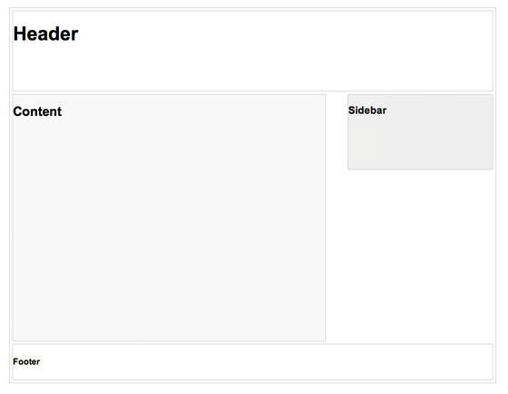
In this example, I have a basic page layout with a header, content container, sidebar, and a footer. The header has a fixed height 180px, content container is 600px wide and sidebar is 300px wide.
Step 3. Media Queries
CSS3 media query is the trick for responsive design. It is like writing if conditions to tell the browser how to render the page for specified viewport width.
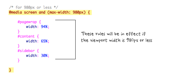
The following set of rules will be in effect if the viewport width is 980px or less. Basically, I set all the container width from pixel value to percentage value so the containers will become fluid.
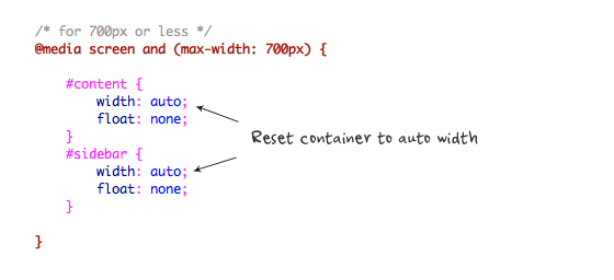
Then for viewport 700px or less, specify the #content and #sidebar to auto width and remove the float so they will display as full width.
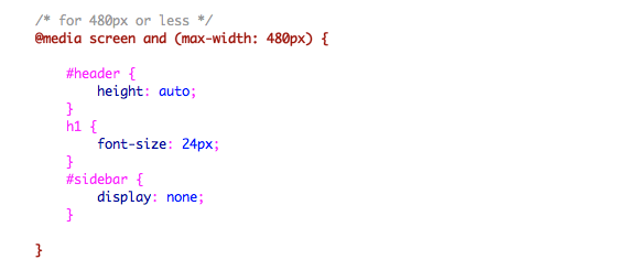
For 480px or less (mobile screen), reset the #header height to auto, change the h1 font size to 24px and hide the #sidebar.
You can write as many media query as you like. I’ve only shown 3 media queries in my demo. The purpose of the media queries is to apply different CSS rules to achieve different layouts for specified viewport width. The media queries can be in the same stylesheet or in a separate file.
Conclusion
This tutorial is intended to show you the basics of responsive design. If you want more in-depth tutorial, check out my previous tutorial: Responsive Design With Media Queries.
209 Comments
Comments are closed.
Marlou
Finally, a simple tutorial with an understandable example. Thanks!
Web design Wolverhampton
Thanks for the tutorial and demo. Web designers ignore mobile devices at their peril!
Amit
Awesome tutorial! I love reading more about responsive design and hopefully people use it for a purpose because with great responsiveness, comes great responsibility. LOL
Dessign
Awesome tutorial, nice and simple right to the point, Its basic enough for everyone to understand and give great points,
Marios
Razlan Hanafiah
Thanks for the simple and clear example! :)
Damian Andrews
Thanks so much for a great introduction to this subject. It’s definitely whet my appetite for more! Top job.
michel
Simple and short… really cool tutorial to explain others this magic feature! thanks
artfanvikram
Though small article, it helped me lot to get started with great feature of css, thankyou for your effort to share.
gerçek vajina
Başar öğretici! Büyük bir tepki ile, büyük sorumluluk getirir, çünkü ben daha duyarlı tasarım ve umarım insanlar bir amaç için kullanmak hakkında okuma seviyorum. LOL
Renzo
I will use these tips in my next client site.
Patrick
I did search around and asking my friends, but none of them explain well. Thanks for sharing, simple explanation + good demo = great article.
Jacksonville Website Design
good tutorial, thanks for sharing.
Kc Rajput
Simply best to understand responsive design. thanks
BMPlus
Great article with demo! :) Thank you for sharing this.
hallodom
Really like this tutorial. Assuming the sidebar has navigation in it would that be better coming above the content?
Kai
Nice tutorial. Thank you
Adeniyi Moses Adetola
Very interesting explained in easy terms. My site just got refreshed to be more responsive.
Agreeboy
I Agree!
Craig
Sounds too easy. I am about to start to do my first site with media queries. Thanks for the tute.
Web Design Malaysia
Thanks for this! Embarking on project soon that requires responsive designs. Should be compatible with handhelds, phones etc.
Tim
Thanks for a great, easy to follow tutorial! Can’t wait to give it a shot!
Hompimpa
Hmm .. I’ve read all the inspiring responsive web design tutorial posts in your blog and I think this is just a summary of them all T_T
Wouter J
I totally agree with that.
The last time I see 2 types of posts:
– Freebies
– Responsive Webdesign
Can you write posts about other topics the next time? I’ve heard enough about this posts on webdesignerwall…
ways to say i love you
i’m not a programmer i just knew wordpress but this helps me a lot. kudus to a great tutorial
Marc Haunschild
Two things I’d like to add: NEVER EVER hide parts of the site without a hint for the user, how to get them back and always provide an EASY way to switch to the desktop version, so users find the things, where they are used to find them (e. g. search or hidden areas).
Never forget: Most modern mobile devices have really good zooming features, which make webpages with a complex layout easy to use and to read!
I know, my own blog uses responsive design, which I use out of the box, so m own site is not a good example, because my own site is always the last to be updated, but nevertheless it should not be this way. Responsive design CAN make the user experience much worse for quite a lot of people!
So you should know your readers and whether they want it or not…
And support the minority as well!
Alex
@marchaunschild
dude… chill. The UX can only be ruined by the designer, not responsive web design.
Good tut.
Adam Baird
You can’t really make blanket statements about responsive design and consistent user experience.
Its important to know YOUR users and how they are using your website on different devices. You need to adjust their experience accordingly.
buy arena carry
nice coding sharing help me a lot
TheDave
Why would you care about having <= IE8 support media queries?
And enable it with javascript?
That seems like a complete waste of time / effort / resources.
If a user is using an browser <= IE8, 98%+ chance they are on a desktop computer system, with a resolution that will handle your max design width (~980px).
Why not just make that the default width for items then, and then add in the media queries to shrink the size as needed?
What am I missing here?
Where are the stats supporting the need for <=IE8 browsers running at lower resolutions that would even benefit from media queries?
Stuart Robson
Don’t we also need img { max-width: 100% }?
Junior
I don’t like your page header… I fixed one is better… at the rest, very clever content! Cheers
TutorialFeed
First I would say it is ultimate post. This is very useful for beginners who never know how to structure html. You have explained it in very simple steps I am really delighted. Your effort highly appreciated. Thanks a ton!!!
Johnny
Heh, very to the point. Great post. :)
Alex
Thanks for your great tutorials on responsive web design. I am very interested in this topic, however I am at a bit of a heads with it:
So far, I actually DISLIKE it when I’m browsing the web on my iPhone and a site that I’m used to on my desktop actually appears different on the iPhone. I mean, the safari web browser enables me to look at any site with pinch-zoom functionality, double-tap to focus on a text column, double-tap out – and I actually prefer doing this to seeing a site all simplified for the 320px width.
Take ents24-com as an example. On the main web site there is a prominent search box where you search for events by category on a day in a town. On the mobile version, it is totally different and less intuitive, you have to set your location etc and the layout is different so I find myself going back to the main site or not using it at all.
I’ve not seen many articles on this… Really, why would an iPhone user want sites dumbed-down for mobile, when the browser handles it fine ( as long as it is tweeked to display correctly )…
Sam
I’m just attempting to read this article on my phone, I think one of these tips is actually making it more difficult: Every time I try to zoom in to see an image, the viewport resizes back to how it was..
Mike Evan
hate that IE usually needs some special treatment, no matter how simple is design, there will still be compatibility problems and each new version comes out the more problems it brings.
But thanks for simple tips!
MisterArcher
Fascinating writeup. not sure why haters gotta hate. but lots of great nuggets of wisdom here. Thanks for sharing.
teguh
Thanks for this perfect basic tutorial
Tony
Really useful tutorial, thanks!
Jon
Useful, well summarized, thank you.
Sid Vel
Been testing various responsive grids. Loving it!
wiz
simple explain, but meaningful,
thanks for share
seven
Nice posting. Thanks for featuring and explaining this :)
Jim
Good explanation mate, keep using those images with written notes on them, they are great!
Chris
Great explanation, this is great.
Salini rokya
Training for Web Design, HTML5, CSS3, jQuery,SEO and Blogging
99% Practical Training in.. Chandigarh
more:
webtechlearning.com
Jose
Awesome explanation. This is what makes bloggers like you so crucial to our web development endeavors. Thanks!
Keith Davis
Responsive design is all the rage now.
I use a Genesis child theme and the guys over at Studiopress are really getting into it.
Nice to have a crystal clear explanation.
jimmy bell
nowadays! wp is powerful blogging platform, is it also need these type of optimization?
Chandrru
really its ourstanding tips, really helpfull with this article, expecting more from this topic..
Pozycjonowanie stron bielsko
Great explanation, i must try this in my project.
Article really helpfull and usefull, well done!
snaphy
thank you.. this tuts really helpful..
Debbs Hosting
I’ve been browsing the web for design basics. i must say, i’ve got some really great sites this included! Thanks for the tips man, you don’t know how much greens your saving me. Hope for more in the future.
Wade
Awesome thank you for posting
Andrea Ballerino
Thank you….very useful tutorial.
Spanish Villa
There must be a better solution rather than having to re-write all CSS on every website?
Don’t mobile and pad browsers have auto-scaling anyway?
Ben Sheedy
That’s the beauty of media-queries. You can have base CSS that handles the elements to be consistent across all the platforms. (fonts, colours etc)
And, then target the elements that have to change to better suit that size (such as alter the layout, maybe increase overall font-size).
Saves building a separate mobile version of the site.
Swami Prakashanand Saraswati
Yeah..! This actually helps us in creating responsive designs. Thanks for your concern.
Andre Morris
This article is right on time for a client that is having problems with multiple devices and their existing website. Time for an upgrade!
Julia Agnes
Hello! Responsive web design is a trend of 2011. Will it be a trend of 2012?
Mohsin Nazir
layout in design is necessary
PrinterPrinting
Great article! Thanks for the advice, greatly appreciated!
web designers directory
Really interesting article, thanks for posting
Chandu
Yup good explanation, thanks
kataskeyh istoselidwn
hehe, i do not usually follow template designs, feels like they are a limit on my mind:)
edgar
Thanks, the viewport metatag helped me…
website design
hey, helpful blog .. good work
WPTidBits
Thanks a lot. Your tutorial made me redesigned my site to a responsive layout. Very useful and easy steps to follow for beginners. Do write more tutorials like this. Thanks!
Website Design Malaysia
Thanks for the really great tutorial! Great guide.
Web Design Warwick
Great introduction to the subject – looks like more and more sites will be designed this way so its good to get an understanding.
web design new York
hi this is very good article for new web designers that will help more for newbies… we also web design company,, good blog keep on posting..
Web Designer Salerno
Thanks for this interesting tutorial.
Dustin
This saved my life! :) B)
référencement grenoble
thx, this article is helpful. for mobile devices, you can also try jquery mobile, it’s great and you don’t have to choose a specific format. have a look on the website !
hyvaa
Great Tut. Thx :)
Glenn
Good info regarding the responsive design. There isn’t to much info available on the web regarding responsive design so I am glad to stumble upon this!
Vincent.Zhao
Thanks for your nice tutorials!
Could you please tell me what tools do you use to write blog articles?
Windows Live Writer?
Thanks in advanced.
raybak
nice little tutorial for web beginners.. thanks for this..
Joe
Nice to read your tutorial on responsive design and media queries, give me a big picture on how implement it in my redesign website. Thanks…
Damian
Putting it into action
Innovative Web Provider
This is very helpful for since I am still a newbie on web design. I’m gonna try this and practice. Thank you so much!
Web designing in chennai
recommended to my friends :)
Myles Kedrowski
Great post. Over the past few weeks we’ve really been perfecting our responsive design and development skills. Came across this article while searching Google for tips and tricks. Thanks for sharing!
ccccccccc
pepe
shreejaya
This 3 rules useful to end user
Thanks for sharing with us
sdfs
fsdsdfsdfsd
Taufik Nurrohman
abcde…
David
This is exactly what I was looking for, and very concisely written. Thanks!
Jay Jalaram Extrusions
I have to still implement this on my website, but I am under research on whether to make the css unnecessary lengthy by including the css styles of all type of devices (all major 3-4 types) or make 1 general css and add addition for responsive styles and call based on devices. As these are two tricks used in recent trend.
Any suggestion?
If reply back.
Glen Wheeler
How did you come up with these values? and Why max width 980 if the page wrapper is only 960?
@media screen and (max-width: 980px) {
#pagewrap {
width: 94%;
}
#content {
width: 65%;
}
#sidebar {
width: 30%;
}
}
thanks,
Glen
Taufik Nurrohman
That’s usually used to ensure that the side room is not too narrow.
GraphicDesigner
#pagewrap {
width: 94%;
}
#content {
width: 65%;
}
#sidebar {
width: 30%;
}
}
Exactly what I did today LOL
Bob
M.H.Awan
Awesome one.Blogger Tricks.
Attitude Design | Graphic Design Portfolio
Many thanks for this tutorial!
vettivong
Awesome clarification. this can be what makes bloggers such as you thus crucial to our internet development endeavors. Thanks!
Ben Clarke
I have only recently been getting in to responsive web design and im looking at using it on my new portfolio site im currently in the process of building (Work+Girlfriend seem to get in the way of this though :D)
Sara Stollings
Responsive web design is very important to my company and I, especially in this day and age. People are accessing websites on their phones more and more and instead of practically creating a whole new site, responsive design allows you to go from big monitors down to iPads and smart phones.
Check out my companies website for another example of responsive web design! http://www.cemahcreative.com – Web Development, Design & Consultation.
Elke Hinze
I first heard about Responsive Web Design when I saw Ethan Marcotte speak at the Future of Web Design 2010 conference in NYC.
It immediately made perfect sense to me and I have started to implement it in nearly all my projects.
Why build multiple designs to suit different resolutions and devices when you can do it one time?
Thanks for the article.
kamran
thanx, this is exact which i want about design
Kristina
Thanks for this article and sharing your knowledge! Helps with understanding Responsive Design and getting it to work properly!
Ken
Nice introduction. It’s a great thing to learn responsive design. There’s foresight and can really help a business cater well to the market who aren’t anymore restricted by a stationary desktop.
SEOrisk
Thanks for the easy-to-read tutorial. I was able to get it installed right away on my site.
My question for you is: how important is it to support browsers less than IE9? Aren’t we primarily talking about mobile browsing when we use responsive design? Are there many (any) smart phones running IE7, for example?
Thanks again!
Oliver
Thank you for this great tutorial.
24SevnLibrarian
I work in a public school and am responsible for the school website. Right now I am using a template, buT i am experimenting with other designs on my own in the hopes of replacing it with something more user-friendly and fitting for our school. In the meantime, everything is switching to HTML5 and CSS3, but my district isn’t there yet. How do I adapt to responsive design using ASP and older CSS?
maxOman
You could try javascript’s innerHeight/innerWidth properties to get the window size.
maxOman
Thanks for the post…
We used to do stuff like that with Javascript long before CSS3
Tường Thọ
Nice post, thank you very much because that post, I will learn it when design my site^^
assasas
qwerty
David
Hi!
I have a question… If my page is visited by some resolution, could be 1280×1024, the browser loads the content made for the other screen resoutions (1024×720 – 144×900 -1366×768 etc ?? the thing is that my website loads different size images depending of the screen resolution, and would be bad thing if loads everything… thank you
Waco Webdesign
Thx that after some Google I found this. Just what I was looking for. Thx a lot
Roseville Web Design
The functions you showed up in your blog clarifies better designing, with all this we all need the designing more keen.
Cambridge Designs
great stuff guys …. Just tweeted about this, Thank you
FX Web Design Perth
Great information, thank you!
Web Design Melbourne
Thanx a lot!
After a long time I got some good stuff to read, especially that ‘Media Queries’ part that clearly shows the flow of the design.
Tony
Thx a lot!
TJ
This is a great introduction tutorial.
Responsive Design is definitely becoming the standard in web design. More and more people want their websites to be easily viewable on a variety of devices including computers, tablets and mobile devices. Traditional websites with fixed widths are limited in their capabilities, but responsive websites can resize and adjust based on the size of the users screen. Responsive web design isn’t necessarily new thinking, but it’s definitely becoming more popular in modern web design.
If you’re interested in checking out responsive website examples, head on over to http://www.gottaloveresponsivedesign.com. It has a lot of great examples of websites using responsive design.
Myron
Your responsive theme works really well. How did you hide just the ads in the sidebar? Is it by using two sidebars one below the other and hiding the one with the ads on it?
Ron Richardson
Thanks for the simple tut! I’m curious how you would handle navigation/menu wrapping?
Steffen Daleng
Very good tut. Thanks alot.
Romi
Very nice tutorial. It helped me to make a base to do responsive design.
Thanks !!
Life Insurance for Diabetics
This is great thanks!! :)
online sticker printing
This is a great introduction tutorial. Thx that after some Google I found this.
Mario
Can you do a tutorial on how to hide the header and footer from a page in a responsive theme? I want to keep it fluid still I know how to create a standard page where I can do that but not with responsive themes.
Jeff Kee
Using responsive scale designs on my new business site – I’m using the Skeleton CSS grid as a base, which saved me a lot of time! And the framework code is clean & easy to understand, and so far it looks great on iPads & iPhones, as well as Blackberries.
Tobias Wagner
Sweet post! Short and clear to understand the basic concept of responsive design. Thank you.
wall321
Using responsive scale designs on my new business site – I’m using the Skeleton CSS grid as a base, which saved me a lot of time! And the framework code is clean & easy to understand, and so far it looks great on iPads & iPhones, as well as Blackberries. Desktop Wallpaper, HD Wallpaper, Wallpaper Background
Desktop Wallpaper
Texas Web Developers
I am a starter and this is surely going to be of great use to me. Thank you for the worthy sharing and waiting for such other articles!
wall321
Thanks for the simple tut! I’m curious how you would handle navigation/menu wrapping Desktop Wallpaper, HD Wallpaper, Wallpaper Background
Desktop Wallpaper
yani
This is a fantastic tutorial, thank you. One question, is it possible to have the pagewrap off center? I’m trying to use this but with the pagewrap div more to the left of the page.
Thanks again
only a comment
this instructions are confusing, 94% of 980 what is that? couldn’t you use standard screen sites, also couldn’t the same elements be used with percentages
Only A Response
94% of any max-width, is the total content width of a full-width page with 3 columns, where each column has 1% padding (i assume this could also, instead, be margin). It doesn’t really matter what the actual px number is… it’s about fluid space. It’s about retaining as similar-as-possible a look, regardless of screen resolution.
Also, 980 x .94= 921.2=total width of all “content” in a width, while preserving a minimum spacing of 1% on each side of each of 3 adjacent content sections.
1%| A |1% 1%| B |1% 1%| C |1%
1%| A |2%| B |2%| C |1%
A+B+C=94%
You could also say that “94%” is a single column (or div with nested columns inside), with 3% padding on each side.
3%|__94%__|3%
ALTHOUGH:
I see that in the aforementioned example, the total of the widths of the #content and #sidebar exceeds the width of #pagewrap by 1%, which tricked me at first, but…
Inside #pagewrap, you have 5% of #pagewrap’s width, worth of paddable/marginable space, and outside it you have 6% of the width of the screen.
According to my calculations, assuming no other elements occupying horizontal space, that leaves you with almost 11% of your total screen width, usable as padding or “whitespace.”
Seems like a good number, to me.
Anyway… i thought the whole point of “responsive” design was to create fluidity and display adaptability, as simply as possible, while retaining all functionality.
The point of “responsive” is lost when you start “coding” for specific conditions. It’s supposed to be responsive and adapt to any screen size, and never look like crap between “standard” or “predictable” resolutions.
Fluidity, simplicity, accessibility and function are key, here.
Escort Website Design
Very well described. I wasn’t familiar with CSS3 media query – now I am. I’m only now getting into web design at a level that I guess one would describe as “beyond basic.” Recently I’ve worked on an escort design site for escort web design.
Stein
thanks for the tutorial dude!
Jinho
Hi, your tutorial is so simple and easy to understand. I translated part of your tutorial in Korean and posted on my blog. I haven’t published it in public. Let me know if I can use your tutorial on my blog.
I left your page link for credit. :)
Thanks,
backpain
Nice blog! Thanks for sharing valueable information.
Nicolas
Very nice. Thanks. < IE 9 rule and viewport tags are very valuable.
I think that media queries are simple by themselves, but the most difficult is being able to think a design that can easily fit to lower resolutions ( or higher ). The main problem is here and the mindset is quite much to be changed or adapted to this new particular problematic.
Thanks for sharing that.
Fatih
Useful information.i will translate Turkish and post my blog with source link.best arcelik servisi.
DiegoQ
Very usefull, but the point is: if the user has a little screen phone we load a whole assets, the big images for example; it´ll takes an strong part of the battery´s energy; no matter if the Css hiddes the big images…
So, I just was thinking…
v
is media query work with only html5?
Gustavs Jurisons
Simple yet very informative tutorial for those who are new to responsive web design . Thanks for sharing and keep ’em coming! :)
Robert
Thank you! The auto formatting from the phone was giving me issues. The meta data did the trick!
css gallery submit
Amazing article, but my site is adaptive, its not a great view in less resolutions, i spoke with designer now working on responsive
Web Design Hampshire
Thanks, looking into doing a responsive website for my new site, and wasn’t 100%., ive been using viewport for ages didnt realise it was that easy to set styles based on width!
magazin
This does look like a great theme.
Abhishek
Hi ! friends sunglasses are really an mandatory objects these days. It not only enhance your look but sometime your overall personality. So do not wait come to gkboptical.com and buy online your spectacle .
Arjun Rk
This is informative, thank you
Christine
Great tutorial! Thank for this!
Praveen
Nice Tutorial!
However, isn’t responsive design a bit more than this – In step 2 your HTML structure has fixed width elements so how is it responsive? Say the users viewport is subject to resize then wouldn’t your layout be non-responsive?
Being responsive tends to define element properties like width, height, gutter and padding to be in percentages of the available view-port isn’t it? Also this includes for the type elements too
Praveen
by resize I meant on larger screens where res is greater than 1024×768.
The layout will stay fixed at 900px wide which is not an optimal size to start with. However, setting the container’s width as a percentage could solve this – like so .container { width = 93.75%; /*900/960 = 0.9375*/}
Vic Dinovici
there is no need to use media-queries.js or respond.js. There is no mobile using IE8 or older.
Daniel
It has use if you’re developing mobile first and have defined media queries for larger resolutions.
Shay Grantham
Please clarify: Do you mean you set @media screen and (max-width: 980px) { … } but the default css is less than 480px?
rooeto
was made. :) Thanks.
Arjun Rk
This is awesome thanks
Kristen
Just what I was looking for! Thank you! This makes responsive design a lot easier to understand.
Looking forward to trying this out
Ray
Great article! Excited to get started
TrufflesForACause
This is a greet article. I am really appreciated. You have informed useful plan to visitor. Thanks for sharing with us.
Social Network
Like this post!
Michael Persson
This is not really new. I made mobile websites for clients also back in 2005. By then nobody had mobile phones with internet connections. Now is the time for mobile device design or as you say “Responsive Design” in order to deliver the content you want at any device based upon the screen size… Maybe not a correct way to select what each user wish to experience but its maybe a good start… and we have to rethink the way we publish information to different people….
Thanks
Thiết kế lô gô
Great post… isn’t that funny though that this very website is not responsive? Viewed on a 1024×768 screen, you gotta scroll horizontally :-/
cheerfulface
Not true. This website is responsive. Which browser were you using? :p
Colin
Probably IE8 or worse. Why people continue to use IE at all is beyond me.
Slimhuren
Great information, thank you!
Rich
…thanks for this! I’m learning this new technique of site building and this is great as a novice designer! I know that peoples posts can’t always be interpreted in the correct context of the writer but some people with more knowledge on this subject seem to be quite rude? Everyone’s entitled to their opinion but maybe just thankful that someone has taken the time to post a tutorial to help those less fortunate than those with more knowledge or education on the matter! Cheers!
Graham Miller
I think http://www.responsivegridsystem.com is worth a look if you’re new to Responsive Design.
Vishal Bansal
Hi
i have a website which is compatible with ifone but not with other smarts fone like samsung galaxy y (Android Base).
Any one help me with this issue.
Thnx Alot
Gil
Awesome tutorial. Really covers the basic of creating a responsive website. Thanks alot!
yebos
Thanks alot!
adeel
Can i convert my html css website into responsive design by using above codes please let me know ASAP?
Prasad Sambari
This is a greet article!. Thanks alot for sharings this article.
igneta
interesting. Thanks
Bhausaheb Zaware
This is nice artical… thanks!
idui
You know what. This article is straight forward than what smashing mag and others offer. This is what i wanted. Thanks a lot. Others talk about history of mobile and all other crap which develoeps and designers arent just intereted in . Thanks heaps for the great tut on responsive web design
Nichive
If I may say, responsive web design aren’t totally dedicated for mobile browser (especially those older type of phones). But it does handle different screen width in a neat way. Say no more to those scroll bars, for sure :)
Web Design
I ‘ve just finished my first responsive site. Thank you for the information, especially for the viewport meta tag.
Automotive Management Service
My site how can i help me in indexing again in bing..
Abdus Samad
Awesome tutorial, helps me a lot to understand the technique. Hats off to you.
John DePasquale
Very well written article. You are right… this is easier than I though now that you explained the basics.
Agustín
Can you share the css file of the demo pleaseee? thank you!
Big Mac
Wow (noob), you don’t know what you’re asking.
prash
LOL….
What an innocent question…
LOLssssss
BaLanZe
Noob if you ask for the css file of this demo it is very ease you just have to open the demo in your browser and click on “see source code” that is implemented on any browser and you will be able to see all the code. The css in this case is on the same html file between the tags. Hope I helped. By the way, very good article for people like me who is learning.
seo
This is nice artical… thanks!
Prapti
Very Nice article
and very useful
Thanks!
Alquiler yates Ibiza
Very well written article. You are right… this is easier than I though now that you.
TinLe
Thanks, so helpful. I saved a lots time to setup my app
Sara
Thank you so much for the info. and for the example code. Great, informative post!
jobin
Thanks, so helpful. I saved a lots time .Very well written article. You are right… this is easier when u described in small steps….
Casey
I love this tutorial! It has been incredibly helpful in designing my website. I am fairly new to web design and am having some difficulties using this design template and having it work in IE and Firefox. Safari works great…
Any help would be appreciated!
Casey
Ok, I think I may have found a problem and would appreciate help with a fix:
I included the script for media-queries.js, but I have my css as a linked stylesheet. Apparently that doesn’t work? Do I need to do all of my css styling inside the html file? Is there a solution to access the media queries on my linked css file for i.e. and firefox??
Javier
Thank you very much!!!! I was going crazy trying to figure out how to have my site to look great no matter where it was display!!!
Club Silver
An excellent and concise explanation of the use of media queries in responsive design!
Cyprus Web Design
Thanks for the source, scratching my head all day trying to remember the tag. :)
Arun
Simple and good..
anmol
Nice and easy, but please give me more simple css rules.
anmol
Sir, you show HTML Structure and css but i think you forgot css trick for header portion actually i can’t understand which area support #pagewrape its header or whole body part i mean like container.
anmol
I make header part for my experiment and in this part i used left side logo and right side menu but i can’t create i used this css:
.maindiv{width:980px; margin:0 auto;}
@media screen and(max-width:980px){
#pagewrape{width:100%; overflow:hidden;}
.logodiv{float:left; width:40%; text-align:left; padding:10px 0 0 0;}
.menudiv {float:right; width:60%; text-align:right;}
}
and my html :
Logodiv
dd : aa
Please tell me where i am wrong way?
Thank you
Anup
Perfect post for starter. Can you please suggest some framework which are supporting responsive design?
Harsh
Really very nice and easy tutorial for basic understanding, my search ends here for understanding the basic for responsive website.. Thanks for sharing.. Thanks a lot.
Admin
thanks for this tutorial it means a lot for me
Manaqib
hanks for this tutorial. really helpful
Marvin
Thank man. Really helpful.
Brian
Hi,
Great tutorial. It’s great to see what could be a very daunting boiled down into such a simple tutorial.
I have one problem though. I tested this tutorial out on a simple “under-construction” page I needed to update. It worked perfectly, and when I narrowed the width of the browser window on my laptop it reformatted as it should have.
However, when I tried to view the page on my iPhone (iPhone 4 running iOS 6.1.3), the error message, “Safari cannot download this file”. Do you know of any common problems that may cause this?
Again, I love the tutorial. I’ve bookmarked this page for future reference.
Thanks,
Brian.
Afzal
You have describe responsive designs in such a nice way or in a kind of series..
Snow & Ice Clearance
Hello !
I am impressed with this technique of using meta tag. This is nice way for getting responsive design in just 3 steps.
Thanks.
Snow & Ice Clearance
Harry Pulau Tidung
Very useful tutorial
Thaks alot
Sangita Chakraborty
You have describe responsive designs in very simple way,this is really helpful..
Cynthia Lewis
Nice tip for making responsive design.
Sasa Gojic
Thanks, this is really useful.