
Typically, to create a column layout, you would need to add the first or last classes to reset the margin space and clear the float. Today I’m going to share a very simple CSS trick to create a responsive column layout using nth-of-type pseudo class. I use this trick to code the WordPress themes at Themify. It doesn’t require any first or last class and the number of columns can be adjusted base on the viewport. In other words, it can be toggled from 4-column to 3-column or 2-column, etc.
View Demo Responsive Column/Grid
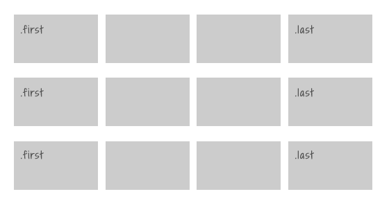
The Inconvenience of Using The First & Last Classes
Normally we would add a .first or .last class to clear the margin space and float in the grid. Adding the first and last class is very tedious, not to mention that it gets more complicate if you need to make it responsive.
Using nth-of-type
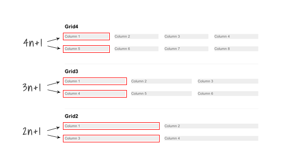
The :nth-of-type(An+B) expression makes it very easy to clear the float and margin without having to add .first or .last class. For example:
.grid4 .col:nth-of-type(4n+1)= target every 4th .col element, starting from the first.grid3 .col:nth-of-type(3n+1)= target every 3rd .col element, starting from the first.grid2 .col:nth-of-type(2n+1)= select every 2th .col element, starting from the first
.grid4 .col:nth-of-type(4n+1),
.grid3 .col:nth-of-type(3n+1),
.grid2 .col:nth-of-type(2n+1) {
	margin-left: 0;
	clear: left;
}
Making it Responsive With Media Queries
To make it responsive and fluid, use percentage value instead of pixel value.
/* col */
.col {
	background: #eee;
	float: left;
	margin-left: 3.2%;
	margin-bottom: 30px;
}

/* grid4 col */
.grid4 .col {
	width: 22.6%;
}

/* grid3 col */
.grid3 .col {
	width: 31.2%;
}

/* grid2 col */
.grid2 .col {
	width: 48.4%;
}
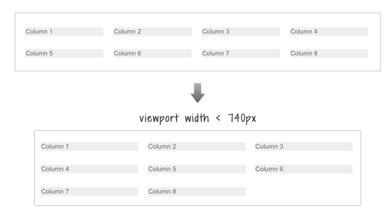
Changing From 4-column to 3-Column
To change the 4-column to 3-column on viewport width that is less than 740px:
- change the .grid4 .col width to 31.2% (one-third width)
- reset the left margin and clear property
- then re-apply the left margin and clear property using nth-of-type(3n+1) to form a 3-column grid
@media screen and (max-width: 740px) {
	.grid4 .col {
		width: 31.2%;
	}
	.grid4 .col:nth-of-type(4n+1) {
		margin-left: 3.2%;
		clear: none;
	}
	.grid4 .col:nth-of-type(3n+1) {
		margin-left: 0;
		clear: left;
	}
}
Changing 4-column and 3-column to 2-column
To switch the 4-column and 3-column to 2-column on viewport width that is less than 600px: basically use the same trick as above to reset the .col width and float.
@media screen and (max-width: 600px) {
	/* change grid4 to 2-column */
	.grid4 .col {
		width: 48.4%;
	}
	.grid4 .col:nth-of-type(3n+1) {
		margin-left: 3.2%;
		clear: none;
	}
	.grid4 .col:nth-of-type(2n+1) {
		margin-left: 0;
		clear: left;
	}

	/* change grid3 to 2-column */
	.grid3 .col {
		width: 48.4%;
	}
	.grid3 .col:nth-of-type(3n+1) {
		margin-left: 3.2%;
		clear: none;
	}
	.grid3 .col:nth-of-type(2n+1) {
		margin-left: 0;
		clear: left;
	}
}
Making all columns Fullwidth (see demo)
To make all columns to full width on viewport width that is less than 400px: set width to 100% and reset the margin and float.
@media screen and (max-width: 400px) {
	.col {
		width: 100% !important;
		margin-left: 0 !important;
		clear: none !important;
	}
}
Internet Explorer Issues
Both media queries and nth-of-type are not supported by Internet Explorer 8 or older. You can use selectivizr.js to provide nth-of-type support for IE and respond.js for media queries. Unfortunately, selectivizr.js and respond.js don’t work well together (ie. nth-of-type doesn’t work within the media queries). This means the only fall back with this responsive grid is that the columns can not be switched from 4-column to 3-column or 2-column.
33 Comments
Comments are closed.
Silvio Bompan
How about css3-mediaqueries.js instead of respond.js? It should work well with selectivizr.js
Gary
Thanks for sharing. Responsive columns work very well in Themify Themes so it’s great to learn how it’s done.
Front-end Magazine
Nice Article. thanks for sharing
Vincent Grouls
Simply set a left margin on all columns and then reset it on the first element of every column (xn + 1); combine it with a clear: left.
Also, if you define media queries with a min-width and max-width, there’s no need to ‘reset’ any selectors using the !important rule (which should always only be a last resort).
Just my 2¢.
sjnnr
Nice article. Been messing around with various options myself for some time now.
A better backwards compatible solution with inline-block usage: http://www.sjonner.nl/sites/sandbox/responsive-column-grid.html
Setting a negative margin on the parent container is better supported than nth-child selector.
In my example I chose to not support mediaqueries for older IE’s, of course this could be easily added.
Nick La
This is indeed very nice, but you still need nth-of-type() to clear the float for situation like this: http://cl.ly/image/0S0P2V3D1t1I
ps. It doesn’t work on FF.
sjnnr
Hi Nick,
What do you mean with “you still need nth-of-type() to clear”? You can change the vertical-align to top to let the items align like floated block elements would, except they remain in the row they’re in (a good thing!).
Which version of FF are you using? I’m using it as well and works fine here :\ I thought I checked all major browser for compatibility.
Example updated.
Nick La
Tested it on Mac FF 16 & 17. Result is: http://cl.ly/image/0L3e3d180S26
Akhtar
Very handy technique… Good idea to post it ;)
lukasz krawczyk
Very nice example of responsive columns. I have to play with it myself :)
Christian
Thanks for this Article, nice technique.
IE8 sucks :|
Ron
Thanks for this helpful post on responsive layouts. I’m studying this now for my second WP Theme.
Dave Rogers
Thanks for sharing this. I’ve been putting off a project for a while now trying to figure this out in my head. All systems are now go… :D
pakaian dalam wanita online
A plus for examples which can be visited with a banal click. I like how the blog confers the best suggestions on anything
Roman
Hi, I found a better solution to Your problem.
Try it at: http://flamecity.piasta.pl/columns
Any feedback appreciated :)
Nick La
Not an ideal solution because it requires left and right margin which causing the left and right empty space.
US Joomla Force
Wow that’s easy. I did it!
Mike
That’s really useful.
Patrick Enyia
Hi,
Thanks for your very informative style of teaching. I really find this skill useful
Supratim
Nice article it will help me a lot :)
Wired Canvas
Phwoar. This appeals to my nerd sensibilities. Thanks for sharing. Shame as always about the problem of IE, but seems like an acceptable solution.
TrendyWp
Thanks for this, I will definitely try to use this in my next project
Mark
Great tutorial!
Would removing all gutters be as a simple as changing margin-left: 3.2% to 0% and adjusting col widths accordingly? Thanks
Brian
Great posted. Very useful especially when/before you are about to make webdesign, websites or webshops. Using nth-of-type is nice to know..:) Thnx for sharing.
Laura K. Chik
As always another good tip! I have followed your site for years now and appreciate your skills! Thanks for helping this designer learn new tricks!
Ceba
Pretty awesome, you can also use inline-block; for reflowing grids rather than floats.
Afzal
This article is really very helpful in making ur website more effective .
In block lines is a great trick . It gives a nice texture to ur blog
Madhav
It’s great! Really useful resources . Thanks
Gareth Nunns
I loved this article and have used it in a few projects. I found myself wanting to edit it, like change the number of columns, have some padding, and change the margin in between them but it got rather tedious working out the sizes of the columns so I made this quick tool to work them out: thhttp://cdpn.io/LuKcgb
Hope it helps
Mass Web Solutions
The most obvious way a responsive design changes is in its layout.