One of the common challenges when designing responsive design for mobile is the navigation menu. If the site has many sections or pages, it gets challenging to squeeze all the items into a small mobile resolution. The navigation most likely ends up running into multiple lines or the buttons stacking on top each other. So I’m going to review some of the design solution and provide a quick tutorial on how to create a mobile navigation with jQuery.
Problem
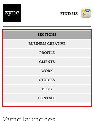
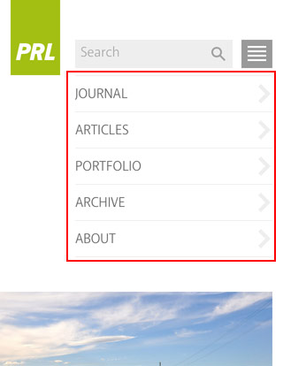
The screenshots below show the navigation layout issues on mobile. If the navigation has 3 or 4 buttons like Web Designer Wall, then the navigation won’t wrap into two lines. But if the navigation contains 6 or more buttons, they will stack on top each other.

Solutions
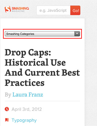
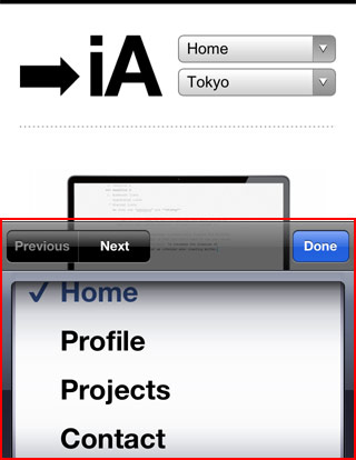
1) Dropdown
One of the commonly used solution is to convert the navigation into a select dropdown. I’m not a big fan of this approach because the <select> element is not stylable with CSS. Javascript plugins like Chosen enables you to modify the dropdown menu, otherwise you end up with the default system dropdown styles. It also causes inconsistent user experience where the desktop version displays link tags and the mobile version displays as a dropdown menu. If you like this solution, here is a tutorial by CSS-Tricks on how to convert a menu to a dropdown.
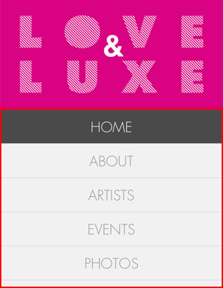
2) Display as Block
Another quick fix is set each menu item as block elements so they display vertically. But this approach takes a lot of header space. If the navigation has many buttons, this is a bad idea because the readers have to scroll down through the long list of navigation before reaching the content.


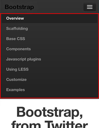
3) Menu Icon
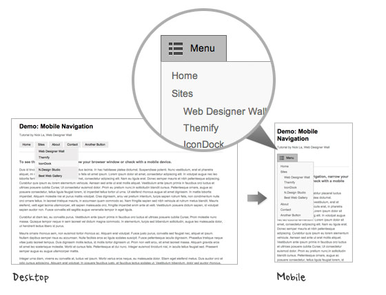
The last solution that I’m going to review is to use a menu icon/button to toggle the navigation. I like this method out of the three because it saves space (very important on mobile) and it gives you full control of styling with CSS. The menu icon can be styled to match with the overall design.

Mobile Navigation with jQuery (view demo)
This tutorial shows you how to create a mobile navigation with jQuery as seen on the sites listed above. jQuery will be used to prepend the menu icon and toggle the navigation. This trick doesn’t require any extra/un-semantic HTML tags.
HTML
Below is the sample navigation HTML used in this tutorial:
<nav id="nav-wrap">

	<ul id="nav">
		<li><a href="#">Button</a></li>
		<li><a href="#">Button</a></li>
	</ul>

</nav>
jQuery Code
Include a copy of jQuery and the function below in between the <head> tag. The function will prepend the <div id="menu-icon"> in the <nav id="#nav-wrap"> tag. When the #menu-icon element is clicked, it will slide down the navigation.
<script type="text/javascript" src="http://ajax.googleapis.com/ajax/libs/jquery/1.7/jquery.min.js"></script>

<script type="text/javascript">
jQuery(document).ready(function($){

	/* prepend menu icon */
	$('#nav-wrap').prepend('<div id="menu-icon">Menu</div>');

	/* toggle nav */
	$("#menu-icon").on("click", function(){
		$("#nav").slideToggle();
		$(this).toggleClass("active");
	});

});
</script>
It will render the HTML code like this (you need to Inspect Element or view generated source code to see this):
<nav id="nav-wrap">

	<div id="menu-icon">Menu</div>

	<ul id="nav">
		<li><a href="#">Button</a></li>
		<li><a href="#">Button</a></li>
	</ul>

</nav>
CSS
I’m not going to explain every detail of the CSS code because it is pretty straight forward. Instead, I will talk about the key parts.
The #menu-icon is set to display:none initially. I used media query to change the #menu-icon to display:block if the viewport width is smaller than 600px.
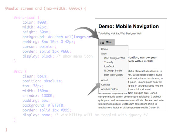
In the media query, I set the navigation to display:none so it is hidden initially on mobile. When the #menu-icon is clicked, it will toggle the navigation as specified in the jQuery function at the above step.
Final Demo
To see the final mobile navigation, view the demo and narrow your browser window or check with your mobile phone.
Update:
Also read this CSS Based Responsive Navigation Menu tutorial.
117 Comments
Comments are closed.
Web Design Wolverhampton
Probably the simplest way of providing an alternative nav is to display/hide different DIVs, each containing a different nav style, depending on the screen size (using viewport). No jQuery needed (although we love jQuery). We’ve used it here http://www.scubashack.co.uk
ehhwhat.co.uk
Interesting idea, just looked at your example too and noticed that the menu doesnt dissappear if you click it again, i think this would be better as a toggle in case a user accidently clicks on the menu button.
Web Design Wolverhampton
Thanks for the feedback. The mobile menu is just at the bottom of the page, so if a visitor clicks “Menu”, they’re still on the same page. We could add a toggle that simply jumps back to the top of the page.
ehhwhat.co.uk
Really useful information, will look to implement the drop down menu at some point in the near future on my website, currently using the block example and even with only 4 or 5 menu items it still takes up too much space
Alexander Taubenkorb
Nice approach. Unfortunately it does not work without javascript….
ehhwhat.co.uk
Be interesting to see some stats for javascript enabled on mobile devices, id imagine that all smart phones have it but i could be wrong
Anthony
I believe all your major phone browsers support javascript (iOS, Android & Windows Phone). Most web apps are built using javascript so they have a dynamic feel. You will get better support from javascript then you will CSS3 or webkit(iOS & Android only). Looking at you Android & Windows Phone.
john
Lol that doesn’t matter anymore kid, everything has JavaScript enabled… if you disable it, you’re a wanker.
Dean
Bug….
Resize browser to switch to mobile menu, open and close mobile menu, then resize back. Horizontal menu is gone….
fatfingur
you are absolutely right!!! Nick La should probably fix the bug first. It’s obvious he didn’t test the demo well enough before putting it up.
I’d stick to the dropdown menu solution though. why rely on javascript when you can use dropdown. it’s easier for users and lighter on the browser.
nice try though.
peter
cmon, who does that?! nobody except webdesigners… and they can find bugs _anywhere_ if they just want to.
zep
The Sony menu is very sexy, I like it !!!
I found this one also interessant http://www.moonservices.ch/
Brad Frost
Great article! I also recently looked into the pros and cons of various navigation patterns for responsive design here: http://bradfrostweb.com/blog/web/responsive-nav-patterns/
Great stuff!
Josh
I’m noticing an issue with the navigation not displaying once you switch back to wider width. Steps to reproduce:
– Make screen size small and the navigation switches to the menu drop down
– Click to see the menu drop down and then click again to hide the menu
– Make screen size large and notice the navigation no longer displays
Nick La
This is intended for mobile users, not for developers like yourself. Normal readers don’t narrow and then expand their browser window (only developers do that). If you want, you can add another media query to force the #nav to display:block !important; on desktop resolution.
sushidev
way to go man. instead of admitting your mistake you tell us that the demo is only intended for devs and “normal readers” don’t resize browsers. great way to treat your readers!
Stuart Robson
“Normal readers don’t narrow and then expand their browser window ” That’s quite a sweeping statement. Have you got any stats to back that up?
john
common sense? That backs it up pretty well…
Zoe Gillenwater
Hi Nick. I agree that normal users rarely resize their browsers explicitly. However, they do often switch from portrait to landscape and vice versa, so it’s essential that you add functionality that allows the user to change back and forth repeatedly.
Nick La
For those concern about the navigation being hidden when switching from mobile version, check the demo again. I applied the fix that I mentioned above in the comment. Now the #nav is always visible on desktop version.
Jay Kapadia
As Nick said, by simply adding @media screen and (min-width: 600px){ #nav{ display:block !important; } } the issue is solved, its a slick and well produced result that I’m implementing right now. Thanks for sharing Nick
Rien
on my galaxy s i switch frequently from portrait to landscape and back and got the same bug ;-) but even though i love this tutorial. Thanx..
Sean
Out of curiosity, why append the menu-icon div using javascript? Why not have it in the source in the first place, and do a display:none on non-mobile widths?
Nick La
Just to be more semantic without adding unnecessary tags.
Sean
But that tag is necessary if you come at the problem from a mobile-first perspective. Plus, one could argue that adding “Menu” in some sort of appropriate heading tag (as opposed to a div) would make the whole thing more semantic.
By the way, I am not trying to be an asshole about it, so please do not take offense. This article comes at a very good time for me, and has some good info in it, so thank you.
Nick La
Good point here. The “menu” text could be a heading tag and semantic. It works the same without prepending content with jQuery.
Hajo
Struggeling on my first mobile first responsive website I have your toggle menu running. The only problem I have is still the bug. It isn’t switching back to normal menu.
I use mobile first so I have the defauld layout for mobile and use the media query to expand for bigger viewports.
How kan I get rid of the bug?
I don’t understand fully the comment fron Sean.
If no solution I’ll have to live with it, this toggle is the only menu I got worken,
So Thanks!!!!
Neil
Its always nice when someone bases a post on one you wrote over 2 months ago.
You made a better job of it, I’ll have to say. Well done.
http://blog.bleepsystems.com/2012/solving-a-responsive-design-navigation-problem/
David
Are you kidding? Your blog doesn’t come up within a relevant number of results for either “responsive design navigation” or “mobile navigation”. If Nick has ever heard of your blog I’d eat my hat. And even if he somehow had heard of it, to claim he based his post on yours is plain silly (and your tone implies he “ripped it off”). Nick lectures about these kinds of things all over the world. Responsive design mobile navigation best practices have been discussed constantly in the web design community (forums, twitter, conferences, videos, articles. podcasts, etc) over the last year or more. In fact most of these exact examples are covered in “Mobile First” by Luke Wroblewski, published Nov 2011 (ah hem, several months before your blog post). Anyone who frequents mediaqueri.es has been exposed to all of these navigation ideas already. Nick wrote a nice article summarizing the ideas and giving his thoughts on which he prefers. Nothing wrong with that… in fact I hope many more posts by various notable web designers add their own perspective. Bah you just wanted to stir up some controversy and drive clicks to your blog, which unfortunately you have succeeded at. Yay for nofollow at least.
robe d'avocat
Good ideas and good solutions for a real problem on mobiles. I guess the “lov&lux” version is the better to easily navigate and to stay a beautiful app.
thx for tips.
web application designer
Thank you so much for this list, it really helps me out!
SEO-Backlink
Great ideas!
But one problem is still alive…
how to navigate on sub navigation if the second level is default hidden. because hover don’t exist…
for examplel ul > li >ul >li
Konstantin
Hey. Why not make the addition of icons in CSS? I think JavaScript is useless. Correct me if I’m wrong. Thanks!
Adam
I like your preferred method of displaying the navigation as a drop-down. Great tutorial! Thanks for sharing!
David Hucklesby
Demo not working in Opera 11.62 on Mac OS X 10.7.3. The HEADER “content” property wipes out the entire menu! :(
Glow
@SEO-Backlink, all the sub navigations will be expanded when you click on the menu link, so this is not a problem.
In some cases you can decide to keep the toggle effect on hover to show the subnavigation, it will be replaced by an “onclick event” on most touchable screens
William@ Budget Web Design
Seems bit complex than HTML but effective :)
Architecture Blog
Love this post to navigation given that mobile browsing is an unstoppable upward trend. I would really appreciate if Web Designer Wall gave some more insights into optimizing websites for mobile devices. Probably and interesting topic is optimizing CTRs (navigation ex-menus) within site pages, as links are not displayed equally in desktops/mobile. Thanks!
ptamaro
Great post. I agree with you and the other folks who prefer the last solution. It seems the most practical, and it has an elegance in it’s simplicity and control over to final look…
Mohit Bumb
nice tutorial
menna
its very good tools for blackberry web works .. but i’m looking for tools like menus may help me to desgin simple menu for blackberry java application.
are these designs good for what i need?
jklm
Or…you could just do it with css:
test it out yourself: http://responsive.is/dabblet.com/result/gist/2345227/dabblet.com/result/gist/2345227/26b646612957768693177845a6650ea7165d999a
dabblet: http://dabblet.com/gist/2345227
rory
Interesting concept…
Why load a heavy library like jquery though? Why not just use straight JS?
food for thought…
Vinny
Very useful information! Great article.
Roman
Does it work when the Java Script is disabled??
Juris Malinens
This doesn’t work on my old Windows Mobile phone with Opera Mini- I get empty space instead of navigation button…
Roman
Does Ur browser support Java Script?? If not – that’s probably the reason why it doesn’t work properly..
coder-design
Great tutorial. Thanks for sharing.
Arcelik
Useful tutorial.Thanks.
Joomla Templates
nice info thanks for sharing.
Hoacatorama
I really really like this site very much
Hoacatorama
Trời ơi, đây là người Việt Nam sao, thật là ngưỡng mộ
Website Development
Thanks for sharing such useful information and I believe blog commenting can do wonders for anyone working on it. I completely agree with your view that blog commenting don’t have to be used for SEO only.
custom icon design
I will use this demo for my next website updated I am sure.
Think360studio
Great tutorial. As per todays demand this article is really good. Every client wants a mobile navigation design because now a days mobile is the vastly used device so its very important for every designer that each site designed by him should also open in mobiles.
Paisagista em Sorocaba
Great tips! I`ll use it right now! Tks!
Jill
Exactly what I’ve been looking for. Great tutorial thanks.
Free Mobile Site Builder
Just to complement this a little, there are many free mobile site builder like morces.com (I’m using it currently) provides the same quality and a comprehensive set of features that meet up to the industrial expectation.
No harm visiting morces.com! =)
Ace
Is source code available ?
Jered
@Ace: Have you read the article? There is are several references to the demo. When viewing the demo you can watch the source and learn from it :)
Sherwin
Thanks for this, i’m looking for this tutorial for a long time.
Michael Oeser
AWESOME. Took me 5 Minutes to implement the jQuery solution into my WordPress theme ( jQuery is loaded anyway for many other stuff). And makes my responsive site much , much better. Thanks a ton!
iWeb
very nice work, but did´nt work with opera
Drew Johnston
I noticed that too, the navigation wouldn’t even show up in the demo, but hey… you would only really notice it on mobile devices unless you resized your window to test it out.
magazin
This does look like a great theme.
Tom
Great tutorial. Always look for a simple way to do this across different websites.
Life insurance for diabetics
looks amazing!! great job…
Web dizajn Sarajevo
Wow ! Nice article. Thanks …
Aaron Lee
This is a brilliant post, I’ve been plagued with navigation problems on mobile devices for a while and was using the display block method for a while but now I’ve definitely been converted to this awesome jQuery alternative. Thanks again!
طراحی سایت
Merci. good paper
Aquaster webdesign
Confronted with mobile webdesign the problem is space, diversity of phones and the thinkness of the finger ;).
Stuart Robson
Unfortunately this demo breaks when the ‘mobile device’ doesn’t have JavaScript enabled. We should be doing this more progressively. I’ve created a tutorial on this too –
http://alwaystwisted.com/post.php?s=2012-05-14-create-a-responsive-mobile-first-menu
Jim
Just a heads up for anyone having issues. My CMS (Drupal) was using an older version of jQuery (1.5.2) which was reporting errors. I think it was the click code in this demo. I fixed my issue by updating to the following code:
$("#menu-icon").click(function(){

  		$("#nav").slideToggle();

  		$(this).toggleClass("active");

 });
Thiet ke logo
thanks for sharing, this article details, very useful!
Debbs Hosting
I like the idea of the Dropdown and Menu Icon, too. I’ve also had difficulties with jQuery before and I thought maybe it wasn’t compatible with the theme I’m using. Thanks for sharing this tutorial. Now I know how to do it.
mojtaba
great post.
is it possible to use twice in page?
Paul
Anyone has a problem in I.E.?
sunil sharma
Many many thanks for great post.
Dheeraj
Nice job. Thanks for the tutorial. I will definitely try it out.
PC Muskel
Thanks, I just updated my website to support mobile devices. :-)
Adrian
I think my preferred method would be the menu icon, expanding to show a menu when clicked. So much to consider when designing specifically for mobile, exciting times though!
Paul
Loved the way you explained it. Thanks for sharing the article.
Paul Spiric
From Webstarttoday
design
Thank you so much for this list, it really helps me out!
Gwen
Remove in style for HTML5 element header the CSS code in line 17 reading content: ” “ and the mobule menue works with Opera, too.
Woody
Good post, am going to have to write a big projects mobile CSS next week, this is going on my ‘watch for’ hit list.
Cheers
Woody
StormGate
Stephen Scaff
First off, great tutorial! Had me up and running in a few mins.
Have a question regarding the last option with jquery:
If I want to use this type of menu on a single page site, using page anchors and scrollTo, how can I get the menu to close after selecting a page anchor-based link?
As is, the drop down menu remains open, requiring the user to select the menu link again to close. I’d like for it to automatically close after selecting the link.
Thanks again.
Sky
I had the same problem. Not sure if this is a great fix, but here’s what I did. I added a class “navlink” to all the links in the navigation. Then I put this script in there:
$(“.navlink”).on(“click”, function(){
$(“#nav”).slideUp();
});
website designer austin
Thanks for this post. I am very helpful by this post.
Termopares
Great tutorial. I always come here for new stuffs! Tks!
Application Development for Android
Amazing tutorial for mobile navigation. When I would like to get tutorials and information about application, design, development and new theme, I have written on browser only webdesignerwall.com. Please keep up the gratifying work.
igneta
its veryy beautiful
Nancy
Tried this out on personal website, works well. I will be using method on several non-profit sites. Thank you ! !
συστηματα φωτοβολταικων
Nice info thanks for sharing!
Ibiza yates
Have a question regarding the last option with jquery:
If I want to use this type of menu on a single page site, using page anchors and scrollTo, how can I get the menu to close after selecting a page anchor-based link?
As is, the drop down menu remains open, requiring the user to select the menu link again to close. I’d like for it to automatically close after selecting the link.
I have written on browser only webdesignerwall.com. Please keep up the gratifying work.
Thanks again.
Alquiler yates Ibiza
When I would like to get tutorials and information about application, design, development and new theme, I have written on browser only webdesignerwall.com. Please keep up the gratifying work.
Yates en Ibiza
Good post, am going to have to write a big projects mobile CSS next week, this is going on my ‘watch for’ hit list.
Web Design Newcastle
Simply put, this is a brilliant tutorial.
Yates de lujo en Ibiza
Son un grupo empresas de gestión global de barcos y yates de lujo con base en Ibiza y nacen con el objetivo de optimizar recursos para cubrir las necesidades de un mercado náutico en expansión cada vez más experimentado y globalizado.
Nuestra principal actividad se centra en la náutica de recreo, seleccionando para nuestros clientes los mejores barcos de alquiler disponibles en Ibiza e Islas Baleares. Únicamente trabajamos con los principales armadores de cada zona, a los que exigimos un mantenimiento exhaustivo de las embarcaciones y, en general, un servicio de máxima calidad, con la garantía que aporta un gran grupo de chárter con presencia internacional.
Entre nuestros clientes contamos con numerosas empresas de reconocido prestigio y somos proveedores de las más importantes agencias de viaje.
Mark
Thanks for the !important fix. I was racking my brain there for a while looking for a solution. Great article btw!
Alquiler yates Ibiza
Your blog doesn’t come up within a relevant number of results for either “responsive design navigation” or “mobile navigation”. If Nick has ever heard of your blog I’d eat my hat. And even if he somehow had heard of it, to claim he based his post on yours is plain silly (and your tone implies he “ripped it off”). Nick lectures about these kinds of things all over the world. Responsive design mobile navigation best practices have been discussed constantly in the web design community (forums, twitter, conferences, videos, articles. podcasts, etc) over the last year or more. In fact most of these exact examples are covered in “Mobile First” by Luke Wroblewski, published Nov 2011 (ah hem, several months before your blog post). Anyone who frequents mediaqueri.es has been exposed to all of these navigation ideas already. Nick wrote a nice article summarizing the ideas and giving his thoughts on which he prefers.
Dan
I read through the discussions earlier about web designers being the only ones to resize their screens and I’m not going to get into that debate, but I did resize my screen and discovered a bit of a bug that I can’t quite remedy and wanted to put this out there.
I’m new to media queries so maybe this is an issue about those in general but at the precise pixel size when the desktop nav converts to the mobile nav, the dropdown ul displays. I’m talking like at screen width 601 its desktop, at 599 its mobile with dropdown hidden, but at 600 exactly its mobile with the dropdown visible. Look at the demo and slowly resize your screen around the point where the conversion happens and you should see what I mean. I tried it in the latest versions of Chrome, FF & IE9 and all did the same thing.
I realize the chances of a user’s screen size being at that 1px wide margin of error is slim at best but are there any suggestions to ensure the dropdown is hidden at that point?
Thanks!
rickymartin
Very nice collection.
Diana
Thanks Nick, though mine is somewhat different I loved this effect!
Michael Meininger
Fantastic Write up and eager for more mobile site solutions
seo
Thank you so much for this list, it really helps me out!
amy sidra
thank’s bro. very usefull. i will apply it to my website
Joe Ray
Unfortunately this script seems to break in mobile when the menu is set to a fixed position. I’m doing a one page site and want the menu to be permanently attached to the top of the screen, and for the links to link to content further down the same page, but when I do that the menu becomes unresponsive on the phone after the first link is clicked, unless i scroll the page slightly.
I don’t encounter this problem when viewing on the desktop. Is anyone else having this problem, and does anyone have a workaround? Much thanks if you do.
Joe Ray
Actually, in answer to my own question, turns out this is a known bug in iOS 5. There’s a whole thread on it at stackoverflow, with a bunch of possible solutions, none of which have worked for me so far, but some of them may be of use to others having this problem.
http://stackoverflow.com/questions/8752220/mobile-safari-bug-on-fixed-positioned-button-after-scrolltop-programmatically-ch
Georgios
Very useful and informative post. Thank you.
selahattin
mobile design is really important.
Ant
Thanks for the tutorial, very simply and a elegant approach. Would this work on a WordPress menu?
Cheers,
Ant
Marcus
Thanks! Chosen is a good plugin which I will use on some apps.
In past I have the only styled by setting the text-size with padding, margin etc..
Joseph
This was not nice at all….i tried it using opera mobile browser and the nav did not even show up. I thought i did some coding error but i tried your online demo link and the same thing. Did you consider mobile browsers without JavaScript support..Such as opera mini and bolt…Nice post too.. Please find a fix for non-JavaScript browsers
vishnu
Another superb article. Liked it :-)
Holistic medicine
I was racking my brain there for a while looking for a solution. Great article btw!
Iacho
Thank you so much. I’ve been looking for this for days and here it is. All I needed was a simple menu and everything I found was super-complex ones.
Really, thank you very much.