
CSS flexbox is an incredibly useful tool for layout without using floats or positioning. Currently almost all current browser version support flexbox, making it a go-to standard for web design. It can solve a number of problems efficiently, such as vertical alignment, space distribution, ordering of elements and sizing. It offers more freedom to arrange the content of a page depending on the size of the viewport, achieving an inherently responsive layout with only a few CSS rules and a simple HTML structure. This guide focuses on the primary properties as they relate to the layout process and demonstrates visually how they work, rather than summarizing with no context or going into too much technical detail. Use it as a cheat-sheet to quickly master CSS flexbox using shorthand properties and only the most common values.
As you follow along, experiment with the effects of the properties highlighted in each step using this handy flexbox tool. Enjoy!
See the Pen Flexbox Playground by Vail (@vailjoy) on CodePen.27486
Flex Container
To get started, you need a wrapper element with some children. This wrapper can be a div, section, header, footer or even a ul. Here is an example of a common structure:
<div class="grid">
    <div class="column"></div>
    <div class="column"></div>
    <div class="column"></div>
    <div class="column"></div>
    <div class="column"></div>
</div>
Then set the display property of the parent class to flex:
.grid{
	display: flex;
	display: -webkit-flex; /* Support for older browsers */
}
The flex declaration is the only one you need to turn all the direct child elements into flex items and makes your wrapper element a flex contatiner.
There are five primary ways to manipulate how the items are layed out inside the flex container. Two involve properties you can declare on the flex container, and the other three on the flex item selector. I’ve broken them down into five steps coinciding with the process of creating layout to make it easy to remember.
1 – Flow
By default, your flex items will flow from left to right in a row starting at the top-left corner of your flex container. You can control this with the flex-flow property.
flex-flow takes two values, the flex-direction and the flex-wrap.
flex-flow: flex-direction || flex-wrap;- Use flex direction to send items horizontally in a row or vertically in a column.
- Use flex wrap to make items wrap or fit themselves in one row or column (works like words in a paragraph).
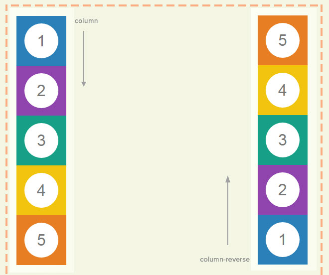
flex-direction
row, column, row-reverse or column-reverse
row lays out the flex items horizontally from left to right.
ow-reverse lays them out horizontally from right to left.

column lays out the flex items vertically from top to bottom
column-reverse lays them out from bottom to top
flex-wrap
nowrap (default), wrap or wrap-reverse
wrap will bump flex items into a new row or column automatically if the parent elements or screen size constrict the flex container width beyond the calculated total of your flex items, just like words wrap in a paragraph. This frees you from having to use clumsy :nth-child clears when building grids, as flexbox will handle the content responsively for you.
In simple terms, if you have five flex items on a row and each one is 125px wide, but your screen size is only 480px wide, the following flex-flow will display the flex items in two rows:
flex-flow: row wrap;wrap-reverse will just reverse the flow so the next row’s items use an opposite flex-direction. In most cases, you would only use it to solve a specific problem.
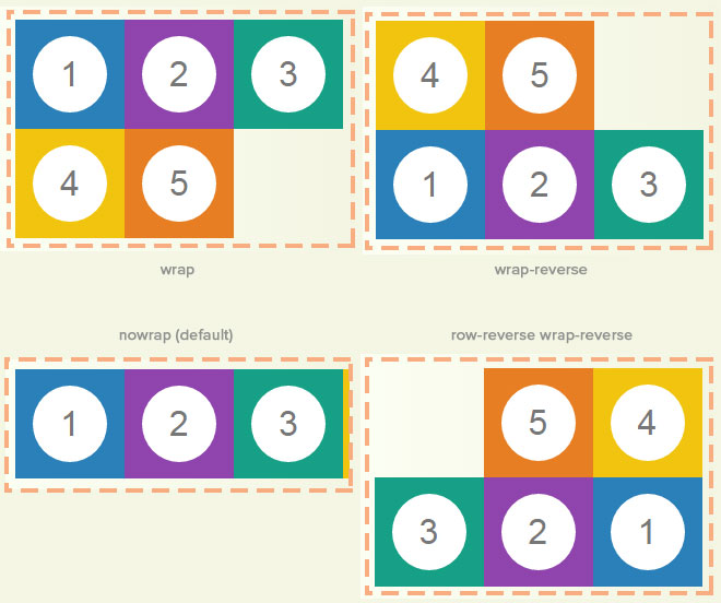
nowrap forces all flex items to stay on one line or in one column and is the same as not declaring a flex-wrap value. In most cases, you will want to use wrap.
- clear has no effect on a flex item.
- float causes the display property of the element to compute to block.
Here is how the whole rule would look:
.grid{
    display: flex;
    flex-flow: row wrap;
}
Note:row and row-reverse are dependent of the writing mode so in?rtl context, their starting points will be reversed.
2 – Alignment of Rows and Columns
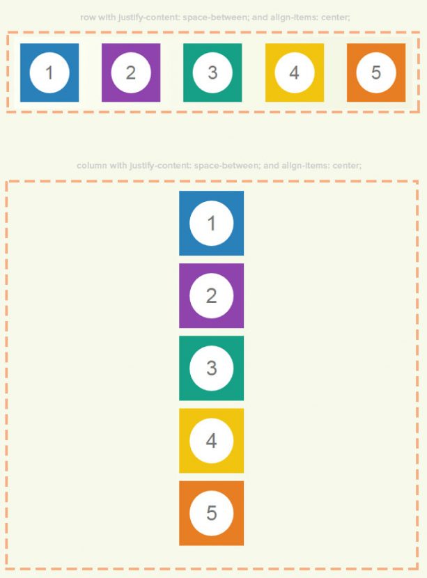
Flexbox gives us two ways of controlling alignment inside the flex container, justify-content and align-items.
justify-contentcontrols the horizontal position for rows, or the vertical position for columns.align-itemscontrols the vertical position for rows, or the horizontal position for columns.
Sound confusing? The values are quite semantic, but it is much easier if you think in terms of rows, then turn the flex container once to understand the column logic.
justify-content
justify-content: flex-start | flex-end | center | space-between | space-around;flex-startlays out flex items from the left (row) or top (column) of the flex container, and is the default (assuming the read-mode is ltr)flex-endlays out flex items from the right (row) or bottom (column) of the flex container.centerwill center flex items horizontally (rows) or vertically (columns)space-betweenwill distribute the flex items with equal spacing between them, placing the first flex item at the left/top edge of the flex container and the last flex item to the right/bottom, similar to justifying text.space-arounddistrubutes the flex items equally with space around them, including the first and last item.
align-items
align-items: flex-start | flex-end | center | baseline | stretch;flex-startlays out flex items from the top (row) or left (column) of the flex container with the top or left edges of the flext items aligned.flex-endlays out flex items from the bottom (row) or right (column) of the flex container with the bottom or right edges of the flex items alignedcenterwill center flex items horizontally (columns) or vertically (rows)baselineis best used when your flex items are varying heights (rows) or widths (columns) and will center the flex items on the baseline
stretch gets a special focus here as it is responsible for allowing all flex items to remain equal height to one another, with the total height inherited from the tallest flex item. stretch is set by flexbox by default, so keep this in mind when working with flex rows.
align-content
If you need a way to distribute entire rows or columns equally within a flex container, you can do so with align-content.
align-content: flex-start | flex-end | center | space-between | space-around | stretchThese values work just like justify-content, but are applied to the rows or columns rather than individual flex items.
Notes
- The alignment is done after the lengths and auto margins are applied, so it is important to note the following:
space-aroundandspace-betweenonly work when there is extra space in the flex container, ie it is taller or wider than your rows/columns, so don’t use it to necessarily replace margins.-
justify-contentandalign-itemswill not have any effect on flex items that are sized using theflexproperty, which we’ll explore next. - vertical-align has no effect on the alignment of flex items.
3 – Flex Item Sizing
Moving on to how flexbox properties are applied to the flex item selector, the first thing to consider is the sizing. By default, the width and height of flex items is determined by its content. There are a number of ways to size flex items. You can either set a height and width using a typical unit like percentages or pixels, or can harness the power of the flex shorthand property to let flexbox handle sizing for you.
Sizing With Units
You will want to define a height and width of your flex items in cases where you need them to stay consistent. The most common sizing unit to use is percentages, to keep things somewhat responsive.
.column {
	margin: 10px;
	width: 33.33%;
}
This example makes each flex item take up about 1/3 of the flex container.
Flex
flex is a shorthand property that takes three numerical values:
flex: flex-grow || flex-shrink || flex-basis;- flex-grow will grow the flex item to take up additional space, if needed.?
- flex-shrink?will shrink the flex-item if needed.
The values for flex-grow and flex-shrink are proportional, changing relative to other flex items in the flex container. Flexbox adds the values for the properties and then divides each flex item’s value by that sum. If we have three flex items and want them to take up ? of the total space, we would set the flex-grow and flex-shrink to 1.
1 (1 + 1 + 1) = 1/3
.column {
	margin: 10px;
	flex: 1 1 0;
}
If we have 6 flex items, then using the above will make them each take up one-sixth or the equivalent of 16.66% of the flex-container’s width.
The flex property becomes really magical when we start mixing values or applying different flexes on individual flex items. See how Bennet Feely uses it in this demo to create a grid with only a few lines of CSS:
See the Pen Flexplorer by Bennett Feely (@bennettfeely) on CodePen.27486
flex-basis defines how much space each flex item starts with, allowing the remaining space to be used up by the other two values. Setting this to 0 is effectivley an auto setting. This value is special as it accepts a percentage or pixel value. Pixel values are helpful to adjust your flex sizing to account for things like margins and borders. For example, if you have a flex item with a 20px margin and 2px border, you can set the flex-basis value to 22px:
.column {
	margin: 10px;
	flex: 1 1 22px;
}
Making Columns Equal Height
You might be tempted to do something like set a height value on your flex items, but this is not necessary! align-items: stretch; is the default for flexbox and will take care of this for you as long as it has not been set to something else. Here is a simple example:
See the Pen Flexbox: Equal height columns by Vail (@vailjoy) on CodePen.27486
Notes
- Flex items sized with flex will probably ignore wrapping since this property make them take up available space on the row.
- Flex items do not need clears or right-margin tricks.
4 – Alignment of Flex Items
Where justify-content and align-items help us align flex items relative to the flex container, align-self allows us to align a single flex item relative to its sibling flex items.
align-self: auto | flex-start | flex-end | center | baseline | stretchflex-startaligns it to the top (row) or left (column)flex-endaligns it to the bottom (row) or right (column)centercenters it, as shown in the below image. If the cross-size of the item is larger than the flex container, it will overflow equally in both directions.stretchwill stretch the flex item to fill the height of the flex-container (if it can)- All flex items are aligned such that their baselines align. baseline is helpful when one flex item’s size is different, and keeps the baseline consistent.

5 – Order
In cases where the markup has to be in a certain order, or you don’t have control over re-ordering items in the source, you can manipulate them using order. This is an especially useful trick if you need to do something like rearrange the order of elements in a page of a WordPress theme.
order: number;It is important to assign an order to all the flex item’s siblings or this property has no idea what to order the flex-item relative to. In this example, we have a flex container with five flex items:
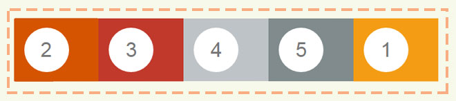
You can use order a variety of ways, depending on the CSS selectors you use to target the flex items. The following is just one example that is the most illustrative, using our original example of each flex item having a class of column:
.column:nth-of-type(1){
	order: 5;
}
.column:nth-of-type(2){
	order: 1;
}
.column:nth-of-type(3){
	order: 2;
}
.column:nth-of-type(4){
	order: 3;
}
.column:nth-of-type(5){
	order: 4;
}
Use Cases
Check out the demos of some our past tutorials to see how flexbox is used in practice:
Resources
Hopefully you’ve found flexbox easier to understand and use with this overview. Below are some of the best resources around the web for learning more about the details and use-cases of this amazing CSS tool.
- Landin Schropp’s Flex Sizing Guide
- Flexible Box Specification
- How Flexbox Baselines Work
- Learn flexbox interactively with flexbox froggy
Example
Alicia Ramirez
The bottom 2 Code Pen embeds aren’t’ working (Not Found).
Thanks for the great article.
Vail Joy
The pens have been replaced. Thanks Alicia!
w3c
More detailed information about CSS Flex on W3C: https://www.w3.org/TR/css-flexbox-1/
Heather Proper
:) thanks for this! I am just starting out and I love coming across an article that actually lets you learn :)