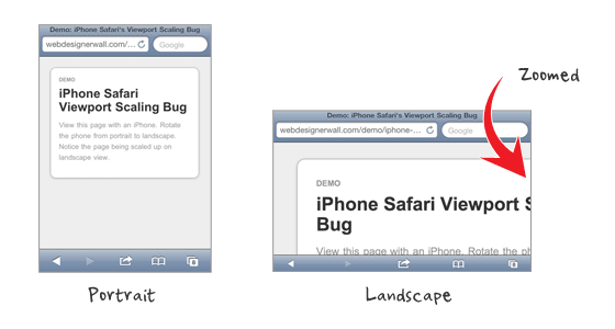
Those who create responsive design for iPhone may be aware of the viewport scaling bug in iPhone Safari. The bug occurs when you set the viewport width to device-width and rotate the phone to landscape view. To see this in action, view the bug demo page with your iPhone and rotate the phone from portrait to landscape view (you should see the page being scaled up). This is a known bug for a long time. Today I’m going to share some tips on how to fix this bug.
Problem (view demo)
View the demo page with an iPhone and rotate the phone from portrait to landscape.
Solution 1: Quick Meta Tag Fix (view demo)
A quick fix to this issue is by setting maximum-scale=1 in the viewport meta tag. This fixes the problem, but the downside is that the page will no longer be zoomable with the zoom gesture.
<meta name="viewport" content="width=device-width; initial-scale=1; maximum-scale=1">
Solution 2: Javascript (view demo)
For usability concerns, setting maximum-scale is not an ideal solution because user can not zoom the page. Fortunately, there is a Javascript fix which was discovered by @mathias, @cheeaun and @jdalton. Add the following Javascript in the <head> to fix the viewport scaling bug on orientation change. With this Javascript fix, the page remains zoomable.
<script type="text/javascript">
(function(doc) {

	var addEvent = 'addEventListener',
	    type = 'gesturestart',
	    qsa = 'querySelectorAll',
	    scales = [1, 1],
	    meta = qsa in doc ? doc[qsa]('meta[name=viewport]') : [];

	function fix() {
		meta.content = 'width=device-width,minimum-scale=' + scales[0] + ',maximum-scale=' + scales[1];
		doc.removeEventListener(type, fix, true);
	}

	if ((meta = meta[meta.length - 1]) && addEvent in doc) {
		fix();
		scales = [.25, 1.6];
		doc[addEvent](type, fix, true);
	}

}(document));
</script>
Comments?
Do you know more solutions to fix this viewport scaling bug? The Javascript fix is particularly useful for coding responsive web design. Please share in the comments.
100 Comments
Comments are closed.
d.
You might want to use comma instead of semicolon in the viewport tag. Seems to trigger some errors in some browsers.
https://github.com/paulirish/html5-boilerplate/issues/626
Andrew
Nice tip!
kalen
Sweet, the ‘,’ got rid of an error in Safari. Thanks! Nice tip too Nic.
David
I use the meta tag fix, I don’t mind that it removes manual zooming, we’re generally trying to imitate native apps anyway, and you can’t zoom in on most native apps.
keakon
You can use width=device-width:
Gabri
I’m using Jeremy Keith’s fix, it’s quite similar to solution 2 http://adactio.com/journal/4470/
Phil
Does anyone know if the scaling bug is still present in iOS5?
Josua Pedersen
Yes, and it’s not a bug.
joshintosh
Well, its buggin’ some people ;)
Chris
Nick, the “demo” link on this text is wrong: “View the demo page with an iPhone and rotate the phone from portrait to landscape.”
RussellUresti
The JS solution offered doesn’t work after the user starts to zoom in / out of the page. If they zoom in, then back out, and then change orientation, they’re met with the same scaling bug.
I also tried the Adactio solution referenced, but the script there hung up my page and it never fully loaded. Not sure why.
Tyce Clee
I second that from Russell, after zooming in and rotating backwards / forwards once the same bug is presented.
In this case, the meta solution is a much better solution.
website design
thanks remah i think i may been having with this JS
rexy
Thanks for sharing. This tutorial will help me.
Patrick
This great articles, I prefer the java-script matter. I wish I can contribute some viewport idea, but I don’t have such knowledge.
JB Web Design
Nice little resource. Thanks
Ryan Hickman
Thanks for sharing this fix, very helpful! A designer I work with provided some additional mobile design tips in her recent blog post. (http://www.back40design.com/news/m.blog/22/mobile-website-designers-need-to-do-less)
Thanks again, I look forward to seeing more posts like these.
Ian
Or you could just use…
…which fixes the original issue and allows you to set whether to allow user scaling or not.
Ian
…sorry, I put this in the wrong place – see below for a JavaScript free fix to this problem.
Imobiliárias Piracicaba
Tks for the tip. Hope Apple fix it.
Web design automaton
yeah you really need to thin this through if your working with zoomable content pretty nice answers though. I would definitely error on the javascript side of things for web design always works.
James
I’m pretty sure as long as your site is 980px wide or less, that won’t happen.
Jon
I normally add this meta tag for all website that i made for mobile devices, the user shouldn’t be able to zoom in and out too.
Jon
Sorry, add this: width=device-width,initial-scale=1.0, maximum-scale=1.0, maximum-scale=1.0, user-scalable=no,
Ian
Just set…
width=device-width,minimum-scale=1.0, user-scalable=yes|no
…fixes the issue describe above and still allows you to set whether the page is resizable by the user or not.
Serge
This one sounds like the best solution. Thanks, Ian!
Scott Bolinger
This fix by Ian works perfectly, why is this not in the article?
Matt
This doesn’t work generally. I can’t even find a combination where it does.
Carolynne
This one works perfect for me! Thanks :)
efishinsea
Ian, you’re correct, and this works great.
The Javascript solution provided here works for iPhone, but causes problems with iPad. Your addition of the user-scalable=yes|no parameter solved the problems for both devices.
Thanks!
freelancehyderabad
nice tip
Damian
helpful thanks
Fahim
Nice tip!
mybookmart
nice tip it well help me thanks
Somchai
Thanks for the tips, very helpful. I will study it.
ucuz beyaz eşya
thank yo
Md Shahnur Arefin
Thank you very much for a nice share. I will definitely implement it today
bobbor
this is definitely some major bug. apple should really work on this one.
I don’t like the viewport solution, and the js-fix isn’t any better.
setting hard maximums and minimums on scale may result in unusable websites.
especially if zooming is essential to your website.
Jamie Brightmore
I’m astonished this still hasn’t been fixed in iOS5.
To be honest, my view is simply to disallow scaling as opposed to using hacks. If your responsive layout is done correctly, i.e, fonts are set well and nothing is too small, there shouldn’t really be a need for a user to zoom-in. Native apps are fixed – users are used to this, so you could argue why should a considered responsive website/web app be any different?
Of course, there will always be exceptions.
Web Design Automaton
I absolutely hate when this happens on my site. I need to fix this asap. thanks for a short and sweet post.
M
If I remember correctly, -webkit-text-size-adjust: none should prevent that behavior
Killt
After house of weeding through posts, trying supposed fixes (including this one), creating my own fixes… this was the thing that fixed my issue. Many thanks. I owe you a beer.
getdatinfo
http://www.1hunnit.com | #1 Trusted for Webhosting SSL Certificates Reseller and MORE!!
under $2.75 Webhosting (GOOD FOR WORDPRESS!!)
Ardor
Insightful post here. Very effective tutorial for iphone bug problem solution.
web design
This is really a great post. I like the tutorial very much. This will helfull for beginners :) Thanks for the post
Bruno
Any idea on how to modify this script to make it work when the initial scale has to be 0.5 instead of 1.0? — Please, any help is always welcome.
Haeya
Where do i write all this code? Thanks sharing :)
W3Spor
Thanks, thats new to me!
Dirt Bike Game
great article, very useful information for beginners
Thiết kế logo
This is very useful for me.Can you share with us something more like this ??? Thanks.
adumpaul
Nice useful article.Thank you for sharing.
Jarndice
Neat solution, thanks!
Jake
Boo ya! Finally, a definitely solution to this symptom. I dig it.
John
I couldn’t get the JS to work, but the meta tag was perfect. Thanks for sharing the info. Great site BTW. I was actually just here a few days ago studying your technique for a fixed column in a responsive layout. Thanks again.
John
You say this occurs with width is set to device-width, which I have indeed found, though not consistently so. Can anyone confirm that it doesn’t happen if you set width to the actual width of your site, eg:
So far as I can see setting the actual width accomplishes the same thing as setting to device-width, at least for me, but if it clears up the scaling bug then obviously that is what I should go with. I would appreciate any feedback on this.
John
this was the eg:
meta name=”viewport” content=”width=480″
didn’t show because of angle brackets
John
In my further testing, I find that setting the width to an actual pixel value rather than device-width makes this scaling problem go away completely. I also find that it is hard to reproduce the scaling bug when using device-width. Oddly, it happens consistently on your own demo page, yet in my recent experiments I was able to reproduce it only once in several hundred orientation changes. This to me seems more of the nature of an odd quirk that sometimes but hardly ever happens, yet clearly on your demo page it happens consistently. The major difference between your code and my experiments is that I don’t use “initial-scale=1.0”. It seems to me that it is this that may be responsible for the ‘bug’ as a consistent event.
buy season 11 gladiator
yes, its amazing work
Ryan Cannon
Actually, John, setting the viewport width to exact pixels doesn’t help. Check out:
http://ryancannon.com/bugs/viewport.html
It even gets the initial scale wrong, and scales inconsistently when moving from landscape to portrait.
Jitendra Vyas
Third link of demo is wrong
Riad Kanane
I was developing a landing page using less framework and was wondering why the iPhone wide layout wasn’t scaling correctly. I have tried your fix and it is now scaling perfectly.
Cristian Demetriad
That is a nice one, thank you.
Cristian Demetriad
That’s a good tehnique, thank you.
Joshua
This script works although it needs to be updated so (as people above pointed out) when you change orientation, it snaps back to just the viewport width.
Another point to make is that yes, setting maximum-scale=1 or user scalable=no solves this problem, even with very well designed responsive sites there will be people who will need to zoom in for some content.
There are many situations where this could be the case and you cannot design for every device. It’s just good practice to include as much accessibility in your designs as possible.
Rory
Well said Joshua
Gavin
Thanks for an awesome site, I really learn a lot from you, and the great thing is it is stuff that i can implement into my everyday use. i just have one issue with this javascript fix, all works fine until i zoom in or out, then it is basically back to square one where it act up with its usual bug…. am I the only one picking this up? am I doing something wrong?
Robert
No, Gavin, your observations are correct. Read the first two comments of the authors of the script at https://gist.github.com/901295 .
Life insurance for Diabetics
Works perfect!!
Thanks!! :)
Monny
It works! :D Many thanks
air max shose
http://www.mycheapmax.com/http://www.mycheapmax.com/
puzzle
I have a 480px width and use the following:
In potrait, why doesn’t it scale down my site? It’s still 480px width, I thought with the ‘width=device-width’ , it’s suppose to scale it down…
Any explanation is very much appreciated…thanks
sadhu
it doesnt work perfectly though
can open zoom one time
sadhu
can only***** zoom one time
Toko Bunga
Thanks for info..i like style your writing of discription..full of info..greating..succes for you…
Rental mobil di medan
Thanks for info..greating..succes for you..
Objek Wisata
Your articel its verry good..thanks for share..see you articel again..
Holiday to Indonesia
good post..greating..succes for you..
Badiuzzaman
Same problem in my Projects, Hope this will help me to fix my view port problem.
Belitung
helloo… i like your post.. full of info…
Brad
Thanks a ton. Apple should really fix this as it was hard to troubleshoot. My implementation works in every desktop browser back to IE7, Android, WP7, Opera Mobile, but didn’t work on iPhone/iPod.
Thanks again
magazin
This does look like a great theme.as
vinay
not fixing the issue
Matt
Its actually the initial-scale setting which causes this bug (not the width=device-width) as mentioned above. If you try it with just the width=device-width option it scales fine.
Toko Bunga Medan
Hai..greating..your style writing its verry good, full of info, i like all about your web, please visit my blog , thanks.. Toko bunga medan ..
Masa
I don’t think this is really a bug. It’s just iOS device trying to keep consistent viewport when you switch from portrait to landscape view. Assuming you have width=device-width and initial-scaling-1.0 declared, when you view a site using iPhone in portrait view, viewport width is set to 320px with scaling of 1.0. Switching to landscape view, viewport width will then change to 480px (because you declared it to). But the current viewport area will not change. What changes is the scaling (since you only declared initial scaling), so you end up with a viewport width of 480px with scaling of 1.5 which shows 320px of content, same width as what you started out with. That’s why restricting scaling fixes it.
Nathan Deamer
Been having a few problems with this:
1. When you first hit the webpage and try to pinch and zoom it doesn’t work – but works the second time you try.
2. Zoom out while in portrait mode then go to landscape mode – same problem comes back.
James Nash
Yup, I have observed the exact same problems. I suppose the JS needs some more work (well, really mobile Safari ought to get fixed).
Still, it’s better than nothing so thanks for sharing this!
Vitaliy
I tryed to implement this fix via event listener fo the orientation change:
window.onorientationchange = function() {…}
Hope this can help to fix bug
Jacek
It’s very useful. Thanks you! :-)
Jimba
Thanks guys,
It is really helpful.
:)
carlo
great solution thank you. When I use the meta tag and javascript code it’s works but when it is in landscape mode I need to tap the screen about two times for the web page to rescale back to original. Is there a way to prevent this? e.g. the webpage should rescale automatically in landscape mode when it is rotated from portrait mode.
Ibiza yates
Switching to landscape view, viewport width will then change to 480px (because you declared it to). But the current viewport area will not change. What changes is the scaling (since you only declared initial scaling), so you end up with a viewport width of 480px with scaling of 1.5 which shows 320px of content, same width as what you started out with. That’s why restricting scaling fixes it.
Chucklebot
Thank you so much to the commenters! I wasted a couple of hours going through Apple Docs and various blog entries about this issue. I read the Javascript solution here (which is awesome by the way) but I’m trying to keep my site super lightweight and wanted to avoid that if at all possible.
Anyway, it turns out that I was using setting initial-scale and minimum-scale, which was screwing up my layout in portrait orientation. When I took those two things out, voila.
thiet ke logo
So much information on this topic is written in the same old fashion. You have brought new life into this subject matter with your fresh views. I agree with you….
Caroline
Still not working :( Sorry
Claus Heinrich
Appreciate this fix – works for me on apple devices.
Peter Wooster
This problem is fixed in iOS 6 Safari, and in iOS Chrome. A very clever JS fix was posted by Scott Jehl. It uses the accelerometer to detect orientation changes. You can find my fork of this tat improves the detection code at https://github.com/PeterWooster/iOS-Orientationchange-Fix
Ana
Hi, I know this post is kinda old, but I bumped into it, and I thought I’d share what I use, with no bugs that I can see…
a) set a min with do the body tag
body {
min-width: 1000px;
}
b) set the same with to the viewport meta tag
Users should now be able to:
– see the design as you have created it
– zoom the content
– change the device landscape to portrait and vice versa with no issues
Ana
the meta code (sorry):
meta name=”viewport” content=”width=1000px”
Afzal
I m jst a big fan of apple company n apple copmany