There are hundreds of ways to create responsive navigation, limited only by your creativity and the boundaries of what CSS can accomplish. Good responsive navigation is a little harder – a responsive menu must become a mobile menu, adhering to the needs and rules of touch-driven devices. Mobile design is rapidly changing, and so the techniques also evolve. In this tutorial you’ll learn which qualities mobile-friendly responsive menus absolutely need nowadays and how you can solve some common problems.
The Basics
When designing a responsive menu, you must think first about the mobile state and how users will interact with it. Good mobile navigation embraces the following principles:
- Menu toggles are easy to identify
- All buttons and links are large enough to be tapped with a fingertip
- Feedback is provided when an item is tapped
- Submenus remain accessible
- Visual effects are kept simple
- Code used is cross-browser compatible
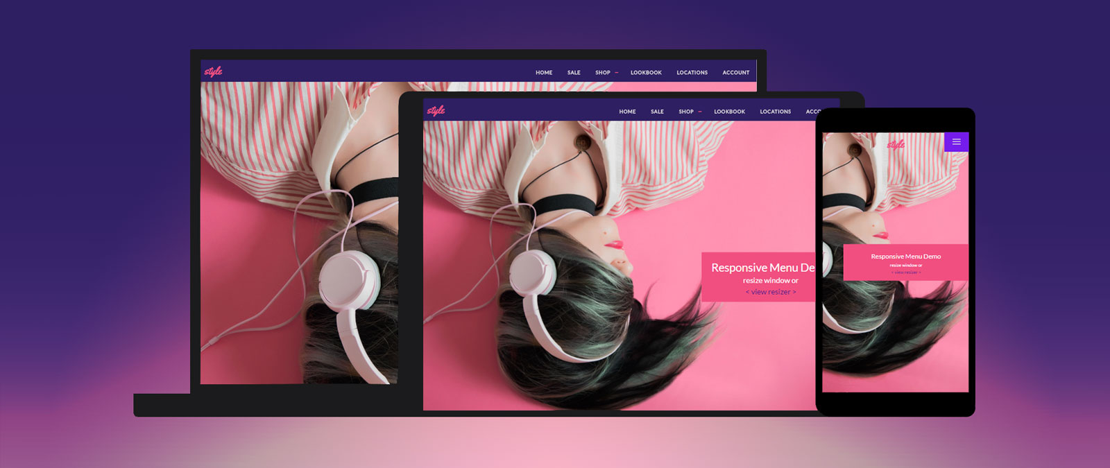
To illustrate, I’ll walk you through a simple responsive menu design that takes a horizontal menu and converts it into an off-canvas menu when the screen size is 768 pixels or less, covering tablets and smartphones. Then I’ll show you how to handle converting a more complicated menu that has drop-downs, pseudo-elements and transitions into an app-style mobile-friendly vertical menu.
Each menu has four main parts:
- The element the user taps to access the menu, affectionately called a toggle
- The menu itself
- When the conversion should happen
- How the conversion happens
You also need a viewport meta tag in your
to keep things straight, but hopefully you already knew that:<meta name="viewport" content="width=device-width, initial-scale=1">
Off-Canvas Menus
While we’ve seen off-canvas drawers in web design for awhile now, the introduction of Google’s Material Design pattern library for mobile design is now being adopted by web designers looking for solid guidance for mobile-first websites. The off-canvas sidebar or menu is Google’s recommended style for mobile navigation, as it works well with most devices and layouts. You don’t need to follow the menu’s design guide in detail if you don’t want to, but can follow its advice in terms of spacing and behavior.
See the Pen Responsive Menu With Off-Canvas Sidebar & Animated Toggle by Vail Joy (@vailjoy) on CodePen.27486
In our example, the menu is made up of an extremely simple unordered list.
<ul id="nav">
	<li class="toggle">
		<div class="bar1"></div><div class="bar2"></div><div class="bar3"></div>
	</li>
    <li><a href="">HOME</a></li>
    <li><a href="">PORTFOLIO</a></li>
    <li><a href="">BLOG</a></li>
    <li><a href="">CONTACT</a></li>
</ul>
For an off-canvas menu to work by sliding in and pushing the layout over, you need to wrap everything in a div. This div needs a relative position at a minimum (so our absolutely positioned elements know where to sit) and ideally a transition to make its change flow nicely.
.container {
    position: relative;
    transition: all 0.3s;
}
1 – Menu Toggle
This menu has more text links than can comfortably fit on a smartphone screen horizontally, so we need to convert it into a vertical menu. To make our user experience better, we want to give users a menu toggle to access this vertical menu. While the burger menu is quickly falling out of popularity for desktop website design, it remains the most familiar interface element for mobile users to identify.
We could make the toggle its own element that sits outside of the menu, but for this implementation, placing it inside the menu allows us to write less CSS and jQuery to handle it’s changes and will hopefully lead to a more consistent display and behavior across all devices and mobile browsers.
I’ve chosen to create this icon out of divs rather than use an icon font or unicode character, as it will allow us to animate it with a transform into an X when the menu is open. Here is how the three bars are created:
#nav .toggle {
  display: none;
  position: absolute;
  left: -55px;
  top: 0;
  cursor: pointer;
  background: rgba(0, 0, 0, 0.6);
  padding: 15px 15px 10px;
}

#nav .toggle .bar1,
#nav .toggle .bar2,
#nav .toggle .bar3 {
    width: 25px;
    height: 2px;
    background: #FFF;
    margin-bottom: 8px;
    transition: all 0.6s;
}
We don’t want the burger to be visible on the desktop layout, so we use display: none; as a default state. The button is positioned at the top left of the off-canvas drawer. A common mistake is positioning toggles in terms of the desktop design – an over-complicated way to go about it. Always pair the toggle with the element it controls.
The height and width of the toggle are determined by the padding, ending up around 55px square. Apple’s iPhone Human Interface Guidelines recommend a minimum target size of?44px?wide and 44px?tall, while Microsoft’s Windows Phone UI Design and Interaction Guide suggests a touch target size of at least 34px. Android uses the dp unit in its design standards, recommending 48dp which translates to 48px on most screens. Our 55px ensures we’re covered.
Finally, the transition on each bar handles the duration of the transform we will add when it is tapped or clicked.
2 – The Menu
This particular menu is styled very simply. The important bit is the inline-block property used to set each list item next to one another, a preferred method over using floats. In the next section, you’ll see how these primary declarations change to turn the menu vertical.
#nav {
    text-align: center;
    margin: 0;
    padding: 15px 0;
    width: 100%;
}

#nav li {
	display: inline-block;
}
3 – Media Queries & Click Events
This @media query applies the enclosed styles only when the viewport is 768px wide or smaller, the typical size of tablets and smartphones. Be sure to view the CSS tab of the demo above for the full code. Below highlights the important parts of each style that change from the original styles:
@media (max-width: 768px) {
  .toggle {
    display: block;
  }
  #nav {
    width: 230px;
    height: 100%;
    position: absolute;
    top: 0;
    right: -230px;
  }
  #nav li{
    display: block;
  }
  #nav li a:hover, #nav li a:focus {
    border-color: transparent;
    background: rgba(0, 0, 0, 0.5);
    color: #5cd;
   }
}
First we change the display: none; on our burger to display: block; so it is visible.
Next, we change the width of the nav to 230px from 100% and give it a height of 100%, where before it was resting at about 75px, an adaptive height based on the nav link font size and padding.
The nav is positioned absolutely using a negative value equal to its width which is used to offset the container moving 230px to the left which we’ll get into in the next section.
To get our list items to stack horizontally, we reset the inline-block with block.
Finally, in keeping mobile users in mind, we need to add a :focus state for when each link is tapped, as hovers won’t take effect on a touch-screen. We still add the :hover state to this rule for desktop users that may just be resizing the browser window.
We want the toggle to open the menu when it is clicked so that it works well with touch devices. We also want the menu to slide in and move the content over rather than drop-down or overlap. This helps avoid issues with long menus or widges covering up the content, prevents unwanted scrollbars and avoids issues with the menu getting clipped by content such as Flash or Canvas elements with a higher z-index.
To handle the click action, we’ll use a very simple jQuery snippet:
$(document).ready(function(){
	$('.toggle').click(function(){
		$('#nav').toggleClass('open');
		$('.container').toggleClass('menu-open');
	});
});
This will detect a click (or tap) on the toggle and add a class of open to the #nav and a class of menu-open to the main container wrapping our layout. These classes will allow us to apply the transforms that tie it all together. Remember to add the jQuery library to your project so it works!
4 – Behavior
Now we get into how to make the menu behave nicely with CSS3 transforms. We’ve just added a jQuery snippet that adds a class of menu-open to our container div when the toggle is clicked. We can add a style rule for this class that moves the container left with translate (and everything in it other than the absolutely positioned elements). We use a negative value to move the container left, as our menu is on the right.
.container.menu-open {
    transform: translate(-230px, 0);
}
To change our burger into an X, the .open class is used to set a combination of rotate and translate that moves bar1 and bar3 into a diagonal, and hides bar2 using opacity. You could use display: none on bar2, but then it wouldn’t take advantage of the transition effect and would just blink out of existence.
#nav.open .bars .bar1 {
	transform: rotate(45deg) translate(8px, 7px);
}

#nav.open .bars .bar2 {
	opacity: 0;
}

#nav.open .bars .bar3 {
	transform: rotate(-45deg) translate(7px, -6px);
}
That is the basics of converting a horizontal menu into an off-canvas menu using media queries, and using jQuery to detect the click event to display it.
In this next example, I’ll show you a more complex menu and how to work with specific issues like drop-downs and how to detect screen widths with jQuery.
Multi-Level Mobile Menus
I won’t get into the details of this menu’s design – check out the code tabs in the demo to see how I used flexbox for the layout and some basic transitions with changing height values for the drop-down effects. Below, I’ll focus on how to convert these kind of menus with several top-level links, multiple levels of sub-menus, and the need to be aligned with a logo in the same header element. We need most of the horizontal menu’s behavior and layout to change on mobile devices, but the visual style to remain consistent.
this menu uses several of the techniques you’ve already learned from the last example, such as transforming the burger menu and adding classes with jQuery to control the behavior. Below, I’ll focus on the mobile menu in particular to highlight the major differences.
See the Pen CSS3 Responsive Menu Mobile -Touch-Friendly by Vail Joy (@vailjoy) on CodePen.27486
Inside our nav we have three primary elements, the logo, the hamburger menu, and the main menu created from a standard unordered list.
<nav id='flexmenu'>
    <div class="logo">
      <a href=""><h1>style</h1></a>
    </div>
    <div id="mobile-toggle" class="button"></div>
    <ul id="main-menu">
		<li>...</li>
         <ul class-"sub-menu">
           <li>...</li>
         </ul>
        <li>...</li>
        ...etc
    </ul>
</nav>
This is followed by our content container, which we want to move down when the mobile menu is toggled open. Like the other menu, this requires us to add a relative position at the very least:
#main{
    height: 100vh;
    width: 100vw;
    position: relative;
}
1 – Mobile Toggle
The toggle in this demo is a separate div outside of the main menu structure. We could do it the same way as the previous example, but menus generated by systems like WordPress don’t allow that, so giving it its own element in the markup is easier to deal with.
When styling the toggle, keep the recommended touch sizes in mind, and give it a high z-index to ensure it never gets covered up by the content it overlaps. To keep the toggle in place, you will also need to absolutely position it. Since our menu will expand from the toggle, rather than from off-canvas, we can use a normal value here.
.button {
    background: #751CEC;
    width: 60px;
    height: 48px;
    position: absolute;
    right: 0;
    top: 0;
    cursor: pointer;
    z-index: 10000;
}
The toggle itself is created from pseudo elements in a similar way to our last toggle, making it easy to transform into an X later.
2 – The Menu
We don’t have to do much to style the menu in its mobile state beyond resetting styles in the horizontal menu that cause problems. Most of the work comes into play whe dealing with the drop-downs. You could always force all sub-menus to be expanded as the default, but this can lead to long menus that force scrolling – a problem in itself. It is better to turn them into accordions that expand when tapped. compare the original and mobile rules:
#flexmenu ul ul {
    position: absolute;
    left: -9999px;
}

#flexmenu ul ul ul {
    margin-left: 100%;
    top: 0;
}

@media screen and (max-width: 768px) {

    #flexmenu ul ul,
    #flexmenu ul ul ul {
        position: relative;
        left: 0;
        width: 100%;
        margin: 0;
        text-align: left;
    }
}
In our sub-menu style, the drop-down is given an absolute position to stick it under its parent link, and a negative value used to create the shuffle effect when it is hovered. The tertiary menu gets pushed over 100% the width of its parent using margin so it pops out to the right. We reset this for the mobile version so the sub menu simply follows it’s parent. Since there is no hover, we also don’t need the position trick.
3 – Media Queries & Click Events
You’ve already seen the media query used to house our mobile menu’s styles and resets, so I’ll skip right to the jQuery.
Here we use jQuery to do two things: detect clicks to add CSS classes, and detect the screen size to make sure classes are removed for cases where the page is not being reloaded between changes.
When elements with the button class are clicked, a menu-opened class is added. If it is clicked again, the class is removed.
$(this).find('.button').on('click', function () {
    $(this).toggleClass('menu-opened');
    var mainmenu = $(this).next('ul');
    if (mainmenu.hasClass('open')) {
    mainmenu.slideToggle().removeClass('open');
});
This also adds an open class to the submenu elements it is affecting, which is used solely in the next query, though you could use it in CSS if you wanted to.
- Here, we find all instances of an
lifollowed by aul, indicating a submenu exists, and add a class ofhas-subto that submenuul. - All items with the
has-subclass get a drop-down toggle with the class ofsubmenu-button, which is styled in our@mediaquery. - When the
submenu-buttonis clicked, it gets a class ofsubmenu-opened, and the open class is removed from any siblings and aslideTogglejQuery animation added.
This is the basic anatomy of what creates the accordion, and how we can manage the styling of these elements in the most efficient way without writing separate click events for every selector or a ton of unnecessary CSS.
flexmenu.find('li ul').parent().addClass('has-sub');
	subToggle = function () {
	   flexmenu.find('.has-sub').prepend('<span class="submenu-button"></span>');
           flexmenu.find('.submenu-button').on('click', function () {
              $(this).toggleClass('submenu-opened');
              if ($(this).siblings('ul').hasClass('open')) {
                $(this).siblings('ul').removeClass('open').slideToggle();
              } else {
                $(this).siblings('ul').addClass('open').slideToggle();
              }
	  });
	};
Finally, let’s add a resize fix.This just ensures things happen the way we need them to if the browser is being resized, in the event styles and queries the mobile view depends on are not properly triggered.
resizeFix = function () {
	var mediasize = 768;
	if ($(window).width() > mediasize) {
		flexmenu.find('ul').show();
	}
	if ($(window).width() <= mediasize) {
		flexmenu.find('ul').hide().removeClass('open')	;
	}
};
resizeFix();
return $(window).on('resize', resizeFix);
4 - Behavior
The final touches on this menu involve transforming the toggle, and sliding down the menu.
First we will take advantage of the .menu-opened class added to our .button toggle by jQuery on click to add some style changes and a transform to rotate the bars into an X:
.button.menu-opened:after {
    transition: all .3s ease;
    top: 23px;
    border: 0;
    height: 2px;
    width: 19px;
    background: #fff;
    transform: rotate(45deg);
}
.button.menu-opened:before {
    top: 23px;
    background: #fff;
    width: 19px;
    transform: rotate(-45deg);
}
The transition takes care of making the change between states appear smooth. Learn more about transitions here.
That's it! The menu is a block element, so it will naturally push the content container down.
Conclusion
As long as you apply the basics of mobile navigation to your responsive menus - ensuring links and toggles respond to taps, are large enough, and the transitions simple enough to work on most mobile devices and browsers, you shouldn't run into many problems.
Responsive is a special art that takes a lot of research and understanding of user behavior, CSS units and overall design, but understanding the basics of how you can convert menus and which tools help you the most will get you on your way to coming up with your own implementations that fit your project the best. Below are some resources going into more detail about the techniques used here, and where you can find more awesome examples.
- Google Material Design on Mobile Navigation
- Android dp/px converter
- A Collection of Responsive Menu Demos
- Things to Be Aware of When Designing Responsive Menus
- Responsive Design patterns from Google
If you have questions, feel free to ask in the comments.
Designix
I just found out the blog, great tips.
Patrick H. Lauke
Crucial aspect missing here: keyboard accessibility. If a non-mouse, non-touch user can’t open the menu…
David Mills
I do not remember seeing a non-mouse, non-touch user menu for a long time, valid point, do you have an example of a menu that is CSS mobile responsive and non-touch, etc?
Ali
Nice article. thank you. but about the demo, I don’t think pushing body contents down is a good idea, this behavior usually ends up in a laggy experience in most of the mobile devices
Danny
What about IE when using “display: flex;” ? Can you provide any solution for this, especially the 2nd menu example, too?
Beside that great article.
Alok Halder
Hello, this is the best guidance, All matter is step by step and easy to understand. Thanks for sharing.
Ian
Awesome article, thank you!
On Windows 10, viewed in Chrome, there appear to be toggling issues.
– the hamburger doesn’t always change to and X and vice versa.
– the – / + sign on some resolutions for the sub-menu is misplaced mid screen for a smaller resolution it appears.
these issues are fixed on a refresh, but re-manifest themselves on use.