Previously I wrote a tutorial on mobile navigation, today I’m going to share a CSS tutorial on how to make an expandable search form that is suitable for mobile and responsive designs. This trick uses native CSS properties — no Javascript or extra markups required. It is a simple and effective way to design a compact search form.
The Purpose
On mobile display, every pixel counts. To minimize the space required to display the search form, it is displayed in a compact form and then expand to full width on :focus. This way more space can be used for other interface elements or content area. Check out the search form on Web Designer Wall and Best Web Gallery for a live demo. When you click on the input field, it expands to full width.

On Best Web Gallery, I use jQuery to fade in the search form when the search button is clicked. I use focus() function to set the input to :focus stage so the user doesn’t have to click again.

Let’s Start: The HTML Code
Below is the sample HTML form. It uses HTML5 search input tag.
<form>
	<input type="search" placeholder="Search">
</form>
Reseting The Default Webkit Search Input
By default, Webkit browsers style the search input like the screenshot shown below:
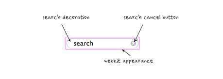
To remove the default style so it looks like a regular text field, add the following CSS:
input[type=search] {
	-webkit-appearance: textfield;
	-webkit-box-sizing: content-box;
	font-family: inherit;
	font-size: 100%;
}
input::-webkit-search-decoration,
input::-webkit-search-cancel-button {
	display: none;
}
Styling The Search Input (view demo)
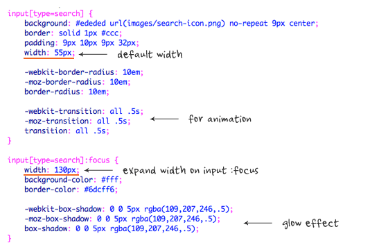
I’m not going to go through each CSS line because it is straight forward. Note that the search input width is set at 55px and it will expand to 130px on :focus stage. The transition property is the trick in making it animated. Box-shadow is used to make the glowing effect on the input.
If you need help on the border-radius or box-shadow CSS3 properties, read the "The Basics of CSS3" article.
Example B (view demo)
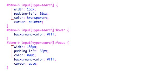
In Demo B, the search input is further minimized – only the search icon is shown without the placeholder text. Note that I changed the padding and width property on the search input to display a perfect rounded button. I used color:transparent to make the text invisible.
Browser Compitability
It works on all major browsers such as Chrome, Firefox, Safari, and IE8+. It doesn’t work on IE7 or older because IE does not recognize search input and :focus pseudo-class is not supported.
75 Comments
Comments are closed.
Gian Luca
First of all, cool search bar and great site.
Then, as I was reading this post, I tried to select the css code aaand… I found out that it’s an image. Seriously? On a website about web design you use images to contain your code?
Nick La
What’s wrong with using the search icon image?
Glen
I think Gian Luca is referring to the screenshots of the example code, not the search-icon.png.
Just clarifying a bit.
Nick La
@Glen – Thanks for the clarification.
@Gian – Illustration is easy to explain what the code does. To copy the CSS code, simply view the demo page source.
Gian Luca
I know that I can copy the code from the example ( that’s what I did!) but, as Luca said, code and pre are more elegant, provide a better user-experience (copy/paste, zoom, etc) and, you know, images should only be used for images (yeah, call me a semantics nazi if you want :) )
Again, amazing work and amazing site.
Theus G.
It seems Gian Luca rather have something easier to copy and paste. Copy and paste? Seriously? LOL!
Luca Rosaldi
You got a problem with copy and paste, Theus? I assume you never copied and pasted anything in your life as a designer, have you?
That’s just a matter of speed, actually: it’s faster to copy/paste the code in the tutorial than to open the demo, view the source, look for the CSS part and copy/paste the CSS.
As for using an image, I agree with Gian Luca: and
are way more elegant than a JPG, and you could use CSS comments to explain the code.That said, Nick, terrific work as always. ;)
Luca Rosaldi
This is the part of the cooment that looked weird, I should have escaped the characters:
As for using an image, I agree with Gian Luca:
<pre>and<code>are way more elegant than a JPG, and you could use CSS comments to explain the code.Emyr Tabrizi
Nick makes a great effort to illustrate how things are done. If you look at the images, they clearly underline areas of attention in red and there’s helpful descriptions. You don’t get the same effect using code . . . .
Nick does it his way and his way rules! If you need the code, use the demo. simple.
Gian Luca
This is just wrong, there’s the possibility of selectable code AND syntax highlighting,. For example, here: http://trigger.io/cross-platform-application-development-blog/2012/03/02/how-to-build-fast-html5-mobile-apps-using-backbone-js-zepto-js-and-trigger-io/
Liam
Emyr didn’t say anything about syntax highlighting, he was mentioning the annotations Nick added to the images.
Chris
Excellent, I’ve been looking for a way to “facy up” the search box in my site, and this along the use of the “placeholder” attribute (HTML5), will make a difference. I looked at the code and I think I can make it work in my site. Thanks.
Mike
Great post … Does it degrade gracefully for older browsers?
Jaap
It simply won’t expand it to 130px. The search functionality will still work just fine. If you are worried about browser support, you can use something like Modernizr or conditional comments to add a Javascript fallback. Or, the other option is an IE only stylesheet.
Luca Rosaldi
I think Modernizr with
.no-csstransitions input[type="search"] {

    width: 130px;

}
is the way to go.
Mike Miday
awesome stuff Nick! If not for the responsiveness just for the safari fixes to alter the styling of the search field . Kind of off topic but when trying it out on your site to see how you implemented it I notice the subtle hover over your twitter and rss icons that shows the followers. Was wonder if you are using a plugin or if its something you put together your self and if you could possibly tutorial that as I have been having issues trying to implement something similar myself for a redesign.
Nick La
I Googled the code. Try ‘wordpress twitter follower count’ and ‘rss subscriber count”.
iDream
It’s true what they say ‘It’s all in the detail’, lots of small things like this make such a big difference, helps take something from being average to the next level.
Nice tut as well, very easy to follow.
tanu
nice tutorial
Charlie Lyons
Thank you so much for these helps. I’ve used both the search form above here as well as your CSS instructions for a customized search/submit button. (They’re both on my website above, if you’re so inclined.)
With that in mind, having utilized your coding, do you require a reference somewhere in a resources section on my site? Thanks.
Rocky
Wow! it is really simple but very effective! Thanks for sharing this tutorial, I learned a lot from it..
ddsign
Great idea!
Business Website Design
Great, we have a new web app coming up which we are doing some mobile development for. This would be of use!
Cheers
Ben
Toan Nguyen Minh
Great idea. I’ll use this tutorial in my next designs. Thanks Nick!
mYTurn
wow all expertise are debating, cool:)
well I’ve been checked nick’s other site he works hardly right?:)
Venkat
Love this Search Box Idea. Simple and Effective.
Debbs Hosting
I’ve come across themes that had built-in search boxes but I think it is better to manually input it to the website. Thanks for sharing. Really appreciated the tutorial as well.
Produce Your First Website
A nice, clean and simple search box design. Great tutorial. Thanks.
Bharat Chowdare
Fantastic stuff! Thanks Nick for writing up a tutorial on expanding search bar. Like it!
Chris Devlin
Search box in a website is important and effective one. It will be very useful for the mobile users where they tend to search for their needs in the site… :)
JTech Web Design
A simple straight-forward search form that is easy to implement. It should fit well in many mobile application designs.
Time
this blog is great, thank you
Hajj Packages 2012 From UK
Thanks for sharing good posting in your blog. I like it. Love this Search Box Idea. Simple and Effective.
modernlogodesign
You have truly been an inspiration. Nice work
saha
Best for mobile search. Very effective and compact search form. I will definitely try this script. Thanks.
Gaslight Creative
That’s cute. Thanks!
Der Applejünger
Thank you for sharing!! ;-)
Luis Angel
This was what I was looking for my responsive project. I like it because it only uses css, js isn’t necessary. Thanks Nick for your post.
creati5
wow, great
creati5
thx for sharing
Natasha McEachron
Cool! Really great solution for getting around the issue of space on mobile devices. I’ll have to try this out.
Website Design Lover
Well I liked it a post that you have left here and I feel happy by reading it because the post has actually peaks my interest. I would like to thank you for sharing your thoughts and time into the stuff posted and look forward to more great posts!
Agencja reklamy Bielsko
Very nicely written article. Thanks for sharing your expertise. Certainly come in handy.
jared
I recently tried to add something like this for a client in their mobile app and it came out pretty sharp.
Julia Mitchel
Thanks for sharing. It’s very nice to have all the needed stuff in one place.Really great solution for mobile devices.
Nimsrules
Great job. I like the way you’ve incorporated it in your sidebar.
Dexter Adams
Very smooth performance.. Love.
naresh
Nice effect.
Thiet ke logo
I have followed your instructions,
was successful
thanks!
Sky: loifresh
Mysite: http://fresbrand.vn
Davy B
So goooood
Yates en Ibiza
It’s very nice to have all the needed stuff in one place.Really great solution for mobile devices.
Mohit Seth
This is a great article / tutorial for 1 of responsive design technique. I have implemented similar search box for 1 of my client.
johanso
good job, provided these tutorials will be useful
babyBride
Nice tutorials and pictures.
rickymartin
It’s nice. Thanks for sharing.
Ruud Voost
Always kind of wondered what the real purpose is for this. I do like the idea but I’ve yet to see a really good example of this in the real world. (Yes I do know that you use this too, but I think you could’ve done a better job there,…)
Though thanks for sharing, don’t get me wrong, I do like the idea!
Kind regards,
Ruud Voost
http://www.creativitea.org – your daily cup of inspiration
aditia
It really nice, we don’t even have to use css transition property
Web Design Malaysia
this is definitely gonna go up on our next project!
Ibiza
I do like the idea but I’ve yet to see a really good example of this in the real world. (Yes I do know that you use this too, but I think you could’ve done a better job there
jared
I’ve been thinking about adding this type of search for a new site I’m working on
kartofelek
Maybe i have to big fingers, but for me it is difficult to tab on that small search.
For me this search should be 2x bigger
seo
this is definitely gonna go up on our next project!
lisaflorence
Great Article.Thanks for sharing.
http://qtechie.com/mobile/mobile-ui-development.html
Spy Bubble
Thanks a lot folks, love this search form thing.
Alquiler yates Ibiza
I do like the idea but I’ve yet to see a really good example of this in the real world. (Yes I do know that you use this too, but I think you could’ve done a better job there,…)
Phil Smeeton
Thanks for the article, I will have to give this a try on my site.
Wordpress installations
Choice, I think we have a similar thing on a couple of our premium themes. Cheers :)
mike kenny
I am having the web developer I am working with put this search feature in our wordpress theme which is responsive design. This should really help http://www.shamrockbonding.com.
Brianna Deleasa
I love incorporating interactive elements like this on websites, though I hate the limitations caused by IE7. I still can’t believe there are people out there using IE7.
Tony Porto
This works excellent for having different styled search bars based on screen width, I def advise to use the CSS above to remove the default style.. I was not able to get it working without it.
mejiwara
Nice! Very useful :)
Afzal
I will impliment all your logics in my website.. You have given broad information regarding mobile search.
Online cleaning supplies
Hello !
This post consists of lots of nice ideas. I really liked the all the post. Two things that I liked the most are the use of jQuerry and second one is expandable search form. Both the demos of expandable search form are quite nice.
Thanks.
Online cleaning supplies
syed
I wonder about webdesignerwall.com .. It’s amazing blog & for me you got five star rating..