Usually, I keep the sketches of every project I designed and use them as simple documentation. Sometime I might refer back to the old sketches for ideas and references. Here I would like to share my development process of Web Designer Wall with you. This article will show you how WDW is done – from start to finish.
Concepting
The design you see now is not my original concepts. I actually been through two versions before I finalized this one. Let’s take a look at my original concepts:
-
Computer desk
My initial concept was to have a computer desk with an iMac or G5, bookshelves, magazines, plants, sticky notes, and a pull-down tag cloud. Then I thought it might look too similar to FreelanceSwitch, so I trashed it.
-
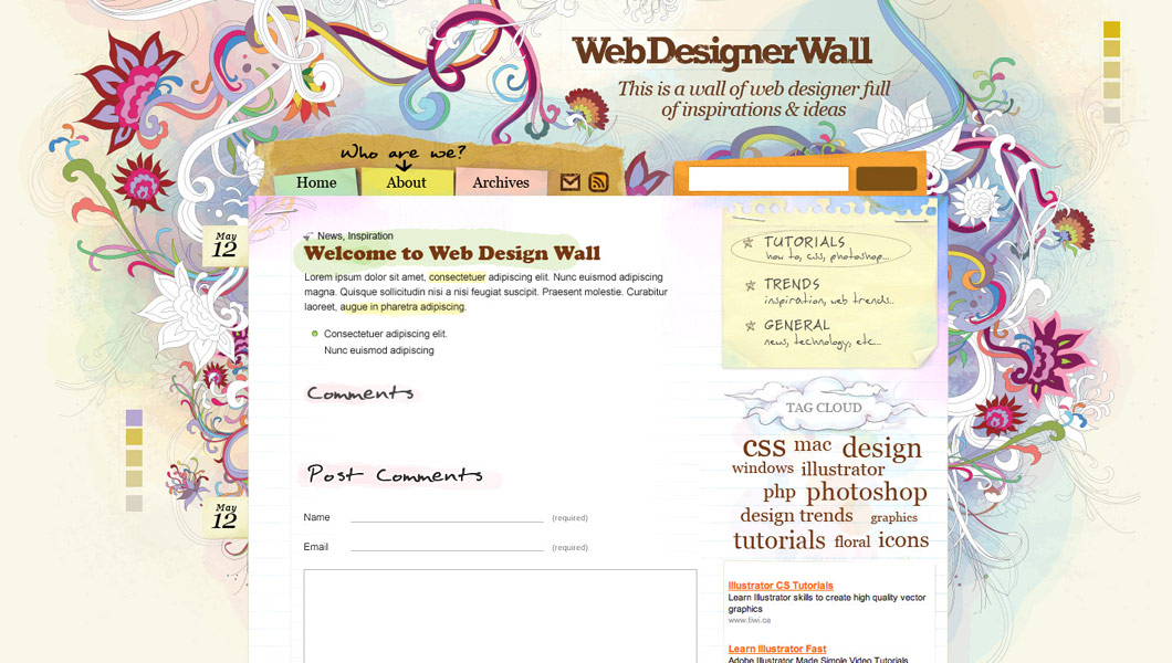
Wall concept
Then I came up this "wall" concept – a lot of sketches on the wall, a bookshelf, some design books & magazines, a Flash ticking clock (just to look cool), Ajax calendar on the sidebar, and some stickies.
Photoshop comp
Here was my first comp of the wall concept. I didn’t like this comp at all. Somehow it didn’t turn out as nice as on the concept sketch. Plus it looked too much like this site. Then I wanted to try another direction…

Another direction
Later, I saw a flower sketch that I drew (for fun) long time ago and I thought it might work on my design. I quickly scanned it and put in my Photoshop comp. I like it a lot!

Final
Finally, I decided to use the flower design and traced it in Illustrator. I chose watercolor style because I wanted the theme to look artsy and sketchy. The tag cloud actually took me a lot of time because I wanted to design a very unique cloud. I tried pull-down tag cloud, but I didn’t like it. Then, I ended up with this plain and simple tag cloud. Here are some more development screenshots:


222 Comments
Comments are closed.
sean3
I really like this design…and I wish I could translate the designs I have in my head to the canvas in photoshop the way you have.
rzepak
it’s fantastic! i love it
Aaron
This is the most beautiful site that I’ve seen this year! The Post-Its, the flower sketch, the wordpress tag, the paper – unbelievable work man!
Tebo
Great job man!! I really love it
AJ
Of course I hate to see more competition, but this is a fucking unbelievable design. Great job !
Russell
Congrats Nick! Everything looks awesome!
JPH
Great looking design. Lots of good information.
Harry
Brilliant! Not many people can make this design work and keep it consistent. Really great look and functionality, love the AJAX effects too, maybe a tutorial on the show/hide comments…?
Timothy Diokno
Oh my God Nick! You did it again!
Elliott
Glad you finally got the site up, Nick :) I’ve been waiting patiently ever since you posted the news on Ndesign-Studio on the 18th :D
Brian Gardner
LOL, just kidding. Stunning work Nick, this puts my stuff to shame. I wish I was a better Photoshopper, b/c that’s my Achilles heal. It’s amazing how graphics can turn a nice theme into something beautiful.
You should be very proud.
Brian Gardner
Ooops, I used arrow brackets for the first part which is why it didn’t show…
(takes screenshot of the world’s best looking wordpress site, so that I can copy every element and claim this masterpiece as my own)
LOL, just kidding. Stunning work Nick, this puts my stuff to shame. I wish I was a better Photoshopper, b/c that’s my Achilles heal. It’s amazing how graphics can turn a nice theme into something beautiful.
You should be very proud.
giacomo coppola
It’s an amzing design.. wow!!
I love your style!!
Bárbara
This is a great design!
I always love you work. Congratulations!
rrmleroux
Freakin awesome!
João
Wow, it’s amazing.
smoke
you’re doing really alot of hard/nice work, God bless you on your effort, really,…
Terri K
My heart went in my throat when I read you ditched a “Computer desk idea” cause it would be too much like freelanceswitch.com. That sounded like my site’s concept!
But when I checked freelanceswitch again, no worries. I’m going for a full screen illusion of the viewer’s desk. I also checked teamviget.com and I’m pretty far from that too. Wheew.
Really breathtaking job you did here, by the way. It’s rare a design forces you to smile! Congrats.
Brynn Shepherd
Wow, this is a fantastic site! One of the best I’ve seen in a long time. Amazing job!
Chris Burrows
Wow! What a great site! Was worth waiting for! Well done!
nubloo
Great site, fantastic design. You must be the man ;)
Congrats!
lester
Pretty……. !!!!! Very cool. Thank you.
Nick
Thanks guys!
I’m glad you guys like it.
David
Wow Nick…
You really have done it again… just amazing what you can do with art :)
Calvin Chan
This is great! I’m so inspired! I wish I have artistic skill like you. Keep up the great work! -Cal
Rob
Great looking site man. I’m definitely throwing this in my feed reader!
Drew
I would love to know how you ported your design over to WordPress.
Damo
WoW…. Best design I have seen this year. Congrats… I will be keeping a eye on the RSS feeds if this is what I get treated with on every visit.
Ness
(posted on CSS Beauty as well)
Waooo, this is by far the most beautiful webdesign I’ve ever seen ! Congratulations !
It’s really original, blends beautifully traditional art and easy navigation…
Funny thing, I planned on doing somehing like this for my blog. But now, of course, I’ll take another direction.
Only one thing : the previous page and next page would look better if they were handwritten as well.
(by the way, I’ve done something not very different from your site concept with my website, and it was really, really fun to design !)
Nico
It is just … bellissimo! I loved also this article, that shows up your work development. Grazie mille!! Go on like this!
Chike Loney
Great work man!! you are fantastic!
I was wondering can you put up a tutorial or a link ot a good one on how ot go from a ps template to standard css markup ?
thanks
Chike Loney
Selena
Beautiful! Here’s another tutorial request for how to go from photoshop to css to wordpress. This is very inspirational!
Mehmet
Amazing! Keep it up.
Paul Annett
Love the design! The stapled bits of paper really remind me of my wife’s scrapbooking (example). I hope you don’t mind, I’ve added a screenshot to my design inspiration Flickr set. I used jaunty tabs and torn paper on my old freelance site, too, although it was nowhere near as beautifully arty as this design.
Ruthie
Loving it! Really do!
Thanx for sharing! Learning a lot from you!
Ruthie
James
First off, nice looking design.
However, you still have some display issues because of the fixed pixel widths. It’s mainly the top menu and bottom “recent comments” bits.
Great work so far. Can’t wait to see how the blog goes. ;)
Ryan
I really liked the design on your other site, but I believe I like this even better! I’m a big fan of mixing realistic items with more traditional website elements. It creates a nice juxtaposition and interest…
Anyway, the place looks great and the content looks like it will be just as nice!
Andrew Green
What a magnificent design! And these walkthroughs of the design process are always very welcome reading, whether they’re from the artistic end of the spectrum (such as this) or the functional (such as the Design Decisions series on Signal vs Noise).
Jermayn Parker
I have to give you credit for breaking the mold of boring alright. I like it…
Reading your articles now mate
MyDooM
Nice Design…. And Good Working
Dani
This is the most beautiful design I’ve ever seen in my life
James Deer
Absolutely amazing, this is very inspiring work, great job!
Mac
Yeah ! great design, I love it
Silent Witness
Freaky…nice colors and I very much like the flowers. Just great!!
Aaron :: miLienzo.com
Simply beautiful design from top to bottom. I absolutely love it.
Much kudos! ;)
LaurenMarie - Creative Curio
I hope you will write some tutorials on how you create your style. I love the fantasy look of your work! It seems we could learn a lot about Photoshop and Illustrator from you!
Ritchie
Wow I like the background. So colorful and very artistic.. nice one..
ozgurra
especially. footer very good
Nacho
Awesome! Really awesome. Page looks beatiful and loads in a flash.
Congratz
Laurent
very … very beautiful website
Ethan
wow, I love your work. even just the sketch one
ismael
One day i want to be as good as you.
perfect example of hard work paying off.
n
Really inspiring this website. The design is so characteristic. Congratulations.
aldomatic
I’m loving the design
Lori Marshall
This is beautiful and exciting work! The whole site is informative, friendly and amazing. Great job!
Zaoris
Nice of you to share this out, that’s really pro work there.
Excellent done!
t3hSLR
I wish I could draw, too. seems like you create the general layout before bringing in ideas about graphics. I’ve tried so far getting the site to fit the graphics, not vice versa.
– t3hslr
Jenny
It’s a beautiful theme. I love it.
Thanh
I’m insanely jealous of your mad design skills. The flower illustration really makes an impact – in fact, it’s so good it almost seems it should exist in the real world on paper or something we can touch and oggle!
Eian
Nice work, your works gave me a total new direction of web designing.
Really talented
Muhammad Abdusamad
Awesome design. Totally changed how i view the design process. Need to hone my illustrator skills. By the way, where did you study? or are you self taught? Thanks again for the inspiration.
h-yaman
good share, thanks
ocube
Lovely design (always loved your work).
Any advice on how to get into wordpress (I mean skinning it with your own design)?
eshark
Wonderfull theme! thanks for sharing..
rhodri
Wonderful, I learned some things. Thanks
Alejandra
¿WHAT IS THE SOFTWARD FOR THIS, FOR DRAW? PHOTOSHOP?, IS NOT EASY DRAW IN PHOTOSHOP.
pens
Hello nice blog! !!
pen
It’s my new page.about pens.
Mai
I love it!!! i could really use some help on my scholarship Design Contest!
Fabiana de Oliveira
I´m brazilian, and your site it´s incredible!Wonderfull!!!!!
mocir
very good
cootchill nelson
Wonderful, you really inspire me in my architectural design concept.
Thank you
Alvin
Great work! Your design is simply fabulous.
shoesonline
Hello! nice blog!
boob
My sites
n1ghtfly3r
cool stuff!!!
System Crasher
Hi! I think that this design is awesome! :-D
I’m a blogger and I’d like to get a “stylish” design for my WordPress powered blog: could you help me please? We could discuss the details. Please tell me what do you think about this proposal.
Best regards
Brian Khouw
Wonderfull job Nick, I love all the little details, it’s fantastic.
Danilux
Your site is breath taking awesome, i wish you could make a list of must read things to learn in Html and Css to do something like this brilliant design.
Roxanne
You’re highly creative and artsy. This design is beautiful, but you already knew that. Great job. =)
asrai
Hi, your site is awesome! really.. uhm I have one question if for example you were to design a “my computer desk” theme, is it legal to use a picture of a macbook (from Apple’s website) as an object in a design? or do we have to buy it from a stock site?
thanks in advance..
Arrisje
Best design I have seen in a a long time. See, now you make me want to learn how to do that to :) You are a true motivator. Keep those tutorials coming.
Agus
well…very nice, great design but I think too long for scrollable up and down…maybe some user cannot expected if your comment on this website had 100 comments :D..just my suggestion…put another link page like “next page” option ..hehe…
loretta
very nice!!! so cheerfull
kablo kanalları
thanks
aydınlatma
good source.well done
Allen
Wonderful, i like it!
nenad
perfect!!
phillip
man awsome work, im starting a web design site withing early 08, and i browse your site for all my insperation. your helpinng me make my $30 designs actualy worth $30, thanks.
aydınlatma
perfect design ,thanks
www.r10.net Küresel Isınmaya Hayır Seo Yarışması
Really perfect design.
wmwebtr ödüllü seo yarışması
Very good sources thansks.
Tullio
Thanks a lot for this…:D
I’m going to try to have a similiar process of making web sites…since i guess it’s going to feel more pro! :D
Great site btw.
Tom
Great website. Much respect from me. Never seen something like that before.
Gunjan
awesome work, haven’t seen before!
WMR
I am really struggling giving my site a professional look. I don’t have sufficient fund for hiring professional designer and am decided to do it myself and learn to design and develop .
Thank you very much your articles. The site is becoming my first hand resource :)
Estela
I love all the little details the site has. Congrats.
CiCi
You did give the cold computer world a fancy feeling! It is so comfortable to come here! Thanks for sharing!
e-okul
thanks you nice.
tedavisi
Great website. Much respect from me.
Lazer Kesim
very useful post thanks
Emprenye
I am really struggling giving my site a professional look. I don’t have sufficient fund for hiring professional designer and am decided to do it myself and learn to design and develop .
Dizin Directory
thanks for this useful resource
Al Fox
You do great work. I love your site and visit often. Keep up the great work!
John
WebDesignerWall.com is one of the innovativest design of a website I’ve seen in a pretty long time.
Very very nice concept and a great mix of structure and playful graphics.
Wonderful work. Keep it up.
JM
bweb
It’s very very good design, and it’s nice to see its evolution :)
Nielle
Thank you for the process… I am stuck now on how to go about creating my online portfolio…. I need more ideas!
Kanal Temizleme Araçları
useful post thanks
MyBB
thank youu
davetiye
very good
söve
thank you vey
mirc
icon currently in use does a far better job than any of the proposed replacements at stating clearly and unambiguously what it signifies …
Penny
I love your design, especially for the flower design use in background. I like artcraft but I don’t have much creative ideals. So need to find some ideals from your webpapge. Thanks
Kent
I like your design but, do you think that the flower background is a little too distracting?
Alain Fiscalini
On which CMS you based your web site?
shannon
thanks so much for sharing this; i think the design of your site is very striking, and it’s cool to see the creative though process that went into building it. I disagree with Kent; I don’t think the flowers are at all distracting. It’s a gorgeous site, and quite useful as well!
Runy
Hi,
I’m amazed. Just one month ago I got to know WordPress (probably the CMS you are using. Until now I did not like sites which use WordPress because they all look like each other. You are one of the first artists who managed to get the art and your idea on the top of the WordPress and make the CMS disappear. This does not look like a cms/wordpress sites at all.
Really amazing how you created the ilusion of the wall.
How can I contact you to design my corporate site for me?
Runy
ilahiler
thankss
Goos design
Good to see that all designwork still starts with hand sketching.
pradip patel
I like artcraft but I don’t have much creative ideals. So need to find some ideals from your webpapge. Thanks
Kelly Janes
Shock! wonderful!
Kelly Janes
icon currently in use does a far better job than any of the proposed replacements at stating clearly and unambiguously what it signifies …
I like the concept!
twinx
erm – WordPress
retrato
Thanks for posting.
Sohpet
Sohpet Web Thanks Wery it Respct Sites.
Sohpet
Good site
Çet
Web Çet Sites
Çet Sohbet
Wery Nice
Çet Sohpet
Ohh yeah
Damar Sözler
Damar
güzel sözler
Güzel Sözler
Kısa Damar Sözler
Kısa Sözler
özlü sözler
özlü
Aşk Sevgi Sözleri
Damar aşk sözleri
wizsa
how did you made the background to adjust to differents resolution. you maked with jquery or only with css.
please help with this subject, i have basic skills…
Flavio Mendes
Parabéns pelo site.
otantik mobilya
thank you
Svetlana
Very nice!!!
The flower drawings are very beautiful!!!I wish I could draw such things)))))
Antonio Ferraioli
Fantastic :)
Douglas Hsieh
Which tool do you use to trace an image on Illustrator?
Kayseri Dostlar Emlak
goood
Romy
Great! I’ve seen your N.design studio, and learn a lot from it. But actually this site has more!
branding & design nottingham
It’s interesting to see the design and thought processes behind one of best sites around!
kral oyun
Thanks for posting.
Webdesign - Henning Nielsen
Very creative. Nice wall you got here… I like the color composition.
Serenis
Nice! It’s always interesting to see the work processing. btw, i saw a site using this flower pattern that you use in your site. Just wonder did they get permission from you or not ;)
http://www.yukishop.cn/
gLENN
I like your web design process sir!, Perfect!
joan iguban
i’m inspired. please keep it up!
QualityWebDesigns
wow, lovely.. I dont have words to explain how am i feeling after reading this
TaY
wow..great wall..perfect
Neta
thx… that’s great
benny
It’s really cool, thanks
autolux
hey this is really a great site, thx for all the information on design!
dfs design www
i too trying made webs like that – 1stly design on paper, next on PC. But sometimes my draws looks bad :) then i dont design on paper, and start design on PC… btw nice article.
Shilvi
great work….
Abdul Qudoos
awesome, really amazed
neta
great blog!!!
Iure Vieira Guimarães
Hello!
Man, your job is very good!
I’m from Brazilian, and i do no speak in very english!
I do speak: to be continued your work!
very thanks to you man brother!
I is hope responses, if want to send!
Thanks!
ntas
great blog!!…. perfect
nia
your design very nice..
nia
hello. hope you send many tutorial about illustrator…coz i want to learn anymore…thankz
mstanseen
so nice
thanks alot
and be sure i will put copy of the lesson here in my sit http://www.mstanseen.com
Bradpitt
hello. hope you send many tutorial about illustrator…coz i want to learn anymore…thankz
Michael Garmahis
Here are my thoughts about Web design process
Paul Muyeshi
How do you make the large flower background to download fast?
Thomas
i dont know if it’a a part of wordpress but could you post any tutorial how to make such thing: when you click on a photo it enlarges but not in other window but in the same (with dark background)
Spike Rory Morris
@ Thomas,
I think you’re referring to a Javascript script called ‘Lightbox’. It’s a free, simple little script that you can run with a tag, providing you upload the free library files required (tiny) to your web server.
The Lightbox (2) homepage is at
http://www.lokeshdhakar.com/projects/lightbox2/
If you’re looking to use it with wordpress, then there is a wordpress plugin that has been adapted from the Lightbox script. You can find the plugin here:
http://wordpress.org/extend/plugins/lightbox-2-wordpress-plugin/
‘Lightbox 2’ Google
http://www.google.co.uk/search?q=lightbox%202
-Spike
Kp
Looks really cool, thanks for the behind the scenes.
wildstylegrafix
I just came across this site through reading a ebook and am very glad I did cause your design work and tutorials are amazing and very informative.
Amazing work, keep it up !
ina
is a e very nice
hey nick
hi, nick… how you create a paper effect, i try that is so hard
Web designer cape town
Excellent techniques, you really inspire my to be more creative and with you showing the details I can sure try and apply them
cheche
i love you guys!!!! u’re so great..=)
cennet
Thanks Thanks What’s the problem here? Google could bury the meager profit number from even the biggest media conglomerates.
Aoobi
How do you make the large flower background to download fast?
bagsin
i dont know if it’a a part of wordpress but could you post any tutorial how to make such thing: when you click on a photo it enlarges but not in other window but in the same (with dark background)
Cyrus
Great , Design Process of WDW
Great article. CSS saved web design
Cyrus
Visit http://www.psdtoxhtmlcoder.com
James
Thanks for Share your idea
Pol55
You are working with an erroneous premise and trying to make my words fit. ,
Mike
Wow, thanks for sharing.
CristHoz
In spanish, Me gusta mucho el proceso que llevaste en el diseño. espectacular…. tanks
vincentdresses
The designs showed here show what simple and tasteful design is all about. Another one to consider
söve
Great post.Thanks
darsh
good…………
CFM
could we use this for our blog template? it’s absolutely fantastic, the colours and the design is beautiful.
Kimi
Very nice…………
khay
thank you so much for sharing. i like it :p
diedy alla
wow…so beautiful laa
Jerky Oats
Good blog, it shows the working process of the new website design and development very well. Are you guys going to be using any flash on the site?
Thanks for sharing
facebook
sharing your exprince as a professional designer is a very good work deserve my full respect thank you
Melvins
I must say that the whole design of Web Designer Wall is really attractive and the posts regarding web design on this site is very useful. I like the graphics used in WDW.
Los Angeles Web Design
replica sunglasses
thank you so much for sharing. i like it
tütüne son
I must say that the whole design of Web Designer Wall is really attractive and the posts regarding web design on this site is very useful.
mikwillson
Your article’s resource box should help to persuade your readers. No matter how amazing your article is if it’s not succeeding in driving traffic to your website cheap uggs
Henry Peise
People think that iphone 4 white is better iphone 4 black. Is that ture? Here you can judge by yourself.
Juno Mindoes
Great news! White iphone 4 Conversion Kit is now avaible! With hottest White color outlook can certainly catch your eyes and heart!
Uçak Bileti
kardeş biz bütünüz
Ben
Thank you for everything!!!
tütüne son
Good blog, it shows the working process of the new website design and development very well. Are you guys going to be using any flash on the site?
solagirl
Hello,
I’m from China and I’m very impressed with your design. The comment preview function is great! Thank you for your great work!
I’m building my own wordpress blog and your blog has given me a hit in mind!
altın çilek
really, I do not know what to say. But thanks so much.
dashawk
Thank you for the great tutorial. I have read all your tutorials and I am very much satisfied with the results. I also have a tutorial website at JasonTechTalk – Everything Programming. I cover a few categories on programming and windows tips and tricks. Thanks a lot.
شات صوتي
thnks
goooooooooooooood
min:(
taem
kilo aldirici
ignore weight
leo
good post
(:
fantazi ayakkabı
really, I do not know what to say. But thanks so much.
Chris
Your design process gives me inspiration to start working on something. The only problem is I can’t draw and don’t have illustrator. I do have inkscape, but have yet to use it.
anket doldur para kazan
Really great, thanks a lot.
Serena Kang
Hi, I found your blog by accidently, and I’m also dreaming of being an artist in 3D field using Photoshop & Illustration, I was looking for some informations about design, and I feel lucky for having your tutorial site! ^^
Thanks for your offer and also giving such a nice inspiration about Design :)
Your blog are already got the my most fave list !
Siraceddin El
Great post but this site is changed :) It’s nostalgia.
complex41
Complex 41 saç bakım seti, tamamen bitkisel ve doğal içeriği nedeniyle güvenle kullanabileceğiniz bir üründür. complex 41İçeriğindeki bitki özlerine
(55 çeşit bitkinin özü vb.) aşırı hassasiyeti olan kişilerde saç derisinde bir miktarkızarıklık yapması doğaldır. Bu durumda kullanım sıklığını azaltmanız tavsiye edilmektedir.
juan flores
well im sw developer but in the desing im pretty noob well now im discovering ilustrator thanks this post thks
complex 41
hello thank you for this great post 23
M Francis
Great share! Keep up the good work!
söve makinası
I like artcraft but I don’t have much creative ideals. So need to find some ideals from your webpapge. Thanks
söve makinası
Great post but this site is changed :) It’s nostalgia.
sövekent makina
Söve makinası imalatı yapıyoruz Söve makinası imalatı yapan bir firmaya neden nofollow link ekeldiniz bilemiyorım
Joel
I like the wall idea better then the current site.
Feels a little cluttered and chaotic.
Web Design Pasadena
Great article! I like how you take the time to sketch up ideas before you actually get into Photoshop and make a mockup. Sometimes that is the best way to be more creative.
resimler
The closing date is May 2012 right ?
Russell Rixie
Hey, you used to write excellent posts, but the last few posts have been kinda boring… I miss your tremendous articles. Past several posts are just a little out of track!
Yates en Ibiza
I like how you take the time to sketch up ideas before you actually get into Photoshop and make a mockup. Sometimes that is the best way to be more creative.
Mark
Hi Nick,
i like webdesigner wall, but in my opinon, your previous design with the flowers was much better, than the actual one.
Greetings
Mark
黄辉泉
I love the WDW so much.