Previously, I have featured David Pache of Dache on WDW, an amazing logo designer from Switzerland. He is known for designing unique and colorful logos. I’m very glad to have David to share his design process of the WebMYnd’s logo. This case study (written by David himself) provides full creative brief and progress images from start to final. Read on to find out how David got inspired by Wassily Kandinsky‘s art (one of the most famous 20th-century abstract artists) to create this fantastic logo.
Introduction
Last year, I was approached by a startup who required a logo in order to launch a business in the US. The WebMYnd team were 3 MIT and Cambridge University graduates who were very passionate about their product. They had acquired seed funding from ycombinator an outfit which picks enterprises to back and who have an excellent track record. WebMYnd have a product which is a plugin for your browser that turns your web browsing into an extension of your own memory. it allows you to keep a copy of everything you look at on the web, and then allows you to search actual page images and text when you need to remember something again.
The creative brief
The main aspect of their brief was to create an identity which would communicate the idea of collecting everything you look at on the web in one place and to inspire the idea of extending your memory. They wanted to make a tool that people would prefer to use in place of the old fashioned way of bookmarking and tagging websites. They also wanted the logo, or some element of it, as a button to indicate when the plugin was in use therefore colour was of great importance.
Getting started
Initially, I took the brief at face value and brainstormed some ideas. I wanted to create a concept using the initial from WebMYnd and the first concept which was produced as as follows. The simple lines created an abstract reference to a brain (an idea which the client had experimented with but did not like the appearance of a brain. This design captures the essence of a brain but at the same time forming a ‘W’.

This concept was discontinued however as the ‘W’ was not clear enough and it did not have the presence that the client was looking to achieve. I therefore focused on colour and did some research for inspiration.
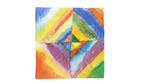
I am a great fan of the works of Wassily Kandinsky, a Russian artist, printmaker and theorist. One of the most famous 20th century, Kandinsky has been credited with painting the first modern abstract works. Below is one of these works from which I took inspiration as to the colour palette which may suit the WebMYnd logo. The use of colour is broad yet it is not offensive on the eye and stands out enough to intrigue the audience. This is what I wanted to achieve so all I needed now was the correct design to show these colours.
Drafting and development
I consulted the client and the idea of creating a monogram using the ‘W’ and the ‘M’ was decided on to take the project forward. Below are my initial sketches.

The first of these above gave the best line to work with however I did not like the linear aspect as I would be unable to use enough variation of colour within a single lined image. Below are my developments of the first idea into a two dimensional concept and intersecting these shapes with differing elements to allow me to fill with colour.

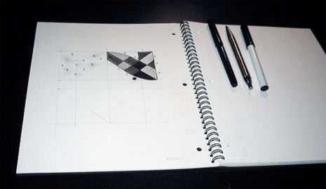
After some re-drafting of one of the concepts, i decided on a wholly symmetrical design where the ‘W’ mirrored the ‘M’ therefore I transferred the design to the Dot Grid Book below. As the design had four elements which were identical in design, I was able to just concentrate on one element which could be copied and rotated at a later stage using the computer software.

Colours
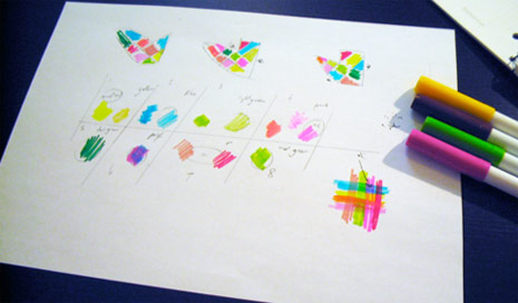
Once the four elements were plotted and finalised, I looked at possible colours. Below are some combinations which I experimented with.
I finally decided on the colour scheme below using quite vibrant colours to create a presence but trying not to use garish tones which would offend the eye of the audience.

Final colour placement and concept presentation
I tried many combinations. When dealing wit the use of colour in this quantity, it is a case of trying until you find the right solution. Below is the finished design which was selected by the client.
![]()
Delivery and feedback
The client initially loved the concept and used it for a number of months however after some further discussion between themselves, they decided to choose a different design to move forward with however they still retain the rights to the design, should they wish to implement it in the future.
I would like to thank the creators of WebMYnd and wish them every success for the future. It was a pleasure to work on this project and this design is one of the more popular with clients when they see my portfolio. Of course, I welcome any comments regarding this specific article or my design process in general. Thanks and enjoy!
Credits
This case study is written by David Pache. Want to submit your article to Web Designer Wall? Please contact me.
Marko Kolar | graphic design blog
great work! thank you for sharing your know-how
Pontus Madsen
Very interesting read, thanks.
Chri
really nice!
Todd Smith
Awesome design. Thanks for sharing the process. I especially love the final result of the color combinations you chose. I can imagine it would be a lot of trial and error. I love the result.
Matthias König
Nice! Funny that i am redesigning my CI right now. Thanks for sharing!
Albert Araalie
Hi,
David, do you paint or draw? Are you an artist? I wonder if it is possible for someone without natural art/drawing talent to really go into logo and other designing.
It looks like you need to have some more than average art talent to pull such designs off.
:)
Thanks for the tutorial.
mojitopl
It is always useful to watch others working. Thanks a lot fro sharing
João Henrique
Thanks for the tutorial!
>>www.swebstudio.com.br
Will
Looking at your design and the design their using on their website now (http://www.webmynd.com) I think your is a much better design and concept. Great to see your process!
Manuel
Nice article. I like the way it is presented.
Manuel
…but why is the background in the last pic so colourful? Does not look very intentional?!
john doe
I think in truth nice process but your logo looks a lil phallic …
mokin
I agree >> john doe
craigH
Web mynd`s new logo sucks. Your design is ten x better.
antonio
It’s good
Steve Johnstone
It’s a shame you didn’t end up continuing with the first idea, as I prefer logos that hint towards what the company or product is about. Thanks for giving us this glimpse into logo design, definatly appreciated!
Mike Rohde
David, thanks so much for sharing your process here — it’s great to see how yo go about solving challenges from sketch to final art.
As a designer, I appreciate seeing how my colleagues in the field work, which encourages me to do the same.
Great work David, I really love the final solution you came up with!
John MacMenamin
Great logo and very interesting work flow. Thanks for a great post.
matt
I would have to completely agree with #9 Will. I immediately went to try to find what they decided upon. If the logo on their site is it…they made an awful choice. Their’s is so damn generic it is ridiculous.
Zach
I like how he turns to other artist’s for inspiration. That’s something that I’ve gotten more and more into as I start experimenting with mediums more and more. It’s a sweet design, I like it a lot.
Zach
Yea and I can’t believe that’s the logo they’re going with now. Way to be an individual.
joyoge designers' bookmark
nice work and tut. thanks..
Alberto
really great work flow, one more time art background it’s so important for visual work….stunning logo!!!
_megankish__
Thank You! What a great process. I always wondered how people come up with such great organic shapes – i have such a hard time with that. I will definitely have to give this a try.
PS: I agree with “CraigH”, you’re design is 10x better!
Timothy
Nice post. Pretty informative.
Elizabeth K. Barone
I love this logo! It seems to really symbolize the mind; bright colors for creativity, and the mosaic pattern sort of resembles a brain.
Thanks for sharing your design process. It’s always great to see the process other designers go through.
Soh Tanaka
Great article and great result on the logo!!
Kayla
Great design process, I love the use of color
me
great work! :o)
David
Wonderful! Nice result!
Tom
I’ve hired Dache in the past to create a logo for one of my clients. He truly does great work and I’m happy to see he’s continued to raise the bar with each project he does. Good stuff David!
Multidesign
Sweet logo. I love the colors!
Kyle Racki
So interesting to see the use of markers. I always start with either pencil or pen sketches and move to the computer for colour. I might give markers a try next time!
Rui
Markers! What a great way to explore colours. Thank you for this informative post.
Robbi
Wow, right, where do I begin!? It looks like it’s been done so simply, but that’s a bloody art, the finished work is stunning. Amazing article, can’t wait for the next!
henry
Great article, and awesome logo, but cant help feel the logo is a bit too colorful for all scales and media types.
Call me out of date and old fashioned, but i thought that logos had to work in black and white, but i guess if its only going to appear on screen then it can be in as many colors as you like.
Johan Lorentzon
Thanks for the thought process. Me myself liked the final result very much. Great job!
William Rodriguez
Beautiful final result. I enjoyed reviewing your cretive process. Thanks for the insight!
clairem
Thank you, its great to see how other people work. thanks for sharing :)
Rich
All I can see is a speckled frog. Ug.
Jeff Deibel
I enjoyed seeing the process from early stages to the final result. I am sorry to hear they chose to discontinue the use of your design. I looked at the new logo on WebMYnd sites and was less impressed.
I think this logo would translate well to a single color. Although the rainbow of colors give the logo a certain pop, the structure of the design is very strong and distinct. I’d recognize in B&W just as quickly, a testament to a quality of the work. Plus, it definitely leaves a lot of room for making fun color variations of the logo, a trend I have been seeing everywhere.
Good Job David.
Webdesigner
Wow, thanks for the in-depth info about the process.
Thanks for the article.
Krystian
I’m curious where to get knowledge about designing such a impressive and creative logos. How to deal with long / short names in logo projects. What colors, how many, etc. Maybe you could write something more about special technics?
Regards, great job.
4psd
Realy nice article! h5
Stunt
wow best tutorial !
dterror
Gee, loved the logo. Kinda agree with henry up here, but it’s so different from anything else that it makes it powerful.
Asi Epshtain
Very nice work and a very good color pallete. The bottom typography can be a bit improved in my mind, it feels colder and too techincal to fit the illustrated logo. Still, a very intresting piece.
Thanks for the case study.
p.s. – just checked up on what logo they went with eventualy, what a shame. I think this one is much better.
Day Two Webdesign
Hi, nice work.
However, one thing missing -imho- in your design process is the use of a mindmap (step 1) in which all communicative associations to the brand you are creating the logo for are in. From there, you can choose different ways to go in your creative process.
Good luck!
John Pezzetti
Thank you for the look into your process! I dig the logo, but the part of this post that I’ll take with me is that the clients decided to go a different direction… as a young designer this happens all the time and its reaffirming to know that even the best get turned away some times.
Ryan Bollenbach
This is a really awesome article and provided great insight for me.
I find experimentation is essential to any piece of design and I like how inspiration was garnished in this logo.
I really enjoyed the process of sketches. This is very valuable and a cool alternative to just cracking open illustrator and going straight through ideas that way.
Md. Shibbir Ahmed
I needed my boder. Do I want boder
Miss Blossom
This would be a great resource all those people who think a logos is just typing a word in a “font” and moving a couple of ovals into an ellipse…
Lovely process, great result. Really innovative and inspiring.
Miss Blossom : )
fractalfrog
Very interesting article and the final result is tasty to say the least. Colorful and bold, but also unique and way more memorable, than their current very generic and boring looking logo.
I do however agree with Asi Epshtain(#48), that the typography below the “mark” could greatly be improved. Feels rushed and in all honesty a bit lazy to simply use the very generic looking Helvetica (Neue?) after all the excellent work that went into creating the mark.
I shouldn’t be too harsh though since that could have been the choice of the client and I’ also aware of the fact that I, as a designer, hold very little love for Helvetica. A brilliant font that is terribly over-used.
Overall, impressive work.
JackF
I think that is one of my favourite logos around right now.
Carlos Hermoso
Nice logo design process. You might like this logo or not, but you wouldn’t say it’s not colorfull, would you?
Kevin
thanks for your process.
I hate making logos, and thank God when the client has one already.
Nice to see the evolution.
melody
im a fan :)
Himangshu Das
Great Post!
Keep it up.
Ronnie
I really enjoy seeing the process that other designers go through. Thank you for sharing. The end result is beautiful. Keep up the good work.
Amjad Iqbal
thanks for your process! keep it up.
Susanne
this shows it again: web design and logo design are art! Wonderful, creative work and very interesting description of the process. Thanks!
Prosopo
Good article.The way you illustrated process of designing logo is very nice.Keep coming more:)
Dave
I really like the simple Brain Logo, I would have like to have seen that developed alongside the Kandinsky’s colour palette. The final solution was good but the brain actually captured the function of the tool much more effectively. What they have now is just cop-out.
Everett
I like the logo, I went to go and see what they eventually went for and I must say I think they took a step backwards. It’s too … how do you say … Bland! It has nothing to do with what they stand for? It’s just 4 transparent blocks. I might be wrong, everyone is entitled to their own opinion. Thanks again! Great site!
galactiklaus
I agree with the last comment – I like the unique nature of the logo described in this article but I can say – you will never know what corps are really after and what inspired them with their choice. Good Job mate!!!
Robert
This is some awesome logo you made here!
Really cool to see you adding some painting in the logo :)
Keep up the good work!
Jatupong
I would be your fan too.
Silvia
Really interesting post. Thank you for sharing.
I do like the logo a lot and find that it has a uniqueness to it that just sticks in your head.
I’d say you have created a very strong identity here!
As someone mentioned before, it would have been interesting to see how the initial brain-shaped logo could have evolved, as it was probably more meaningful to the project.
Mark
This article is great because it details the design process and how the designer took the time to understand their clients solution and how it would help people. Creativity can be subjective and being in this business myself you try and point the client into what appeals not just what ticks their personal box(es). Achieving both of these is design genius!
MONZERRATT
I AM STARTING IN THIS AREA, I WAS LOOKING FOR SOME TIPS TO DESIGN A LOGO TO A PROJECT TO MY SCHOOL,
THIS ARTICLE SHOW US A PERFECTO WAY TO DESIGN OUR OWNS LOGOS.
I THINK IT’S GREAT & VERY EXPLICIT.
I WISH I WERE TOO CREATIVE TO DO THOSE TOO GREAT AS THIS.
: (
m&m
Jennilyn
I really love the logo. It combines with the amiable, attractive, suitable colors. Very interesting and so creative. Keep up the good work!
sonapie
i saw the current logo and i dont like it…it’s one of the same….
Andrew
Ouch! WebMynd.com current logo looks too common and can easily done by a grade school student. what a shame to change the logo. I’m now beginning to believe that beauty is in the eye of the beholder is true.
Nerdvana
Once the logo is designed, do you have any sort of method to test it for distort-ability? By that I mean some litmus test for a logo that distorts it in ways that the end-user might experience it (skewed, upside-down, etc.).
I wrote a quick bash script on Nerdvana that does something like that, but I would certainly appreciate any feedback you have, or tips to that end. Read the post about strength in branding.
Thanks!
Lorena
Very interesting post… liked the creative process of materializing the idea and the final design you got. Pretty neat. Thanks for sharing!!!
Andrew
A very inspiring showcase indeed :)! There is an interesting blend of ‘tribal/psychedelic’ feel in the way the icon is made. I love the analogue approach.
Yes, I wholeheartedly agree with many posters in regards to the current (today’s) logo of the website – it looks mundane and repetitive.
Seth Etter
Amazing showcase! Great insight on your design process, and a great read overall. :)
Colin
Allow me to be a contrarian here–I like the one they ended up choosing better. Yours isn’t ‘techy’ enough–and honestly feels a little unprofessional.
Sorry.
Enjoyed checking out your process tho… keep on keepin’ on.
Jan
Nice colors! It’ great to see when people deviate from something traditional.
Mat
Fantastic tutorial. It’s always nice to see how everyone else tackle the biggest part of a brand (the logo).
Brian
Thanks so much for this insight into the ‘dark-art’ of Logo design.
The final product looks great.
caroline
I checked out their new logo. It is awful.
caina
i don’t like the numer of colors that u use, but if the like.. its mean something like music! :D
Mark
Yeah I agree that the colors are probably too much but definitely love this tutorial and overall feel of the logo!
@caroline – yeah I don’t see how their current logo really fitting into what they are doing. awful, simply awful!
Sergio
Ups! How can anyone call the new thing a “logo”. The isotype shouts “lazy designer here!”. My work is also inspired by Kandinsky, but I’m very far from David in both, style and quality. :P
I think all designers must read deeply ‘Punkt und Linie zu Fläche’. I believe that the title is ‘Point and Line to Plane’ in english, y ‘Punto y Línea soble el Plano’, en español. It’s more easy to understand than apply what he tell us. At least for me.
Erik @ Logo Critiques
It’s always nice to see other designers processes. Thanks for giving us a look. I enjoyed seeing your exploration of the ‘w’ & ‘m’ monogram. Great job!
MartynJ
He is an amazing designer, Great article!
keda
Nice. I like the idea. Enjoy to read your blog!
Chris
No offense to the creators of the current WebMynd logo, but they should’ve stuck with yours! It’s much nicer.
don
great way to create identity, i confess i’m bad for this, i love to create interfaces instead of logos, but this is for sure a great article about logo creation
khalil
Great work my friend … Actually the process you choose to go through is the best way and I almost do the same, when you start specially a corporate identity, better to put all your lines and curves on paper and try to test the intersect lines and colors as you did, which give you wide picture of how the logo will look like. My rules in doing a logo is as the following:
Simple, Strong, less and attractive colors, meaningful, pay more time on the idea not the graphics.
Thanks again on this case study :)
Tz Church
Excellent insights into the logo creation process. Thanks a bunch.
Keith D
Great insight.
All looks very easy until I try it myself…. and then it’s not so easy.
Thanks
Keith D
Tim
You make it look to easy. Great work.
eviezee
Whilst your design is far more creative, striking and better executed, I believe what they are using now better represents their product. I don’t regard it as better design, but – IMHO – it does the job of conveying ‘technology, simplicity and modernity’.
Thanks for sharing – interesting reading.
Grafiko
Love the final design. Great use of color.
Raphael M
Work would be much better if there was no clients. Awesome design btw.
Krewnich
Very interesting design process, thanks for sharing!
I think the current WebMynd logo, altough better serving the purpose and better presenting the WebMynd service, is far inferior to the logo you’ve made! I love your logo, amazing work!
Reinis I.
The current WebMynd logo? Bleh! What were they thinking!
Deepak
very smooth process…Really nice
Brian Vanaski
Great work on the logo. I enjoyed hearing about your creative process, especially seeing your initial sketches.
facu
Muy buen trabajo, me gustó el uso de colores, saludos!
sean farrell
Hey David,
Great article and insight. I went to their site and was suprised to see such a “blah” logo. Just four transparent boxes overlapping one another..
Yours seems to have much more character and thought put into it.
Great job
Michelle McCarrick Truett
If I NEVER see 4 overlapping boxes like their “new” logo again, it’ll be too soon! ugh! Yours has so much more of a story to tell… too bad they had to get swayed to BlazeDesignLand!
Rudi
WOW you have a lot of idea to design something …
thx for givin me inspiration man, keep sharing :)
Ruth
Love your design.
Had a look at the logo on their website and was stunned to see overlapping semi-transparent boxes. Your initial concept is great!.. I would have chosen that one too.
Benedikt R.
Thank youfor this article – pretty interesting.
I think this is a very professional workflow for creating a logo.
The paper drafts are best works, I think :P
Diarmuid
Oh my god… clients clients clients… you gotta thrust the designer… you gotta buy into the whole process and at the very least thrust the professional and educated opinion of the designer. The logo above is far more interesting than what you currently have on your website. I say bad move WebMYnd…. and well done on your logo David Pache of Dache
ice
I love the shape of logo but too many colors on it.
chad
It looks like a quilt my mom has hanging in her room. Very disconnected from an internet branded company. It would work on a youth group camp t-shirt though.
tim
looks better thats for sure. kinda looks like a frog.? ya
cennet
Thanks Thanks What’s the problem here? Google could bury the meager profit number from even the biggest media conglomerates.
cennetevi
Thank =)=)=) you http://www.cennet.gen.tr webdesignerwall Thanks
Astho
good inspiration.. thanks
Rebecca Westby
Masterful work on the mirror-image letterforms. I agree that there may be too many colors to make this a truly successful logo, which may have contributed to them abandoning it, but I think what the company has now is a watered-down concept (too many members on the committee?) that has no individuality. Yawn….
christy
GREAT logo. Was curios to see what they changed to…..boring.
Not only is it boring, I do not see the correlation as I did in David’s design.
We can make and explain our suggestions, but cannot force our creativity on clients.
franky
Nice color combination. Love it.
KJL
It looks like a quilt my mom has hanging in her room. Very disconnected from an internet branded company.
Test
Doe these comments really work?
bagsin
Nice color combination. Love it.
Cyrus
Great , Dache: Logo Design Process
Great article. CSS saved webdesign
Cyrus
Visit http://www.psdtoxhtmlcoder.com
Suzan
google
Nebz
Dache’s logo looks great but between Dache’s and the current logo of WebMynd, I’d pick the latter. The concept of W and M is great but why the colors? I agree with KJL (fashionow.net); Dache’s logo did look like a quilt.
Coder45
Herman Menderchuck,Can you explain to me everything that has existed thousands of years before your existence? ,
Mike
Thank you to the writer of this post!
Akinnard
Its great! do not understand the people saying they dislike it,
vincentdresses
喜欢你们的设计与技术,常来看看
ewitttas
this is perfect logo design process describe here, thanks for guidance
Jack
Hi there,
I love this tutorial and the way you shared that’s lovely, It really very great.
Neelakandan
This is awesome. Great colours and just love it. TFS
Logo Design Monster
I really like the colours that you have used together in this logo. There is also a nice shape to the symbol. Great work.
This is my first visit to your site and really think the illustration style is fantastic. Thank you for sharing the logo design process.
icecream冰淇淋
really great article!thanx。
köpek oyunları
logo looks great but between
Linda-logo design
This is absolutely gorgeous.I love the vivid colors specially the way they are meshed with each other.
Web Design
thank you for sharing with us. just what i needed
Aravind
Hi…This is really nice article and very useful to create unique logos.
Thanks,
aravindtemplates.com
Jon
Wow. Cool post. Hope I could design a logo for myself (one day, maybe) but I tried designing one for myself but in the end decided to use the professional services of an online logo design site instead after googling for one (http://www.logodesignplanet.com) and finally got the logo I wanted at an affordable price and fast too. Lesson learned. I’m not going to design a logo without any professional help though it’s somewhat fun. Hahaha…
Aurora
i just did a logo design project last semester, if my work was something like this logo, i thought i would get a full mark. The logo is just simple but fantastic!
Website design London
Very well written article indeed, it really helps me with my programming skills, thank you so much for sharing such information with us, i hope we will see more from author in the future.
logo design
Thank you very much for posting such valuable information. As i am associated with Web Banner Business, so i am very well aware of usefulness of the info..
Thanks again….
ball mill
Very beaulity! thnak you share.
Melvins
A good logo helps a company to have a professional and polished look. It is very hard to design a logo. When you design a logo, you have to consider the whole company and the product it sells. Logo represents your brand. So it is very important part of your business.
Web Design LA
Logo Design Mart
Beautifull logo design, thanks.
تقنية
that a wonderful loge design thanks
logo templates
Very nice and informative post. This is really helpful in creating effective colorful logos.
Thanks for sharing.
mary
Oh God you are a genius person and a good photographer i like your pics thanks.
Craig
Thanks for going through the design process for the WebMYnd’s logo, Thanks!
Las Vegas Web Design Company
Good tutorial for learners.thanks
Las Vegas Web Design Company
cil
Just saw WebMynd’s new logo. They should have kept this one, this is so much more interesting!
term paper
You are really genious!!!!
Juno Mindoes
People die for iphone 4 white is understandable, isn’t it? The reason is quite simple, We all want to be differnt!
Logos
A cool tutorial, thanks for sharing with us!
Henry Peise
People can have no interst in Nokia, Moto or other mobile phone brand, but he wiil surely love the apple offical white iphone 4.
mikwillson
That is to be expected in a long-term, high-risk project like ours. So, we turned to the blogging community for help – and got it! We have published our problems, and the community responded with results!uggs outlet
Uçak Bileti
kivircik ali ölmüş
Shailesh K
Hello this is a graphic designer and I can design a logo for you, and to inform you that I am soon to register my business for making logo and graphic designs, so if you are really intrested in making logo than please dop your message on my email and soon I will contact you, and start my work as soon as I get registered for my work.
thank you
from shailez
Creative Logo Designers
We are LogoProDesign as a Creative Logo Designer, We checked your artwork collections. Those are amazed us. Thanks for that type of good work collections. We regularly checked your website for good artwork example.
Thanks
David Thomas
Theraisa K
It’s always fun seeing another logo designers creative/thought process. Thanks for sharing
david
I agree with Cil, your logo is so much better and on so many levels, why would they drop that in favour of four coloured and uninspiring boxes.
Lichuan Zhang
u and ur site inspire me a lot !
Jim Lee
the color is sooo wonderful
Fabio
Student get more training in eu or canada then i in joy my life
trio@gcreatives
great blog post david, nice final logo.
syxt
Want to submit your article to Web Designer Wall?
Alejandro
I can’t believe they opted for red-yellow-green-blue squares instead of yours! I’m shocked. What a missed opportunity.
Sharon W
Nice logo, very colorful. Thanks for sharining.
goldenboyz
nice to see the whole process, a bit more details and this tutorial would be perfect. good luck
Jimmy Bovia
Hi! This is my first comment here so I just wanted to give a quick shout out and say I really enjoy reading your articles. Can you recommend any other blogs/websites/forums that cover the same subjects? Thanks for your time!
Fred
கலக்கல் … பின்னிடிங்க பின்னி
Matt M
Very inciteful blog! We put together a blog about our logo design process a short while as well – http://www.back40design.com/news/m.blog/22/logo-design-how-we-do-it
web前端寒风
好文章,好标志
Sherise
Oh thanks for this helpful peek at that process. I wish they had stuck with your logo! Not a fan of the squares or the type treatment that they currently have.
Moliva
Oh thanks for this helpful peek at that process. I wish they had stuck with your logo!
Piotr Płachta
I love this logotype ! Great Job .
The Logo Designer
Thanks for sharing, it really helps me gain a better undertanding of the design process from a different designer perspective. Love the colours…
ROSE
It happy for us to share .From this I know logo design process.thank you!
Thiet ke logo
I checked your artwork collections. Those are amazed me. Thanks for that type of good work collections. I regularly checked your website for good artwork example.
Thanks
bitkisel
Thank you Thank you!! This is organized very nicely
Ronilancer
Finally i gated a wonderful tutorial about logo designs.100 % not satisfied but I’m happy.
DesignFacet
Nice work, really enjoyed reading your process.
Richard Bland
Just working on my new company logo. I have the basic shape but making it into something extra special is proving difficult. Your process has given me some inspiration. I also happened to notice a Dot Grid in there… Fricking love them!, Got some on sale on eBay in the Uk: http://bit.ly/UJlMUZ – Someone may want one :-) Great work mate
james
Nice logo designing tips by david pache.
https://www.ababouinage.com/doku.php?id=profile_christianemchenr
I think this is among the most vital info for me.
And i am happy studying your article. But wanna commentary on few normal things, The website taste
is great, the articles is actually excellent : D.
Excellent job, cheers
www.out2go.de
Only wanna input on few general things, The website style and design is perfect, the written content is real excellent :D.