Previously I wrote two tutorials on how to style the image element with CSS3 inset box-shadow and border-radius. The trick is to wrap the image with a span tag and apply the image as background-image. However, I recently ran into a problem with that trick while designing the PhotoTouch theme. The issue is that the background-image is not resizable and thus it is not a good idea to use in responsive design. Fortunately, I found a workaround to resolve this. So today I’m going to revisit this topic again.
Problem
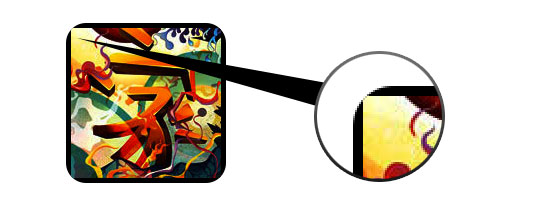
Most browsers don’t render the border-radius and inset box-shadow perfectly on the image element. This means you can’t make the image look like embossed, glossy, pressed, etc.
Previous Solution (see previous demo)
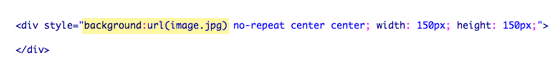
As I posted before, you can work around by applying the actual image as background-image.
Problem With Background-Image
Now the problem with using the background-image trick is that the image can not be resized dynamically. So it is not a good idea to use with responsive design where the images have to be resizable. This was an actual problem I encountered while designing the PhotoTouch theme for Themify.
New Solution!! (see demo)
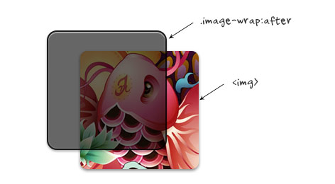
Then later I found another workaround using a similar trick. Instead of applying the image as background-image, I found that I can achieve the same result by applying the CSS3 effects on the overlaying image wrap :after pseudo element. The best thing about this trick is the image remained intact and resizable.
Dynamic jQuery
Again, jQuery is used to add a dynamic wrap to the target images. The jQuery function below looks for all images in the #demo container and wraps it with a span tag.
<script type="text/javascript" src="http://ajax.googleapis.com/ajax/libs/jquery/1.5/jquery.min.js"></script>
<script type="text/javascript">
$(document).ready(function(){

	$('#demo img').each(function() {
		var imgClass = $(this).attr('class');
		$(this).wrap('<span class="image-wrap ' + imgClass + '" style="width: auto; height: auto;"/>');
		$(this).removeAttr('class');
	});

});
</script>
Output
The above code will output the following HTML code:
<span class="image-wrap " style="width: auto; height: auto;">
	<img src="image.jpg">
</span>
The CSS Trick (see demo)
The CSS trick is very simple. The overlaying effects are applied to the .image-wrap:after pseudo element. Border-radius (rounded corners) is applied on both the image and image-wrap:after element to match the style.
CSS
.image-wrap {
	position: relative;
	display: inline-block;
	max-width: 100%;
	vertical-align: bottom;
}
.image-wrap:after {
	content: ' ';
	width: 100%;
	height: 100%;
	position: absolute;
	top: -1px;
	left: -1px;
	border: solid 1px #1b1b1b;

	-wekbit-box-shadow: inset 0 0 1px rgba(255,255,255,.4), inset 0 1px 0 rgba(255,255,255,.4), 0 1px 2px rgba(0,0,0,.3);
	-moz-box-shadow: inset 0 0 1px rgba(255,255,255,.4), inset 0 1px 0 rgba(255,255,255,.4), 0 1px 2px rgba(0,0,0,.3);
	box-shadow: inset 0 0 1px rgba(255,255,255,.4), inset 0 1px 0 rgba(255,255,255,.4), 0 1px 2px rgba(0,0,0,.3);

	-webkit-border-radius: 7px;
	-moz-border-radius: 7px;
	border-radius: 7px;
}

.image-wrap img {
	vertical-align: bottom;

	-webkit-box-shadow: 0 1px 2px rgba(0,0,0,.4);
	-moz-box-shadow: 0 1px 2px rgba(0,0,0,.4);
	box-shadow: 0 1px 2px rgba(0,0,0,.4);

	-webkit-border-radius: 6px;
	-moz-border-radius: 6px;
	border-radius: 6px;
}
Image Styles
Various styles such as embossed, cutout / pressed, and glossy effect can be achieved using multiple inset box-shadows. You can also use the :before element to another layer of effect such as glossy gradient. See the demo source code for CSS details. Resize your browser window to see the resizable images.

Browser Support
This trick works with most modern browsers such as Chrome, Firefox, Safari, and IE9+. Technically, it works with any browser that supports Javascript and CSS3.
97 Comments
Comments are closed.
Raksaka Indra
Awesome… especially for Cutout and Glossy Style
Colin Oakes
Nice job Nick! This method is way better than part 1, only problem is no IE7/IE8 support.
Emilio Cobos
But IE7/IE8 do not support border-radius and CSS3 (at least if yo don’t use behavior), so the result is a normal square image.
Luis
Oh my…why in the hell there’s always these people with the “but in IE” mumble rumble?!? This is a CSS3 tutorial for Christ’s sake! If this isn’t enough, you can read at very bottom of the article that “it works with any browser that supports Javascript and CSS3”.
Spke
You can use PIE CSS3 (http://css3pie.com/) if you fear is IE, PIE makes Internet Explorer 6-9 capable of rendering several of the most useful CSS3 decoration features, Try it!!
Nick La
PIE wouldn’t work because IE7 or lower doesn’t support :after element.
Rob
Why does anyone even care if a person who has chosen to stick with IE can’t enjoy a more aesthetically pleasing site? It’s not as if there is some barrier preventing them from installing a real web browser. If web browsers cost money, and there was hardship involved, I would understand. But there all free.
I agree with Luis, enough with this IE mumble rumble!
Art
I’m curious as to why you wouldn’t just apply the .image-wrap:after styles to the .image-wrap itself. I’m probably missing something trivial, but thought I’d ask.
Art
My initial tests seem to indicate that if you don’t use .image-wrap:after and apply all of those styles to the .image-wrap itself, excluding, content, height, width, position, top, and left, that you get the same results.
I’ll have to do more cross-browser testing, but This would significantly reduce the overall markup and CSS necessary for this approach.
Tim Hettler
@Art,
You need to apply the styles to the :after pseudo-element so that they appear “on top” of the IMG. If you apply the styles directly to .image-wrap, the IMG would obscure the styles.
Art
Thanks Tim. That makes complete sense now, and I can see that those styles that needed to appear above the image (box shadow) weren’t getting applied in my .image-wrap only attempts.
A very nice solution!
Beben Koben
wow science again…ty master :)
César Rodríguez
very nice tutorial, congrats
Jason
Very nice, love the glossy one and opens up the doors for lots of creative shines and shimmers over pics. Will save a lot of time tampering with the pics in PS. :)
Morten Brunbjerg Bech
Nice trick. I’m saving this one for reference and a touch of awesomeness in future projects.
Thanks for sharing.
Peter Yee
Freaking awesome!
Alis
Thank you Nick, I really liked and enjoyed your past tutorials, thank you for sharing the fixes!
Translation Services
Impressive stuff, the glossy effect sure does enhance the visual impact of a picture.
I am going to try and use some of the styles here.
Renzo
I am definitely using these tips in my current project! Thank you for this post.
Cheers from Sunny Florida!
Ryan Bradley
Great fix Nick, I didn’t really like the background image fix either. This is way better.
maxOman
Nice post Nick.. good old jQuery to the rescue again.
It seems the “browser wars” will never end
bob marteal
This is good. This is getting fun now that more and more of this fancy stuff is supported by IE. It makes selling to the bosses a lot easier.
Damian
and makes it fun again to be doing the dev
web designer blog
nice tur, and great examples..thx for sharing, bookmarked this article!
Shellway
Nice trick and demo, we can do magic arts with CSS3. haha
Web design london - Evan Skuthorpe
Nice work, cheers for the article. For those going on about IE7/8 etc, who gives a poop, it’s called browser degradation. If you want/must cater to user IE7/8 users you’re better off not using CSS3 at all if pixel perfect cross browser compatibility is essential.
Bharat
Cutout style using box-shadow effect is really awesome. All these awesome things doesn’t work on IE.
Smashious
Nice post, I had this issue before. Thanks
Jianbo
Excellent job, can’t image css can do this
Ammar @ CSS and HTML Tricks
Excellent post. I love to play with CSS and HTML
ayub
my name is ayub admed khosa is warking
ayub
CS3 and HTML Tricks
Edgar
Great solution…. Nick is a genius
Paul
That is great how you combined both relative and absolute positioning within the two image-wrap classes. They are the same yet different working together like a well-oiled machine. Kudos!
Nora Reed
Good to see this Post! Great job :)
Daniel
Last year I wrote about this behaviour in context with Opera and a possible solution for jQuery and mootools. For those who need help in german, here’s the link: http://bit.ly/s4yWJW
Graeme Blackwood
Most browsers let you apply CSS3 directly to the image element now, so no need for the span.
Texas Web Developers
Excellent efforts! Thank you for sharing the information. Its been great to know about and appreciate your work.
Surrey Web Designer
Awesome post – loving the soft embossed images.
Websalut
Great job, Nick! Thank you!
Shawn @ Mississauga Web Design
I wouldn’t have thought to use multiple inset box-shadows to create those effects, Thank you!
joe
Agreed!
DevilZen
It’s Great !
référencement grenoble
intersting tip, as usual. and useful ! but for such a little effect, so much css code still to write, isn’t it ? anyway, thanks !
Mike
Thanks for the write-up! I really like these styles, but I was curious if I could still do the circle layout or the Morphing & Glowing like you had in your previous tutorial with this new version.
m1m1k
Yeah, I really liked some of your older overlay “frames” which still aren’t possible with code alone.
But could definitely be done with a combination of image re-sizing/stretching OR repeating chunks.
Caspar
Thanks for sharing! Just as a sidenote: there’s a minor typo in the code. It’s supposed to say
-webkit-box-shadow, not-wekbit-etc.. Also some white-spaces get swallowed by the editor (?), like<imgsrc="and.image-wrapimg.Cheers!
Devin
Thanks for sharing your findings with us all.
polyglot
Thank you for the great tutorial. Keep ’em coming :)
Fren Dee Bee
Nice tutorial, I’m should start to learn CSS3 now.
web designing in chennai
Image styles are so easy to learn. Very good tips and it is more useful for me.
Anita
Nice tips in one place. CSS3 gives us so many possibilities… Thaks for sharing your knowledge.
Jo
nice!
Jahangir
Thank to share great resources.
Tony
Interesting, thanks!
four ball testers
What’s up, I desire to subscribe for this blog to get hottest updates, thus where can i do it please help out.
Stephen Costello
Thanks! Been looking for a tut like this everywhere.
free psd
Nice using of :after selector.
Peter Hjemmeside
Hi,
Do this also work on mobile browsers?
glass tiles
Hey Guys!!! this is very pretty article., this article is very helpful for us and now we came to know via this post how make image style in CSS. thank you very much for sharing us.
Huey Le
Brilliant. Thanks
Steffen Daleng
Great tip. thanks for sharing
Website Redesign
Wow! CSS3 is so cool! Imagine the possibilities using these tricks. No more photoshopping and faster loading speed!
alex li
Awesome! Thank you for the tutorial! Great tutorial!
Rebecca Randesi
You put together great tutorials and they are easy to follow… Thank you for being awesome :)
Kathrine
I’ve always faced this problem and ultimately got around with this post.
Thanks for this awesome tip. =)
Prime
You great, you master, you imba, grrrrrrrrrrrr! Thanks mate.
Imóveis Sorocaba
wow! awesome tips! And its easy to understand. tks!
bitwise-bncc
I’m new to webdesignwall but after seeing only one tutorial (this one) i know i’m going to come here more often. This was really useful
wall321
Desktop Wallpaper, HD Wallpaper, Wallpaper Background
Desktop Wallpaper
Oswald
You might enjoy some of these CSS3 code samples:
https://code.google.com/p/css3-graphics/
Kreativ Theme
Thanks a lot guys for the tips … I’m gonna need thsi trick for creating some thumbnails like pictures on a products page …
nice
nice
Trecio
Much needed workaround – great example!
-Trecio
Bakirkoy
every browsers is support?
test
https://code.google.com/p/css3-graphics/
evolution
Very impressive! I’ve also created a beutifull Html5/Css3 galley -> http://explosivelab.blogspot.it/2012/01/galleria-di-immagini-css3.html
SE
Great tips. Keep up with your fantastic work!
dezebo
This article is very helpful for us and now we came to know via this post how make image style in CSS. thank you very much for sharing us.
tsun
I’m having trouble aligning said image, if I align the image the :after stays where the image previously was
How do you manage this?
Life Insurance for Diabetics
Great tips thanks for this… :)
Louis-Philippe Dea
Also really interesting, you can use CSS3 PIE to be compatible with IE! Thanks for the tutorial!
Louis-Philippe Dea
Sorry, finally I can’t find the way to implement this code with CSS3 PIE. Someone found a way to make it work in IE?
whtb
nice tips thank u for sharing
Empregada Doméstica Sorocaba
Great tips! I`ll use right now on a project! Tks!
magazin
This does look like a great theme.
Web dizajn Sarajevo
Nice and useful article. Thanks.
web design Maryland
awesome!! keep writing for us pls
طراحی سایت
i like this site and all articles
Rak Design
I can see this getting used a lot soon. I can’t wait to experiment. Cheers.
电影
This very good,picture’s beauty!Tks
Alquiler yates Ibiza
’m having trouble aligning said image, if I align the image the :after stays where the image previously was
paul
Thank you for this – and Iwas very hopeful that it would work – but clearly I am missing something! And I wonder if you could help?
I have added the jQuery and this is correctly producing
And I have these classes in the CSS
.feather .image-wrap {
position: relative;
-webkit-border-radius: 30em;
-moz-border-radius: 30em;
border-radius: 30em;
opacity: 0.25;
}
.feather .image-wrap:after {
position: absolute;
content: ‘ ‘;
width: 100%;
height: 100%;
top: 0;
left: 0;
background: -webkit-gradient(radial, 50% 50%, 50, 50% 50%, 70, from(rgba(255,255,255,0)), to(rgba(255,255,255,1)));
background: -moz-radial-gradient(50% 50%, circle, rgba(255,255,255,0) 50px, rgba(255,255,255,1) 70px);
}
I am looking for “feathered” edge to the image; and once I have got this working I would like to try and do it for a rectangular shape – any thoughts most welcome and thank you
Paul
seo
I am definitely using these tips in my current project! Thank you for this post.
Graphic Design Belfast
Interesting approach. Border radius of an image on website design can be tricky especially when trying to create various effects. I like your solution here. The embossed edges are a fresh take on image design and layout for graphic design in websites.
Piotr
I am not a CSS pro but I’ve take what was the best and apply to my site:
http://guistyles.com/index.php
If someone can take a look, maybe i can clean code after that.. i think i leave to much of it :)
Thx
D8Lab.com
Thanks for that. Bookmarked the page! nice one…