In HTML, if you don’t specify a specific width, block-level elements are vertically expandable by their nature. Think of an unordered list. That list will grow be be as big as it needs to be to fit all of it’s list elements. If a user increases the font size in their browser, the list will expand vertically, growing to fit the larger content. Sometimes it feels like vertical-only expansion is limiting and it would be nice if the element could grow horizontally as well as vertically with a font size increase by the user.
Abstract
If you have been using the Firefox 3 beta much, you might notice that it handles this automatically. Increasing the size in Firefox 3 doesn’t just increase the font size, it increases everything in size, which actually feel really natural and nice. But despite it’s growing market share, we can’t count on Firefox for the resizing needs of our users.
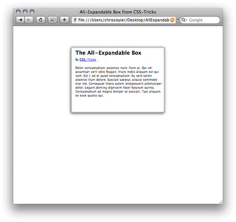
I am going to attempt to explain how to make an All-Expandable box, with the following features:
- Works in all major browsers
- Expands both vertically and horizontally
- Uses a single background image
This is a bit of a tall order, especially the use of the background image. This will end up using kind of a combination of the CSS sprites technique since different areas of the image will be used in different places and the Sliding Doors technique, since different amounts of those images will be visible depending on the current size.
Make the box horizontally expandable
There is one way simple way to make a box horizontally expandable: specify your width in em’s. For example:
.box {
  width: 35em;
  margin: 50px auto;
}
The margin is there for example purposes, to keep it centered and away from the top edge of the browser window.
Thinking about image placement
In this example, the box has rounded corners, a bit of a drop shadow, and a bit of an inner shadow. This means that all of the four corners of the box are distinctly different. This is uniquely challenging since images are not expandable. We will need a way to apply the four different corner images to the four corners of the box separately.
Also, we will need to overlap them in such a way that the transitions are seamless. And also, we are trying to do this with only a single background image, to make it as efficient as possible.
Below is an image of how you might think of what we need to do. The boxes would be overlapping, I nudged them apart so you can see the whole boxes.

When creating the background image, think big. The bigger your background image, the larger you will be able to expand without borking the layout. The example background is 700px wide which gets you about 4 or 5 different text sizings it works at, but it does eventually break apart above that.
Coding the box
Of course we always like to be as semantic as possible with our XTHML. That means not using extra markup for things that aren’t really content but are purely design. Unfortunately, with all this craziness of needing four boxes for our single box, it ain’t gonna happen.
This is how it’s done:
<div class="box">
  <div class="topleft">
  <div class="topright">
    <div>
       CONTENT GOES HERE
    </div>
  </div>
  </div>

  <div class="bottomleft">
  <div class="bottomright">
  </div>
  </div>
</div>
Styling the box
Here is the CSS for the four areas within the box:
.box div.topleft {
	display: block;
	background: url("images/box-bg.png") top left no-repeat white;
	padding: 2.0em 0em 0em 2.0em;
}

.box div.topright {
	display: block;
	background: url("images/box-bg.png") top right no-repeat white;
	padding: 2.0em;
	margin: -2.0em 0 0 2.0em;
}

.box div.bottomleft {
	display: block;
	height: 45px;
	margin-top: -2.0em;
	background: url("images/box-bg.png") bottom left no-repeat white;
}

.box div.bottomright {
	display: block;
	background: url("images/box-bg.png") bottom right no-repeat white;
	height: 45px;
	margin-left: 3.0em;
}
Note the negative margins are necessary to pull back from the padding applied from the parent spans. It just works out good that way with the padding, keeping text inside the box. Also note the height of the bottom spans are set in pixels. That is on purpose as they need to be kept short and not be expandable.
This has been tested in Firefox, Safari, Opera, and IE 6 and is working in all of them, so I’m fairly satisfed it’s a solid technique.
Credits
This tutorial is contributed by Chris Coyier. Visit CSS-Tricks to learn more CSS tricks from Chris.
Update:
The code in this example was updated to fix the div within a span issue and now validates.
JK Mohr
Nothing new, but good nonetheless
David
yeah, rounded corners, good illustrated!
the last three days i fight with the IE6 PNG Problems… :) I’ll habby that works now on my new page… puh…
Joefrey Mahusay
This is nice though, I gonna apply this on my XHTML and CSS website projects.
Thanks for this tutorial Nick! Keep up the good work :)
Snork
Good techinque!
But it’s not good to put block “div” into inline “span”, it’s not valid. Perhaps, will be better to use “div”, if we want to use block elements inside “topright”.
Dragan Babić
Bad example, you can’t put a block level element (a
div) inside of an inline level element – aspan. Also it is not good having two completely empty non-semantic elements. Check out this article I wrote some time ago (it’s in Serbian, but the example is what you’ll be interested in), I am using a definition list to mark up a comment (just as an illustration) that is as semantic as possible and uses as little markup as possible.Zeb
“But it’s not good to put block “div” into inline “span”, it’s not valid.” +1 but I prefer sliding doors !
Darren
Good example although I’m not a fan of using none semantic markup I can understand that achieving this any other way is near impossible without CSS3 or other technologies.
breaker
OK – up to a point. If the text size gets to large then the whole thing ends up looking like a dogs breakfast. Tested on Windows in Firefox, IE7
Glow
Firefox 3 is not the only one to scale everything when increasing the text size, ie7 and opera 9 do the same. I think the zoom thing must be achieved by browsers, this code is not semantic at all. Interesting experiment anyway.
Squawk
Very nice, but it breaks in Safari 3 at a certain point. (keep enlarging the text..)
Jan
interesting. thank you.
Mark Abucayon
I have to try this one.. this is fantastic. great tutorial out there. I love the site also. Thanks for sharing this with us.
fqch
goog enjoy!`iam chinese.^_^
Milan
Hi, that’s very useful and interesting! Thanks a lot for this tutorial.
Dustin Brewer
Yeah I kind of agree with the rest of the crowd about the placing of a block level element into an inline level element. That isn’t valid HTML/XHTML. Interesting idea though.
!an
why bother with the spans? with that content, you’ve got four hooks, which is all you need for an expandy box with unique corners
brad
I agree with the comments about the valid code and empty spans. I’ve utilized similar techniques using all divs but found the excessive code to be messy.
The best solution is to write javascript to add in the extra divs, keeping the html code simple and just living with the fact that if js is off then it won’t be as cool…
Dang - CSS Questions
It does not work when zooming too large or too small in FF, or when using a large image in the content.
Will
nice to see another tutorial with a different slant on an old problem…
Ken Deifik
The example page broke at three expansions, using Firefox 2 on XP.
Screenshot sent on request.
Edmonton Web Design
goog enjoy!`iam canadian.^_^
Johan
As I think someone said before be, Opera (latest I think) and IE7 also increases everything, instead of just font. (note that it says “zoom” instead of text size)..
Pretty interesting code though, great tutorial :)
Allen
Thanks again, you are the top!
Wypoczynek
beauty :-)
Andrei Gonzales
It breaks after two resizes on gecko browsers…
(This is what happens when you don’t test on other platforms and browsers as well)
JackieZhang
你的设计真酷!
you cool !
Alex
Its list elements.
It’s = it is, and “as it needs to be to fit all of it is list elements” is probably not what you meant to say.
Sara Susan
Well its nice sharing, i also find a good link which i m sharing with u all http://www.eyecatchypics.com
Chalo
I just replicated your box, but I had to adjust the top-right corner left-margin as it was too far away from the left border because it started to show in the the top-left corner. Maybe is the image, I had to give enough margin (15px) to set the drop shadows. Still not exactly like your tutorial but is a good start, this is in IE6. Great tutorial by the way!
Sverri
It doesn’t work in IE7:
http://www.sverri.name/upload/IE7.gif
aj
Interestingly this site doesnt scale when text is resized!
Slavo
Doesnt work in IE6!!!!
TefoZi
Doesn’t work well under Firefox/Linux :(
But looks nice!
Mike J
well its cool one!
Stubbornella
I really like the CSS Mojo approach to this kind of expanding glowy box. It works with transparent png, though obviously you have to provide an IE6 fallback design. Leslie’s code is really clever so I thought I’d share. http://www.lesliesommer.com/wdw07/html/#glow-wrapper
Jessica
Should that read “a specific height“
5ivedance
The page broke at three expansions, using Firefox 2.
Tom
Great solution. Thanks for sharing your knowledge.
Bundini
This is a workable solution. Probably the best supported solution. However, it’s less than ideal because it breaks semantics and fuddles up your code with divs strictly devoted to visual presentation.
There is a way to do this with a div, or p, and no additional markup. Unfortunately, because of flaky CSS 2 support amongst browsers, it doesn’t always work. The trick is using the :before and :after pseudo selectors along with generated content (via the css content attribute).
ALi SEVİMLİ
Very nice! Thanks.
Joomlabased
Thank you for this great solution.
ray
div.bottomright error in my ie7,but the idea is very nice ! I will try it. thanks
Uxma
Thanx for sharin! its grt one
Kings Design
Great tip that I have used once already.
Thank Rik
DottorZed
Very nice but don’t work on IE 6 !!!
almog media design
Heres a question how could you create a hole site to expanded with the text size of different users. Example on my site if the user was to change the text size, making it bigger then it well push down and overlap the design which look very bad.
How would you solve something like that , or in general what would be the best way to make a site that well work in all browser size , screen size and text size’s?
Would love to ideas or comments via email at [email protected]
elvisparsley
yeap, it’s cool. but it doesn’t work on IE7 and it breaks in firefox after 3 steps. Thanks for sharing.
Andrew Bexx
I also noticed it doesn’t work in ie7, the bottom right div brakes apart. But I have a simple fix, not tested this on other browsers so let me know if this works on anything other than ie7. Here it is:-
Add the following “margin-top:-0;” as in the CSS below:-
.box div.bottomright {
display: block;
background:url(“images/box-bg.png”) bottom right no-repeat white;
height: 45px;
margin-left: 3.0em;
margin-top:-0;
}
jon
doesn’t work in IE 7. Looks like crap.
James M
Absolutely great web site. Well done
chris
this sucks, why the hell do people idolize you?
Marlyse Comte
Great site, love the design and good article!
Maa-ku Online
Thank you for sharing! Great Job!
Fred
Would be great to say why you actually use em’s for making a layout like this.
1em = 100% of the computer’s font-size. Usually the default font-size is 16px, so 1em = 16px. By using em’s instead of pixels, you can really reach every configuration.
posicionarsitio
Let’s see …. It is FAB! I really love it but as a matter of fact I think I cannot use it very freq.
Love it!
Thanks a lot
posicionarsitio
efectivaweb
Really nice. I love it!!!
efectivaweb
petnos
good job. its working well.
Joey
Doesn’t work everywhere. Stop claiming that it does.
Secondly, Dear Andrew. We do not use negative margin in the professional world. Even if you are applying a negative margin to a zero value… which makes no sense in the first place.
Matthew
Yep – looks like crap in IE7.
I always cross (browser) check things before posting for public view…
I
Yep. Bad in IE7
PawelGIX
Fix for IE7
.box div.bottomright {
margin-top: 0em; /* add this */
}
virtualnetia
Good job and greate site !
miniak
I love it! Thanks a lot !.
Geison
Thanks !!
quongdang
hixx hixxx… it’s not work correctly in IE. Why so???
NGP
Hey guys!
I must say nick I have been a huge fan of your sites for a couple years now, and am always impressed with the content, tutorials and discussion on this site, so please keep up the good work. Been getting people to visit your site as well for their web and applications tutorials as well, and you got me into Considering WordPress as a viable CMS for a site I am coordinating.
I had a question about this tutorial: What i basically want to do is combine this tutorial with the CSS Web gallery example you have created most recently. I want to be able to apply border treatments to images that range in size, which would give me the ability to apply the border to an image of any size and not have to do it in photoshop. Was wondering if this was possible. I am thinking that you do the CSS sprites technique talked about in this tutorial, but lay the border over top of the image, using transparent PNGs. If you could email me with some suggestions or any resources that would be great.
Thanks for a great site
N.P (Joker101_np(at)yahoo.com
Browser compatible Code/CSS
Kindly check it on IE 6.0, there is some bug with expandable box.
Community Site
Nice trick, expandable boxes are widely using all over the web.
Owin Thomas
I’m using Safari 3.1.2 running on OS X v10.4.11 and the box is gaining an extra left side and bottom edges after using Cmd + until the text has expanded to its limit.
Great site by the way, I’m learning a lot from your tutorials, thanks for the work you’ve put in so far.
Cheers
Owin (U.K.)
Zeytin
Good job and greate site . Thanks
feha
This does not work on IE6
eric
Doesn’t work in IE 7 or IE 6.
Antonio
The box is ok under Firefox2 and MSIE6 but the image border is white instead of be transparent, any idea?
Dave
Great article, though you spelt ‘its’ wrong in the first paragraph…
Pbirdblog
Thank you for your code but Doesn’t work in IE 7. Now i am try to correct that.
Teknoloji Platformu
Thank’s that’s sound great.
mental
It does not work well in IE7
Busby
Great! I will reserve this one!
decapper
Another great feature I will add to our site http://www.pricelessweddings.com.au
Paula
I was wondering if any of you designers/front-end coders have a good example of a project timeline or a good estimate of how long the front-end code takes to build. The site is probably going to contain 3-4 different sub-page layouts and maybe 100 to 200 total pages. I use table-less (X)HTML and good current CSS. I just started a new job with full responsibility for redesigning and rebuilding the entire web site. I’m bad just at figuring out how long it takes to drive to work or get a cup of coffee, much less how many minutes per page I’ll spend!
henry
I got it working -http://www.flawlessfinish.com.au
sanat
thanks
nic
antonio
try defining it in the style sheet
img { border:none }
:]
guest
Would you(or someone) please fix this in IE7?
pretty-cool
Has any one an idea how to fix it in ie6 and ie7?
Steve
fix for IE is to give div.bottomright style 0px on top margin….however the great expanding box cannot handle this
expandabilityexpandabilityexpandabilityexpandabilityexpandabilityexpandabilityexpandability
David Dell'Agostino
it breaks if you increase the view too much
Dave Fowler
Thanks I’ll use that in my site. Already written a cool window close thing, gonna have to make it resize that as well. http://www.wecomparemobiles.co.uk
Birch
I increased the font size with FF, and it breaks. I edited the page with Firebug also, and put more text. It breaks again.
Bradford Sherrill
Great post! I will use this soon
hasfa
Thanks a lot Guys. U are doing the great job. This is what I looking before.
Really useful, nice and cool ever. Nice tutorial sure easy to understand. I must show all this to my group. Keep in touch.
Goboi
Seriously, who gives a flip it “breaks semantics.” In a perfect world maybe. And plenty of professionals use negative margins.
Not saying if it does or doesn’t, but I only care if it works, and works cross-browser.
Jako
NIce and flexi box.
bagsin
Would you(or someone) please fix this in IE7? thanks
Abi
Nice example. For those having problems in IE7, add a margin-top:0; (or your favorite shorthand equivalent) to .box div .bottomright.
Also suggest using strict doctype (mine appears off page to the left with transitional). To use strict, replace the doctype with: DOCTYPE html PUBLIC “-//W3C//DTD XHTML 1.0 Strict//EN” “http://www.w3.org/TR/xhtml1/DTD/xhtml1-strict.dtd”
and add this to the
headsection:meta http-equiv="Content-Type" content="text/html;charset=utf-8".David Dell'Agostino
it no longer breaks if you increase the width too much
Cyrus
Great , CSS: The All-Expandable Box
Great article. CSS saved web design
Cyrus
Visit http://www.psdtoxhtmlcoder.com
Roberto
I got it working on this application (www.qooshi.com) as well
G-ray
This is probably the best way to do the rounded corners with divs and css. Unfortunately, it is not infinitely expandable, and will break down the larger it gets. The larger you need the box, the more image data needs to be sent. The best infinite rounded box that will work in ie7 is this:
.lcrt div,.rcrt div,.lcrb div,.rcrb div{ width:15px; height:20; background-image: url(images/box.png); background-repeat:no-repeat;}
.lcrt div{ background-position:0 0;}
.rcrt div{ background-position:100% 0;}
.lcrb div{ background-position:0 100%;}
.rcrb div{ background-position:100% 100%;}
Mike
NIce and flexi box. Thanks
kinza
hey
this is great post you have save my time keep it up thanks for sharing.
kinza
vincentdresses
The designs showed here show what simple and tasteful design is all about. Another one to consider
w
Very nice box! Except for the nasty blurred edges. ick….
Waqas
Kindly check it on IE 6.0, there is some bug with expandable box.
anyway Nice trick!
Vertex Web Solutions
Great , CSS Thanks for Shear
Faraz
Nice CSS!
Tzon Tikis
It doesn’t work on IE6
Oliver
nice trick. I don’t think it matters about lack of IE6 support, considering recent revelations of IE6 being a security issue. The more we continue to support this old browser the longer it will take to disappear for good.
jams
Nice Tutor….
Dave
Great, but why does the background box on THIS page stops halfway through the text and never gets close to the bottom of the page? Oh, and the comments don’t seem to fit in the comments boxes if over 2 lines. Viewed with IE8 btw. Nice to find free css tuts though. Thanks
Sebastian Hill
Hey Chris,
this is very useful piece of work. Top!
I certainly intend to start applying the expandable box. But what I am even more impressed with is the actual design of your example box. I am new at the webdesigner thing and even more so at Photoshop, but I have been trying to design exactly such a box in Ps. I’m afraid I am not up to it yet. Is there any chance your could explain how it is done, or share the .psd even? I’d like to play around with it, change some background/foreground colors etc. (or is there a way to do that in CSS?).
There you have it: you give them a superb tutorial, and all they ask for is MORE!!! :-)
Thanks, mate!
Tobbe
Hmm i tried this but i dont really get where to put the bottom text the “style” anyone knows where and could maybe show a example, cause im really new at this
packetpirate
Tobbe, it’s CSS. You’re not going to be able to make rounded corners with raw HTML…
Web Design
chris yoour awesome bro thanks for sharing!
gheuntak
I tried using this with fixed width but not succeeded… any clues?
Sim
Any ideas how you can make it work without the DOCTYPE and HTML NS tags (tested it and its breaking in IE 8)?
Ishana
If the box comes to be higher than 700px, you’ll have a problem. If your design uses a png with transparency and a fancy border, the image will be very big for some low bandwidth. Any ideas of another method that would overcome these situations?
hasfa
Thanks chris. Nice and good tutorial. another one of the best rounded css box
Let me try..
Gary
Hey guys can anyone help? I have added this to my site and it’s working perfectly except it seems for some reason that the width is limited? I am using it within wordpress and using a box like this to hold the checkout. But the checkout is going over the right hand side of the box?
Thanks in advance!
Gary
external sliding doors
Wow………………….!
Marilu Lubawy
love your website
اليوتيوب
done with this very fast and very easy thanks for such tut
serge
great stuff…it would be nice if it also work for patterned/image backgrounds, as some very ugly part of the images appear when the default plain white background is deleted.
Don Guzman
You guys that do these free tutorials are studs! Man I wish I had the time to go through just 1/100,000th of them out there. I am currently in college (at 48 and I grad. in 2012 w/BAS in web dev) and the professor linked us here to check out different CSS methods. I’m a noob, but in time I hope to catch up to you guru’s and then maybe I will contribute. For now I just want to say thank you.
Don G
anish chapagain
nice to learn!! thanks
outlet uggs
I am using it within wordpress and using a box like this to hold the checkout
Juno Mindoes
In the third part of the test I’m shooting an object from a pretty close distance (15 cm). Here you can really see a big difference between the different cameras and if you compare the 3G with the white iPhone 4 side by side you can see that they are miles apart.
Henry Peise
Apple’s launch of the iPhone 4 white has seen the greatest excitement for a new phone ever, with HD video recording, a super high-res screen and ridiculously slim dimensions, it’s not hard to see why its so popular in the world.
Melvins
I am learning CSS in depth and this is what that can help me a lot. Your this tutorial about expanding box is really appreciated and helpful.
Los Angeles Web Design
Ben
Oh, that’s what i’m looking for!
Uçak Bileti
kölemi lazım kardeş
altın çilek
That’s Great! Thanks for the post!
hcg damla
You guys that do these free tutorials are studs! Man I wish I had the time to go through just 1/100,000th of them out there. I am currently in college (at 48 and I grad. in 2012 w/BAS in web dev) Hcg Damla and the professor linked us here to check out different CSS methods. I’m a noob, but in time I hope to catch up to you guru’s and then maybe I will contribute. For now I just want to say thank you
شات صوتي
thnks
goooooooooooooood
min:(
teem
Derek
I’ve been studying CSS and web design lately and must say: this entire page is a work of art! So many aesthetically pleasing great ideas, and still perfectly readable without styling. Understanding its components would be worth a couple semesters in college!
mike d
It has breakage in i.e. 6 and 7 and does not grow with text size growth. boo.
How To Put On A Condom | How To Get Taller
So true. Thanks for this wonderful article!
How To Get Taller | How To Put On A Condom
Your explanation of making an All-Expandable box is quite easy to follow. Thanks.
Joe
Im not sure if this is really going to help, cos it cannot expand even vertically
bluesoft
Text box nice css very professional.
PhotoshopWarrior
Very professional CSS techniques, Tnx
Asigurari Locuinte
Very professional CSS techniques….
yavuz
thank for this css web site
Caravan Man
Interestingly WAI accessibility guidelines say that for an increase in font size above 200% expansion in both dimensions is necessary. Emastic is an excellent CSS grid that allows the use of em or % measures for width which means that the whole latout grows with the text. I hope it is OK to post a link to this here: http://code.google.com/p/emastic/
Sven
Thx man! But the use of the div selector in the CSS is not nessasary. I know.. I’m a bit of a perfectionist.. :P
yemek tarifleri
Painting on the tablet is fun, but to do cool things need work.
tim
Is there a way to move the box away from center? Like to the right for instance? I havent had much luck…
Facebook
Very professional CSS techniques ^_^
Yates de lujo en Ibiza
Interestingly WAI accessibility guidelines say that for an increase in font size above 200% expansion in both dimensions is necessary. Emastic is an excellent CSS grid that allows the use of em or % measures for width which means that the whole latout grows with the text.
nate
I find this method to be very inconsistent across all browser, but nice explanation and write up.
DymoLabels
hi
i really like this code
i needed it badly
thanks for sharing
keep it up